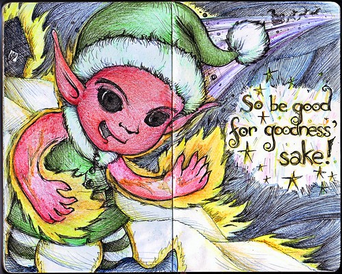
Just when we thought Santa's not serious when it was said, "So be good, for goodness' sake", here comes Xaphan, Santa's fiery elf to carry out his worst secret missions.
Just when we thought Santa's not serious when it was said, "So be good, for goodness' sake", here comes Xaphan, Santa's fiery elf to carry out his worst secret missions.
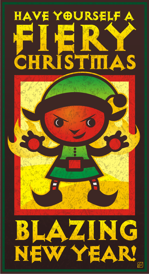
Wishing everyone a Fiery Christmas and a Blazing New Year! There's something about the coming year that will be uplifting for all!
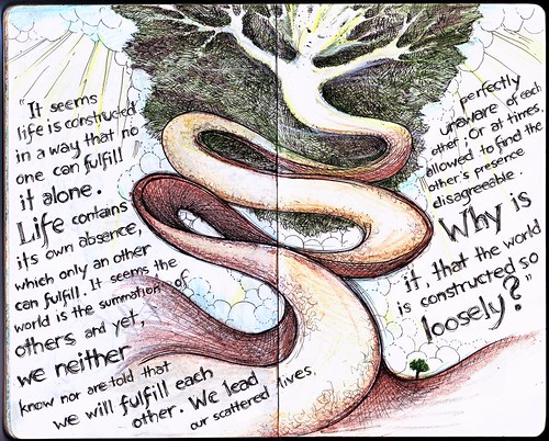
"It seems life is constructed in a way that no one can fulfill it alone. Life contains its own absence, which only an other can fulfill. It seems the world is the summation of others and yet, we neither know nor are told that we will fulfill each other. We lead our scattered lives, perfectly unaware of each other; Or at times, allowed to find the other's presence disagreeable. Why is it, that the world is constructed so loosely?"
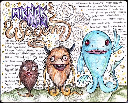
Merduk naflotani kuti ferpon. Refuman nor me ayutan fri. Froman-ruppendiskulana fi. Kuti ruppen tinduts fi. Adlunini Zeppun ru. Kuti tindantsunati Adlunini ruppen klupendut. Plud dut pukhi La Pang it akhu khoki me. Ku palak holomin Kalam Ngipun Shippunde Kuti Reppundi Zek eras Ku phalandi re Merduk miknok mek kendolomon re. Ayu Zeppundu re ti Dopondol ki fitalon.
Kalipantoran Zerdunyalondi keppu reppunda koloko indak put ain holorondika Taron Ki. Fulando rolondok titilongaring kopol pilikon porokulan merduk parfulandok kili-dontafen fi zuppan rhopa reppun zolonki kepundulant nelun pholondolar kepunduran Ken fi zorbankorngiz miknok Kepu niken Kuti lor rhop refuman fi zun kolon zi Zephi Zoool Zun Zi.
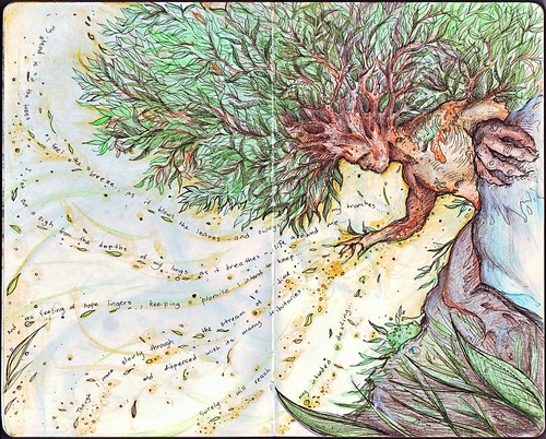
My head is in the trees... I feel the breeze as it blows the leaves and sways my branches... I let out a sigh from the depths of my lungs, as it breathes life around me... And the feeling of hope lingers, keeping a promise I intend to keep... Though I move slowly through the stream of time and dispersed through its many tributaries... Surely I will reach my intended destiny...
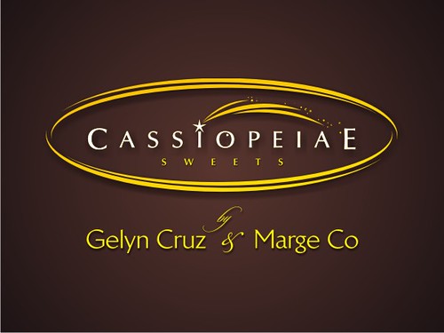
It's the season again for joy and merriment and what better way is there to make hearts happy but through gift-giving. And you're always sure to win through a box of delectable fudge cake… or some zesty lemon cashew… or some sweetly intoxicating fruit cake… I better stop there, because there's more ways than these that Cassiopeiae Sweets can offer.
Coming home from a 2-year stint as pastry chefs in the world's first seven-star hotel, the Burj Al Arab of Dubai, my sister, Gelyn and her friend Marge decided to venture into creating their own cake and pastry business. They invested on my mom's sought after and time-tested recipes (my mom's Solita's Kitchen), and actually improving on it by perfecting its taste and presentation using the skills and experience they gained from abroad. Looking at their first batch of sweets, one couldn't deny the effort put into the presentation (how often do you find authentic gold leaf as garnish?) and more so to its rich flavor. I couldn't prevent myself from helping out in the best way I can… by creating their logo brand.
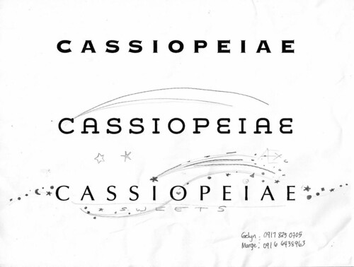
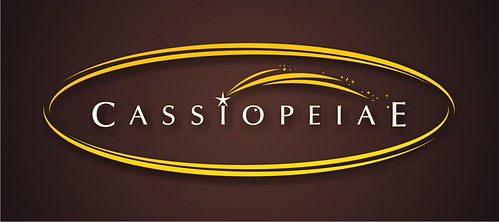
They chose the name "Cassiopeiae" because it creates an image of stars shining in the night sky, something that they aim to emulate through their creations. After some brainstorming about the name (and we did have some interesting debates), I sat down to draw some working concepts. I started selecting fonts, and worked on the graphic around it.
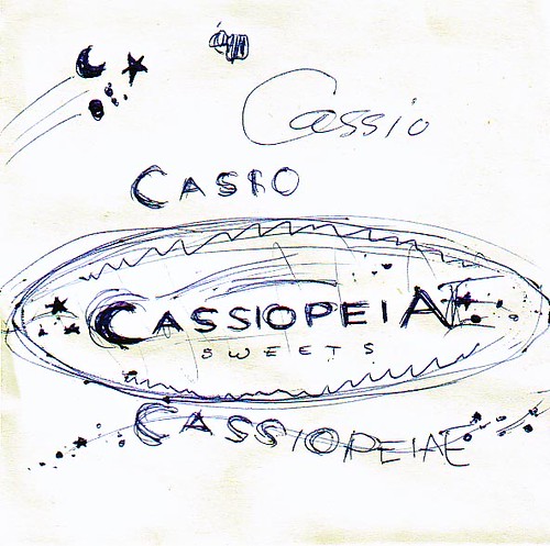
And after some deliberations, the final design was chosen. It wouldn't be a surprise though that I would also be tasked to create their label design. Simple and homegrown.
Highly recommended and it doesn't matter whether you have a sweet tooth or not. Great gifts especially for the holiday season. Scroll down on the pdf viewer below for their products.
For inquiries and orders, call Gelyn at 09166438963 or Marge at 09178250705.
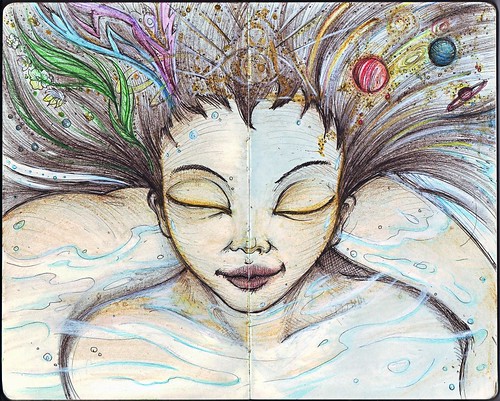
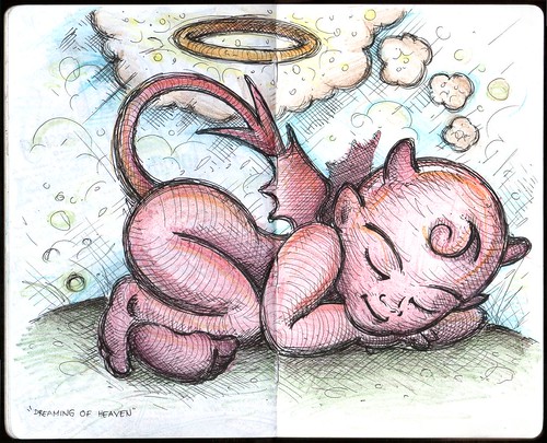
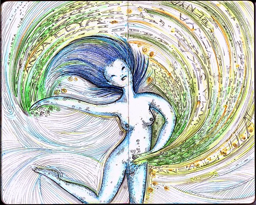
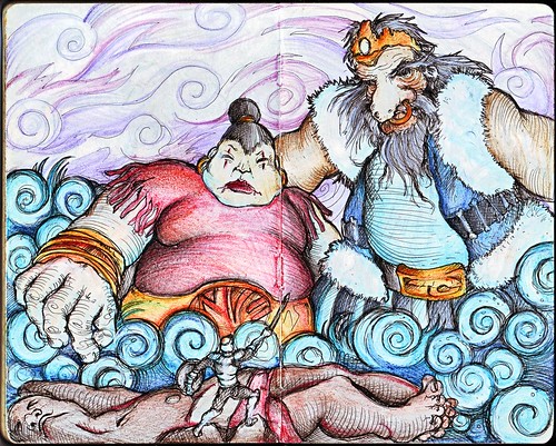
One of my latest moleskine entries which is partly related to the previous "Muse" spread:
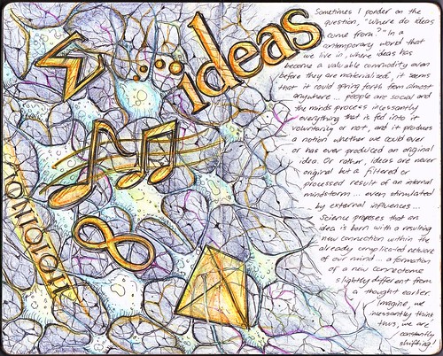
Sometimes I ponder on the question, "Where do ideas com from?" In a contemporary world we live in, where ideas has become a valuable commodity even before they are materialized, it seems it could spring forth from almost anywhere... people are social and minds process incessantly everything that is fed into it voluntarily or not, and it produces a notion whether we could ever or has ever produced an original idea. Or rather, ideas are never original but a filtered or processed result of an internal mindstorm... even stimulated by external influences... Science proposes that an idea is born with a resulting new connection within the already complicated network of our mind.... a formation of a new connectome slightly different from a thought earlier. Imagine, we incessantly think, thus, we are constantly shifting!
I have to say that while I was working on this, I saw the following TED talks in YouTube, which directly inspired the drawing and the texts. The first one is a very interesting lecture by Steven Johnson about how ideas, rather than born from instant "Eureka" moments are actually brewed inside our heads quite differently.
The second talk is by Sebastian Seung as he discusses his work which involves mapping the connections in our brain, and how our "connectome" as he calls it, could open up a new way of understanding how our brains work.
Now let's all say... "I am more than my genes! I am my connectome!" Interesting!
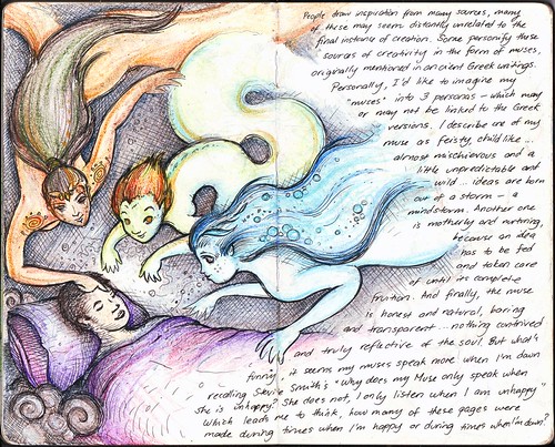
People draw inspiration from many sources, many of these seem distantly unrelated to the final instance of creation. Some personify these sources of creativity in the form of muses, originally mentioned in ancient Greek writings. Personally, I'd like to imagine my "muses" into 3 personas - which may or may not be linked to the Greek versions. I describe one of my muse as feisty, child-like... almost mischievous and a little unpredictable and wild... ideas are born out of storm - a mindstorm. Another one is motherly and nurturing because an idea has to be fed and taken care of until its complete fruition. And finally, the muse is honest and natural, baring and transparent... nothing contrived and truly reflective of the soul. But what's funny, it seems my muses speak more when I'm down recalling Stevie Smith's "Why does my Muse only speak when whe is unhappy? She does not, I only listen when I am unhappy." Which leads mo to think, how many of these pages were made during times when I'm happy or during times when I'm down?
It took a long time before I made another page in my Moleskine again. And what better topic than to talk about my muse/muses. It take a certain level of motivation to work on art, but once I get inspired the process is easy. And in one way or another, I lost my muse, thus the hiatus.
Last November 20, 2010, one of my artworks was published at Manila Bulletin's Ang INK Corner. As I have mentioned before, Manila Bulletin features in their Student & Campus/Youth Section artworks from Ang Ilustrador ng Kabataan, or Ang INK as we are fondly called. This is my second time to be published there, my first one being published almost a year ago, featuring my art coupled with my sister's poem about recess. Unfortunately, due to my extreme "busy-ness" juggling time between work and my numerous passions, I haven't been able to attend Ang INK's regular meetings. I definitely regretted not being able to participate in the annual exhibit since I was not able to finish the painting I was already working on. Anyway, when Blooey asked me if I could work on that weekend's feature, I just had to say yes. It was an added bonus that there was no theme for that week, I could choose any artwork I have, as long as it's for general patronage. In my mind, I thought I don't have to create from scratch since I have tons of materials from my Moleskine collection. I already had a particular drawing that I thought would be a great feature:
It's one of the favorite drawings from my sketchbook, and it's not surprising. It's cute and witty, unlike most of the other drawings in that collection. I was already preparing the layout for the newspaper, when I realized, while looking at it, that I wouldn't allow it published. First of all, it's from a notebook and it had this ugly line in the middle. The lines are not that refined. And the overall layout would not look natural. I finally said to myself, I have to rework the whole drawing from scratch!

It took me a whole night to work on this. If you notice, it was indeed a huge improvement from the original drawing. The lines and cross-hatching are finer, the features of the characters are more defined, plus the layout is more natural, as if it was drawn particularly with the final layout in mind. Just exactly how we children's book illustrators should do it!
I just love the description about me: "Rev is usually a good guy, but sometimes he imagines himself to be uhmm naughtier?" I meant it as a joke, but I was surprised that one of my patients in the clinic remarked: "That's very you!" Uhmm, I wonder what she meant by that.
It's interesting when my clients ask me about my other interests, because it opens a whole lot of creative avenues. Most probably, after seeing my online photos about my passion for BodyCombat®, which is a Martial-arts inspired workout designed by Les Mills International, and being an instructor myself, a regular client of mine asked me if I was into "martial arts, karate, MMA (mixed martial arts) ?" I never received any formal training in any martial arts, but in BodyCombat® you get exposed to various disciplines despite being a non-contact activity, mixing everything into one dynamic cardio workout. I said "in a way, yes…" and this inadvertently plunged me into another creative project: I have to create a logo for an MMA website.
The brief was pretty straightforward. MMA Headquarters (or MMAHQ) is a website that obviously caters to MMA enthusiasts with a demographic of 15-35 years old individuals. They intend to sell MMA-related products and feature a blog discussing product deals and events. They were open to several ideas: "fighting related elements, icons, silhouettes, other metaphors." The logo needed to have an icon or a scalable element that can be used independently of the words but still maintain the brand Identity. In their words: "what the Nike Swoosh accomplishes on its own." (a request, almost every client I had always remarked ;-P) Having been involved in MMA inspired artwork, I somehow have an idea of what they wanted. A quick Google search of MMA-inspired logos will show you what I mean.
I focused on creating an icon, this time working on a clever graphical way of combining "H" and "Q" since it is these two letters that set MMAHQ apart from other competing websites. Drawing inspiration from a logo I made for my old BodyCombat® team, I made the following sketches:

The client provided a very informative feedback:
Maybe like a clean grunge, if that's not a total contradiction. Like discipline amidst the grunge, if that makes sense. Like more jagged edges than sloppy, messy ones. I'd almost want to say there's a bit of military influence; I've seen so many board shorts and t-shirts that have camo or camo-like patterns. There's also a bit of a hip hop element; not too much but a bit of graf influence I think… but if you look at the fonts they use they are always super durable... Like you put all the fonts together and let them fight it out and the really strong one emerged victorious. Tempered by steel/tested by fire. It's still sort of Gladiator-esque in a way, but still trying to gain legitimacy as a new sport, so that's why I'd say it's not quite as grungey...grunge being sorta not caring about anything, MMA being more hyperfocused on a goal and defying human odds to get there
The client was very excited with these previews and almost immediately, we decided to develop the ideas to their vectorized format:

With almost little editing, the logos were finalized as what you will see in their website. On a side note, not entirely unrelated to this post, and with the fact that my birthday is nearing, I would just like to say that if anyone gift me with this or this, I would love you forever…

One of my recent logo creations involved one of my favorite things: baking! Well, not really. I'm not that much of an expert in baking, my skills limited to simple cookies and cupcakes, but I can say, I'm very good in eating what other people has baked! Anyway, the challenge of creating this logo is to capture the magic of baking, and with a very enticing company name, the logo should be as well.
Baker's Confetti carries the sweetest, best-tasting bottled sprinkles around. Their products are formulated with the finest ingredients, and were created with even the most discriminating consumer in mind. They wanted a logo with business professional style, but must be trendy and memorable as well. Their target audience is the typical home baker/candy maker, small bake shop/ice cream shop owner and the run-of-the-mill sprinkle aficionado (anyone with a sweet tooth!) The logo should represent quality, be memorable and visually attractive.
Sometimes, before I set myself into creating a logo, I select keywords to guide me through the process. And for this one, I specifically chose "magic" as the name of the company pretty sets it up… "baker" and "confetti". The confetti part is easy. I can create a logo with sprinkles about it, but that would be too common. So I had to illustrate the baker and confetti in a sort of magical way… After a few swings using simple geometric shapes in my vector program (I didn't go through pencil sketches for this one), and choosing a "delicious" font (which I edited slightly to balance it out) to go with it, I came up with this.
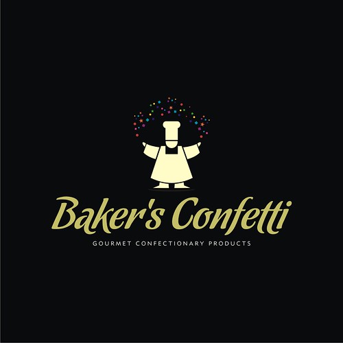
And on light background.
It was an instant favorite, and a personal one for me as well. Definitely one of my most memorable creations. Baker's Confetti is yet to launch their website and release their products, but they have a blog which features some recipes, and a facebook account as well.
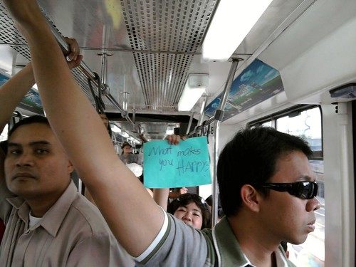
I was on the MRT the other day heading to one of my gym classes, when out of the usual bustle, there were people in the train carrying sign cards… this small lady seemingly so excited to catch my attention showed me hers… Her card says… “What makes you happy?”… I thought to myself, “Secret, hehe…” and smiled.
Quality Life Discoveries was supposed to be featured at Umagang Kay Ganda, the daily morning show of ABS-CBN, on Wednesday, focusing on the various services that the clinic offers. Of course, being the Aquatics specialist of the center, I was more than prepared to demonstrate and talk about Aquatherapy and WATSU® once more, the last time being in Unang Hirit (GMA's morning show). This meant waking up as early as 3 am, to be at the clinic at 4 and sink in the pool for more than 3 hours straight. Gruelling work, while trying to look pretty for the camera! But highly enjoyable!
However, due to some reasons, Umagang Kay Ganda had to back-out and instead I was invited to be a guest at a radio talk show in DZMM… Fine, I did radio interviews before, but of course I couldn't hide my disappointment. The first question I asked myself: Do I still have to wear my swimming trunks?
I was told to be at the DZMM station around 10:30 AM per instructions just in time for the 11:00 talk show. I was greeted by Lyn, the station assistant who led me to the make-up room. I saw the television screens around broadcasting the live radio shows and only then did it dawn to me that this was a televised radio show: Todo Todo, Walang Preno. Darn, I should have worn my trunks! Kidding aside, I was wearing the clinic's uniform of course. Make-up make-up while chatting with Lyn who shared how she could relate very much with the topic to be talked about because she had a nephew who was a "special child." Not long I was led to the booth, where hosts Winnie Cordero and Ariel Ureta were already airing. Off air, Winnie would talk to me, orienting me when we would go on-air, and asking a few questions about me, my work as a clinical consultant in QLD and the programs. I looked around from my seat, and pretty interesting, I could see the producer and technicians in their own booths, and pointed at me was a robotic camera. Ooops don't stare! Winnie and Ariel had their own cameras too. Good thing I was wearing the aqua colored shirt… looks good onscreen. I don't really listen to radio shows, but seeing how Winnie and Ariel work… uhhm, actually work is not the right word, have fun on-air, I was amazed… they're funny, witty and entertaining. After their signature "word of the day" segment, they were already informing the listeners about the next topic: "One Stop Shop to Wellness." This is it… just be my natural self, and forget the camera, forget that you're on air. It's just a conversation.

On air! Winnie asked me about my work, starting first with how I got to be called Teacher Rev… then my work as a physical therapist, how long it takes to be one and so on. We then talked about the programs starting with the TheraSuit Intensive Method, then Aquatherapy, which we spent considerable time with, with me talking about how great the water environment is in bringing out the best in children with disabilities, and at the same time, enjoying it. Ariel, would occasionally summarize or generalize these thoughts, highlighting the importance of early intervention and how physical therapists are "heroes", even "magicians" for helping patients regain their strength and skills when most think are unrecoverable. We had a short break, while new reports and some features were covered. Then in a few minutes, I was back on air, to continue talking about the other programs. I admire Winnie and Ariel for creating a light-hearted atmosphere that I almost forgot we were broadcasting. I wondered before the show, how such a potentially serious topic could fit their show, but they managed to bring out some laughs, while maintaining an educational tone all throughout. I asked Winnie if I could leave some parting message (remembering the small chat with the make-up artist who were all sad and pitiful about people with disabilities) and I did… (translated already) that we shouldn't focus on what our friends with disabilities can NOT do… because if we did, we are depriving them with opportunities to uplift themselves, and furthermore as a therapist, we wouldn't last long with our work… instead, we should focus on what they CAN DO… the small improvements that we see in our patients sometimes are enough reward to push us though…
The show finished around noon, and I asked for a photo with them. I thanked Winnie and Ariel for wonderfully championing the physical therapy profession, and told him that all PT's who were listening would be very glad. I went back to the clinic, very very happy.

It's wonderful when clients seek you out because a previous work impressed them and somehow fit the particular style they needed for their logo. Cam McCulloch saw the Art Deco style I did for Savoy Special, a rock and roll band based in Houston, Texas. Cam wanted to have a similar illustration and text for their seaplane company called "Flying Fish Aircraft Company". She shared ideas on how it could look like would like, one of which would have a flying fish with propellers on its back "like an airplane " coming out of the water. Cam provided me with reference pictures.

Another thought would be to use two F's in flying fish back to back some how to make wings. I did some research again about art deco design particularly how it represented aircrafts and fishes, and similar themes. I promised her 3 initial drafts for the logos and I came up with the following conceptual sketches.

The first one utilizes the two F's, forming the outline of the seaplane. It is a very simple design and can be framed in a numerous ways as shown in the variations. The second one invests on the idea of a flying fish-plane hybrid, and basing much from the reference pictures provided, the illustration was executed in art deco style, combining the dynamism of the fish and the sophistication of the plane. Again it can be framed in many ways, and various options for embellishments such as waves or splashes may be added. The final concept is again a flying fish-plane hybrid, but this time, executed in a simpler manner, flat from the lateral perspective.
Promptly after submission, Cam commented that the "Flying Fish" name of the company seems not to be working as a text in the initial drafts, and requested to use "Riley Seaplane Company" instead, executed in a more art deco inspired font. She liked the hybrid concepts and decided to steer the design development process towards that direction. The name "Flying Fish" would then be redundant, if an illustration using a flying fish would be use. Cam reminded me about the rejected design concepts I did for Savoy Special, particularly the wing concept and asked if it can somehow be incorporated in the design. It was of course possible, and presented an interesting opportunity. Before doing vector work, I made another sketch for final approval:

Cam really liked the design, and provided me with more reference pictures to incorporate in the design, specifically making the fish more detailed and framing options. After a suggestion of adding waves in the frame, the design so far was this:

And after much deliberation, we decided to tone down on the waves and settle with this final design:

This design was truly a collaborative work, and as a designer, I was very glad to have been able to realize the design the client wanted. Designers sometimes are frustrated with clients who seems too controlling of the creative process, while at the same time failing to communicate what they truly want, and sometimes, changing their mind incessantly. Not with Cam, whom I enjoyed working with. It is very rewarding to conclude projects with very satisfied clients.
What do you see in this logo?

UnoNovè, is a small company based in Los Angeles and they manufacture and sell woman's active sportswear apparel. They were looking for a logo that would represent fitness and style, can be artsy but not overly masculine (as most sportswear apparel logo tends to be). Since the name of the company literally means "19", the logo should somehow draw inspiration from it.
My first concept utilized the Roman version of the number, "XIX" which is a very interesting symbol to work with as it is inherently symmetric and allows itself to a variety of design executions. I came up and submitted this version, which evokes elegance. I was not exactly confident in the design as it particularly fails to represent "fitness" and more of the "style". Looking at it, it works better as a high fashion apparel logo, rather than a sportsline.

I worked on another concept, this time focusing on the original "19" and executing it in a simple iconic design. Looking at the numbers, I felt the key would be the head of the number "9". I worked on numerous sketches, and finally executed it in the version first shown at the top of this blog.
And on a dark background:

I tested it by showing the design to people, and obviously they see a flower, particularly a rose, as most of you did. Only then when they see the name of the company or they are told outright do they realize the rose is actually the number "19". I felt immediately that I hit it confidently with this design, and I was genuinely excited with it, and I really hoped UnoNovè pick this one. It can be executed in a variety of colors and will work well with embroidery and print. And they did pick this design!
This is quite old news already, and I myself am wondering why it took me a long time to post this. I have been very busy lately and in a way mentally and emotionally preoccupied with a lot of things. Yes! Raisinhead placed 2nd at the People's Choice Awards, which just proves how many friends love me, haha! But really, I thank everyone who took time to register at Pelicola.tv and vote for my baby.
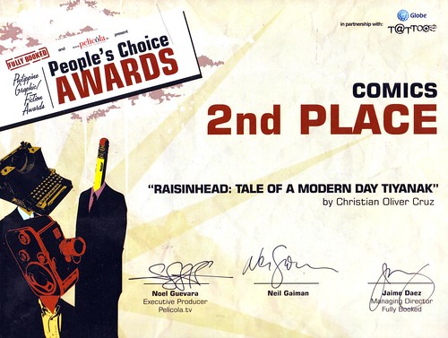
The awarding night was an unforgettable one - very informal, lots of yuppies (My dad felt out of place and can't stop muttering, "Puro bata naman pala rito!"), premium San Mig beers, but most especially we had Neil Gaiman grace the event. Of course, I was hoping to at least place in the top 3 in the judges' picks so I can personally spend time with Neil. But that didn't stop me from approaching him on the stage and have a little discussion. Unfortunately, my camera ran out of battery!
Congratulations to all the deserving winners, especially to Irene who placed 1st place in the People's Choice Awards and 2nd place Judges' pick! Woohoo!
About 3 years ago, I created what could be one of my most popular creations: Paranormal Philippines. It's basically a Philippine map, where each geographic detail is drawn with the country's folklore and mythology.
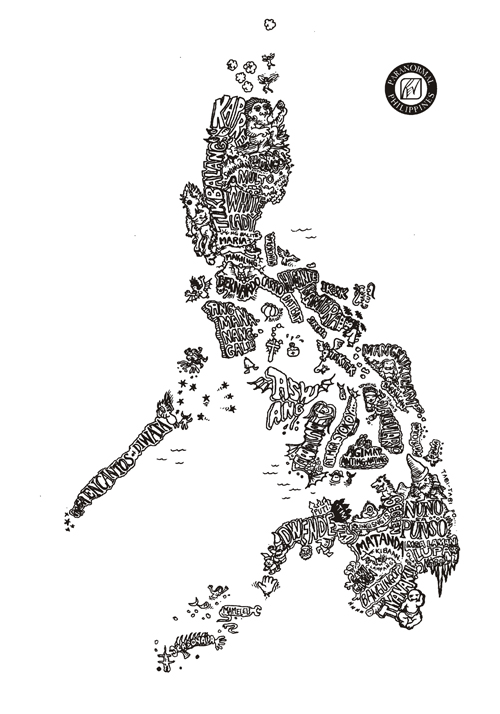
Originally inspired from Aaron Hogg's Para-Normal US, I intended this design to be printed on a shirt. I would like to apologize to everyone who had been waiting all these years for the T-shirt, but due to numerous circumstances, it can't come out yet. I had no time to produce the T-shirts yet, and besides, the design is not prepared yet for printing. Though it looks nice as a whole, once you zoom into the parts of the work, you will notice how smudged it is. This is expected, as it was drawn on A4 paper with a 0.1 fine line marker.
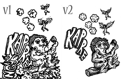
It is about time I update the artwork. This time, I plan to expand the map 500% of the original A4 and work with a variety of tools from ink brushes, brush and fine line markers. This is just a comparison of how the original compares with the new version. The other parts look more awesome.
This is something to look forward to. The Paranormal T-shirts will soon become a reality. Besides Paranormal Philippines v2, I'm currently researching for a new comic I'll be working on. Let's just say it's a combination of the historical and the supernatural. And if you have frequented my blogs, its plot won't come as a surprise to you. March will definitely a busy month, from numerous speaking engagements (aquatherapy and ergonomics), creative projects and an awarding ceremony plus I'll be officially training for BodyCombat! Hope I survive this busy month… Ciao!
The finalists for the 3rd Philippine Graphic/Fiction Awards are finally revealed at Pelicola.tv, and my "Raisinhead: Tale of A Modern-Day Tiyanak" made it to the shortlist for the Comics Category
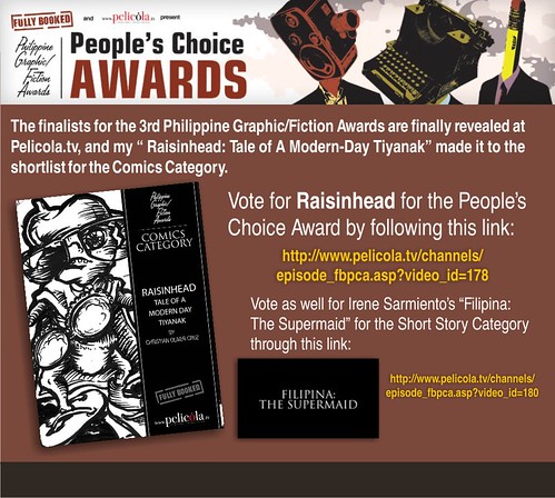
Vote for Raisinhead for the People's Choice Award by following this link: http://www.pelicola.tv/channels/episode_fbpca.asp?video_id=178
Vote as well for Irene Sarmiento's "Filipina: The Supermaid" for the Short Story Category through this link: http://www.pelicola.tv/channels/episode_fbpca.asp?video_id=180
Just a week ago, I met with Irene to talk about her The Open Time Capsule project and she asked what my plans for Raisinhead comics was. Raisinhead: A Tale of a Modern-Day Tiyanak was my entry to the 3rd Philippine Graphic/Fiction Awards. It's almost 2 years already and we haven't heard anything yet from the organizers regarding the status of contest. Assuming that there was already no hope for the contest, I told her that I might release it for the Komikon in its present form, or perhaps expand it to a series or graphic novel format.
A few days after this, I received a pleasant surprise from Fully Booked… in the form of an email:

I have no idea yet who else are shortlisted for the comics category but this is indeed GREAT news! Irene's entry was also chosen in the shortlist of the short story category.
I checked Fully Booked's website and saw that they have already posted an announcement regarding the line-up of events related to this: the awarding night, an art contest and book signing by Neil Gaiman himself!

Someone told me we won't know the winners until awards night (kaya nga Revelations no! Gosh, I hate the suspense!) Hoping for the best!
My brother Gelo's getting married. And like a good elder brother, I volunteered to prepare the invites… from design to finished product. The theme: Filipiniana. Of course, I wanted something special and unique for my brother and his fiancé and what better way but to make an illustration… of them… in a manner that reflects their personalities and how friends see them and their relationship, within the Filipiniana theme… And this is what I came up with:
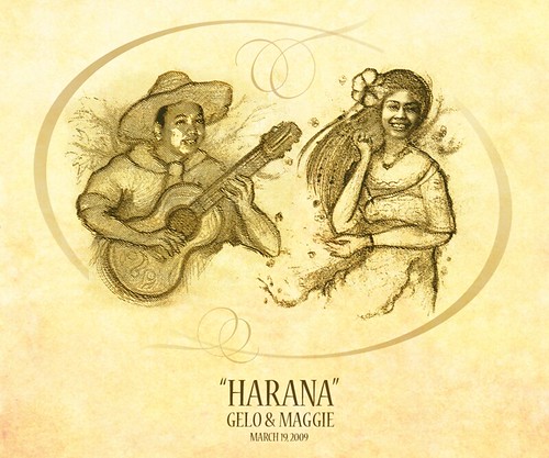
Solid theme but subtly humorous. If you knew any of the couple, I hope the drawing brought out a chuckle or at least a smile.
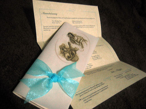
The drawing served as the main graphic element of the invitation, which upon instructions, should be kept to elegant simplicity:
So happy for my brother and his soon to be bride and I hope their love endures. Happy Valentines to all!
The Year 2009 has been an action-filled year despite the disasters and other numerous setbacks everyone experienced that year. Personally, the year had definitely been a rewarding one. Not only was I able to further and expand my creative endeavors but I was also able to establish a masterful grasp in my other areas of interest as well. It's scary, but I was able to cross out a lot of items from my "List of Things To Do Before I Die" so does that mean… Uhhm, stop the morbid thoughts, I ended up adding more to the list, making sure it was a loooong list. I wrote this in response to the lyrics of a song from Rent. So how did I measure my year?
The Year in Logos. Here are some of the logos I made this year. Again, a bunch full of variety and styles.

I should mention, that although there were numerous projects this year, there were some projects that simply fizzled out (that is, the projects were already completed as commissioned, but were stolen, ignored or abandoned). It's sad to think that some of these failed projects involved fellow Filipinos whom you would expect to be more supportive but ended up depreciating your efforts. I can't help it, but I enjoy working with people who truly appreciate and give value to artistic creations. I should be more cautious in accepting commissions and adapt more effective strategies in dealing with my clients. I know I haven't been able to update my blogs with my recent logo creations, but hopefully I would find more time this year.
The Year in Illustrations. This year, I was able to join Ang I.N.K. (Ang Ilustrador ng Kabataan) and through it, I was able to affirm myself further as an artist. It's truly gratifying to be able to visit the UP College of Fine Arts for our regular meetings, discuss our projects and learn from other artists: things I could only dream of doing before. As an INKie, I was able to create illustrations for books, newspapers and exhibits! But if there was one achievement I could cite, it would be for my entry illustrations for "Ang Higante Sa Loob Ng Aming Bahay" which garnered Honorable Mention at the 2009 PBBY Alcala Award. The year 2009 affirmed my ability to create art but I learned that I should be more daring and exploratory.

The Year in Books. The year marked the publication of the book "Spinning" and its Filipino counterpart "Paikot-ikot." It's so exciting to be able to promote the book with Irene, and finally being able to see it in the bookstands. Interesting, I used to fall in line to get my books signed by their authors, but this time, I was on the other side of the table signing and giving autographs to both kids and adults. The other book "Chulliyaw" was also published this year, as a project of the Australian Embassy. It wasn't made available to the general public, being a private project with the Kalinga communities, but I hope that this Kalinga storybook series will be made available for public consumption this coming year.

The Year in Moleskine. I actually hoped I could make more entries this year in my Moleskine book, but ended up making only 9 (I made 13 last year). And most of my Moleskine art were actually studies for some illustrations. I promise to create more entries this year, and perhaps create more reminiscent of my 2007 entries.

The Year in BodyPump. This year also marked my official participation in the growing fitness industry. Being able to complete my training in Les Mills' BodyPump through Fitness First, I am now a group fitness instructor. I know it would seem difficult for some of you to imagine me leading a group fitness class (relax guys, this is BodyPump, I'm not required to dance here, hehe), but I've always thought I had a knack for it. Now only do I get free access to the gym, but through this, I am constantly reminded to stay fit and strong. Not only is it a great assured workout, but it is a huge ego-booster as well. It's so rewarding to see the students sweat and grunt, and flash their smile and thanks after an hour's workout. After 3 releases, I've taught more than 120 classes for the year 2009 and hopefully earn my international certification in 2010. Catch my BodyPump classes at FitnessFirst RCBC, every Mondays 6:30 AM and Wednesdays 7:45PM, at FitnessFirst Manila, every Tuesdays 8:15PM and at FitnessFirst MetroEast (with Bea), every Saturdays 4:00 PM.

The Year in Runs. Lots of runs! It's interesting that recently, there's been a surge in the frequency of fun-runs and marathons – almost every weekend! And as much as I can, I made sure I was putting in the miles. As a constant reminder to this newfound love for running, I've collected all my bibs to the window curtain in my room.

More than 120 official cumulative kilometers completed, and many more unofficial ones, but I do hope that this coming year will mark the completion of my first marathon (42km).
The new year will be a promising one for everyone. Expect lots of changes, drastic and high-risk but hopefully successful ones. So bring it on 2010!


