Wednesday, August 29, 2007

Logo Design: Quasar Light Therapy

I designed this logo for Quasar Light Therapy, a manufacturer and seller of light therapy devices for use in spas and salons. They already have their own existing logo and mock-up posters for advertising purposes but apparently they were looking for something different. The logo style must be spa-like, professional, clean and simple and should evoke comfort, relaxation and elegance.

Drawing inspiration from the name of the company, "quasar" which is one of a thousand known extragalactic objects, starlike in appearance and having spectra with characteristically large redshifts, that are thought to be the most distant and most luminous objects in the universe. Here is an image representing a quasar.

I wanted to integrate the galaxy features of a quasar in the logo, and also to represent light flow. I also tried to integrate the letter "Q" into the design. Here are the basic stroke paths for the design, basic circular arcs to form the body and tail of the "Q".

Here is the final logo upon application of appropriate brush/artistic media tool for the paths. The colors the client preferred were used.

The poster presentation with the new logo:

It's quite interesting how this logo was accepted around the time I was preparing for a lecture on laser therapy as used in physical therapy. The use of lasers for pain relief has been quite controversial as several studies have shown mixed results. It appears that nerve tissue has a photosensitive component, which results in a biostimulation blockade response following laser exposure but these are dependent on the parameters of the laser used, such as energy density and depth of penetration. But it is without contention that laser has a profound effect on dermatologic lesions and conditions. It is no wonder that lasers will be used widely and more commonly in spas and cosmetic establishments.

Monday, August 20, 2007

Furball

Latifa 20

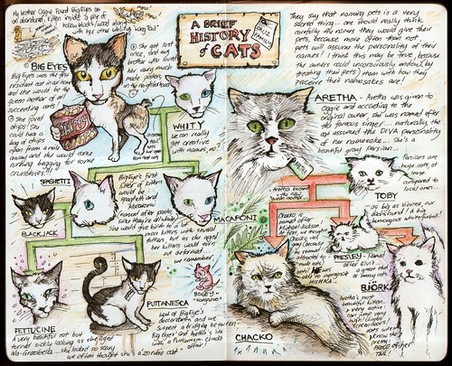
Let me introduce the newest addition to our feline family: Latifa… Some of you may recall an early notebook entry where I traced the lineage of our cats here at home. Now Latifa is the only surviving daughter of Björk among a litter of 4. The other 3 died during birth. Seems Björk has a lot to learn about parenting. Puttanesca herself bore 6 new kittens. Looks like I have to update this page:

2007-05-13

Take note that Latifa is only 3½ weeks old, and see how much of a furball she has grown already. We were all excited when Latifa first opened her eyes, and this is how the family discussion went:

Mama: "Oggie, nakita mo na si Latifa? Ang cute cute… pero di niya kamukha si Björk… mas kamukha yung tatay, malaki (with matching hand gestures suggesting how exagerratedly large the stud father was) at maamo mukha..."

Archie (overhearing, indignant): "Teka, sino nagpangalan na Latifa? Masbagay yata na Lupita, mas-cute pakinggan!" (Papa and Oggie, just listening, beginning to smile, seem to know where this discussion is leading to)

Mama: "Ano ba? Masbagay yung Latifa no! Kasi ang taba taba niya. Tsaka, naumpisahan na na puro singers yung pangalan ng lahi ni Aretha…"

Archie (looking at Latifa): "Cute nga siya oh… pero bakit mukha siyang Ewok? Masmaganda yata na Ewok na lang tawag natin" (halatang nangaasar na)

Ian (ako ito, imitating the high pitched voice of an Ewok): "Ayun maganda!" (Star Wars fans should know why I said this! If you don't, click this link: Tagalog Ewok)

Mama: (already cuddling Latifa) "Ano ba?! Maayos na nga yung pangalan eh, di ba Lupita?" (without realizing what she said.).

All this talk happening while Sigrid repeatedly saying in the background "Awwwww, ang cute-cuuute! Awwwww, ang cute-cuuute!"

Check out the other pictures of Latifa, as well as the other cats at Flickr: Felis Catus.


Thursday, August 16, 2007

Legilimens (A peek inside my Moleskine notebook and other sketches…)

There's something about being stuck in your home, or being stranded outside as the rains continue to pour on. Outside, perhaps it's the adventurous feeling, the fear that you might not be able to go home knowing the But when you're at home, perhaps it's the comfort and privacy, that for at least moment, you can just rest, forget about work (for a moment) and be yourself. It's a time to be creative without guilt and worry.

It's been months since I started filling up my Moleskine with my sketches and notes. In a way, it has become a reflection notebook, and as we in CBR would call it, my "nilay" notebook. I would like to personally call it my low-tech blogging device, since I much prefer writing in it than typing my blogs. Some of my Moleskine entries manage to find themselves featured in some of my blogs here. However due to time constraints, most of them might never make it in their digital counterpart. Let me take this opportunity to provide you a peek at my recent sketches/notes:
2007-07-28

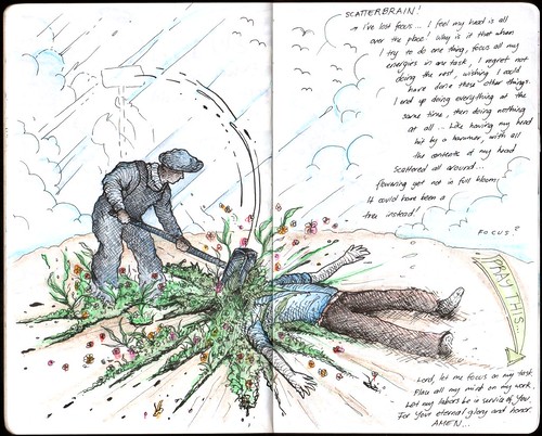
Scatterbrain... in a way, that's what I am right now. With a lot of things in my mind, a lot of things I have to finish and accomplish and lot I would wish doing, I end up doing everything at the same time, to the expense of quality... focus or missed opportunities. (July 28, 2007)
2007-07-31

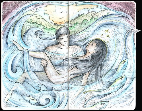
Watsu… Poetry in Water. Everyone should experience watsu at least once in their lifetime... with complete trust to the giver one can achieve deep relaxation and mobility not achievable in ordinary land exercises and massage. Some have even described the experience as very emotional and nostalgic. By the way, this entry features the imperfection of my Moleskine which you can see on the right side... an extra flap of paper folded in... the page which I drew this is crumpled, but I was able to get the most of it! (July 31, 2007)
2007-08-08

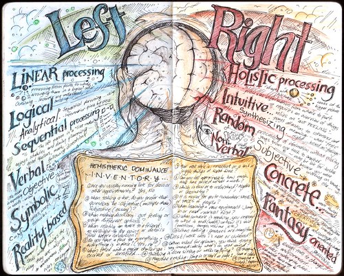
Which is more dominant: the right or left brain? Apparently, each side of the brain possesses certain characteristics (by virtue of apparent mapping of the various functions of the brain) which manifest themselves through patterns, behavior and cognitive processes. Though both sides of the brain naturally work together, it can be said that one hemisphere is dominant. After taking the inventory, I realized (not surprisingly) that I am more of a right brain person. Which are you? (August 8, 2007)
2007-08-09

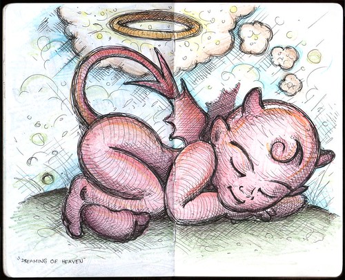
Dreaming of Heaven or "Mabait lang kung tulog..."(August 9, 2007)
2007-08-14

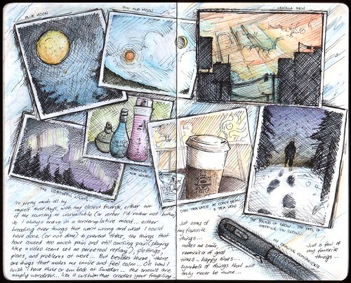
Just finished this… A few of my favorite things... the sound of snow falling, and the feel and sound of your feet sinking on stiff snow ; when the rising moon sees the setting sun (reminiscing the song "Sun and Moon"; from Miss Saigon); the blue moon looking unusually large in the silent night sky; a vanilla sky, with palettes of cream, cinnamon and cyan; a moment with a book while enjoying the soothing aroma and sweet sips of chai tea latte; the arresting view of a night horizon filled with the ghostly ribbons of aurora; the scents of women's perfumes... oh, the list continues... (August 14, 2007)
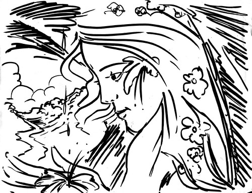
Maria Makiling

I was demonstrating to my friend Mitch (who is very good in creating cartoon characters!) how I make my drawings and on one occasion I showed him how to use the brush pen. Unfortunately, I made this quick drawing on used bond paper (at the back side is a page from a discarded thesis draft)… The drawing features Maria Makiling inspired from Irene Sarmiento's short story entitled "Malakas and Maria" which by the way is already published in the Philippine Free Press. Oh how I wished I drew this on high-grade Bristol board. I'll be coming up with drawings based on her other short stories. One of these days, I'll release a graphic novel.

Some people say, you can tell a lot about the person based on his drawings. I believe this. A person may always be able to hide behind the words he spoke or written, but one is always at the risk of revealing himself through his drawings (especially if you know where to look at)…

All my other Moleskine entries can be viewed at Flickr Album: My Moleskine.

Monday, August 13, 2007

Logo Design: Clarke & Cunningham

This logo was designed for Clarke & Cunningham, solicitors and attorneys from New South Wales, Australia. Logos made for law firms are usually minimalistic and formal, but the clients wanted one that is traditional with a modern twist. They wanted to avoid all symbols usually associated with law firms, for example, the "scales of justice" or the "gavels." I've made logos for law firms before, and it is a general trend to build around the initials of the law firm, in this case, the dual C's. I presented the C's to be clasping each other to create a unique symbol that evokes trust and stability. Presented also in business cards and stationary:

Thursday, August 9, 2007

Little Bathroom Creatures

During heavy rains and flood, sometimes you'll be surprised what creatures turn up seeking refuge inside the house. When we were still kids, I remember we've even had fishes flapping inside our flooded garden. We would have a swell time scooping up these fishes (dalag and hito!) knowing that these will be our dinner for the night. We had a good time at home during the storm seasons. But it was a totally different thing when you're stranded outside and you're trying to get home. During the 1980's, floods in Ortigas Avenue Extension can reach chest high, and I remember being carried by my dad on his shoulders to reach home! Thank God, it's much better these days… it's only knee high.

Warning: The succeeding texts and images are not for the fainthearted. If you are, I suggest not to proceed.

The recent rains summoned to my bathroom the most unusual creatures. Imagine waking up (and you know how nice it is to sleep during a rainy day, lulled by the monotonous hush of the downpour, tucked snugly in your comforter) realizing you have to take a leak. You run to the bathroom, aim at the toilet bowl and voila you see this!

It was a miracle I didn't pee right there and there, but in fact, I forgot to do it at all. At first I thought it was a "submarine" since it was of the same color (you get what i mean?), but yet it moved! I immediately took my camera and had an impromptu session with the frog in my toilet. For those interested (and I mean only those interested, who don't get sick looking inside toilet bowls with the slimiest creatures), you can view the whole photo shoot at: Flickr Album: Little Bathroom Creatures 2. Here's little froggy captured in video:

I really wonder how that frog came into the bathroom and ended up inside the bowl… I hope it didn't came from inside the bowl, otherwise my sessions there would be extra stressful – I don't want to worry about something crawling up my ass. For those wondering, I didn't flush the frog and is safe back outside.

I named the album "Little Bathroom Creatures 2", because there was an album called "Little Bathroom Creatures 1". A few months back, in almost the same situation, but this time I just finished doing Number 2. I was about to tidy up and picking up a tabo full of water, I see something floating in there. I took it out for closer inspection:

I thought it was a plant part of some sort since it wasn't moving in the water, but as soon as I placed it on a flat surface and poke it a little but, it started to flinch and move! I didn't know what it was then, but I was pretty sure it was a worm or a larvae of some sort… but of what? Again, only for those interested, the whole photo shoot with this creature is at: Flickr Album: Little Bathroom Creatures 1. Here's the thing in moving glory:

Any guess what it was? Here's the answer (drag your mouse in the space after this): After a little research, I discovered that it was actually a cockroach larvae.

Now, I'm quite excited what I'll see next in my bathroom… One can never tell what sorts of other creatures live in those areas.

Wednesday, August 8, 2007

Ambigram Project: Embrace Apathy

The ambigram designs I've recently been doing are quite different from the ambigrams that most of us are familiar with. That is, my recent artistic projects involve ambigrams that depict two words, one viewed from each of two vantage points. These are asymmetric ambigrams, particularly named as "symbiotograms" (from John Langdon). From the creative perspective, these are more difficult to create and depend greatly on the configuration of the words, but are more enjoyable and awe-inspiring to look at.

I was commissioned by Michael Lo (who described himself as a "random guy on the internet") who discovered my artwork portfolio in DeviantArt. It took a long time before we committed on this project (since I myself was busy with my teaching/community work), but as soon as time allowed, we were ready considering options for his ambigram. He wanted an ambigram with the word EMBRACE reading one way and APATHY when turned upside-down. For those you who have read my previous blog on Ambigram Project: Memento Vivere, you would be familiar already with the challenges that are present when creating these ambigrams. Again, the words are unequal in number and length. Here are my preliminary sketches:

The uneven nature of the words meant I have to figure ways in which certain letters will have represent two. In the sketches, I was focusing mainly on the configuration of the "ac" of "embrace" and "p" of "apathy". The inverted "a" could become the bowl (curved/round) part of the inverted "p". A modified "c" could be the stem (straight) part of the inverted "p". This would make the resulting "p" unusually thick, so I thought the typeface of the rest of the letters be modified so this wouldn't be that pronounced. Not shown in the sketches (as I immediately set to digital work as soon as I discovered the solution for "ac" and "p" was the "mb" and "th" combinations. Part of the "m" represented the "h" while "b" represented part of the stylized capital "T". Here are the initial digital presentations:

I also decided to use a more traditional Gothic font, which resulted in a more readable solid design (unhindered by the spiky stems of the above typeface):

Here are the final renders:

Michael will be sending me pictures of the ambigram as soon as he has it set as a tattoo.

Although personally, I don't absolutely agree with embracing apathy as a philosophy (though there are times when I have to assume a state of apathy as an act of self-preservation, since being empathic or active can just be so exhaustive and futile), here's an excerpt from interesting piece I found discussing how apathy can be viewed as a virtue:

"Albert Camus, among others, wrote of life's inherent meaninglessness. But, he also wrote of the unique meaning individuals are able to put into their own lives. It is very difficult to discover this unique meaning if one does not give apathy a chance. If a person is never apathetic about life, he will never have a chance to judge it. One must separate oneself from the everyday to understand it. Apathy allows people to become outside observers of humanity. Those who embrace apathy for their own sake are truly virtuous, for they are not lying to themselves about how much they care about various matters of ranging importance." (word of Matthew Bettinger)

Sunday, August 5, 2007

Logo Design: GrantStream Symbols

A few months ago, I designed symbols representing corporate support and caring for communities for GrantStream Inc., a business-to-business company that helps corporations with their corporate citizenship and community involvement programs. Their services include: internet-based technology that allows major corporations to accept and manage requests for charitable donations and sponsorships from community-based organizations; and consulting services that help corporations to identify where they should invest their donations in the community.

As you can see, GrantStream's logo features 2 basic shapes: a white stroke and a yellow spark. I wanted the symbols to be created around the basic shapes of the logo, so when people see the symbols in brochures and materials, they will be immediately reminded of the company.

The symbols I created depict a growing seedling (to represent corporate support), handshake (to represent cooperation), flowers (to represent service) and a house (to represent community care). The common denominator among the symbols is the hand/hands to represent the company's direct involvement in its programs. The stroke and spark are integrated each symbol.

Taking cue from the company website's general color and design, I also created icons for each of the symbol.

Now that's a nice thought... corporate citizenship and community investment: companies beginning to look at their impact on society (and how they can contribute to community development), rather than just their economic impact (or accumulation of wealth)!

Ambigram Project: Memento Vivere

The Latin, memento vivere, means literally "remember to live." These words would look wonderful as a tattoo, constantly reminding you of the beauty of life, of what it means to be truly alive and that you have to go on with life, whether how good or bad it can get.

This ambigram commissioned for Matt Ferguson requiring it to be read as "memento" on one side, and "vivere" on the other was a very challenging one. The ambigram would be very difficult to create because one, the letter count is unequal therefore there's no one-to-one correspondence with the letters. Second, the configuration of the letters is also unequal, with "memento" containing a greater number of long width letters (m's) and "vivere" with short ones (v's and i's). Matt even contemplated of doing an ambigram instead for each word, but I decided to push for combining both in one ambigram. I believe that there will always be a solution. It was simply a matter of time of finding it.

Initially, I knew the solution would require the use of a free-hand cursive font, so I sketched some ideas. It took an unusually long time and huge page allotment (the scanned pages here is only a fraction) experimenting with possible configurations.

After finding a suitable solution, I worked on digitizing it. After setting appropriate calligraphic pen parameters, I used a tablet to draw the strokes in, preserving the smooth lines of the original sketch. Matt liked the direction of the design. I then added optional flourishes, the circular frame, and a "twin" version.

As soon as Matt gave the final approval for the design, the design was eventually set in my signature parchment background.

Once a solution is discovered for a particular ambigram, the design may be modified to a variety of configurations. Although, the final design has been selected, I tried other configurations. You may very well observe that the solution involved the matching the whole word "vivere" with the "ement" component of "memento", with "m" and "o" rendered slightly differently from the rest (to make "vivere" stand out). I still like the the smooth free-flowing lines of the original design, but this configuration has the Victorian feel to it, which gives it a whole new personality of its own. When I have the time, I'd like to try out other possible configurations.

I truly appreciated the feedback provided by Matt during the creation of this ambigram. It was difficult but enjoyable nonetheless. Just like life. We may not have the ideal life we have wanted for ourselves, but there are always ways of making the best out of what we have, solutions to every question and problem we may face. Memento vivere!

Photomanipulations: FD Strategy Summit 2008

Het Financieele Dagblad, a Dutch financial newspaper, will be sponsoring the FD Strategy Summit 2008. They will be inviting the chief executives of the leading companies in China, India and Russia to discuss these developments at the FD Strategy Summit 2008. Together with Europe's political leaders and other top business people, these CEOs will share and discuss their ideas for the future. As part of the promotions for this event, they partnered with Worth1000, a site specializing in all kinds of photomanipulation techniques to come up with ideas for promotion images. Here's a description of the event's theme:

"The powerful ascendancy of countries like China, India and Russia is causing a seismic shift in the world's economic and political balances of power. The global dominance of the West is in decline, while new economies – built on centuries-old cultures – are pushing themselves to the forefront of the world stage. China, for instance, is attracting excess international capital, India is swallowing up high-quality jobs while Russia is grappling with its new role as the world's oil and gas baron. As part of this dramatic realignment of the world economy, the allocation of money, jobs and commodities is undergoing a fundamental change. The way companies compete is being reinvented by household names and lesser known companies and their governments from the new economic powers. They are changing the rules of the game of global competition."
They wanted images representing how India, China and Russia "changed the rules of the game".

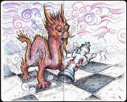
I started with China, with the idea of a dragon eating up some chess pieces…

2007-06-26

I personally liked this, and even if they didn't pick this, this would still be something I'll be proud to look at. Here's the final photomanipulated image (I used actual pictures of a dragon sculpture, chess board, pieces and numerous patterns), and you can quite see how the idea on paper proceeded to the final image. I wanted to achieve an illustration-style look rather than photorealism. Somehow, I like the hand-drawn image better.

I made images also for Russia, which is described as monopolizing Europe's gas and oil market. I thought of using an oil barge filled up with cargo ala "Tetris style". The image is quite weak, and I wasn't completely satisfied with the finished product.

But the one that Het Financieele Dagblad chose among my proposals was my image entitled simply as "Job Race" for the India part. The idea behind the image was a standard horse race with an Indian elephant leading it… "India leads the job race... by brute, size and brawn!" With numerous industries worldwide being outsourced to India, one can't deny that they are indeed making huge strides economically. Remember the call center agent in Transformers: "Sir, have you heard about our Premium Plus full service call package?" NO I DON'T WANT A PREMIUM PACKAGE! Here is the series of images showing how numerous layers are added, leading to the final image.

Source image, stretched both sides to fit elements that will be added. Note cloning artifacts on the right side (Didn't have enough time to refine it. Besides, it will be unnoticeable later.)

I looked for a royalty-free stock photo of a running elephant, and placed it appropriately at the back of the horse pack. Shadow and blur effects (more noticeable at the leg area) added.

The elephant has to look Indian, so I borrowed gold decorations from images of elephants from Hindi festivals and parades.

Of course, the elephant can't run on its own. Add the four little Indians (one with an umbrella)!

Naturally, the client would like to see it with sample texts.

Watch out for this image when it comes out in 2008.

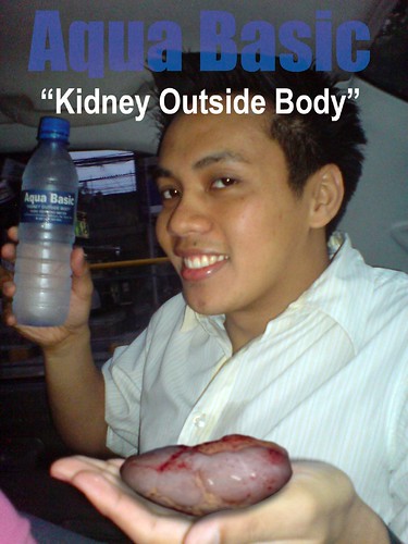
And while we're talking about photomanipulations, here's one I did for fun ("Kidney Outside Your Body"… Yes, that's the slogan of the water drink! Makes me wonder what the hell they are trying to say. It doesn't exactly make me want to drink the water more than before.):

Aqua Basic Final

I'm thirsty...

Thursday, August 2, 2007

“Kapag May Access, May Success!” (or “More From The Sublime Paralytic”)

This year's theme for the National Disability Prevention and Rehabilitation Week (July 17 – 23, 2007) is "Kapag May Access, May Success!" It has that humorous ring in it, reminds one of the famous Department of Health slogans during the Flavier era. Honestly, I laughed out loud when it was announced that this will be this year's theme. And it brought similar amusing smiles from students and colleagues.

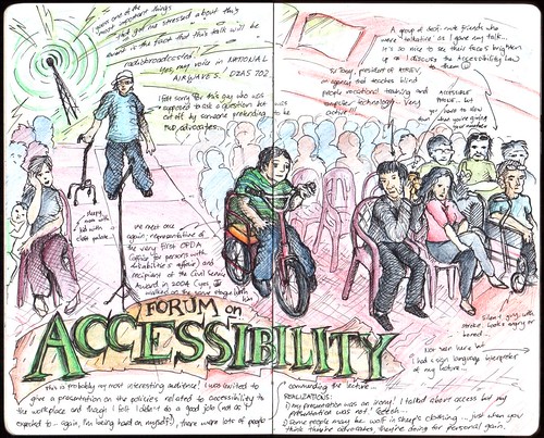
A week before this, Dean Jake requested me to represent the college in the Public Forum on Accessibility organized by the National Council for the Welfare of Disabled Persons (NCWDP) and Emilio Aguinaldo College, due to my background in environmental modification and ergonomics. Beside this, I will be very busy coordinating with the local government of San Mateo, Rizal and other stakeholders for a CBR Free Clinic and of course negotiations that will eventually lead to the assurance of infrastructures of the CBR Program in its new home. The transfer of CBR to San Mateo has really been giving me too much stress, and a series of setbacks would surely leave this job to be an excruciatingly worrisome one. One busy morning, I was contacted by NCWDP humbly requesting me to be the resource speaker for the Public Forum. It's quite funny that the forum that I'll end up as the speaker in the forum I was just supposed to attend to. I was aware of the amount of work I was required to finish, but this is a request that will be very difficult to turn down – actually, I had no choice but to accept it (as a government employee and a UP Professor, it is my civic responsibility). Besides, this wouldn't be too much work since I already have some materials for a presentation on "Public Policies Regarding Accessibility in the Workplace". Or so I thought…

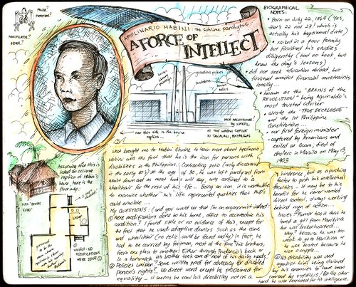
Let me recount one of my little discoveries while I was preparing for the presentation, studying the pertinent laws and policies pertaining to the rights of persons with disabilities here in the Philippines. I have often wondered why the National Disability Prevention and Rehabilitation Week is specifically scheduled on the exact days of July 17 to July 23, and if you noticed this year, it started on a Tuesday and ended on Wednesday next week. Wouldn't it be more convenient if it was scheduled on the exact days of the week, from Monday to Sunday? Apparently it was originally declared every third week of July according to Proclamation No. 187 (enacted on June 22, 1979). However, this was changed to July 17 to 23 according to Proclamation No. 361 (signed on August 19, 2000), where the week should culminate on the birthdate of the sublime paralytic: Apolinario Mabini, who is identified as an outstanding icon for persons with disabilities because of his exemplary and dedicated heroic acts during the Philippine Revolution. Come to think of it, besides being identified as an exceptional hero, Mabini may very well be one of the first ever recorded Filipino person with disability who have held an office and served the local government. Numerous questions popped in my mind, and being an academician who teaches environmental modification to accommodate persons with disabilities it may not be surprising that I would wonder whether Mabini ever modified his home and working conditions and two) being an exceptional lawyer himself and author of prominent legal documents, did he ever write something, even some form of correspondence, that gave special privileges to persons with disability such as him. I even wrote Ambeth Ocampo, presently director of both the National Historical Institute and the National Commission for the Culture and Arts on this inquiry:

  1. Were there any accessibility features installed in the residences and place of work of Mabini to accommodate his condition? There are a lot of information regarding Mabini, being confined to a wheelchair, but I am curious whether he himself or his friends/family members did any changes/physical modification in the household and workplace to accommodate his condition. Was he fully independent at all times? How did he take his bath? Were his table and other furniture lowered? How about his transportation? (I believe there are illustrations of Mabini being carried in a hammock to enter his office).
  2. Being Aguinaldo's political advisor and considered as the "Brains of the Revolution" (being the proponent of the 1st Constitution of the Philippines and the Decalogue), did he write any correspondence, literature giving special attention to his disability? Did he correspond or befriended fellow "paralytics"? Were there any special privileges/arrangements given to him because of the fact that he was a paralytic?

I also visited the Mabini Shrine in Tanauan, Batangas to seek answers to these questions. Looking at the replica of his house and even accounts from descendants of Mabini himself, I found little evidence of modification. Besides the rattan wheelchair he used at home and in his office, no other accommodation was used. Now I am sure you will wonder how he managed at home and work, doing his daily activities and work tasks… he had always by his side his trusty brother who pledged to serve him at all times. If he had to be carried on his back, Prudencio, his brother will carry, cook, bathe him if necessary. He had to be carried on a hammock to travel from one place to another (from Batangas to Cavite).

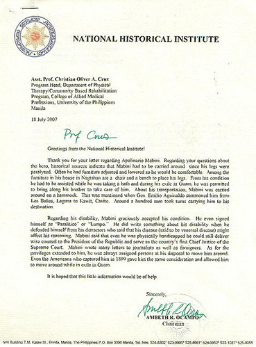
Surely enough, just recently, I received a reply from Ambeth Ocampo:

"Prof. Cruz,

Greetings from the National Historical Institute!

Thank you for your letter regarding Apolinario Mabini. Regarding your questions about the hero, historical sources indicate that Mabini had to be carried around since his legs were paralyzed. Often he had furniture adjusted and lowered so he would be comfortable. Among the furniture in his house in Nagtahan are a chair and a bench to place his legs. From his condition he had to be assisted while he was taking a bath and during his exile in Guam, he was permitted to bring along his brother to take care of him. About his transportation, Mabini was carried around on a hammock. This was mentioned when Gen. Emilio Aguinaldo summoned him from Los Baños, Laguna to Kawit, Cavite. Around a hundred men took turns carrying him to his destination.

Regarding his disability, Mabini graciously accepted his condition. He even signed himself as "Paralitico" or "Lumpo." He did write something about his disability when he defended himself from his detractors who said that his disease (said to be venereal disease) might affect his reasoning. Mabini said that even he was physically handicapped he could still deliver wise counsel to the President of the Republic and serve as the country's first Chief Justice of the Supreme Court. Mabini wrote many letters to journalists as well as foreigners. As for the privileges extended to him, he was always assigned persons at his disposal to move him around. Even the Americans who captured him in 1899 gave him the same consideration and allowed him to move around while in exile in Guam.

It is hoped that this little information would be of help.

Sincerely,

Ambeth R. Ocampo"

I used this information as an introduction to my presentation. But for the main part of my lecture, rather than plainly presenting the list of pertinent laws related to accessibility to the workplace in the Philippines, I discussed the policies around a situation: a person with disability trying to get to work. All the issues one will encounter will be presented accordingly with a relevant policy. And it will be up for the audience to decide whether these policies are enforced or not. One thing we should realize though: We have very good laws. They are complete in a sense and encompasses all the relevant aspects of life of a person with disability, to the point that it can also rival those of other nations. We just don't have enough resolve and resources to enact these.

I had to deliver the presentation in Filipino, since it was also broadcasted through DZAS. The audience was probably the most unusual and interesting one. Imagine a group with all the various types of impairments and disabilities in one huge hall. I had an interpreter beside me delivering my lecture in sign language. I knew they were a "talkative" bunch because they were busy signing among themselves. I realized that my lecture was an irony in itself. I talked about access but my presentation was not accessible to everyone! (I had pictures in my slide presentation which I failed to describe… I kept referring to pictures in my slide, and the audience who were blind or visually impaired would seek assistance from their seatmates to describe to them what were in those pictures).

I ended my presentation with another historical tidbit related to Apolinario Mabini. One of the things I discovered when I visited the Mabini Shrine was that Mabini's birthday was not July 23! Apparently, it was recently discovered in documents that July 23 was actually his baptismal date. His real birthday was July 22, 1864. So I thought, should the Proclamation of the National Disability Prevention and Rehabilitation Week be once more amended to accommodate this recent discovery. On another thought, if this will be amended, should the rest of our policies be amended to accommodate our seemingly slow ability to enforce and enact these? Or should we rather amend our attitudes towards issues surrounding persons with disabilities?

I was just happy to have survived that hectic week, with the culmination of our CBR Free Clinic in San Mateo, Rizal. But the work is far from finished. And when I thought that there won't be any snags on the side of the municipal government with the transfer of CBR to San Mateo, little did I realize that the problem would come from the university itself… Stressful. To end it on a happy note, here are my mandatory source journal entry presentations:

2007-07-13

2007-07-18