Showing posts with label ambigrams. Show all posts

Wednesday, September 17, 2008

Ambigram Project: Angel - Belle

I was sent a sketch by Candice who wanted help with an ambigram that reads "Angel" and "Belle" in different configurations.

I really appreciate this attempt, and looking at her solution, I would say that she has found the solution for this ambigram: The "a" of Angel automatically forms the "e" of Belle; the "n" of Angel conveniently translates into the double "l" of Belle; the "el" into the "B"; the challenge here obviously is the "g" and "e" combination.

In creating ambigrams, the ultimate goal is to make the words as legible as possible. In this case, I decided to change the usual configuration of the "e" by flipping it making it readable as a "g" the other way around. With testing, I think it worked.

Upon request, I made the "a" and "e" more curved and feminine.

I just hope that this ambigram will be a worthy tribute to Candice's friend.

Click on the image to rotate...

Sunday, October 28, 2007

Ambigram Project: Music - Marco

I received a request from a fellow deviant, Angelica to create 2 ambigrams, of which we only agreed to complete one. The other was too difficult and due to time and budgetary constraints, that would be quite unfeasible to accomplish. This ambigram was intended to be a special gift for her fiancé, whom she had been with for about 8 years already. She wanted the ambigram (a symbiotogram, to be exact) that read "Marco", and "Music" flipped. She says "He sings... music is what brought us together."

As soon as the details were finalized, I proceeded to the drawing board, figuring out the nuances of letter configurations.

Although both word have 5 letters, it would be unwise to create an ambigram with 1 to 1 correspondence (M for C, A for I, etc…). It wouldn't look to legible and balanced. I opted to combine certain letters. In this case, it seemed most aesthetic to make the "M" of "Marco" to stand for the "IC" of MUSIC… the "M" of "Music" can stand for the "CO" of "Marco"… I started digital work using the font I used in the sketches, but they weren't looking that good (I could pull it off actually, but I would end up creating an entirely new font if I proceeded with this). So, I ended up modifying a traditional Gothic font. I came up with these:

Flipped:

And the colored versions, using a musical background theme:

It was better than what Angelica expected it to come out. That was enough compliment, but ultimately I just hope that this ambigram is a worthy tribute of her love for her fiancĂ©…

Wednesday, August 8, 2007

Ambigram Project: Embrace Apathy

The ambigram designs I've recently been doing are quite different from the ambigrams that most of us are familiar with. That is, my recent artistic projects involve ambigrams that depict two words, one viewed from each of two vantage points. These are asymmetric ambigrams, particularly named as "symbiotograms" (from John Langdon). From the creative perspective, these are more difficult to create and depend greatly on the configuration of the words, but are more enjoyable and awe-inspiring to look at.

I was commissioned by Michael Lo (who described himself as a "random guy on the internet") who discovered my artwork portfolio in DeviantArt. It took a long time before we committed on this project (since I myself was busy with my teaching/community work), but as soon as time allowed, we were ready considering options for his ambigram. He wanted an ambigram with the word EMBRACE reading one way and APATHY when turned upside-down. For those you who have read my previous blog on Ambigram Project: Memento Vivere, you would be familiar already with the challenges that are present when creating these ambigrams. Again, the words are unequal in number and length. Here are my preliminary sketches:

The uneven nature of the words meant I have to figure ways in which certain letters will have represent two. In the sketches, I was focusing mainly on the configuration of the "ac" of "embrace" and "p" of "apathy". The inverted "a" could become the bowl (curved/round) part of the inverted "p". A modified "c" could be the stem (straight) part of the inverted "p". This would make the resulting "p" unusually thick, so I thought the typeface of the rest of the letters be modified so this wouldn't be that pronounced. Not shown in the sketches (as I immediately set to digital work as soon as I discovered the solution for "ac" and "p" was the "mb" and "th" combinations. Part of the "m" represented the "h" while "b" represented part of the stylized capital "T". Here are the initial digital presentations:

I also decided to use a more traditional Gothic font, which resulted in a more readable solid design (unhindered by the spiky stems of the above typeface):

Here are the final renders:

Michael will be sending me pictures of the ambigram as soon as he has it set as a tattoo.

Although personally, I don't absolutely agree with embracing apathy as a philosophy (though there are times when I have to assume a state of apathy as an act of self-preservation, since being empathic or active can just be so exhaustive and futile), here's an excerpt from interesting piece I found discussing how apathy can be viewed as a virtue:

"Albert Camus, among others, wrote of life's inherent meaninglessness. But, he also wrote of the unique meaning individuals are able to put into their own lives. It is very difficult to discover this unique meaning if one does not give apathy a chance. If a person is never apathetic about life, he will never have a chance to judge it. One must separate oneself from the everyday to understand it. Apathy allows people to become outside observers of humanity. Those who embrace apathy for their own sake are truly virtuous, for they are not lying to themselves about how much they care about various matters of ranging importance." (word of Matthew Bettinger)

Sunday, August 5, 2007

Ambigram Project: Memento Vivere

The Latin, memento vivere, means literally "remember to live." These words would look wonderful as a tattoo, constantly reminding you of the beauty of life, of what it means to be truly alive and that you have to go on with life, whether how good or bad it can get.

This ambigram commissioned for Matt Ferguson requiring it to be read as "memento" on one side, and "vivere" on the other was a very challenging one. The ambigram would be very difficult to create because one, the letter count is unequal therefore there's no one-to-one correspondence with the letters. Second, the configuration of the letters is also unequal, with "memento" containing a greater number of long width letters (m's) and "vivere" with short ones (v's and i's). Matt even contemplated of doing an ambigram instead for each word, but I decided to push for combining both in one ambigram. I believe that there will always be a solution. It was simply a matter of time of finding it.

Initially, I knew the solution would require the use of a free-hand cursive font, so I sketched some ideas. It took an unusually long time and huge page allotment (the scanned pages here is only a fraction) experimenting with possible configurations.

After finding a suitable solution, I worked on digitizing it. After setting appropriate calligraphic pen parameters, I used a tablet to draw the strokes in, preserving the smooth lines of the original sketch. Matt liked the direction of the design. I then added optional flourishes, the circular frame, and a "twin" version.

As soon as Matt gave the final approval for the design, the design was eventually set in my signature parchment background.

Once a solution is discovered for a particular ambigram, the design may be modified to a variety of configurations. Although, the final design has been selected, I tried other configurations. You may very well observe that the solution involved the matching the whole word "vivere" with the "ement" component of "memento", with "m" and "o" rendered slightly differently from the rest (to make "vivere" stand out). I still like the the smooth free-flowing lines of the original design, but this configuration has the Victorian feel to it, which gives it a whole new personality of its own. When I have the time, I'd like to try out other possible configurations.

I truly appreciated the feedback provided by Matt during the creation of this ambigram. It was difficult but enjoyable nonetheless. Just like life. We may not have the ideal life we have wanted for ourselves, but there are always ways of making the best out of what we have, solutions to every question and problem we may face. Memento vivere!

Thursday, August 2, 2007

Ambigram Project: Stian - Aries

I was commissioned last April by Stian Pedersen who saw most of my work at DeviantArt, for an ambigram that will be used a tattoo design. We had to clarify the details first and pretty soon, we decided to work on his nickname "Stian" which will be read as "Aries", his zodiac sign among many options. Here are my initial sketches:

As can be seen, the solution for the ambigram is quite tricky. Luckily, the "S" and the "I" in Aries and Stian already coincide so it leaves me with the "A-N", "R-A" and the "E-T" combinations. This required several versions, trying out capital and lower-case versions of each of the letters, modifying as necessary.

Since Stian seems keen in featuring his zodiac sign, I wanted to integrate it within the ambigram design. Using additional loops on some letters, I configured the design in a triangular form, thus when it is viewed as "ARIES", it would look like an inverted triangle – to suggest the shape of a ram's head. I avoided using too much embellishments to give more focus on the text component of the design (Also, as the client already possesses a graphic tattoo of a ram).

Finally, the final design shown in its two configurations:

Saturday, May 12, 2007

Ambigram Project: One Love One Blood

I've been recently commissioned to develop an ambigram for Robert Renling, a fellow deviantArtist. He wanted an ambigram for a tattoo on his forearm, and he needed the words "One Love" and "One Blood." So, this is essentially two ambigrams… two projects. Seeing my other works, he liked the particular style (the Gothic font) I used for the ambigrams, so he wanted that style retained in his tattoo. As for the embellishment, he wanted it to look like this:

With all the preferences set, I set out to the drawing boards. Usually, I start with pencil sketches in determining possible "solutions" for the ambigrams. As I mentioned in an earlier blog, a word or words that will be set as an ambigram is like a "problem". The task of the artist is to look for the solutions to that problem. Naturally, there will be several solutions to a problem, but the best solution is one that is easily readable and beautiful at the same time. The goal in the pencil sketches is to figure out the optimum configurations of the letters (not so much about how the letters should look like) in the ambigram. This would require constant experimentation, lots of paper flips to make sure the letters work inverted until I am satisfied. Here are the sketches:

I work in an iterative design process, that is, I work closely with the client, asking for feedback in every stage of the ambigram's development. The design after all will be immortalized on his skin, so I better be sure the client is highly satisfied with it. As soon as I received approval and am ready, the solution is digitized in a vector drawing program. Appropriate fonts are selected and almost all the time, the fonts are drastically modified to the required configuration of the ambigram.

At this point of the development, I realized how the word could be combined to one ambigram, and suggested to the client to have both combined, so that in one configuration, it would read "One Blood One Love" and in another "One Love One Blood". I already integrated minor embellishments to get a glimpse of how the final design would look like.

The client agreed to the proposal, and eventually I was working on the embellishments. I wanted it to look aggressive but at the same time dramatic, giving focus and attention to the words. Here is the final design.

Only thing to wait for are the pictures of the design tattooed eternally on Rob's forearm. I also set the design in a flash animation, so that each configuration of the ambigram can be read without having the readers of this blog twist their heads in front of their monitors.

For those interested, I accept commission works. E-mail me for more information at revcruz@yahoo.com.

Thursday, April 5, 2007

Logo/Ambigram Design: FLIPNY Clothing Corporation (Prospective Work)

Recently, I was contacted by FLIPNY Clothing Corporation regarding developing ambigrams for them which will be used as their logo and integrated as shirt designs. They have been doing some research about ambigrams/inversions and came across my work and designs. They were quite impressed with my concepts/designs and were interested in acquiring some commissioned work. Naturally, I was interested in this potential project, as this combines my current creative passions: making logos, ambigrams and t-shirt designs.

This is prospective work, so I have to submit proposals first before they can commit to the project. Prospection helps the client decide whether the work initially fits the requirements for their project. For freelance graphic designers, prospection by clients can be very risky. You turn in your work first or previews of it, and hope it gets the "go" signal. I have been scammed before by potential clients, who used my "good as final" work without paying for them (even used it as an example for other artists to reference to!). But that's part of freelance designing.

FLIPNY is a clothing company that truly embodies the heart and soul of New York City and distributes it to the rest of the world. I found their company concept intriguing: "New York is not a City. New York isn’t even a State. New York is a lifestyle. A lifestyle that can’t be experienced by walking through Times Square or by visiting Rockefeller Center to check out the tree. It can’t be felt by shopping on 5th Ave or wining and dining in Tribeca. Only those that are most intimate with the city can truly see, hear and feel New York...The New York that they can feel as the FLIPNY logo burns on their chest and echoes through their head." I love New York. My 2 weeks stay before in that lovely city somehow gave me an experience of that lifestyle. In fact, if I ever get the chance to reside in the United States in the future, New York will be my place.

The image above shows their original logo. I was also supplied with previews of their current designs. So far, I have 2 distinct concepts, each one investing on the main company name "FLIPNY". These are just pencil sketches of the ambigram logos, but I think they are legible enough to get the message across.

Concept 1: Classic Gothic Style

I like this concept as this design offers a huge number of possibilities for shirt designs. The style uses classic Old-school lettering, similar to the "Angel & Demons" ambigrams. I added a little twist to the font, making it reminiscent of old New York pub or baseball team slogans. The design forms one word but effectively separates the name into its basic word components mainly "FLIP" and "NY". Here's the scanned image of Concept 1:

This will look cool as a tag or embroidered/printed at the nape or lower part of the shirt. Also, this looks like a logical evolution of their present logo, as the style is not so different. It adds a new dimension to the name, as the design can actually be "flipped" being an ambigram. I think it will work well and stand noticeable among logos of established T-shirt companies. I made small sketches of possible T-shirt designs using this as base design (sorry for the lack of details, but these are fast sketches). In this concept, the NY city skyline can be placed on top of swirl of the "F" (or below the "Y" in the inversion). The Statue of Liberty torch can be superimposed on the stem of the "F" (or "Y" in the inversion). These graphics are integrated effectively as part of the main ambigram, so they will also be inverted along with the main text.
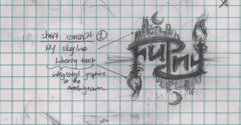

Of course, this is just a sample shirt design, as the graphic component of the design can be modified/replaced in unlimited ways. I am thinking of using other NY icons such as the Yellow Cab, Empire State, Rockefeller statue... images of daily NY life, such as hotdog stands, NY bystanders, speed bikers, office workers, skateboarders, etc. The potentials for design are endless, and can cater to almost any market.

Concept 2: Modern/Hip(Hop)/Hi-Tek

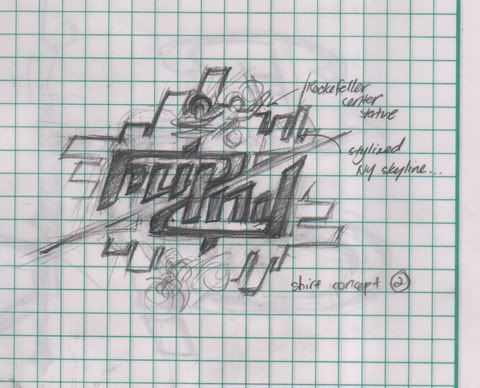
Using a more modern font for the "solution", this like the first version also offers numerous possibilities for shirt designs. As this is more modern in approach, I think this will cater more effectively to the younger, sophisticated market. Here's the scan of Concept 2:
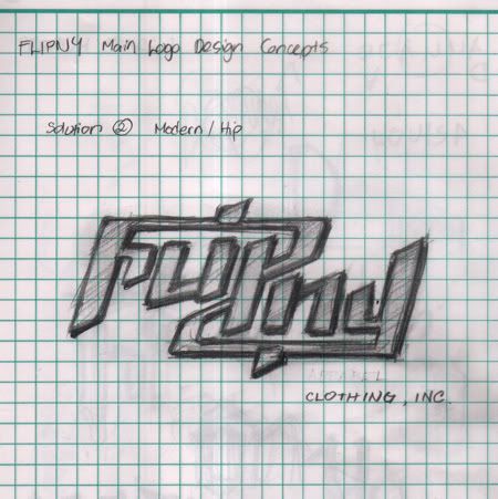
Here's a treatment of Concept 2 as a t-shirt design, this time, framing the logo with stylized illustrations of the NY skyline, and then highlighted with the Rockefeller Center statue. Of course, potential graphic components used will be endless, but I think for this version, geometric and linear graphic designs are more appropriate.
I think I made very interesting concepts that will surely make the company name stand out, even among established T-shirt giants. These two designs are definitely eye-catching and memorable. Hopefully, these proposals get the "go signal" an see the next stage in development.

Images copyright 2007 Rev Creations

Friday, February 16, 2007

The 50 Ambigram Project

Ambigrams (or inversions, as others would call them) are graphical representations that spells a word or words not only in the form it is normally presented, but also in another direction or orientation. They have gained a boost in popularity after having been featured prominently in Dan Brown’s novel, Angels and Demons, as cover design elements and essential visual objects in the story. There are many types of ambigrams, most common of which are the rotational, where the same word would be read when the ambigram is rotated in another angle (usually 180 degrees). Other types include the mirror, chain and 3-dimensional ambigrams, among others.


Y'know, I make ambigrams! I consider it a great exercise in graphic design, a “play in optical illusions, symmetry and visual perception,” to the point that I consider it a challenge in undertaking every ambigram project. I call each ambigram a “solution”, the problem of which is to figure out the optimum configuration of the graphic presentation of the letters of the word or name even when it is rotated at another angle. It can be very easy to make one, as some words or names are already natural ambigrams by themselves (eg.: "ella" and "suns") but a lot of effort is placed into making a very good ambigram. An ambigram is considered superior in construction if it is not simply "line work" or a "mishmash" of shapes or strokes. It should be legible enough to be read in all its intended configurations.


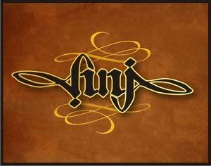
I never considered making ambigrams before, but I was always fascinated by them (especially after reading Dan Brown’s book). My friend Anj, asked me if I knew about ambigrams after seeing an ambigram tattoo on one of her patients. I told her that I knew about them but I have never attempted making one, but I will try to make one for HER… I then studied the work of John Langdom, and considered various approaches into constructing ambigrams, and finally made my first convincing ambigram:


And it all started from there… I have been making ambigrams for friends who request them (and clients who actually pay to have them). I have yet to consider whether I should write my own tutorial on making ambigrams (although there are already many online tutorials out there). But sometimes I wonder whether making ambigrams can actually be taught at all. Here's an ambigram of my FULL name:


Photobucket - Video and Image Hosting


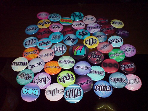
Anyway, recently I undertook a massive undertaking which I call “The 50 Ambigram Project”, which was a collaboration with Anj (my special birthday gift for her too). The 50+ ambigrams was constructed in a span of 2½ - 3 weeks and was finally set into pins and given to her friends as birthday treats. You would notice that each ambigram was constructed with the character and personality of each person in mind. This was done through careful selection of font style, illustrative embellishments, background and colors used. Nice idea, isn’t it? I’ve been making all sorts of graphics but never thought of setting them into pins. Anj does have the creative knack in thinking up these unique ideas. Impressively, she has already developed her own skill in making ambigrams (good and powerful suggestions!) Seeing the final product, I couldn’t help but feel proud, like a dad seeing how beautiful his “babies” are.


The 50 Ambigram Project 03


For those interested, I accept commission work for ambigrams. Not only will it be a special personal property, but it has the potential of being a unique and valuable gift to your friends and loved ones. Only you or your loved one will have that ambigram. My ambigrams usually cost around $25 to $150, depending on the difficulty level of the word/s or name/s provided, so please contact me first so I can quote a reasonable price (Of course, I’m open to friendly considerations and discounts). The basic package includes the electronic file of the artwork saved in various versions. You can provide your preferences when it comes to font style, background, colors and other special elements used for your ambigram. Special requests are also accepted if you would want to set your ambigrams into pins, frames, mugs, T-shirt or other merchandise.


My ambigrams can be seen in my DeviantArt account at http://revcruz.deviantart.com. Detailed pictures of "The 50 Ambigram Project" pins can be seen at my Flickr account.