Sunday, April 29, 2007

21097

Twenty one thousand and ninety seven meters (21,097 m.) is the distance for a half-marathon in indoor rowing. The Global Marathon Challenge by Concept2 runs from April 16-30, 2007, and as an avid indoor rower myself, this challenge is one that must not be passed up. Time is running out, and I decided to go for the half-marathon this Saturday at FitnessFirst Ortigas. This is the longest distance that I'll be attempting yet on the ergs. Although I have done the 10k numerous times, this will be different, because this is more than twice the distance and effort, and it had to be done in one sitting, non-stop. I approximated the time it will take me to finish the half-marathon from my recorded times: it will take me around 1.5-2 hours, counting in the possible fluctuations in speed and effort.

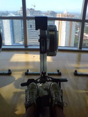
Prep: At least 3 times a week of indoor rowing, going for not less than 2k for each, progressing to 10k if time allowed. Of course, include there the normal routine at the gym consisting of Body Combat, RPM and Body Balance classes. That Saturday morning, I stuffed myself with my usual breakfast (Vegemite and Muscovado toast, apple juice) and an extended bed rest (had to recover from my workout the night before). I had a hearty lunch, after which I headed for the gym. I bought enough water (2 liters!) and an isotonic sports drink, and downed an energy drink (ION!) before heading to the ergs section of the gym. I had to choose Fitness First Ortigas as my choice of gym to do the half-marathon, because not only does it provide you with a well ventilated area with video monitors, it also offers a wonderful vista of Ortigas Center and the east of Metro Manila.

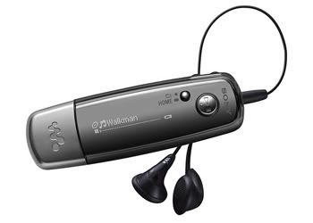
I brought Kundun (my latest Sony MP3 walkman... yes I give names to my gadgets...) and programmed it to play the Les Mills RPM tracks (particularly releases 33 and 34), which I found appropriate for rowing. Unfortunately, this attempt at a half-marathon row was a self-imposed goal, and I really have no one to compete with or row with (my gym friends avoid the ergs, I really couldn't expect them to row the half-marathon with me, tsk). I was on my own...

The row: After enough proper stretching and hydration, I programmed the PM3 to a set distance of 21097m. I was beginning to have second thoughts as I was pressing the buttons, when I suddenly remembered the muscle aches on my shoulders and upper back as a result of previos 10k runs. And this time I was attempting twice as that (crazy me!) But I was prepared for this, and there's no backing out. I was not really aiming for an impressive finishing time, but I was hoping to just be able to complete the half-marathon with as little damage (to my body) as possible. This was my first attempt after all. I turned on my MP3 player, and the first track of RPM 33 (KT Tunstall's Black Horse and The Cherry Tree) pushed me at starting pace. Interestingly, I was following the dynamics of the played songs as done in the usual RPM spinning classes. I was pulling harder at Chris Isaac's I Want You To Want Me, doing intervals of fast heavy rows with faster light ones in time with the music. Knowing the choreography of RPM helped me vary my rowing pace, thus not allowing boredom to kick in. Once you get bored with rowing, you get easily tired, I noticed. I was distracted with the PM3 monitor, and I had it face down, just enough for me to see the rate I'm going and not the distance I have yet to cover. INXS' Afterglow was a gem because it signalled I was about to finish the whole RPM release, and I was already at a steady pace. I planned to do some quick stretches and hydrate after this. It was already 45 minutes in, and I knew I was halfway, approximately 10k to go!

The remaining half of the row was a different story. This time I was listening to RPM 34 but found it much more difficult to follow the dynamics of the tracks. I tried to pull harder, but I realized this would drain my remaining energy too much. I tried to maintain a constant load but varying the spm (strokes per minute) as necessary. I was already feeling the familiar aches in my arms and shoulders, but they were still tolerable. My butt was aching, and I found myself switching my weight from one side to another. There was a point when I had to take a brief stretch to relieve the pain, and again to hydrate myself. Soon, Warp Brothers' mix of Smells Like Teen Spirit was playing, and I found renewed energy in doing intervals of slow hard pulls and fast slow ones. It felt like I was strong, but the PM3 says otherwise. I was weaker, but I was still pulling. The last tracks were playing, and I decided to look at the monitor so I can focus on the remaining distance. I decided to do a constant pace in rowing the remaining meters... and it was the most gruelling 2k I ever rowed! As the meter counter trickled down, I had to endure the nagging pain in my shoulders and pressure on my butt, but I already felt like a well-oiled machine and stopping would be more painful. Soon, I raced to the finish line in the remaining 500 meters. With a row like this, the happiest moment is seeing "0 meters" on the PM3. I finally rowed 21,097 meters! A half-marathon in 1 hour, 37 minutes and 24 seconds.

Surprisingly, I felt good afterwards. The pain was not that bad. In fact if there was a Body Combat class right after my row, I would most probably join it. But I knew that I had to respect what my body was telling me (my left trapezius was screaming "I need a traps release!!!") and that was enough workout for the day.

Aftercare: I rewarded myself to an extra-hard full-body Swedish massage right after. I knew I was exhausted because I slept for an hour after the massage, according to my masseuse. All my body aches melted away when I woke up! What a good massage could do!

Now, I'm thinking of when I could do the full marathon (42,195 m!). Of course, I have to finish a series of half-marathons (to the point that it's a habit) before I aspire for the full marathon. But knowing how a half-marathon feels like makes me wonder what a full marathon would be like.

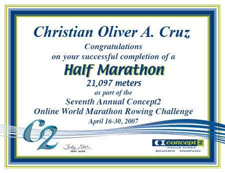
Here's my certificate of completion of the half-marathon for Concept2's Global Marathon Challenge 2007, another proof of how easy I am to please (mababaw ang kaligayahan!):

For the meantime, fitness-wise, I have yet to master the bird's balance pose in the latest release of Body Balance:

Monday, April 23, 2007

For the new graduates...

Another batch of students graduate, another schoolyear of hardwork accomplished. As most of the faculty returns from our annual college planning (this time organized at a beautiful private beach in Cabangan, Zambales), I am busy thinking of what the PTdepartment's graduation token for this year's graduates will be. The previous year's tokens were drawings of the faculty members presented in caricature styles. Of course, this year's drawing would still feature the faculty members, but I was imagining which style to use... I started work as soon as I found the time (I had to take a day off to finish the line work) and since the design involves entirely digitized work, my tablet was easily on flames in no time. Anyone familiar with Linklater's Waking Dreams, and the recent Scanner Darkly will notice that I adapted the same style of digital rotoscoping, enhancing the basic lines of the face, still making them recognizable. Here's what the PT graduates of this year will be receiving this year from the department (I hope you'll be able to recognize us!):


At the back are the personal messages of each PT faculty member, which I scanned and rearranged for layout purposes.


The design was then printed, cut (3" x 4.25" card format) and then laminated. Thanks to Sigrid for helping me out, the work finished faster. Our mini assembly line managed to produce 56 tokens in all! I hope the graduates appreciate these...


To the new graduates... congratulations! I hope you remember and imbibed everything that we have taught you, by thought and by example... and that you share to others, not only your knowledge and skills, but also the core values that a true UP graduate possesses. God bless to you all!

Friday, April 20, 2007

Logo Design: Center for Jewish Values and ModernTribe

Designing logos can get pretty exciting epecially if the client requires a reinvention of established cultural, religious or political symbols. In my experience, this requires a huge amount of research work, even to the point of being able to explain the symbols as if you were from cultural, religious or political denomination. It is indeed challenging work, but at the end of the design process, not only were you able to satisfy the needs of the client, but you learned a lot more, knowledge and skill-wise. You also gain a different attitude... a certain oneness with your client, a sense of being a "man of the world."

Anyway, a few years back, I designed a logo for the Center of Jewish Values (CJV), a non-profit organization devoted to promoting Jewish values. CJV works with other groups, Congress, the White House and Governors to help support policies that are consistent with Jewish values. They hold events to educate the Jewish community about certain political ideas and they hold conferences for Jewish activists. Interestingly, they wanted to see a blend of Judiasm with American symbolism in their logo. In addition to this requirement, they wanted the logo to exude optimism, patriotism, strength and gravitas. I worked on 3 concepts, each one investing heavily on a particular Jewish (mezuzot or menorah) or American symbol (flag and eagle):


I utilized the blending of these ideologies through an arrangement of graphic elements (instead of the flag stars, the Magen David was used) and colors. The strongest most ingenious of the three, I think, is the Diyu Nesher, where the American eagle also effectively forms the shape of the menorah. The client enjoyed the third concept and even requested for a short essay describing the logo:


"Diyu Nesher" (Wing Swiftly, Eagle)

Throughout the history of America, since its founding, the American Jews have maintained a collective identity while actively participating in American society and public life. They have constantly assured the survival and echoing of their voice amidst America’s diversity and freedom. The Center for Jewish Values aims to educate the Jewish community on political ideals; to rally for support for policies consistent with Jewish values and to influence the general public in advocating these values.

The bald eagle, symbol of America’s sovereignty and strength is used as the centerpiece in the image of the Center for Jewish Values. The colors of the nation are integrated also, as red symbolizes hardiness and valour; blue, vigilance and white, purity. It is layered with the symbol of the Menorah, cleverly combined within the body of the eagle, representing the role of each American Jew to serve as a light unto others, an exemplification of true morals and good deeds. This eagle-menorah image further signifies the soaring need and swift resolve to maintain and uphold Jewish values in today’s harsh political climate. The eagle can be seen clasping in its beak a symbolic flame, evoking unity and oneness in endeavor. The Magen David reflects the original constellation (13 stars) depicted in the Great Seal.

Versatile and unique in design. May be presented in horizontal and vertical positions, in tiled and seal versions, depending on mode of use.

Recently, I was tasked with doing logo concept work for ModernTribe, a company that manufactures and sells Jewish household items such as menorahs, mezuzahs and seder plates. The client wanted a reinvention of the Star of David. The logo should represent a new generation of American female Jews: hip, fun, cool and modern. It does not necessarily have to be religious, but it should identify with the ethnicity, culture and history. The logo should be able to invoke feelings of happy surprise and excitement.

A modern twist on an otherwise traditional symbol is tough. I reviewed current logos of pop culture, and the logo I wanted to emulate for this concept was that of Hed Kandi. I came up with this:

I admit, the font required a little more work, but the symbol I created is simple, modern and powerful enough to stand on its own.

I hope to encounter more design challenges such as these. These examples goes to show that "traditional" does not necessarily mean "outdated"... "traditional" can also be "modern and contemporary".

Sunday, April 15, 2007

I'm a Soundaholic!

"My name is Rev and I'm a soundaholic. At first no one knew I had this condition. It was my own little secret. Sometimes I hear sounds that dogs can't even hear. I'm addicted to bass. And treble. Midtones are nice too. I went to a lot of doctors and then I discovered there are others out there just like me. I live sound. Every detail. All I need is my Sony MP3 Walkman and my ears." If you know about Sony's latest MP3 player, you would also know that the lines above came from the advertisment. If you found the advertisment amusing and saw yourselves relating to the character, chances are you are a soundaholic too. No idea? Here's the video of the ad:

Readers of my blog would know that a few months ago, I was held up while on a jeepney ride home. I mentioned that my "precious MP3 player" was taken from me, but I wasn't able to accurately describe how "precious" that MP3 player was. It was a Sony NW-E005f, and I had the black version as shown in the image below:


My daily commute and gym session became all of a sudden very dull because I was missing my sound fix. It felt so different not carrying any portable sound device - almost like missing an arm, or walking around town naked. I was on the lookout for a replacement, and I had set my eyes (or more appropriately my ears, a hearout?) on acquiring the new Sony NW-S705f. Sorry, no iPODs for me (never had been an option). iPOD's are nice to look at, but Sony products still provide the best auditory experience. What truly attracted me to the Sony NW-S705f was its noise-cancellation feature. I have to set the volume to the highest levels just to appreciate the music from my old portable devices (CD, MD and MP3 players) above the cacophony of the daily commute. The noise-cancellation feature alone is enough to convince me in buying the new product.

As soon as I had the funds to do so, I ordered online (from Japan actually. Shipping wise plus customs/tax, it was much cheaper than buying it from local Sony retail stores. Besides, these players are not yet available in the Philippines. You have to arrange for a special order.) A few days ago, the package finally arrived. And I had the whole day today to test the features of my new gadget.


1. Aesthetics

The product came in the usual metallic purple box, but much bigger than the box of the NW-E005f. The package I realized was much bigger to accommodate the extra accessories that came together with the product, particularly the USB cord which also served as a charging cable, the larger earphones, and an extension cord. The product looked stunning in its shiny gold and silver finish (I chose the Gold 2GB version to match my K800i Brown Allure phone). Unlike its predecessor, this product looked sturdier, being constructed with a metal frame. It actually looks like a very fashionable lighter, being topped off with a jog dial. Once turned on, play information is shown through an 3 line OLED display. This time around, the device can display album art, albeit its low resolution. Overall, the product is very pretty to look at, a sure head-turner. Too bad, I can't use it as a fashion accessory, because this will surely catch the eyes of the evil ones.

2. Ergonomics

Being familiar with the controls of the NW-E005f, I didn't bother opening up the instructional manual. Indeed changes were done. The volume controls were positioned this time on the front,together with the play/stop button. The shuffle/browse controls belonged appropriately to the jog dial (sweet jog dial), which can be switched in two levels whether you would want to browse through files, or skip through folders. Menu/home buttons was located at the side. Play/sound mode and hold buttons was located at the back. It took some time for me adjust to the changes, but evaluating it objectively (and observing how my friends would attempt to decipher its controls, learning curve), Sony still has to improve on the user-friendliness of this product. In this aspect, iPOD wins. But if you're familiar with Sony interfaces (which I am), you don't have to worry that much.

3. PC Interface

The NW-S705f connects to the PC through a proprietary USB cable. Somehow, I found this slightly irritating because it meant I had to always carry the USB cable whenever I would use it as a storage device for transferring files from my home computer to the work computers. The NW-E005f is constructed with a built in USB connection, so it could be conveniently plugged in directly to computers without the need for extra cables. As most Sony products, music files can only be transferred through the SonicStage software (version 4.2 CD provided), which I found slow and slightly confusing. Again, Sony had to learn a thing or two with regards to software design. Music files can be transferred through ATRAC3, ATRAC, MP3, WMA, AAC, ATRAC Advanced Lossless and linear PCM formats. I usually transfer the files in their native MP3 format and (at least 192 kbps) bitrate, as I found ATRAC to sound slightly inferior. Of course, this results in larger filesizes. But sound quality is more important for me. Which brings us to the next part...

4. Sound Quality

After I uploaded my favorite music to the NW-S705f, I fitted the unusual looking earphones. Unlike the usual earphones, the earbud inserts are angled in such a way that they should plug in directly to your ear canals. You can actually change the soft rubber earpads depending on your ear, but it was explained that in order for its noise-cancellation feature to work properly, the earbuds had to fit snugly within the exterior of your earcanal. I had to choose the large earpads. It was somewhat uncomfortable but pretty soon I got the hang of having earbuds plugged in your ears. I tested the device first without the noise-cancellation feature, and sound quality is already impressive. The device is equipped with Mega-Bass and Clear Stereo features so the music sounded fuller and richer compared when played in other portable devices, Sony or not. It has equalizer functions, so users can customize their sound experience (more treble, more bass, live, jazz, hall, arena, etc...).

I truly appreciated the noise-cancellation feature during the commute. Ambient sounds were greatly reduced which enabled me to focus primarily on the music I'm hearing. No need to turn up the player's volume to compete with the FX's music, because the background music though still audible, just becomes a faded background sound. This feature would only work with the supplied earphones, which are specially built with microphones that listen to ambient sounds. The device then produces a cancelling negative wave integrated into the played music. This thus effectively reduces the ambient sounds (about 75% according to other users). The only other way I think to produce the same experience is by buying the bulky ear hugging headphones, which is very inconvenient in terms of portability.

My dad is an audiophile (somehow, the term audiophile is beginning to be relegated to the older generation, soon to replaced by Sony's tagword soundaholic), and this is obvious from his passion in investing in topnotch music equipment at home. I had him test the NW-705, playing his favorite music. He was amazed and speechless to the point that he asked me if my device is compatible with his speakers in our AVRoom. Unfortunately, I had to tell him that it only works with the supplied earphones. I had to explain to him, geekily, how the earphones worked. This is one of the few things that I had in common with my dad - an audiophile and a soundaholic.

I was truly impressed with the sound quality of the NW-S705f when I listened to my favorite music. I was surprised to hear clearly the sound of Sufjan Stevens stepping on the piano pedal in the seconds right before the first sounds of his pianoplaying in Concerning The UFO Sighting Near Highland, Illinois. I didn't even notice it was there before! Andrea Ross's rendition of Moon River almost drove me to tears. Listening to the music of Ryan Cayabyab's San Miguel Chorale and Orchestra, made you appreciate distinctly the melodies of each vocal group and emotional sweeps of strings ensemble. I found a heightened motivation to exercise by listening to Les Mills music (Body Combat, RPM and Body Balance). OK, OA na ako. But take my word for it, it's surprising that such sound quality could come out from an MP3 player.

This is the main selling and shining point of the NW-S705f and would be enough reason to buy it. The only thing I fear is that "regular usage may result in an uncontrollable craving for crystal clear sound." This device has raised the bar in terms of portabe auditory experience.

5. Other Features

I have been using the device for a day, more or less continuously and the battery indicator has only halved. Sony claims that on a full charge without special features turned on, the device can be used for more than 50 hours. The device utilizes a Li-Ion internal battery. Charging takes a short time and is by attaching the device through USB connection (therefore only through a laptop/computer). Accessories are available ranging from docking stations to other additional cords, which will enable the device to record directly from analogue devices. I'm trying to figure out whether this device (with the necessary accessories) can be used as a voice-recording device. Theoretically, it is possible but not entirely sure whether it will work. The NW-S705f is available in other colors (Black, blue, violet, pink, etc) and storage sizes (1GB, 2 GB and 4GB).

Summary

Sony has produced an excellent MP3 player in the form of the NW-S705f. This device outclasses other mainstream portable sound devices by virtue of its looks and sound quality. However, Sony has to improve more on their ergonomics department, unit and software-wise. So Sony, hire me! I believe that aesthetics can be balanced effectively with function and additional features without making it look like an Apple product.

If only I had a digital video camera at my disposal, I would make my own spoofed up version of the Soundaholic ad. I have a few ideas already ("I like bass"...me hearing someone fart; ("Midtones are nice"...me listening to my fish in my aquarium...) But for the meantime, I have to settle with static art.

Medyo i-close-up natin ang wallpaper. Hindi ako addict... hehe...

Saturday, April 14, 2007

Grown Inside Our Hearts


In the heart-tugging 17th episode of Heroes, “The Company Man”, Mr. Bennet had to explain to Claire about her real parentage. In this flashback scene, we find Mr. Bennet trying out several glasses:

Claire: “Grandpa Glasses!...(laughs) Why do you need glasses too?”
Mr. Bennet: “I don’t know”
Claire: “Well if you needed them, and grandpa needed them, won’t I need them?”
Mr. Bennet: “Your mother and I are wondering when we are going to have this conversation…(hesitates)
Claire: “What’s wrong?
Mr. Bennet: “No, no… Nothing’s wrong. It’s just”
Claire: “Tell me”
Mr. Bennet: “I’m not your biological father. You’re adopted.”
Claire: “Then who are my real parents?”
Mr. Bennet: “We’re your real parents. We just don’t know who your biological family is, but we’re your real family.”
Claire: “How can you be my real family if I’m adapted?”
Mr. Bennet: “What makes us real is not where we come from, but it’s how much we love you. And we love you very much. I love you very much. You didn’t grow inside your mother. You grew inside our hearts. Claire… talk to me…
Claire: (getting a new pair of glasses) Try this on…
Mr. Bennet: “How do I look?”
Claire: “Like my dad!”

And this would be followed by a surprising twist in the plot of Heroes, offering a new look at the character of Mr. Bennet who will be more than willing to take a bullet to prevent Claire from falling into the hands of the secret company which he worked for.

One night while watching TV with Sigrid, my little sister, I found myself personally relating to that scene. Sigrid and I have this ritual of asking each other for what we call "Squeeze Hugs" and while I was hugging her tightly, I asked her, "Sigrid, do you think I love you?"
Sigrid: "Of course... Well, you're my brother and I'm your sister... that's what we're supposed to do."
Me: "Okie, do you think Ogie loves you..." (and I began enumerating my other brothers)
Sigrid: "Yes... yes... yes..." (promptly saying yes, to each of my query... kulit ko talaga!)
Me: "Do you think Mama and Papa love you?"
Sigrid: "Yes, they love me very much... even if they're not my biological parents. I don't know who my biological parents are, where but Mama and Papa are my real parents. You're my brother."
Me: "Oh ok...", a little surprised about how Sigrid could talk about it so matter of factly, and how much she knows already about herself, about where she comes from. I tried to imagine what Sigrid felt when she first heard about this reality, how she would look at our old family pictures and didn't see herself there. I hugged her tightly, like I never hugged her before, and whispered to her ear "I love you very much Sigrid!"
Sigrid: Gasping for breath, "L-o-v-e yoo-oou too, kuu-yaaa..."

Sigrid's eight years old now. When she was just starting in nursery (she was around 5 years old then), some of her classmates would tease her, telling her that she was bought from a "shop of children". Apparently, word has spread to that little school about Sigrid. She came home to my mom asking "Mom, where did you buy me?" We were always wondering when would be the appropriate time to tell her. Mom, realizing that this was an opportune time to ease her on the truth replied, "Sigrid, I did not buy you. You know, before, I wanted to have another baby girl. That's why I prayed to Jesus to give me a baby girl. Jesus told me to go to a certain place (an orphanage) to get a baby girl and that baby girl was you! That is why I love you very much because Jesus gave you to me..."

Our family volunteered before to Norfil Foundation Inc. as a foster family to abandoned infants/children. Sigrid was the second baby we took care of. We were devastated when Eunice, our first foster baby had to be returned to the real parents after taking care of her for almost 6 months. Sigrid and Eucelle actually became star characters in my comic art "Goodness Bites" (which almost got syndicated in Christian websites) back then:


That time when we were already taking care of Sigrid, who was already part of our family for over a year, we finally decided as a family to adopt her. It would take more than 5 gruelling years of legal processing before we could finally call Sigrid Sandra Cruz our very own beloved daughter/sister.

There was another time when Sigrid browsing through our parent's old pictures chanced upon a snapshot of my mom as a child. Sigrid asked my mom who the woman was standing beside her in the picture. My mom replied, "That is one of my mothers." Sigrid, obviously was puzzled with the unexpected answer. "You know Sigrid, we are both the same. Both of us have 2 mothers, the biological and the adoptive mother. This lady in he picture is my adoptive mother. I didn't know who my real mother was back then, same as you. But what is importan is who is taking care of you, who is loving you... and that is US..." My mom never knew who her real parents were until she was already married to my dad. She had to endure almost a lifetime of doubt and pain before she could finally come to terms with her identity. It became a personal journey for her and it seems almost amusing that this journey would destine her to Sigrid in an orphanage. She would find spiritual completion and peace of heart and mind with Sigrid.


From a very bubbly and cheerful infant, we watched Sigrid grow into a talented and intelligent girl which she is now. Though she did not grow inside my mother's womb, she grew inside each of our hearts. Though she is not of our own flesh and blood, it is not very difficult for us to love her. She has brought immense joy to our family.

And so, it wouldn't be a wonder for me why Sigrid loved movies such as "Oliver Twist", Disney's "Tarzan" "A.I." and relate to them intensely. I asked her, after watching an episode of Heroes, "Sigrid, who's your favorite character in Heroes?" She answered in a reflective tone, unusual for a child of her age, "Claire... Claire's my favorite..." Of course. Then I bid her goodnight with another squeeze hug as she dozes off to dreamland.

Saturday, April 7, 2007

Logo Design: MyFinalParty.com (Concept Work)

The internet has created a vast community of online people busting with life and energy, a celebration of how truly alive, though physically disconnected but virtually united, we are. So, it will come as a surprise that certain websites would offer something out of the norm, take a venture to the "dark side" and actually invest on the idea of death. Now, a start-up online company, MyFinalParty.com will let you keep a log of what you want your death ‘celebration’ to be like, and then they offer to notify your near and dears when you pass into the unknown.

Since they are still under beta-testing and are still under development, they are currently looking for an image to represent themselves. They wanted a logo style very similar to the company website. Morbid though their theme may be but the logo should essentially represent the celebration of life.

I made a few sketches, coming up ith 4-5 ideas, but will only blog about my "Celebrate Life!" concept which they acquired as concept work, but it is unlikely to end up being used as the primary logo in their website.

I wanted the logo to illustrate a celebration, with a main character being the "life of the party". Somehow, I wanted the idea of a "heavenly party" across the design. Soon, I digitized the design, giving it the gold and blue/gray color palette. Touches of the other colors are present in the confetti in the main logo and text.

Also presented how it would look like on business card and as a letterhead.

Even though this was not selected as a primary image, hopefully, bits and pieces of this concept will be integrated in their website.

Thursday, April 5, 2007

Logo/Ambigram Design: FLIPNY Clothing Corporation (Prospective Work)

Recently, I was contacted by FLIPNY Clothing Corporation regarding developing ambigrams for them which will be used as their logo and integrated as shirt designs. They have been doing some research about ambigrams/inversions and came across my work and designs. They were quite impressed with my concepts/designs and were interested in acquiring some commissioned work. Naturally, I was interested in this potential project, as this combines my current creative passions: making logos, ambigrams and t-shirt designs.

This is prospective work, so I have to submit proposals first before they can commit to the project. Prospection helps the client decide whether the work initially fits the requirements for their project. For freelance graphic designers, prospection by clients can be very risky. You turn in your work first or previews of it, and hope it gets the "go" signal. I have been scammed before by potential clients, who used my "good as final" work without paying for them (even used it as an example for other artists to reference to!). But that's part of freelance designing.

FLIPNY is a clothing company that truly embodies the heart and soul of New York City and distributes it to the rest of the world. I found their company concept intriguing: "New York is not a City. New York isn’t even a State. New York is a lifestyle. A lifestyle that can’t be experienced by walking through Times Square or by visiting Rockefeller Center to check out the tree. It can’t be felt by shopping on 5th Ave or wining and dining in Tribeca. Only those that are most intimate with the city can truly see, hear and feel New York...The New York that they can feel as the FLIPNY logo burns on their chest and echoes through their head." I love New York. My 2 weeks stay before in that lovely city somehow gave me an experience of that lifestyle. In fact, if I ever get the chance to reside in the United States in the future, New York will be my place.

The image above shows their original logo. I was also supplied with previews of their current designs. So far, I have 2 distinct concepts, each one investing on the main company name "FLIPNY". These are just pencil sketches of the ambigram logos, but I think they are legible enough to get the message across.

Concept 1: Classic Gothic Style

I like this concept as this design offers a huge number of possibilities for shirt designs. The style uses classic Old-school lettering, similar to the "Angel & Demons" ambigrams. I added a little twist to the font, making it reminiscent of old New York pub or baseball team slogans. The design forms one word but effectively separates the name into its basic word components mainly "FLIP" and "NY". Here's the scanned image of Concept 1:

This will look cool as a tag or embroidered/printed at the nape or lower part of the shirt. Also, this looks like a logical evolution of their present logo, as the style is not so different. It adds a new dimension to the name, as the design can actually be "flipped" being an ambigram. I think it will work well and stand noticeable among logos of established T-shirt companies. I made small sketches of possible T-shirt designs using this as base design (sorry for the lack of details, but these are fast sketches). In this concept, the NY city skyline can be placed on top of swirl of the "F" (or below the "Y" in the inversion). The Statue of Liberty torch can be superimposed on the stem of the "F" (or "Y" in the inversion). These graphics are integrated effectively as part of the main ambigram, so they will also be inverted along with the main text.


Of course, this is just a sample shirt design, as the graphic component of the design can be modified/replaced in unlimited ways. I am thinking of using other NY icons such as the Yellow Cab, Empire State, Rockefeller statue... images of daily NY life, such as hotdog stands, NY bystanders, speed bikers, office workers, skateboarders, etc. The potentials for design are endless, and can cater to almost any market.

Concept 2: Modern/Hip(Hop)/Hi-Tek

Using a more modern font for the "solution", this like the first version also offers numerous possibilities for shirt designs. As this is more modern in approach, I think this will cater more effectively to the younger, sophisticated market. Here's the scan of Concept 2:

Here's a treatment of Concept 2 as a t-shirt design, this time, framing the logo with stylized illustrations of the NY skyline, and then highlighted with the Rockefeller Center statue. Of course, potential graphic components used will be endless, but I think for this version, geometric and linear graphic designs are more appropriate.

I think I made very interesting concepts that will surely make the company name stand out, even among established T-shirt giants. These two designs are definitely eye-catching and memorable. Hopefully, these proposals get the "go signal" an see the next stage in development.

Images copyright 2007 Rev Creations

True Colors...

I enjoy facilitating reflection sessions, and my years as a clinical supervisor of CBR led me to develop and use materials that have grown from the mere "think about the reflection question per week" done before. Not only are these more interactive, but as far as I know, made the reflection sessions more interesting than usual. So far, we have the "People Puzzle: Personality Style Survey," which aims to describe each person's personality styles and how knowledge of these could lead to better self-understanding and relationships with others. We also have a personal invention of mine, "Free Association Game" (sorry for the lack of creativity in the name), which provides insight on how well you know yourself and others, and how skilled you are in identifying the "good things" in life. There's also "The Path" by Laurie Beth Jones, which I streamlined for 1-2 sessions, which aims to enable a participant to identify his/her "mission statement" at the end.

A few Sundays ago, I was invited in Antipolo City to give a brief seminar to the Kapitanes and Kapitanas. Each year 2 Kapitanes and 2 Kapitanas are chosen to lead the Holy Week Celebrations in Antipolo, and along with their friends organize activities for the whole city. This time, they organized a retreat for themselves, and together with their priests became part of the resource pool.

It's funny, how I feel unworthy to be actually part of such a "sacred" retreat. Sino ba ako para magsalita, eh pati ako, ang dami dami kong issues! Hindi ako banal! Hehe, "banal" (beyn-l) pa siguro... But I took it as a personal challenge, making sure the participants understand that I am among them and with them in this spiritual journey. After hearing that this activity will be followed with a confession, I wanted it to be somewhat preparatory, to guide myself and themselves through a process of self-assessment and eventually gain the appropriate attitude prior to confession.

As an introduction, I gave the group a preliminary exercise where each of the participants would have to draw their ideal selves. I told them that each one of us, ever since we were little kids, was raised to have a set of aspirations that we would like to achieve. Each of us was endowed with a set of capabilities and abilities and a physical body and prowess which more or less we use in order to achieve these aspirations. Of course, some of us may perceive these endowments to be blessings, even to the point of making them the main highlight or tool of our trades. Some of us may even consider them as boons or obstacles towards the achievement of our ambitions. But more often than not, we also consider them as insufficient and often becomes the cause of our insecurities. They proceeded with the activity and soon afterwards, they were sharing each other's aspirations. It was very clear that many of them wanted to change things in themselves. Often times we try to aspire for something that we are not. There is nothing wrong in having ambitions, but the main root of problem here is when these aspirations become a mask in which we hide ourselves. We become slaves to it, rather than we, the masters of our fate. In turn, our perception of what beauty and other things are. Ultimately, our conception of goodness is corrupted, often defining it according to what we want it to be.

Using this as a springboard to the main point of the seminar, I proceeded by sharing insights from Scott Hahn's "Lord, Have Mercy" where he tries to explain how he as a sinner have been constantly concealing and masking played a major, if not pivotal role in his sinful life… I followed with a personal sharing. At first, we often feel a tinge of success and victory over the sins we have done. How lucky we feel in “getting away” with our wrongdoings. In other words, nakalusot o nakaisa tayo. We may be very glad at first, but looking at what we have done at the end of the day, we feel a deep sadness. We may be glad, but there’s a deep emptiness in our hearts. Instead of trying to take responsibility of what has happened we often portray ourselves as the hero or heroine or the hapless victim in this part of the drama of our lives. I proceeded with quotations from Josef Piper's works:

  • “Falsification of memory is among our greatest enemy for it strikes the deepest root of our spiritual and moral lives.”
  • “There is no more insidious way for error to establish itself than by this falsification of the memory through slight retouches, displacements, discolorations, omissions, shifts of accent”
  • “The peril is the greater for its being so imperceptible… Nor can such falsification be quickly detected by the probing conscience, even when it applies itself to this task. The honesty of memory can be ensured only by rectitude of the whole human being.”

As soon as I emphasized these points, I shared how often we complain that we wouldn't have been so neglectful of our spiritual lives if God has been more present in our lives. In the same way when we say that if our parents have been there all the time during our childhood, perhaps, we wouldn't have been that delinquent. God just is so invisible in our lives and can be understandable in the way he was represented in the Bible, especially as the burning bush, lightning, booming voices in the Old Testament. Perhaps, if He would have shown himself more tangibly, we would have been more convinced, isn't it? But indeed, God is there all the time. Not as a judge or magistrate, ready to punish us whenever he can, but he judges as a father does, with love. Life is a stage, in which we as performers try to act the best way we can be… where the only most important spectator is God himself. As a performer on stage, we do not see the audience and seek assurance regarding our performace, because the spotlight is on us. We just do our best, and hope our most important audience approves of it. I proceeded with a discussion on God is simply waiting for us to confess… not forcing us to do so citing various biblical stories, where God, omniscient of everything that man does, still asks the sinning man, "what have you done?", and man goes on denying, hiding, self-pitying and even blaming God for what he had done. God's love is fatherly, as I mentioned earlier. But it is like a double-edged sword, because fathers will always demand more from their children than a judge will demand from the accused.

As a final activity, I asked each one of them to look one more time at the image they drew earlier, and try to see the person that they have built. I proceeded, "Try to remove all the masks that you have built around your face… the many false facades, the lies, the embellishments, the discolorations, make-up, envies, anger, depressions and pretensions… and underneath these numerous layers, guess who you will see? Not your face but the loving face of Jesus… which is what our true reflection should be." We ended up with a prayer, "Lord Jesus, I want to be like you"


After the activity, I tried to answer their questions and realized how as Catholics, we have so many questions and misunderstandings about our faith. This is but healthy and natural to have questions about one's faith, and I told them to be more active in trying to learn more about the faith, rather than diss it for the lack of understanding of it. That's the joy of its mystery. What cracked me up, was that all along during the activity, the participants thought I was a priest. Oo nga naman, pinakilala ako as Rev Cruz! Akala Reverend Cruz! Even the priest thought I was one! But seriously, when I was in high school, I actually thought of entering the seminary. During college, I also came to a point of reconsidering it, even if I had an unfortunate experience with one. Perhaps it's not yet too late. But, as most of my friends will say, kung maging pari ako, napakabastos ko sigurong pari!.

36 hours worth of Starbucks...

Thirty-six hours worth of Starbucks to complete this year's thesis, counting in the time I spent drafting the proposal, meeting with students, correcting drafts, meeting with students, finalizing drafts, meeting students, and then completing the grades. I'm not an avid coffee drinker, and that is very evident by the way my mom and sister laughs at the way I prepare coffee at home. They would blurt out after I offer them the coffee I proudly made, Kape ba 'to? Counting the number of hours I spent at Starbucks for work and leisure, made me realize how many cups of coffee I downed - but still I don't consider myself a coffee drinker.

One of the things I always enjoy whenever I'm in Starbucks, aside from the ambient music and cozy arrangement and atmosphere is staring at its numerous logos emblazoned innumerably across its establishment and merchandise. Whenever I'm with friends relaxing, and usually when it's the first time I go out with them at Starbucks, I always ask them if they knew what Starbuck's logo is all about. Sure it's a crowned lady, but what the held is she holding. I would be lucky if I could get an answer claiming she was a mermaid. Yup she is a mermaid! But a different kind of mermaid - a melusine, a two tailed mermaid (Image 1)


The melusine creature, is a unique form of the mermaid, and perhaps was imagined by sailors who were trying to figure out how to copulate with a mermaid. Of course, with two tails emulating the legs of a real lady, it wouldn't be a real puzzle where sailors would place their package in. It seems likely that Starbucks was utilizing this "sexual" symbol as part of their iconic image. Image 2 shows their early "cigar-band" logo featuring the melusine, which was obviously very similar to that 15th-century illustration. This was further developed into the more familiar stylized siren framed within the more attractive green of the present logo (Image 3). Starbucks didn't survive the censorship inquisition in the 1980's and had to give in to demands of the public who deemed the logo too sexually suggestive, indicating that it looks too much like a woman with open legs. The new and existing logo features a cropped out version of the original siren where any indication of the belly part is removed. Only the two fins remain to remind us that it is still a melusine. Sexual suggestion as marketing strategy. Well, some drinkers come to the point of craving for coffee the way they do to...

Anyway, one time while I was working alone in Starbucks, I decided to relax a bit and read articles from Men's Health magazine. And what do you know, an article about Starbucks coffee:


And I was drinking a Grande White Choco Mocha that time. Wow! 450 calories! That is equivalent to 40 minutes worth of indoor rowing, or 50 minutes of treadmill running. I've read somewhere that Starbucks coffee has more calories and caffeine than what we think, and somewhow, this formula makes us crave for more of it. Addictive behavior among its customers means continuous patronage. Continuous patronage means more business, more money.

Starbucks is everywhere! And sometimes, when I need to find a place to work or relax, I get irritated when the nearest Starbucks are jumpacked with people. People from all walks of life... I myself have to shell out a huge chunk of my daily salary to get a sip of their coffee... which leads me to wonder, what makes Starbucks so hard to resist, despite its expensiveness. I found this 18-minute video of History Professor Bryant Simon at the Taste3 Conference, where he presents a deconstruction on how he believes Starbucks works, and how our patronage of Starbucks reflects our culture. He discusses three aspects: the functional, emotional and expressive aspects of Starbucks. He also talks about the high caffeine content of Starbucks coffee (about twice other coffees), the emotional reasons why we buy (self-gifting, ordering language use and predictability) and the expressive aspects of Starbucks (being part of the performance, and showing our ability to afford the luxury of a fancy coffee):

Interesting... how Bryant's ideas not only is applicable to the American phenomenon, but seemingly relevant to the Philippine context also. The cross-cultural influence of Starbucks is truly astounding.

But, don't get the idea that I like Starbucks obssessively enough for me to blog about it. Usually I usually end up in Starbucks because I had no choice or my friends invite me to. But if I had the choice, I would always choose Coffee Beans and Tea Leaf's Chai Tea Latte over any coffee of frap that Starbucks offers. If I don't have the budget to pamper myself, a freshly brewed green tea at home would do.

References: Starbucks Wiki, Deadprogrammer's Cafe and Rohdesign Weblog