As an animal lover myself, I consider it entertaining drawing various animals as subjects in artworks and cartoon characterization. Integrating animals within logos can itself be a creative undertaking, and a challenge since they can be represented in countless ways (from basic suggestive shapes and strokes to realistic illustrations to comic characters). I remember a favorite logo I made a few years back, and I realized how satisfying making logos with animals in them can be.
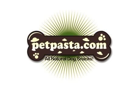
A recent project offered another opportunity to integrate one of my favorite animals: man's best friend, the dog. The client, Petpasta.com is a new line of high end dog snacks. The product they offer is all natural, with no salt or preservatives, so they wanted the logo to represent this. The market is for the higher end boutique type pet shops as well as breeders, trainers and especially the show dog circuit.
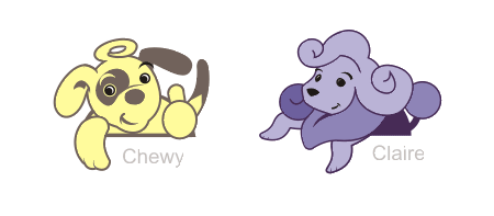
For this project, I summoned some of my cartoon characters which started out as doodles. I introduce two of my dog characters: Chewy and Claire!
Since the company manufactures dog food, I thought the logo should somehow be packaged in a familiar shape, using friendly and eye-catching designs that could stand apart from other pet products. I started with the main text, encasing it in a bone shape with familiar dog paws and cappelleti shapes. Font used was modified Cooper Black.
To make the logo more noticeable, I added a blast at the back, colored green to complement the brown of the logo, to facilitate the "all-natural" feel of the image.
Finally, a dog character had to be placed. The logo, even without the dog character may already work on its own, but the character adds a friendliness to the logo. Chewy was chosen, since Claire may be too high-class looking to cater to all dog owners. Now, Chewy looks like he's endorsing the food product, and he's happy about it... Thumbs up!
Now I would like to present the good souls that served as inspiration to this project, without their licks, purrs and tail wags, this logo wouldn't be that successful.
Recently, I made logo designs for Westfalen Orthotic Services, Inc., a small company located in Markham, Ontario, Canada, that manufactures custom foot orthoses for clinics across Canada. They also offer in-house clinical services, including biomechanical assessment, gait analysis and fitting of custom foot orthoses. Now, it's very interesting to create logos that combine both my technical knowledge (as a physical therapist by profession and a trained ergonomist with appreciable background in biomechanics, orthotics is a familiar discipline) and creative skills.
The client wanted the logo to look modern and sopisticated. It should be able to represent feet, comfort, health and a company who delivers quality service. The logo should make potential/current customers think of a reputable and dependable company. A search on existing logos of companies providing foot orthosis resulted in a variety of designs. The most widely used symbol is the foot, and I think this is unavoidable, since it is what primarily what these companies represent. For this project, I wanted the logo to stand noticeable among current "foot" logos, while maintaining a modern feel characteritic of current logo trends.
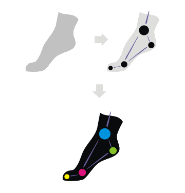
I developed 2 concepts for this project. The first concept invests on the standard foot, but for this I used a silhouette of a foot in "push-off" position, to denote movement and function. Next, points were placed on the functional joints of the foot, and a representational diagram was created, signifying the specialty of the client. This was then colorized, with each dot, using a different color, colors the company may wish to modify to suit their objectives.
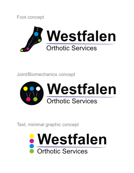
Simple but beautiful Arial font was used for the text accompanying the graphic. The "foot" concept may further be reconfigured but still be able maintain the same feel as the original.
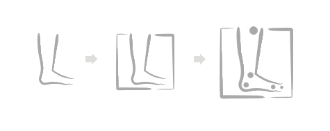
The second concept still invests on the the standard foot symbol, but this time utilizes the outline in fine brush strokes. This was further framed in similar brush strokes and the biomechanical points are also added. Unlike the first concept, the points in this version are not connected through lines. An attempt was made to connect the dots, however, since the graphic already utilizes a number of lines (the brush strokes), these lines would look redundant and would overcrowd the logo. It was also commented that these dots, while originally placed to represent the functional joints, could also represent the usual pain areas of the foot, an area which orthotics addresses too.
The graphic was then colored (limit to 2 colors to maintain simplicity). The Futura font was used for the text.
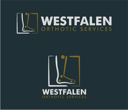
A version on dark background was also made.
Although both concepts were highly regarded, the client ultimately chose the second concept.
My recent logo creation offers the client, Preston Family Chiropractic, a health and wellness center in Ontario, Canada, an intriguing yet ambient image. The client was very specific in their requests, mainly that the logo can contain only 2 colors, preferably of the earth tones. It should be modern, fresh and professional and would be able to represent health and wellness very well. The client's office, as described by them, is very zen-spa-chiropractic, possessing a calm, healing and warm environment.They would like the logo to reflect that. Suggestions as to symbols that represents health included a leaf, flower, tree, hands, and spine.
Initial sketches included inspiration from my previous spa logos which featured the bamboo and bamboo leaves. I aimed to combine the bamboo, a symbol of strength and stature to represent the spine/vertebrae. The leaves would then sprout from the bamboo forming the outline of a meditating man/woman.
If you notice, the initial sketch on the top right features a straight bamboo. But I wanted to avoid making it like look a stiff spine (an "ankylosed" spine, which in radiographs looks very much like a bamboo). I decided to bend the bamboo into a flowing and graceful shape, and the leaves would look like they were flowing out of this naturally. Final design features the meditating man/woman with arms raised in a salutation position. This main icon may either be framed or not by a lotus shape. Text used the BibleScript font, which is very appropriate and fits the graphic very well.
An option with dark background utilizing the same base earthy green colors was also provided
The logo evokes a warm and friendly image, but most importantly I think it seems to tell their clients that they will feel "free" from worries and pain just as the person in their logo. I wish I would just be as "free" from worries and pain as that person. Perhaps, there's a huge likelihood my aspirations translated into my art.
Day was going well (San Mateo OPST 131 Field Visit, gym...) until a jeepney ride home. I was just trying to rest my eyes after a tiring workout at the gym, when I felt a sharp pressure tug at the right side of my tummy. The guy sitting beside me told me to be quiet, and just give him everything in may bag's wallet (which was on my lap) to him fast and discreetly. I immediately realized I was held up, and nobody in the jeep noticed what was going on, especially in such an overcrowded jeep. I had no choice but to give him my precious mp3 player, my 1 GB flashdrive and bluetooth dongle, after which he immediately fled carrying my little treasures away. Surprisingly, I felt no remorse and anger at my loss... I looked at the other passengers in the jeep who was unaware of what just happened. I wondered, if they knew what was happening, what would they do?.. what would I do, if I saw that happening to someone else? What would you do?
I installed Sims 2 Mobile on my phone a few weeks back, and I started playing it. It's an interesting game where you control a "sim" and all his life activities, ranging from eating, taking a bath and watching TV to looking for a job and partner, improving your house and many more. In the game, your sim had to fulfill certain objectives or "aspirations", to progress in the game. I haven't played the PC version before, but it was interesting enough, so I tried it out. I started with my sim, whom I aptly named "Oliver" and guided him accordingly to accomplish simple aspirations such as purhasing an alarm clock, prepare food and talk with someone. The first sim I got to know in the game was "Ben", and one of the aspirations changed into "make a new friend." Ok made Oliver make a new friends out of Ben. Soon the aspiration changed into "marry someone"... Out of curiousity whether the game was "politically correct", I made Oliver propose to Ben... and voila, I got married with Ben! Ok, my sim is gay... There's nothing wrong there, but I decided to restart the game, and try a different route in the social life of my sim. This time, my sim made friends with "Penny", who didn't like talking about politics. Penny works in a restaurant, and through her, I got a job as a cook... Good, Oliver now has a decent job, and can now purchase other items. Now I have an espresso coffee maker, a cooker and a bath. Soon, the aspiration changed into "marry someone" and this time, Oliver married Penny, and Penny moved in the apartment. New aspiration: become head cook... So I made Oliver practice cooking better, to gain enough skill points to get the job. Soon, my sim had enough skill points. Oliver talked to Penny again to inquire about the job, and immediately, got the job. New social aspirations came up but were pretty simple: "Hug someone...", "Kiss someone...", "Tell a joke", and hehe, "Tell a dirty joke"... Occassionally I would let Oliver "woohoo" with Penny, but surely there were plenty of hugs and kisses. Things were going well, the apartment was getting big, and Oliver was earning big, and with Penny, he had a lucky life! Then a new aspiration popped up: "Get a divorce"... What the?!! I thought, OK, this is a game... I made Oliver talk with Penny about the divorce... but a message popped up: "You do not have enough money for the divorce." Figures... I shut the game down. How can a simple game on a phone teach such values... but come to think of it, it does happen in real life, perhaps the value of the game simply reflects how the world works these days.
Yesterday, I went to my regular Body Combat class at Fitness First Manila, after a lecture that due to problems ended up rescheduled to next week. Turned out this Body Combat class will not be a usual... I know, I've heard stories of people in exercise forums getting into uncontrollable fits of emotional outbursts during strenous exercises, usually crying. Exercise psychologists said it occurs occassionally in some individuals and this is considered normal, as the workout causes a release of hormones that translates into a heightened sense of euphoria, and in some cases, crying. I was surprised to see myself uncontrollably crying during Body Combat! I am sure this is beyond normal. Everybody knows that Body Combat is an aggressive workout. I admit sometimes, for motivation, I would imagine the face of someone I hate in front of me while doing the punches and kicks. But I knew something was terribly wrong, because during that workout, the face in front of me was mine...
And that workout turned into a bout with my negative past... confronting my disappointments , pressure, abuse, betrayal and rejection by those closest to you, being remembered for your failures rather than your contributions, wrong decisions, guilts and regrets... Life can just be so unfair... I was blaming, punching and kicking my imaginary self for being so foolish, gullible and stupid. It was one of the most exhaustive workouts I had... my imaginary self was beaten to a pulp.
Well, I'm sure everybody have their own problems, and I acknowledge that my problems are probably just a trifle compared to others. But for each problem, there is always a solution... the challenge is looking for it. Some problems need confronting but some, you just need to step away and surrender lest it becomes more complicated. Especially, if it's for the benefit of everyone, and that means even sacrificing yourself.
Good thing, I perspire a lot during my workout. Nobody noticed except the instructor. My tears were lost in my sweat...
That's the view when I do indoor rowing at Fitness First Ortigas (located at the penthouse level of Winsome building). Talk about rowing with a view...
Being sick is definitely not good news for me. Not only does it make me miss doing important and critical work (in an institution whose idea of stress relief is making fun of other people behind their back) but it makes me miss the gym, which unfortunately for me, is close to what I can get to a social life nowadays. It's funny that it's so easy to get your body deconditioned (that is, lose the hard-earned tone of your muscles and belly)... you gain nothing, but more fat. All one needs is 3 days off the gym, a little out-of-the schedule snack, a slight tug of depression and worry and tons of work to put your mind into binge mode. All hell breaks lose!
In one of the replies a few blogs ago, I mentioned how excited I was to receive a message from Xeno Muller, an Olympic rowing champion, who mentioned that it was great that I was incorporating rowing in my workout. Indeed, I make sure that I row at least 2000m of per gym visit, working towards a regular 5000m to 10000m workout. This is also in preparation for a self-imposed half- and full marathon.
I started indoor rowing when I joined Fitness First in 2005, and the geek that I am, made sure I knew how to correctly use all the electronic exercise machines in the gym. The indoor rowing machines, or 'ergs' as they are commonly called in other countries are (I think) the most unpopular exercise machines in the club. I'm not really sure why, but I think people don't know the proper rowing technique and understand the benefits of rowing... If done correctly, indoor rowing could be the most efficient fat-burning exercise in the gym. Rowing basically consists of 4 actions: the catch, the drive (with emphasis on the leg, body swing and arm pull through), the finish and the recovery. Each phase consists of coordinated muscle action that requires application of force in a repetitive, maximal and smooth manner and employs all large muscle groups.
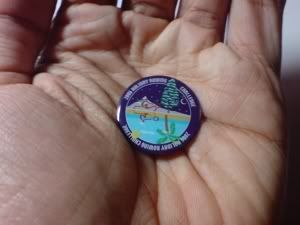
Concept2, the company that manufactures these excellent ergs provides enough motivation to the thousands of users of their machines around the world by hosting an online personal logbook where registered members are allowed to record their times/distances finished. There is also a ranking feature where you decide to enter your best times and see how you compare to other rowers. I'm not that bad though, having my best 500m timed at 1:36.3, 2000m at 7:53.7 and 5000m at 19:52.1 and 10000m at 44:09.6... Still needs improvement! Concept2 also arranges regular challenges for its members. The most recent major challenge I completed was the 2006 Holiday Rowing Challenge where interested members should finish 100K or 200K m in 20 days! It was a self-imposed goal (I aimed for the 200K) and I finished well. Soon, I was sent a pin and access to an online certificate, hehe (babaw talaga kaligayahan ko...):
I have yet to join the C2 Million Meter Club where upon reaching 1 million meters or more, you join the elite list of finishers, and be awarded with a certificate, a pin and T-shirt. As of my last work-out, which was a week ago, I have completed 468,000 m already... Malapit na!
Recently, Concept2 and Row2K sponsored a YouTube video-making contest with prizes including cash and gifts. I was supposed to join this video contest, however, due to time constraints and the apparent disinterest of my cinephile brother, Oggie, whom I was seeking help with, I didn't make it to the deadline. I really wanted to win the latest indoor rower machine... Oh well... next time. I realized that they have finished judging the entries already and have already announced the winners. Among the winning video entries here are my favorites:
I would like to confiscate ergs and keep them for my own, if my students dare to do that in the classroom.
I will never look at ergs the same way again...
Something bothers me about her technique, she can hurt her knees...
Sometimes, I wonder why I hum Debussy's 'Claire de Lune' when I row at the gym, while sinking into a nostalgic trance doing a regular 26 strokes per minute rythm. Just now, I realize why:
I hope I convinced enough of you to "incorporate rowing in your workouts" too... It's tough at the start but pretty soon, you can't get enough of it. I have had enough of my nagging headaches, I should get back to the gym. To erg or not to erg... to erg, of course.
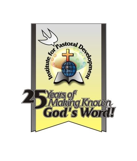
A month ago, I was commissioned by the Institute for Pastoral Development to develop concept logos for their 25th Year Anniversary this March, with the theme of "25 Years of Making Known God's Word!" The Institute for Pastoral Development (IPD) as described in their website, is a leadership development institute founded in 1982 by the Ang Ligaya ng Panginoon Community (Joy of the Lord) (of which I am presently a "dormant" member). IPD is committed to make "the Kingdom of God present in the world by equipping the people of God with skills, knowledge and spiritual deepening to empower them to become more effective servants in the missionary role of the Church." They have become instrumental in providing spiritual education to lay workers of numerous parishes and dioceses, sponsoring biblical summits and the like. Creating art for them would be a great honor!
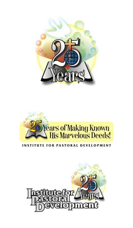
I was provided with initial information, incuding suggestions from their panel. Since the theme was based on Psalms 105:1 " O give thanks unto the Lord, call upon His name; make known His deeds among the people!", they suggested that the graphics: 25 years of making known His (or God's) marvelous deeds". They envision a silver trumpet with these words spilling out of it. They hope the logo would look jubilant, quite playful but in a formal way. Hmmm, that was tough to achieve... After enough discussion with them, I proceeded to my drawing board, but it was worth looking at their existing official logo... perhaps I could build something from it:
The original logo features the typical components of a Christian institution: the world atop a bible, with the symbols of the cross and the dove. Quite traditional for my taste, but has been recognizable as the institute's logo for 25 years. Traditional, but functional. Building on the original logo, I developed a concept that is consistent with the theme, something that would convey growth... just as an adult would still retain features from when he was still a baby. I noticed that the original logo featured a closed bible, which was not consistent with the present theme... the book should be wide open, radiating with light, conveying a sense of "spreading the word to the world." I retained the original components, but rearranged around the "25" text:
The concept was then submitted and deliberated upon by their panel. They liked the concept but requested some changes: Yes the changes requested are as follows: one, that the 25 be placed outside the drawing of the dove, bible and cross (seems like there was too much overlapping of things) and that the name be written circumferentially, or around the graphics. No problem! At this point of development, the theme title has also undergone changes, and were incorporated in this version, laid out in a silver banner style:
I also developed another concept featuring their original suggestion of silver trumpets. The new IPD logo is incorporated in the banners of the trumpets:
Both concepts have been finally accepted and will be featured on their activities this March. Of course, grayscale and black/white versions were also provided.
This was a very interesting and deeply meaningful project to work on. The first email asking me to start this project included this: "My dear Ian, IPD can offer its prayers in exchange for your creativity. I hope this is okay with you too." Of course, I wasn't expecting anything in return for this job, as I consider this job as a service for God... I shouldn't have any qualms of not getting anything in return, as my talent is only on lease from Him. It is but expected of me to use it for His glory, and use it well... To the email, I jokingly replied "Haha, I need prayers!" and indeed I needed them very much...
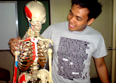
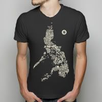
Recently, I received an e-mail from Threadless T-Shirts saying: "Your photo has been accepted! Hello, Christian Oliver A. Cruz! One Street Team point has been added to your account and your photograph has been put online into our gallery. Oh Boy! We liked your photo so much that we chose it to be a photo on the product page! Also that means you get an extra 9 points for your photo! Have a good one!" I immediately checked the product page, for the shirt I was wearing and surely there it is, my photo was added... I am officially a Threadless model!
Not only have I been buying t-shirts from Threadless, but I've also been submitting designs. In fact, I first heard of Threadless from circles of amateur and professional graphic designer forums saying it is a good venue for submitting art and getting valuable critique for it, but also, if you're good and lucky enough, earn dollars (They will award you with $1,500 for every design accepted) and other prizes. As much as 6 T-shirts designs get printed each week and sometimes special contests are held focusing on certain themes sponsored by bands, artists and companies who 'love' Threadless shirts. I've submitted artwork, but unfortunately, they haven't been printed yet. Numerous Filipino designers had their designs printed already such as kaloyster, bad_nobe, folo, and impossiblejosh among others! So far, these are the designs I've submitted... I have yet to find time to make new ones:
Threadless T-shirts are unique. I understand that not everyone is expected to appreciate the shirts that gets chosen to be printed there, but one thing's for sure, their shirts are sure to get noticed and talked about... a conversation piece in any situation. It's almost a vice, but I found myself building my own collection of Threadless shirts (I only buy during sales where each shirt can cost as low as $10). Sometimes you have no choice but to buy shirts with your favorite design on, because popular designs get sold out pretty fast. Shirts are printed in a limited collection manner, so you might have to wait for a long time before your favorite design gets printed again, if they ever get printed again. Some out-of-print shirts have found their way in ebay, selling at outrageously high prices! And if your favorite design actually gets printed again, you really have to buy it as soon as possible, because there will surely be a buying frenzy among the community that Threadless has already built upon.
What's wonderful about Threadless is that their site is not only a catalogue of shirts you can select and purchase, it also boasts of a web community of friends and designers, a site where you can design your own profile page, write in the forum and have your own blogs, score design submissions and participate in their unique rewards system. It's a place to meet friends and designers from around the world.
The above are pictures of just some of the shirts I already own. I still have some shirts to photograph myself in. Ultimately, I have yet to receive an e-mail from Threadless saying "Your design has been selected to be printed!", when that time will be, I am not sure. Haven't found the time within my busy schedule to sit down and brew up new designs. However, I am confident my designs will eventually see the light of printing day when I launch one of the "projects" I have in mind. Here's a preview of what's to come from this project:
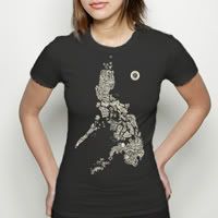
The "Paranormal Philippines" design was greatly inspired by a sold-out Threadless T-shirt design by Aaron Hogg entitled "Para-normal US"... but knowing it can only be understood by Americans, and though I love the concept (which I think is also inspired by the typographical map work of Paula Scher), I can never wholeheartedly appreciate the original design. So I decided to create something by borrowing the concept yet adding a little twist of my own (see the little drawings to illustrate some of the mythological creatures): a translation using the Philippine's very own folklore and mythology. I will be working on another design inspired by Rizalista cult dogmas and personalities from the Philippine Revolution meeting ala da Vinci's "Last Supper"... I will have these shirts printed soon. Be sure to stay posted!