Old picture albums have that uncanny ability to take you down memory lane. But nothing can compare to the vividness of retrospection that a written record of daily experiences can provide. Especially, if it's a log of friends, mutual experiences immortalized in words, mementos and art. Not only does it revive old experiences, but also provides a window view to the quirkiness of each individual in this circle of friends, a taste of their precious randomness, awesome brilliance, arresting humor and lovely insights. Presenting: The Logbook!
I'm sure my friends have been wondering where the logbook was, and perhaps through the years, people have forgotten that I was assigned as the guardian of this piece of college history. I also promised that I will scan every page of the logbook for archiving purposes, preserving it in digital glory. Thanks to my brothers who took turns in scanning every page (almost 300 pages!)
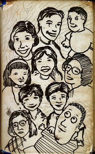
Here's the unforgettable cover of the logbook: (Betay, Rev, Roman, Alona, Mylene, Edleen, Ivy, Kata, Deanna and Alain...)
I received a request from a fellow deviant, Angelica to create 2 ambigrams, of which we only agreed to complete one. The other was too difficult and due to time and budgetary constraints, that would be quite unfeasible to accomplish. This ambigram was intended to be a special gift for her fiancé, whom she had been with for about 8 years already. She wanted the ambigram (a symbiotogram, to be exact) that read "Marco", and "Music" flipped. She says "He sings... music is what brought us together."
As soon as the details were finalized, I proceeded to the drawing board, figuring out the nuances of letter configurations.
Although both word have 5 letters, it would be unwise to create an ambigram with 1 to 1 correspondence (M for C, A for I, etc…). It wouldn't look to legible and balanced. I opted to combine certain letters. In this case, it seemed most aesthetic to make the "M" of "Marco" to stand for the "IC" of MUSIC… the "M" of "Music" can stand for the "CO" of "Marco"… I started digital work using the font I used in the sketches, but they weren't looking that good (I could pull it off actually, but I would end up creating an entirely new font if I proceeded with this). So, I ended up modifying a traditional Gothic font. I came up with these:
Flipped:
And the colored versions, using a musical background theme:
It was better than what Angelica expected it to come out. That was enough compliment, but ultimately I just hope that this ambigram is a worthy tribute of her love for her fiancé…
I have this special relationship with paper. Perhaps, it's because of my strange childhood where I was severely deprived of paper. I wanted to have paper so bad I had to steal from the office supplies of my parents. Paper was systematically hidden from my reach. And when I got my hands on these precious onion skins and silk pressed ones, I would cut out the ugly letterheads and leave the pristine white sheets for myself. This turned out to be disastrous because my parents would find out about the letterheads which I lousily disposed of in the garbage cans. Result? A swollen hand, huhu… Sometimes, I would rummage through the stockroom looking for milk (Bear Brand, specifically) cardboard packages (or other similar cartons). I learned to remove the thin layer bearing the printed side leaving me with the grayish brown cardboard. When I didn't find paper to draw on, I resorted to drawing on the walls, ceiling… every square inch of the second floor of our home was covered in either the "waxy depths of crayon" or pencils… You can say that this was my very first major masterpiece in the tradition of the frescoes of Michelangelo… It was a testament to my precocious skills and unfortunately a shame for my parents, who had to turn away visitors from looking at our second floor and challenge Barclay salespersons to offer a product that can clean my art away. Haha…
Just what did I do with paper… if I could get my hands on them? I loved the versatility of paper so much… You can fold them, cut it to your desired shapes, glue it, and make sculptures… almost anything! Aside from the traditional drawing, I remember making toys out of them… (huhu, not only was I deprived of paper, but also of toys… I made my own toys!). I would make Game and Watch replicas with complete "floating" character that would move if you tapped on them… I would make action figures (GI Joes, Mask, and even Transformers) complete with their equipment and accessories (also made out of paper)… I created my own virtual toys with paper, and perhaps this desperation to have my own toys upped my creativity notches beyond that of any normal child. These days, it's a different story. I now have access to a variety of paper, and I now have my own personal stash.
But stop this reminiscing already… recently I was commissioned to create a mascot/character design for an upcoming website that would feature ways into which an ordinary A4 paper could be turned into useful and practical CD protectors:
They wanted to build the website around this character so it needed to be cute or edgy, "maybe a superhero...something with emotion... something about using paper to protect cds....maybe cd character with folded paper hat, armor....paper shield...origami theme...origami crane dragon… protecting cd...." and so on… I did some research, and one thing led to another. Here is my initial sketch, working on the paper and CD idea, sort of like a paper samurai knight of sorts. I call him Papiro (Japanese twist on "papyrus").
The client liked the character, and with a little modification to make Papiro look more animated (such as extending the legs more, and having the eyes look more expressive) the design was finally finalized.
I was later contacted again to create a new character for the renamed site, this time to be called Diskimono… same concept, just different name. So, the new character should reflect the new identity. Here is the initial sketch, and go signal was given for the geisha concept.
Final design:
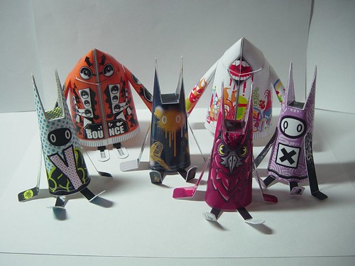
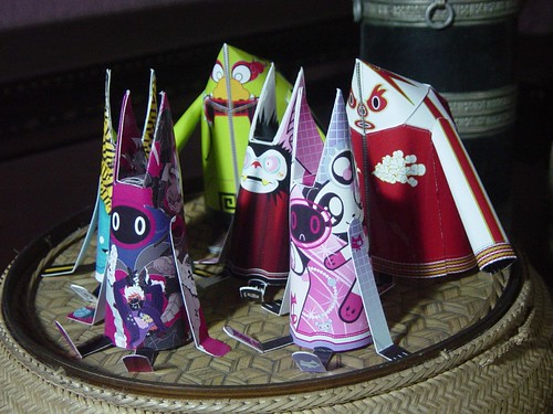
While researching for this project, I stumbled across a new art genre… the world of paper toys! Immediately, I was attracted (hmmm, addicted is more like it) to this craft. The process of making these toys is quite simple: download a design (or template and create your own design), print it on cardboard paper and then assemble (fold, glue and cut if necessary)! Here are just some of the toys I've already made:
Now, all of these designs are based on Shin Tanaka's Masked Hoody and Spiky Baby designs, all of which can be downloaded in his website. It's also worth visiting ReadyMech, another site that offers simpler toy models. Custom Paper Toys features toys in a regular basis in its blogs. There's also Pepakura Designer 2, a software which creates templates based on existing 3-D data. Amazing… Now check this paper model of Transformer's bumblebee!
On a totally different light, I have to go back working on a (research) paper… and prepare for a new twist in my life. Ciao!
After months of inquiring in almost every branch of Powerbooks and Fully Booked, I finally obtained a copy of "Good-bye Chunky Rice" through special order. It is the first graphical novel book by Craig Thompson, most known through his latest graphical work entitled "Blankets". The plot of "Good-bye Chunky Rice" is described in the fold of its front cover as:
Mister Chunky Rice be living in the same rooming house likewise myself, only that boy be restless. Looking for something. And he puts hisself on my brother Chuck's ship and boats out to sea to find it. Only he be departin' from his bestest of all friends, his deer mouse, I mean, mouse deer chum Dandel.
Now why in a whirl would someone leave beyond a buddy? Just what be that turtle lad searchings for? I said you best read the book to find out. Merle said, "Doot doot."
No, those are not typographical errors. That's just how one of the characters in the book speaks. And yes, it's about a turtle and a mouse dear… looks more like a children's comic? Don't be fooled, it's loaded with sentimentality that will appeal to any adult who has experienced separation from a dear and loving friend.
After settling down from the excitement of finally having the pleasure of reading this book with my own eyes (my Thompson collection is at last complete!), little did I know I was in for an emotional ride, how much the story (which I suspect is based on Craig's own life experiences, only unlike in his work in "Blankets", these bits are camouflaged behind the endearing cute characters) reflects my own recent experiences. Great timing...
In the story, Chunky Rice decides to leave home to look for something. But every time he is asked what he is looking for, he replies with this:"I don't know…" He seems undecided but he is sure that he needs to look for it, whatever it is. And in order for him to do this, he has to leave everything he has grown familiar with, his belongings and even his best(est) friend, Dandel. Both of them suffer from this, how everything that seemed familiar, suddenly grow with meaning because of their sentimental value… but at the same time becomes meaningless because of each other's absence.
There are other characters who also reflect different levels of separation, acceptance and loneliness. There's Solomon, who suffers from an unforgettable childhood trauma involving his brother and pet dog, and then finds peace while taking care of an injured bird, Merle. Expectedly, the bird regains the strength of her wings, and flies away. There's this Siamese twin conjoined at the torso sharing vital organs leaving the option of separation impossible. Then there's Chuck, the captain of the ship, who tries to cope up with past issues with his brother and braves a storm. Their lives intertwine. Every frame resonates with symbolism and emotion (be careful, some scenes are bound to pull heartstrings… I found myself crying in more than one). Craig Thompson's art is delightful, and if you like his style, you are in for an eye-treat.
It's a thought provoking book…critiques even describe it as "an alternative-comics answer to Saint-Exupery's The Little Prince." You may end up asking yourself the very question the book poses. Why would you leave the things that you are most familiar with? I need to grow, move on, heal, hope once more… Sometimes, letting go helps you accept that things just cannot be, that you can't have everything… As Leo Buscaglia would say, "Why hold on the very thing which keeps you from hope and love?"…Letting go may even be the only way you can say that you love someone…
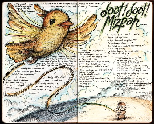
I won't reveal the ending of the book (if it really does end, I also won't tell). "Doot doot!" (the sound) for me represents things that are best unsaid. Though it's a sound commonly associated with censoring words that are not meant to be heard, we must realize that this attempt at concealment also reveals itself… we eventually understand what's behind "doot doot", its real meaning. I would rather use the words "Mizpah" a Hebrew word meant to represent the emotional bond between people who are separated (either physically or by death): "The Lord watch between me and thee, when we are absent one from another…"
Here's my tribute to Craig Thompson's work… I just couldn't help it…
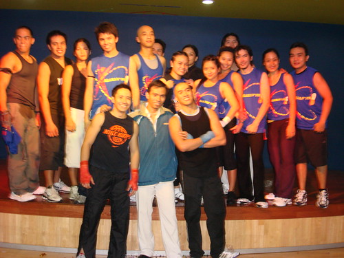
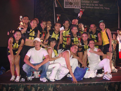
Perhaps the most awaited event by gym addicts such as me, "The Main Event II: The Grand Body Combat Marathon", organized by Fitness First was held last October 7, 2007 at the NBC Tent at the Fort Bonifacio Global City in Taguig. The event was attended by team and individual representatives from each Fitness First club, donned in their combat attires and poised in their best forms. The teams faced off against each other in displays of synchronization, technique, energy, and team unity and it wouldn't be a surprise how huge the amount of effort, time and dedication that each team poured into this. Our team gave more than 100%, and coupled with the ordinary stresses of our daily work, most of us were down sick the following week.
Eliminations for Fitness First Metro East were held on August 30, 2007 and luckily I was able to make it to the final 12 finalists who will represent the club, considering that I didn't have enough preparation for the event (busy with critical work at school, I had to give up my gym sessions), so I was not exactly that fit. But I thought, I'm glad that I made it to the top 12, this gave me an incentive to keep up with my fitness goals, which I have been failing to achieve, and of course, to get to hang out with my fellow Body Combat addicts, and get first hand training from the instructors! We had more or less a month to prepare…
Training was intensive. And when I say intensive, I really mean INTENSIVE! Imagine 2-3 hours of non-stop Body Combat drills. We were only allowed to drink water every hourly break. We had to practice during the late hours, with the security guard of the club already asking us to leave the studio. We had to practice outside the club (In Ateneo actually), to train ourselves sans the comfortable air conditioning and accommodations of the gym. All part of the training. It's funny how you get used to working out long hours, that a standard 1-hour Body Combat class wouldn't cut it. You find yourself wanting for more pain and sweat!
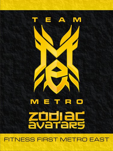
Everyone poured in their skills and talents, and in one way or another every team member helped out in building our image. Of course, I helped out in creating the brand image for our team. Since our chosen colors were black and yellow, and our costumes were military-inspired, I had to create something to evoke aggressiveness. It should be recognizable, familiar yet unique in its own way. It should also match up with our chosen name, "Zodiac Avatars". It should look good as a tattoo (since we decided that we will all get henna, to my misfortune) and represent the mixed martial art nature of Body Combat. Drawing inspiration from Manny Pacquiao's own Nike logo, and of course the iconic Transformers logo, and of course, my familiarity with Chinese glyphs I came up with this final design:
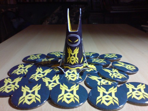
The team is actually considering merchandising the logo for Fitness First Metro East members. Imagine that in black caps and muscle shirts. We already came out with pins and ID cards, but this was limited only within the team. And here's my Spiky Baby to go with it!
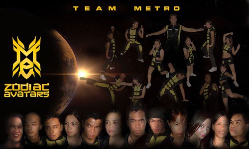
Richard and Liz came up with our tarpaulin design, inspired from a Heroes poster. Looks cool no? But we were laughing our heads off looking at how hilarious our poses and facial expressions were (Look for Judy Anne "nawawalang anak" look, the strict principal, "nakatawa kung galit", mischievous grins, "UP Oblation", Cynthia Luster, "Geisha", etc…). How I would love to add talking balloons…
October 7, 2007… Day of the event. Most of us were already sick (flu) which we think we got from our last late practice, but we still managed to get enough strength for the event. Lunch at PASTO, then headed to Fitness First Fort to warm-up and prepare. The atmosphere there was quite tense. We were already tense and excited, and everyone in the gym being in a competitive mood. It was daunting seeing the other teams in their costumes and make-up, getting ready for the event.. I know ultimately, and I hope, every participant was in this for the fun and joy of doing Body Combat. In no time, the tent was raging hot as the instructors led the group in two and a half-hours of workout (I think that was around 26 tracks, lost count!). The space was cramped, we have to adjust our blocking to the ever shrinking space (The team in front was pushing us back, and the team behind us were complaining already), and accidentally, you're bound to kick someone in front or behind you. It was exhilarating! Seeing the whole crowd punch and kick in unison to the upbeat music (Body Combat 33 is cool!).
Everyone was tired after the event, but miraculously, we still had energy to cheer ourselves on. We bagged the 3rd place in the Team Category and four of our open category participants were finalists! Congratulations to the other teams!
Now that the event is finished, and we (participants and instructors alike) are still recuperating (I actually suffered from a combination of flu, allergy and bronchitis), I can't help but think how much we gained from the event. Not only were we moved closer to our fitness goals, but most importantly, we found friends among each other. I miss the training already. Even if the team is no longer aspiring for an event, we are hoping that we still find time to train (and go out) together.
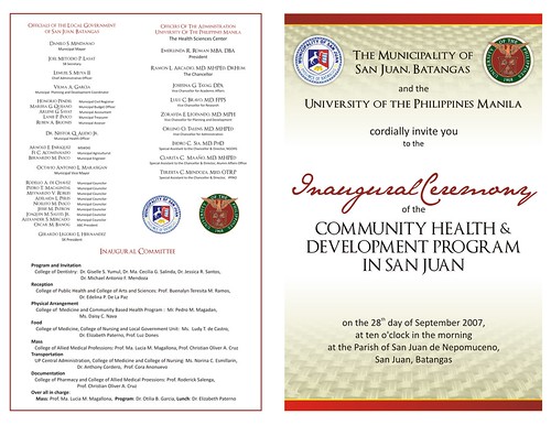
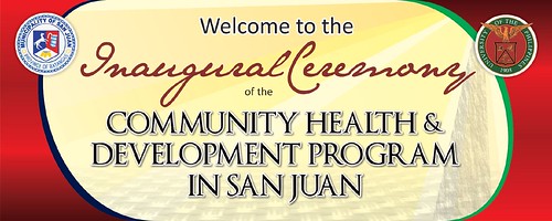
Shortly after the culmination of the inaugural ceremonies of Dean Cynthia V. Isaac, and just as I was recuperating from the stresses brought about by the preparations, I was tasked to help in the preparations of the inauguration of UP Manila's Community Health and Development Program (CHDP) in San Juan, Batangas. As head of CAMP's CBR Program, I am automatically a member of this group, along with the program heads and point persons of the other colleges in UP Manila. The CHDP was envisioned to be a venue where every unit of UP Manila converge on a common community site, addressing the needs of the community through an interdisciplinary approach (IDA). If you are familiar with the history of CAMP's CBR Program which started in Bay, Laguna in the form of the Comprehensive Community Health Program (CCHP), you will feel that the thrust of CHDP rings a bell. Imagine all the interns, students and supervisors of all colleges and units of UP Manila in one community, interacting for a common goal of community development. This is IDA to the max! Now, the Chancellory has tasked us to prepare for the inauguration of this worthy program.
As they always say, if you do well in one thing, chances are you will be tapped to do the same thing in the future. Sabi nga nila, 'wag masyado magpakitang gilas! Apparently, a lot of people appreciated the efforts I put into the inaugural ceremonies in CAMP, and they wanted to emulate that for the inaugural ceremonies in San Juan, Batangas. My talents were indeed stretched nearly to the limits in this event! Here were my assignments: (1) Program/Invitation, (2) Banner/Decoratives, (3) Responsorial Psalm (to be sung!), and (4) Audio-Visual Presentation and Logo… all to be accomplished in 2 weeks.
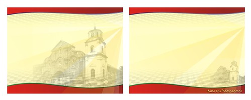
Program/Invitations. Since I have already the source files for the program used in the inauguration in CAMP, all I needed to do in this instance is to modify it to fit the theme of the event. Whereas, for Dean Jake, I used blue, silver and gold being her favorite colors, I have to be more traditional in the selection of colors in the case for the CHDP program/invitation. Since it will be distributed not only to the UPM constituency, but also among stakeholders in the San Juan, Batangas community, it had to embody the spirit UP Manila, as well as the community. For anchor colors, I selected UP's "luntian at pula" (green and red/maroon) colors and ochre/earth for general background. Using my own stock photography, I attempted to subtly blend in a basketweave pattern into the background, suggesting a native/rural feel. Of course, colors had to be subdued to save on printing expenses, so the challenge was to not make this look deliberate. Here are the designs:
This had to go through 8 revisions, but these were limited only to textual content. So I guess the Chancellory was satisfied with the aesthetics of the design.
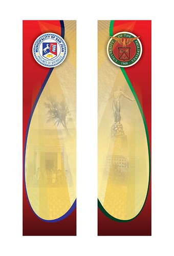
Banner/Decoratives. For the banner and the decorations, it was very important for me to do an ocular inspection of the actual place where they will be used. This way, I will be able to create a design that will not clash with the surrounding environment, something that will be seamless with the existing environment. The venue for the event will be the church of San Juan de Nepomuceno (a church to be venue for such activities is highly unusual since the church as much as possible maintains the sanctity of the place of worship, it should not be a venue for political activities). After requesting permission from Archbishop Arguelles of Batangas to use the church as venue with provisions that the eucharist be removed, thus de-churching the place. The Archbishop was a happy fellow (though he seemed strict and difficult to approach at first impressions). I cannot forget how hilarious he was when we noticed that he had attractive dimples on his cheeks. He said that he actually had 5 dimples, 2 we can see, 3 we cannot, 1 of which smells awful (dalawa nakikita, tatlo nakatago, yung isa mabaho!). We ended up chatting for a long time with the "holiness".
After getting permission from the archbishop, we went to the venue itself. The church was beautiful so I wanted a design that will not take away the beauty of the church, something that will look like it was part of the church itself. I thought of using long banners that will span the length of the two columns on each side of the altar, one symbolizing UP Manila (red/maroon and green), the other representing San Juan, Batangas (red and blue). As you can see, the design was drawn from the concept used in the program. A banner will be placed at the façade of the church. I also had to take approximate measurements of how the banner/decorative should be sized, and with this, I have the budget that I have to work with. Here is the preliminary sketch:
And the final designs:
The banner was basically patterned from the program materials, but integrating the colors of the tarpaulin. Also, I created templates for the slide presentations bearing the responses during the mass celebration:
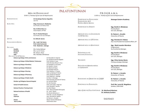
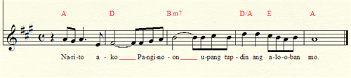
Responsorial Psalm. I was also tasked to compose the melody for the responsorial psalm for the mass celebration. This was no ordinary mass, since this will be concelebrated by an archbishop and two parish priests, and most of the liturgy will be sung. Looking at the song line-up for this mass, I knew I had to create something that was traditional (and not modern/contemporary, as the Our Father I composed before). Also, it had to be simple so that the community will be able to follow it, and easy to learn since I will be teaching this piece to the choir a few minutes before the start of the mass. Most importantly, it should fall comfortably within my vocal range. I came up with this:
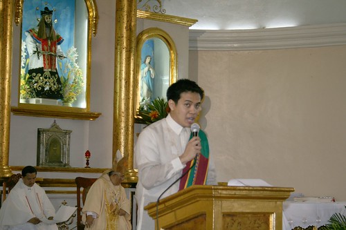
The choir was good! They were easy to teach and they were very eager to learn the tune of the psalm. It had been a long time since I taught a choir (oh the CAMP Choir days, where I was known as the "master beater"), but it came out almost naturally as I found myself leading this choir which I only met and interacted with for a few minutes. I think I sang the psalm well, since people from the UP Manila community who didn't know I could sing was surprised to see me up there "singing like an angel". Dr. Sia always amused me. Not only did he not embarrass me before in an event in CAMP by calling me "isang artista!" (which is a direct translation of "artist" which is what he truly meant), he commented again, "ang dami ko raw talino" (which I think he meant "talents"). Oh, if the UP Manila Community only knew that years and years before during a flag ceremony attended by the very same people, I sang the national anthem in which I forgot the lyrics! It was the most embarrassing moment of my life. Imagine the guard who had to stop raising the flag up the pole since I had to repeat the song all over again (not just twice but thrice)! I wanted to be shot right there and then ala-Jose Rizal. I guess, I regained my dignity after singing the responsorial psalm successfully!
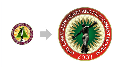
Audio-Visual Presentation/Logo. I did the audio-visual presentation highlighting the history of CHDP the night before the event. It's a good thing that we were already there in San Juan, Batangas as part of the advance preparation party. Again, the available stock photography was limited, so it was very difficult to create a presentation to stretch within the allotted 3 minutes. In order to fill in the remaining time, I decided to create a logo for CHDP, which as you will see is an evolution from the original CCHP Logo. My rationale for this was that the CHDP is actually a renewal of a dream that was extinguished which was CCHP. The original logo featured a triangle and an oblation. I retained the oblation symbol, refining it, using actual photos of the oblation statue, but instead of the triangle, I utilized a star burst, a blossoming shape symbolizing the renewed vigor in the community service endeavor. The 3 points of the triangle is now a many-pointed shape representing the numerous units supporting this endeavor, and the multi-faceted aspect of community development.
Here is the short AVP I prepared for the event:
Summary. Again, you could imagine how stressed I was. But this was something I enjoy doing, and something I know I am good at, so even though I was exhausted and stretched thinly in the end, I knew I was able to contribute to making this event an unforgettable experience. Though I relished in the attention I got for the efforts I put into this, I have to make it clear that this was not my main motivation. Through this event, I was able to work with individuals from other colleges, and seeing firsthand the same effort and talents that they have shared, it further motivated me. The CHDP is an exciting program to look forward to, and with like-minded people from other colleges and units, it reminds me just how privileged one can be to be part of UP Manila.
Photos from the event can be seen at my Flickr Albums.
As the number of days left trickle down until the much awaited rematch between the Filipino boxing hero Manny Pacquiao and Mexican legend Marco Antonio Barrera (October 6, 2007), I couldn't help but notice the hype among Filipinos as they prepare for another victory. The fight will be televised live, even projected at theaters in major malls (and even in remote town plazas). Posters and ads line up every street announcing the fight. Of course, corporate giants are hard at work taking advantage of this unprecedented media coverage.
One thing that caught my attention most is Nike's endorsement for Manny Pacquiao which added more glamor to the boxer's already superstar status. Not only did it not fail to catch my attention since I frequent Nike Park/Stadium stores, but Nike made history by creating a personalized crest and logo for him, and blatantly shows this in advertising materials all around the stores.
The crest designed by Mike Friolo, will be emblazoned over at the back of Manny Pacquiao's red and white robe on October 6. According to Nike's website, Manny, because of his will to fight to live his sports dream, is worthy of a heraldic display. The elements in the crest draw inspiration from aspects of Manny's life and country. The sun and stars reflect the Philippine Flag and just like the flag, the stars represent the 3 major island groups: Luzon, Visayas and Mindanao, with the Mindanao star as the largest, being the island where Manny was born. Being a powerful southpaw boxer, a left gloved fist is prominently displayed in the middle, along with 6 other fists representing the massive following and support of the Filipino people. The national bird of the Philippines (the monkey-eating eagle) is also centrally featured to symbolize his extraordinary courage. The crest also bears other symbols that reflect the Filipino heritage: banana leaves, tattoo-style flames and waves and the sampaguita, the country's national flower that represents purity, humility and strength. The crest abounds with Filipino symbolisms and invokes pride in any Filipino who sees it. I think it is a well-crafted crest that matches Manny Pacquiao's kingly status. Though the crest successfully raises feelings of nationalism, one thing I'm missing is Manny's veneration and devotion to God, the only one that he fights for more than the country. I think it should be represented as well in the crest. But aside from that, the crest is faultless.
The "MP" logo is similarly well made. Done in a style that could rival the logos of other athletes (particularly the basketball players), one can't help but be drawn to it (I was! In fact, I noticed this logo first before being drawn to his crest). It has enough nationalism (thanks to the allusions to the Filipino flag particularly through the sun and its symmetry) and ethnicity (font treatment to the M and P…almost tribal). I liked this logo so much I used it as one of my main inspirations for the logo I made for our Body Combat team (which I will blog about next week)(After all, October 6 is not only Manny Pacquiao day for me, but it is also the day where I, together with the Fitness First Metro East team will compete in the 2007 Body Combat Challenge).
Now, I am still looking for the limited-edition red/white Dri-fit shirts that bear the crest and logos. If anyone manages to see one, please oh please get it for me (My size: M).
Naturally, I think Manny Pacquiao will win. I predict that it will be a fast fight, not going beyond 5 rounds, via knock-out. What do you think?
This is a simple Web 2.0'ish design I made for DownloadLyrics.org, a music site where people can search and download song lyrics. The icon is straightforward, embodying the essence of the site. I also integrated the download (arrow) symbol and a subtle smile over the "i" in the text component of the logo.
The music site might ultimately use the more simplified version of the logo (sans the music, arrow and smile symbols), as can be seen in their beta website.