Thursday, April 15, 2010

Guesting at DZMM Teleradyo: Todo Todo, Walang Preno

Quality Life Discoveries was supposed to be featured at Umagang Kay Ganda, the daily morning show of ABS-CBN, on Wednesday, focusing on the various services that the clinic offers. Of course, being the Aquatics specialist of the center, I was more than prepared to demonstrate and talk about Aquatherapy and WATSU® once more, the last time being in Unang Hirit (GMA's morning show). This meant waking up as early as 3 am, to be at the clinic at 4 and sink in the pool for more than 3 hours straight. Gruelling work, while trying to look pretty for the camera! But highly enjoyable!

However, due to some reasons, Umagang Kay Ganda had to back-out and instead I was invited to be a guest at a radio talk show in DZMM… Fine, I did radio interviews before, but of course I couldn't hide my disappointment. The first question I asked myself: Do I still have to wear my swimming trunks?

I was told to be at the DZMM station around 10:30 AM per instructions just in time for the 11:00 talk show. I was greeted by Lyn, the station assistant who led me to the make-up room. I saw the television screens around broadcasting the live radio shows and only then did it dawn to me that this was a televised radio show: Todo Todo, Walang Preno. Darn, I should have worn my trunks! Kidding aside, I was wearing the clinic's uniform of course. Make-up make-up while chatting with Lyn who shared how she could relate very much with the topic to be talked about because she had a nephew who was a "special child." Not long I was led to the booth, where hosts Winnie Cordero and Ariel Ureta were already airing. Off air, Winnie would talk to me, orienting me when we would go on-air, and asking a few questions about me, my work as a clinical consultant in QLD and the programs. I looked around from my seat, and pretty interesting, I could see the producer and technicians in their own booths, and pointed at me was a robotic camera. Ooops don't stare! Winnie and Ariel had their own cameras too. Good thing I was wearing the aqua colored shirt… looks good onscreen. I don't really listen to radio shows, but seeing how Winnie and Ariel work… uhhm, actually work is not the right word, have fun on-air, I was amazed… they're funny, witty and entertaining. After their signature "word of the day" segment, they were already informing the listeners about the next topic: "One Stop Shop to Wellness." This is it… just be my natural self, and forget the camera, forget that you're on air. It's just a conversation.

On air! Winnie asked me about my work, starting first with how I got to be called Teacher Rev… then my work as a physical therapist, how long it takes to be one and so on. We then talked about the programs starting with the TheraSuit Intensive Method, then Aquatherapy, which we spent considerable time with, with me talking about how great the water environment is in bringing out the best in children with disabilities, and at the same time, enjoying it. Ariel, would occasionally summarize or generalize these thoughts, highlighting the importance of early intervention and how physical therapists are "heroes", even "magicians" for helping patients regain their strength and skills when most think are unrecoverable. We had a short break, while new reports and some features were covered. Then in a few minutes, I was back on air, to continue talking about the other programs. I admire Winnie and Ariel for creating a light-hearted atmosphere that I almost forgot we were broadcasting. I wondered before the show, how such a potentially serious topic could fit their show, but they managed to bring out some laughs, while maintaining an educational tone all throughout. I asked Winnie if I could leave some parting message (remembering the small chat with the make-up artist who were all sad and pitiful about people with disabilities) and I did… (translated already) that we shouldn't focus on what our friends with disabilities can NOT do… because if we did, we are depriving them with opportunities to uplift themselves, and furthermore as a therapist, we wouldn't last long with our work… instead, we should focus on what they CAN DO… the small improvements that we see in our patients sometimes are enough reward to push us though…

The show finished around noon, and I asked for a photo with them. I thanked Winnie and Ariel for wonderfully championing the physical therapy profession, and told him that all PT's who were listening would be very glad. I went back to the clinic, very very happy.

Sunday, April 11, 2010

Logo Design: Riley Seaplane Company

It's wonderful when clients seek you out because a previous work impressed them and somehow fit the particular style they needed for their logo. Cam McCulloch saw the Art Deco style I did for Savoy Special, a rock and roll band based in Houston, Texas. Cam wanted to have a similar illustration and text for their seaplane company called "Flying Fish Aircraft Company". She shared ideas on how it could look like would like, one of which would have a flying fish with propellers on its back "like an airplane " coming out of the water. Cam provided me with reference pictures.

Another thought would be to use two F's in flying fish back to back some how to make wings. I did some research again about art deco design particularly how it represented aircrafts and fishes, and similar themes. I promised her 3 initial drafts for the logos and I came up with the following conceptual sketches.

The first one utilizes the two F's, forming the outline of the seaplane. It is a very simple design and can be framed in a numerous ways as shown in the variations. The second one invests on the idea of a flying fish-plane hybrid, and basing much from the reference pictures provided, the illustration was executed in art deco style, combining the dynamism of the fish and the sophistication of the plane. Again it can be framed in many ways, and various options for embellishments such as waves or splashes may be added. The final concept is again a flying fish-plane hybrid, but this time, executed in a simpler manner, flat from the lateral perspective.

Promptly after submission, Cam commented that the "Flying Fish" name of the company seems not to be working as a text in the initial drafts, and requested to use "Riley Seaplane Company" instead, executed in a more art deco inspired font. She liked the hybrid concepts and decided to steer the design development process towards that direction. The name "Flying Fish" would then be redundant, if an illustration using a flying fish would be use. Cam reminded me about the rejected design concepts I did for Savoy Special, particularly the wing concept and asked if it can somehow be incorporated in the design. It was of course possible, and presented an interesting opportunity. Before doing vector work, I made another sketch for final approval:

Cam really liked the design, and provided me with more reference pictures to incorporate in the design, specifically making the fish more detailed and framing options. After a suggestion of adding waves in the frame, the design so far was this:

And after much deliberation, we decided to tone down on the waves and settle with this final design:

This design was truly a collaborative work, and as a designer, I was very glad to have been able to realize the design the client wanted. Designers sometimes are frustrated with clients who seems too controlling of the creative process, while at the same time failing to communicate what they truly want, and sometimes, changing their mind incessantly. Not with Cam, whom I enjoyed working with. It is very rewarding to conclude projects with very satisfied clients.

Monday, April 5, 2010

Logo Design: UnoNovè

What do you see in this logo?

UnoNovè, is a small company based in Los Angeles and they manufacture and sell woman's active sportswear apparel. They were looking for a logo that would represent fitness and style, can be artsy but not overly masculine (as most sportswear apparel logo tends to be). Since the name of the company literally means "19", the logo should somehow draw inspiration from it.

My first concept utilized the Roman version of the number, "XIX" which is a very interesting symbol to work with as it is inherently symmetric and allows itself to a variety of design executions. I came up and submitted this version, which evokes elegance. I was not exactly confident in the design as it particularly fails to represent "fitness" and more of the "style". Looking at it, it works better as a high fashion apparel logo, rather than a sportsline.

I worked on another concept, this time focusing on the original "19" and executing it in a simple iconic design. Looking at the numbers, I felt the key would be the head of the number "9". I worked on numerous sketches, and finally executed it in the version first shown at the top of this blog.

And on a dark background:

I tested it by showing the design to people, and obviously they see a flower, particularly a rose, as most of you did. Only then when they see the name of the company or they are told outright do they realize the rose is actually the number "19". I felt immediately that I hit it confidently with this design, and I was genuinely excited with it, and I really hoped UnoNovè pick this one. It can be executed in a variety of colors and will work well with embroidery and print. And they did pick this design!

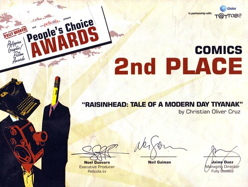
Raisinhead places 2nd at the People’s Choice Awards

This is quite old news already, and I myself am wondering why it took me a long time to post this. I have been very busy lately and in a way mentally and emotionally preoccupied with a lot of things. Yes! Raisinhead placed 2nd at the People's Choice Awards, which just proves how many friends love me, haha! But really, I thank everyone who took time to register at Pelicola.tv and vote for my baby.

Revelations 37

The awarding night was an unforgettable one - very informal, lots of yuppies (My dad felt out of place and can't stop muttering, "Puro bata naman pala rito!"), premium San Mig beers, but most especially we had Neil Gaiman grace the event. Of course, I was hoping to at least place in the top 3 in the judges' picks so I can personally spend time with Neil. But that didn't stop me from approaching him on the stage and have a little discussion. Unfortunately, my camera ran out of battery!

Congratulations to all the deserving winners, especially to Irene who placed 1st place in the People's Choice Awards and 2nd place Judges' pick! Woohoo!