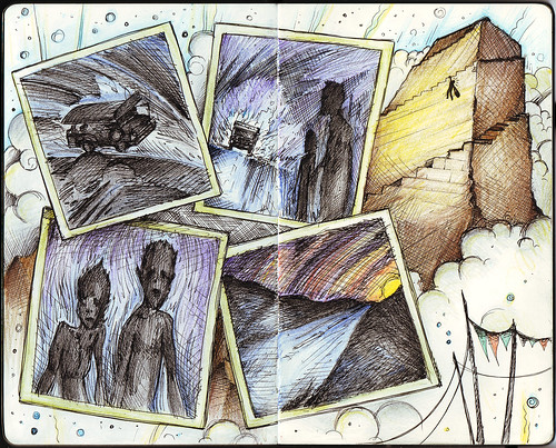
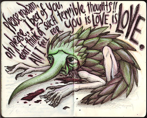
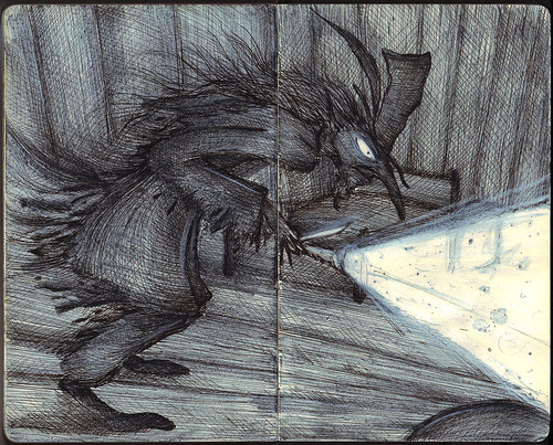
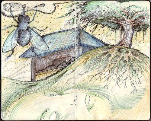
I hate nightmares. I really do.
Wednesday, December 14, 2011
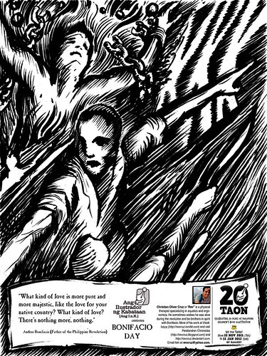
AngI.n.K. Corner: Bonifacio Day
“Bonifacio” celebrates Bonifacio Day held every November 30. Unlike other commemorative days , his is the only day where we celebrate on his birthday. The others are celebrated on their dates of death. Highly respected, but little do people know about him. Oftentimes, the limited knowledge the people know of him are already tainted with controversies and rumors. Published previously at the Manila Bulletin’s AngI.n.K. corner last November 26, 2011.
Wednesday, August 3, 2011
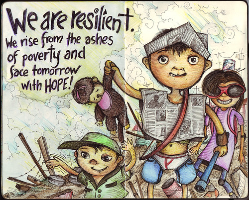
…Face Tomorrow With Hope
We are resilient. We rise from the ashes of poverty and face tomorrow with HOPE!
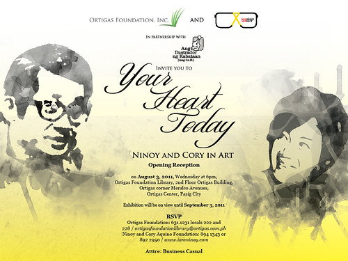
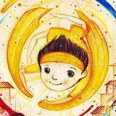
This feels like a prequel to a piece I made for “Your Heart Today: Ninoy and Cory In Art”, a joint project by Ortigas Foundation, Inc., Ninoy and Cory Aquino Foundation and Ang Ilustrador ng Kabataan (Ang I.n.K.) which will exhibit artwork renditions of select writings of Ninoy and Cory Aquino. The exhibit will be on view from August 3, 2011 to September 3, 2011 at the Ortigas Foundation Library, 2nd Floor Ortigas Building (Ortigas corner Meralco Ave.).
My piece for the exhibit entitled “Heroism Unleashed” was inspired from a quote from Essential Cory Aquino: Sustaining Stewardship of People Power:
“We need to focus on helping the individual recover his or her sense of dignity and self-worth. In other words, before we can realize strength in numbers, we must first unlock the full human potential of every Filipino trapped in the debilitating culture of poverty. Empowering the individual is akin to unleashing the nuclear energy in an atom—ultimately it energizes the entire community.”
Here’s a preview, but you’ll have to visit the exhibit to view the whole along with the other exceptional artworks of Ang I.n.K. members.
Thursday, July 28, 2011
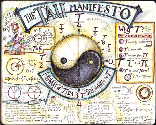
The Tau Manifesto
This is based on Michael Hartl's The Tau Manifesto which is dedicated to one of the most important numbers in mathematics, perhaps the most important: the circle constant relating the circumference of a circle to its linear dimension. For millennia, the circle has been considered the most perfect of shapes, and the circle constant captures the geometry of the circle in a single number. Of course, the traditional choice of circle constant is Pi but, as mathematician Bob Palais notes in his delightful article “Pi Is Wrong!”, Pi is wrong. It’s time to set things right." I can't remember how I came about this article, but the geek in me naturally drew me to read and understand this. And I must say, it is very convincing! Now, I realize why trigonometry seemed a little off and illogical, and I could only wish that my teachers then used tau instead of pi. Things could have been a lot easier to understand, and a lot of us could have loved math a lot more. I wished I was able to finish this Moleskine entry on June 28 which coincidentally is Tau Day!
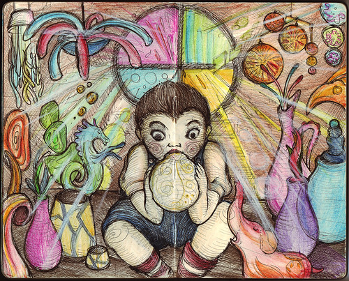
MyMoleskine and “The Glassblower’s Apprentice” (Study)
This is just a study for "The Glassblower's Apprentice,” a piece I hope to be chosen for an upcoming exhibit. I’ve always been fascinated by the magical nature of glass and the craftsmen at Murano, Italy seem to conjure magic in every piece of glassware they create. I’m still trying to figure out how to properly execute the effect of glass in a painting form. The final piece may look totally different as I try to explore various styles to execute this.
I uploaded the drawing as well to Moleskine’s MyMoleskine gallery, which they describe as “the best place where you can find and share the most beautiful creations made on a Moleskine notebook.” So if you own a Moleskine, and make art in it, that place may be a nice venue to showcase your talent.
Saturday, July 2, 2011
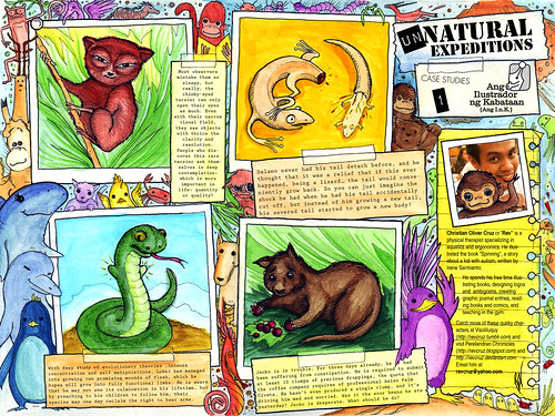
AngI.n.K. Corner: Unnatural Expeditions
"Unnatural Expeditions" features some of the characters I created for my tumblr site: Visoliluquy where I post doodles from my little drawing notebook. I try to post as much as time allows. This is also a special tribute to my colleagues at Quality Life Discoveries, who are represented here in their alter-ego animal forms. Published today at the Manila Bulletin's AngI.n.K. corner (page E-2).
AngI.n.K. Corner: A Student's Life
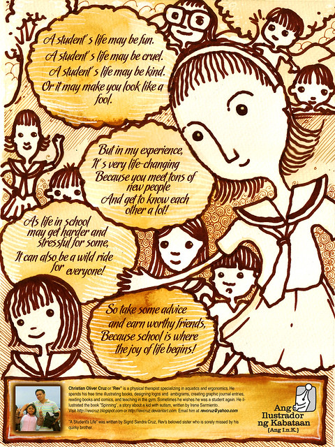
"A Student's Life" is another collaboration with my sister, Sigrid who wrote the poem for this piece. This was published in Manila Bulletin's AngI.n.K. Corner last April 16, 2011.
Sunday, May 29, 2011
Logo Design: Wolfe Landing LLC
Usual logo depictions of a wolf more often than not exude fierceness, aggression and dominance. These themes are very appropriate for sports teams and tattoos. But sometimes, the wolf image is required in a logo without necessarily portraying these themes. For instance, a logo for a real estate company or a home community, which would focus on tranquility, carefree living and comfort. In a project I recently did, I was required to develop a logo for Wolfe Landing. The specifications were very simple: I only needed to have an image of a wolf, and the name "Wolfe" and that it should have a similar feel to earlier logos I made for them (Eden Park Homes and Fairfax Park). Pressed for time, they wanted me to come up with my own design and proceed immediately with vector work. Cool! The challenge I faced in creating this logo was how to portray the wolf in a manner that focuses on the positive aspects that is appropriate for such a company: privilege, freedom, dignity and respect. I knew that I can avoid the ferocity of the wolf by entirely using curves in the graphic (notice that most other wolf logos utilizes sharp lines). I had to select a dignified posture for the head of the wolf and work the curves from there. For the text, I chose Optima as the preferred font, simple yet elegant. I provided them with variations of the same logo. And luckily, they immediately accepted this design with no revision at all!
Saturday, May 28, 2011
Logo Design: Maluka Produce
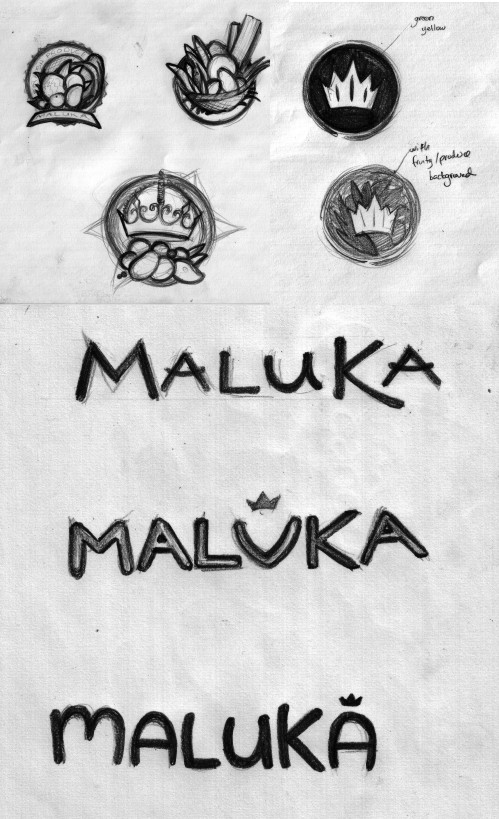
Maluka Produce is a wholesale/retail business dedicated to delivering fresh local fruit and vegetables. They are located in Noosaville, QLD (Australia) and the owners wanted a logo that was clean and industrial, matching the industrial area in which their headquarters is located. As part of my creative pitch for them, I mentioned that the logo they will be needing would look best as an icon, either simple, minimalist or detailed but nature-based. Researching on the word "MALUKA", I discovered that it meant "Queen" and/or "Flower" in some cultures and "Work of God" in others. I thought of combining these key words and infusing these in the graphic, something that evokes cornucopia (bounty) and royalty. It turned out that the name Maluka is a combination of Matt and Luke, the names of the owners (but they did appreciate the research, and it turned out, these were the things they wanted in their logo as well!). As for the text, the themes would be minimalism – evoking cleanliness, freshness and health… thin, clean lines; or whimsy – evoking bountiful, freshness, wealth… thick, curvy, nature, wavy lines and modernism – evoking relevance, cleanliness, modern… thick, power, industrial lines. I provided them with these initial sketches:
Among these, they wanted to go with the minimalist stamp approach. I then proceeded with vector work, providing them with numerous options for the icon, among which they selected to develop the "leaf" concept.
As can be seen above, the developments included revisions in design elements (removing unnecessary embellishments and maintaining simplicity and minimalism in the icon) and color. Ultimately, the final design was reached and packaged to fit their needs. Maluka Produce is in www.malukaproduce.com and Facebook: Maluka Produce . All the fresh and healthy fruits in their store now has made me hungry…
Sunday, May 22, 2011
Murakamiesque 5
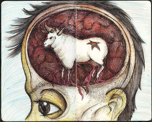
Inspired from Haruki Murakami's "A Wild Sheep Chase", a story about a man's unusual adventure that leads him on a hunt for a mysterious sheep that seems to have powers to control the world. It is filled with quirky characters including a girl with magically seductive ears (that can increase the quality of sex a thousand-fold! woah!), a strange man that wears sheep clothing and many more.
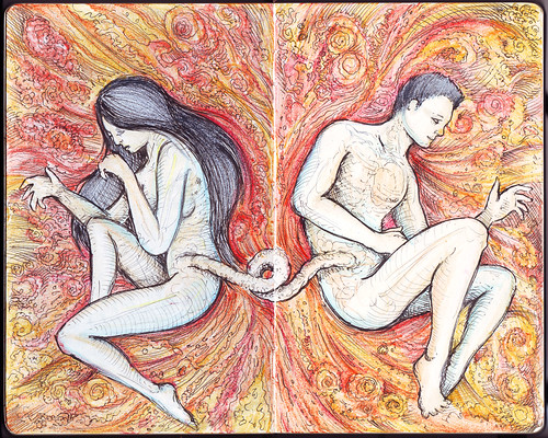
Aristophanes and Eleven Minutes
If you like Paulo Coelho and is quite familiar with most of his works, then it will be very easy for you to say that his novel Eleven Minutes comes as a unique story. First of all, Coelho apologizes in the preface saying that the theme of the book might be too "harsh, difficult and shocking". The book talks about sex, true love and passion but through the eyes of a young prostitute named Maria. We follow her journey in looking for true love even in the context of her unusual profession. The title actually is based on her observation that it only takes on average eleven minutes for the whole sex act to transpire.
There are many interesting moments in the book, but one of these that I loved is when Ralf, one of Maria's lovers, explains why one person always seems to seek the love of another, seeking a sense of fulfillment and oneness:
"According to him [Plato], at the beginning of creation, men and women were not as they are now; there was just one being, who was rather short, with a body and a neck, but his head had two faces, looking in different directions. It was as if two creatures had been glued back to back, with two sets of sex organs, four legs and four arms.
"The Greek gods, however, were jealous, because this creature with four arms work harder; with its two faces, it was always vigilant and could not be taken by surprise; and its four legs meant that it could stand or walk for long periods at a time without tiring. Even more dangerous was the fact that the creature had two different sets of sex organs and so needed no one else in order to continue reproducing.
"Zeus, the supreme lord of Olympus, said: 'I have a plan to make these mortals lose some of their strength.'
"And he cut the creature in two with a lightning bolt, thus creating man and woman. This greatly increased the population of the world, and, at the same time, disoriented and weakened its inhabitants, because now they had to search for their lost half and embrace it and, in that embrace, regain their former strength, their ability to avoid betrayal and the stamina to walk for long periods of time and to withstand hard work. That embrace in which the two bodies re-fuse to become one again is what we call sex."
- Ralf Hart (from Paulo Coelho's Eleven Minutes)
This is actually derived from Aristophanes' Speech in Plato's Symposium where various philosophers debate about the nature of Love and human interaction. Here is a video featuring the whole speech.
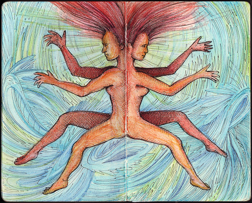
The art I made above features the mythical creature (the proto-man) rendered in a more human (rather than the egg shaped creature in the animation) approach. After I drew this (initially in my Monologue notebook), I realized how it serves as a reversal of an earlier Moleskine spread I made. Thus, I went along with the reversal, using colors similar to the earlier version.
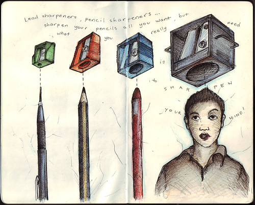
Sharpener
Lead sharpeners, pencil sharpeners… sharpen your pencils all you want, but what you really need is to sharpen your mind.
Thursday, April 7, 2011
The Duhat Tree
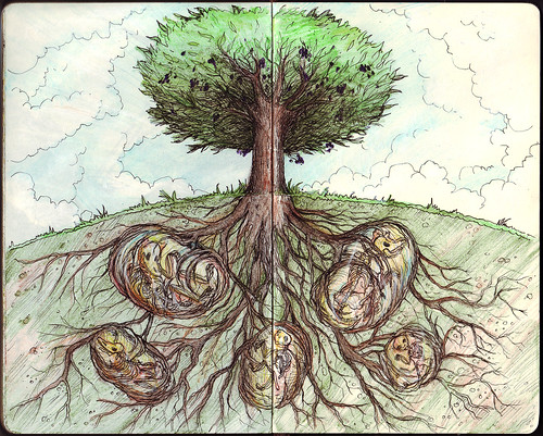
Every year our house is blessed with an abundant supply of giant duhat (java plum). Never has our duhat tree failed to produce extremely sweet and dark pulpy fruits. I often wondered how could such a small tree create an overflowing amount of fruits! And not just quantity, but the quality is so excellent you can swear it tastes better than any market can sell. My dad gave me an explanation, but it was never direct. He just told me, "Ever wondered where I buried all our pets who died?" I remembered all the dogs and cats we cried over when the life left them, but we never asked our dad where he buried their bodies. I look at the duhat tree and from the trunk I trained my eyes to the ground, and though I couldn't actually see what's under, I imagined the roots trailing deep under and around the corpses of our pets long gone. It's almost sacrificial in the manner that the bodies each root has taken hold of has given life to the tree and the seasons of bounty it has endured. I eat the duhat fruit as a tribute to each of the pet our family has loved and taken care of.
Sunday, March 13, 2011
Logo Design: The Cheer-Up Squad

I love creating logos that just by looking at them, you can't help but smile. I recently made this logo for an organization, and this logo literally has a smile in it. The organization is called 'The Cheer up Squad' and they are a professional team of dedicated members that go around visiting the sick and elderly, cheering them up in all kinds of amazing ways. They wanted something colorful and playful with character but it should remain classy and very professional. Based on experience, the look of a logo like this can either look creative or silly, and there's a fine thin line between the two.
As I often do when I start creative projects like this, I presented the client with at least three initial concepts (colored versions using marker pens). The image below shows the sketches on the left, and the corresponding digital version on the right. It is quite evident in all versions that I have become fixated with the use of the smile, conveniently converting the letter "u" into a graphic of a smile.

The client was very happy with all versions but decided to go with the top orange version (which I personally liked as well). She suggested creating variations of the graphic by playing a bit with the smiling face, perhaps adding a hat or face element; or creating some flourishes with the text elements.

They all looked good, but compared to the original version, they all looked overly designed (and perhaps, as I said before, silly). The smile and the eyes seemed enough to convey the cheerful attitude they aim to portray, and the professionalism and respect they wanted as well.


Stay Strong Japan!
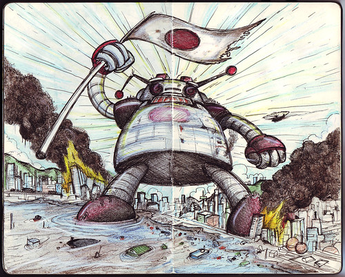
Stay strong Japan!
I originally drew this for my Visoliloquy series, and can be found here: Visoliloquy: Stay Strong Japan! Seeing the breath-taking images of the aftermath of possibly the worst earthquake and tsunami combo that rocked Japan somehow made me reminisce of childhood mecha and anime cartoons I grew up with. It's quite unsettling to witness such devastation which I only relegated to the realm of animated imagination. Japan may not have the gigantic robots to protect and save them from this tragedy, but the real spirit of fortitude and unity is very much alive in their people and the rest of the world.
Sunday, February 27, 2011
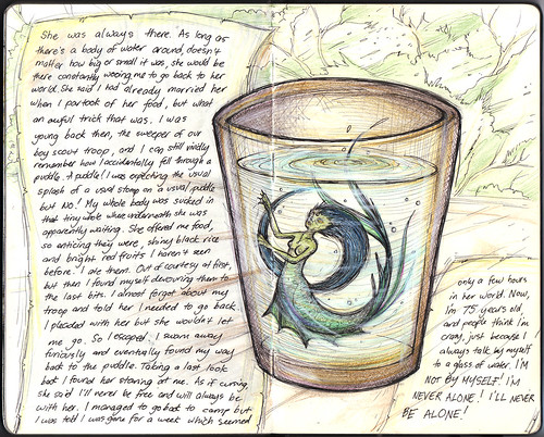
Never Alone
"She was always there. As long as there's a body of water around, doesn't matter how big or small it was, she would be there constantly wooing me to go back to her world. She said I had already married her when I partook of her food, but what an awful trick that was. I was young back then, the sweeper of our boy scout troop, and I can still vividly remember how I accidentally fell through a puddle. A puddle! I was expecting the usual splash of a usual stomp on a usual puddle but no! My whole body was sucked in that tiny hole where underneath she was apparently waiting. She offered me food, so enticing they were, shiny black rice and bright red fruits I haven't seen before. I ate them. Out of courtesy at first, but then I found myself devouring them to the last bits. I almost forgot about my troop and told her I needed to go back. I pleaded with her but she wouldn't let me go. So I escaped. I swam away furiously and eventually found my way back to the puddle. Taking a last look back I found her staring at me. As if cursing, she said I'll never be free and will always be with her. I managed to go back to camp but I was told I was gone for a week which seemed only a few hours in her world. Now I'm 75 years old, and people think I'm crazy, just because I always talk by myself to a glass of water. I'm not by myself! I'm never alone! I'll never be alone!"
Just a recounting of the story of one of the elders I interviewed at Mt. Banahaw a long time ago. I myself thought he was nuts. But who am I to say so. I remember an aunt of mine telling me an old relative who was similarly courted by a sirena, and my folks inform me as well that I had a duwende as a playmate when I was a kid. Hmmm…
This was initially drawn in my Visoliliquy series at http://revcruz.tumblr.com as a character. Here is its iteration in my Moleskine notebook.
Logo Design: Activiteens

I made this logo for an exclusive upper class after school club for teenage girls. They organize activities ranging from drama, music, IT and many more. They wanted a new logo that was colorful but very professional. It must be very classical to reflect their clientele yet still have an element of excitement. The logo should have character to it, something different and attractive so they could use this as a powerful marketing tool. They specifically did not want any figures of girls in the logo but don't mind abstract vector faces.

These were my initial drafts, and for some of these drawings, I actually did not follow the specifications of the client (no figures of girls) but thought of presenting what it would look like if it did have these figures. Sometimes, if I feel strong about an idea even if the client was very specific, I would go ahead and present these as exploratory ideas.
It turned out they liked the versions with the figures. The design process involved combining elements from each draft concepts until we reached the final design.

For logo concepts and designs, illustration and other graphic design needs, you may contact me at revcruz@yahoo.com .
Thursday, February 24, 2011
Murakamiesque 4
Inspired from Murakami's The Little Green Monster, a story about a woman who finds how irresistible she is to a small green monster that burrowed through her garden. I really felt sorry for the creature and made me wonder who the real monster in the story was.
I started drawing this as a character in my Visoliloquy series at http://revcruz.tumblr.com, but realized I should feature it in my Moleskine as well.
Wednesday, February 23, 2011
Murakamiesque 3
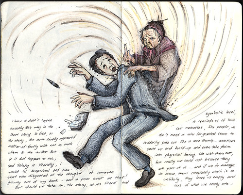
I know it didn't happen exactly this way in the short story. In fact, in the story, the aunt simply appeared – matter-of-factly – with not so much as an alarm to the author. But if it did happen to me, and taking it literally, I would be surprised and somewhat disgusted at the thought of someone growing out of my back – and a poor aunt at that! Should we take the story either its literal or symbolic level, it reminds us of how our memories, like people, we don't need or take for granted suddenly poke out like a sore thumb… emotions that pent up… build up and even take its form into a physical being. We wish them out of our lives but really we could not do it ever because they are a part of us… and if we do manage to erase them completely which is so unlikely, they leave us empty and less of who we really are…
Sunday, February 20, 2011
Murakamiesque 2
Inspired from another Murakami masterpiece, this time from a novel… ""I had no idea if what I was thinking was right or wrong, but I knew that as long as I was here, I had to defeat this thing. This was the war that I would have to fight."
The initial reviews for the preview of its stage production is so intriguing… "Imagine watching a David Lynch film on stage." (City Arts New York)
Sunday, February 13, 2011
Murakamiesque
I've been reading a lot of Murakami's works lately, interspersing between his novels and collections of short stories. It may not come as a surprise that some of his ideas may seep into one's consciousness and/or imagination, just as situations in his stories seem to thin out the line between reality and dream. The imagery created by his works are said to be unique to the medium, and may derive a variety of different emotions and interpretations from its readers. Despite having had some of his works turned into film adaptations (I've already seen the Ichikawa "Tony Takitani" and Logevall's "All God's Children Can Dance", but have yet to see Anh Hung Tran's "Norwegian Wood") and upcoming theatrical presentations ("Wind-Up Bird Chronicle"), interpreting them poses a unique challenge. I can't help making some illustrations while I was reading his books and I must say my drawings will never do justice to his story, but I'll post some of them in succeeding posts, as a sort of mini-game for Murakami fans out there.
Now try to guess which story the above drawing is inspired from. It's a dead giveaway actually. (By the way, this happens to be my first Moleskine drawing for the year… I've been very busy. Plus, I might have very interesting Moleskine related-news soon.)
Here's the original drawing I made, and that in itself is a clue.

Wednesday, February 2, 2011
Logo Design: Zengu
Tengus are mythical creatures found in Japanese culture and are believed to be protective spirits or deities according to recent Buddhist lore. In one of my recent projects, the tengu served as reference for the logo of Zengu. The name of the company is actually a wordplay on tengu and Zen, and for my initial drafts, concepts started from literal representations of the tengu, which by the way are often depicted as a combination of bird and man, to abstract icons, leaning more on the minimalist zen aspect of their image.

The client was initially attracted to the icon versions, and revisions were made until the following image was reached.

Sometimes, the design process turns around in an entirely new direction, especially when dealing with clients which involves a committee deciding on the approval of the logo. My concept was entirely rejected and I ended up developing and refining a concept they developed on their own. Apparently, they chose a more classical direction for their logo. In the end, I basically enhanced their logo by sharpening their crane image and cleaning up the font to make it more legible.

It may be a little disappointing to have my proposals rejected, but thinking about it, the client knows what's best for their company and how they should be represented. But as an artist, I think was still able to infuse something of my own in the final work. In designing a logo, there is always balance between what you and the client wants. Some clients are more controlling of the process, while others would give free rein to the designer. It's part of the job to find that balance point, and simply flow wherever the design process takes you for optimum results.
For logo concepts and designs, illustration and other graphic design needs, you may contact me at revcruz@yahoo.com .
Wednesday, January 12, 2011
Evolution of a Bunny Drawing
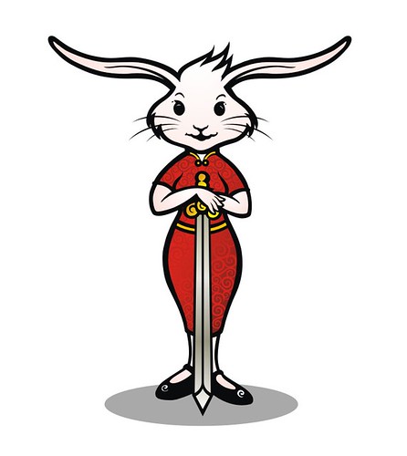
It's the year of the rabbit, and browsing through the set of commissioned works I finished last year, I thought of featuring one that fits the New Year. Just to show, how painstaking it could get to capture what the client wants. I was asked to create an illustration version of a Chinese name which quite closely resembles a rabbit holding a sword. It took numerous revisions…
Until we settled in the final colored design. Happy New Year to everyone!
Wednesday, January 5, 2011
Paranormal Philippines v2: Prints are now available!
It's been a slow work in progress but I've finally completed re-drawing Paranormal Philippines! No drastic changes, I just made the lines clearer and sharper, the text parts more readable so it can still be clear even when blown up to a 30" x 45" inch print! I've been receiving numerous requests through my DeviantArt account to have the original Paranormal Philippines ready as a print. So I used this opportunity to update the artwork, so it will be pretty to look in full map size. A full-size map of the Philippines featuring our favorite Filipino mythological creatures! And I prepared it in two versions, black print on ancient parchment paper, and white on black. Just head on to http://revcruz.deviantart.com , select the map you prefer and click "Buy as Print". You'll notice it's available on different formats, from greeting cards to puzzles and mugs and lots more!
I understand that there's a bigger demand to have this on T-shirt. Frankly, I've seen this printed on shirts without my permission (apparently, they used the picture grabbed from the internet). I wonder who those motherf*$#ers are. They don't look pretty and the print is just to blurry for you to make out the details. Take note, that Paranormal Philippines is copyrighted and is protected by the law! *grins* Well, there already exists real Paranormal Philippines shirts, and I've been wearing the prototypes (dark grey print on grey shirt, as below; silver on black, white on black) for quite some time now. What prevents me from releasing it yet is that I am still not satisfied with the print. I'm still looking for a shirt printer who can execute the design perfectly. So for those who have been waiting, sorry, you will still have to wait for the official shirt. But I assure you, it will come out and when it does, it will be perfect!
