Monday, August 25, 2008

De Quervain...

2008-08-21

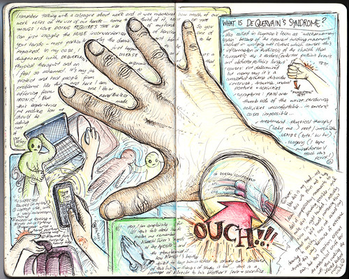
I remember talking with a colleague about the things required in our line of work and we ended up claiming that our hands are our most valuable tool. Come to think of it, almost EVERYTHING I love doing requires the use of hands. So, just imagine the inconvenience of having an impaired hand, rendering it almost useless because of pain! Yes, I've been nursing a severe case of De Quervain's Syndrome for more than 2 months now, and there was a week where the pain was so intense I couldn't do anything at all! It's so ironic that as a physiotherapist and ergonomist by profession that I would have one. It is my job to protect and heal people from such problems, and here I am afflicted with one. Well, a lot contributed to this... work (handling patients in and out of the water with unusual hand positions), trauma (I carry a heavy bag to work) and abusive thumb movements during cellphone, mouse and laptop use. In fact, I drew this page entry with pain in my hand... my left hand modeled as my affected right arm drew). Funny, how we can be our worse patients. But I'm greatly relieved it's healing now.

Brought a lot of reflections... such as the story of Abrecht Durer's "Hands of the Apostle" and how it came to be...

Back in the fifteenth century, in a tiny village near Nuremberg, lived a family with eighteen children. Eighteen!

In order merely to keep food on the table for this big family, the father and head of the household, a goldsmith by profession, worked almost eighteen hours a day at his trade and any other paying chore he could find in the neighbourhood.

Despite their seemingly hopeless condition, two of Albrecht Durer the Elder's children had a dream. They both wanted to pursue their talent for art, but they knew full well that their father would never be financially able to send either of them to Nuremberg to study at the Academy.

After many long discussions at night in their crowded bed, the two boys finally worked out a pact. They would toss a coin. The loser would go down into the nearby mines and, with his earnings, support his brother while he attended the academy. Then, when that brother who won the toss completed his studies, in four years, he would support the other brother at the academy, either with sales of his artwork or, if necessary, also by labouring in the mines.

They tossed a coin on a Sunday morning after church. Albrecht Durer won the toss and went off to Nuremberg.

Albert went down into the dangerous mines and, for the next four years, financed his brother, whose work at the academy was almost an immediate sensation. Albrecht's etchings, his woodcuts, and his oils were far better than those of most of his professors, and by the time he graduated, he was beginning to earn considerable fees for his commissioned works.

When the young artist returned to his village, the Durer family held a festive dinner on their lawn to celebrate Albrecht's triumphant homecoming. After a long and memorable meal, punctuated with music and laughter, Albrecht rose from his honoured position at the head of the table to drink a toast to his beloved brother for the years of sacrifice that had enabled Albrecht to fulfil his ambition. His closing words were, "And now, Albert, blessed brother of mine, now it is your turn. Now you can go to Nuremberg to pursue your dream, and I will take care of you."

All heads turned in eager expectation to the far end of the table where Albert sat, tears streaming down his pale face, shaking his lowered head from side to side while he sobbed and repeated, over and over, "No ...no ...no ...no."

Finally, Albert rose and wiped the tears from his cheeks. He glanced down the long table at the faces he loved, and then, holding his hands close to his right cheek, he said softly, "No, brother. I cannot go to Nuremberg. It is too late for me. Look ... look what four years in the mines have done to my hands! The bones in every finger have been smashed at least once, and lately I have been suffering from arthritis so badly in my right hand that I cannot even hold a glass to return your toast, much less make delicate lines on parchment or canvas with a pen or a brush. No, brother ... for me it is too late."

More than 450 years have passed. By now, Albrecht Durer's hundreds of masterful portraits, pen and silver point sketches, water-colours, charcoals, woodcuts, and copper engravings hang in every great museum in the world, but the odds are great that you, like most people, are familiar with only one of Albrecht Durer's works. More than merely being familiar with it, you very well may have a reproduction hanging in your home or office.

One day, to pay homage to Albert for all that he had sacrificed, Albrecht Durer painstakingly drew his brother's abused hands with palms together and thin fingers stretched skyward. He called his powerful drawing simply "Hands," but the entire world almost immediately opened their hearts to his great masterpiece and renamed his tribute of love "The Praying Hands."

...a story of love and sacrifice... Come to think of it, what if we truly lost the use of our hands?

Monday, August 18, 2008

Logo Design: Flex-3 Fitness Product

I recently designed the logo that will be considered for a new fitness product, the "Flex-3" which stretches and tones the muscles and joints of the shoulder girdle, chest and upper back to improve flexibility and strength, decrease pain and improve posture. The device helps golfers improve their drive and overall game and practically "unleashes their A-Game." In a therapeutic setting, it helps patients with slumped posture, pain and stressed-out muscles in the upper back and shoulders, as well as pain and tingling down the arms and hands. A session takes only 3 minutes and greatly improves shoulder girdle flexibility and tone, hence giving it the name "Flex-3". John F. Carlucci, D.C., chiropractor and owner of a physical rehabilitation facility in New Jersey developed and patented the Flex-3 device. He wanted a logo to represent the product.

The product goes with the tagline "Super Flexibility in Just 3 Minutes." Specifications stated that fonts, graphics and style must be dynamic yet professional since it will be directed at financially and educationally upscale golfers and medical professionals. Some sort of stylized or abstract human figure can be incorporated into the Flex-3 logo text that communicates upper body flexibility, dynamism, vibrancy and life. John wanted the logo to be so visually striking and instantly compelling that when people see it on a T-shirt, golf hat or ad they think "that REALLY looks cool, what's that about?"

Initial ideas consisted of integrating a human figure within the text, and the most obvious way to do that is to replace the "X" with a human figure. I suppose this approach has been done in innumerable designs in various configurations, so this version should somehow be unique. Since the product emphasizes on flexibility, I decided to separate the human figure in two components, with each one using different colors. The two components met at each other's point, forming the apex or the joint of the figure. I think this suggested movement even though it is essentially a static figure.

Adding in the text, using a modified Microgamma typeface (connected capital "F" and "L", with a small "e", of the same height) and a dynamic "3" (using Scope-3, a typeface I developed), I completed the initial proposed logo. Since the "X" was the main focus, I made sure it was exactly in the center of the whole logo, adjusting the rest of the text to make it balanced. I made an enclosure that "bent" inwards, further placing focus on the human figure.

John commented that I tone down the "3", the same font as the rest. In a way, the "3" seemed too loud, taking away the attention from the "X".

The frame used before seemed to penetrate into the logo (the logo has to float on top of this frame), thus decreasing its legibility. I devised another frame that provided an ample enclosure, and with its design, also suggested "flexion".

After providing multiple color options, the final design was eventually accomplished and released.

The logo can now be seen in use at their website at Flex-3, Inc., and a video of the actual product can be seen below.

Saturday, August 16, 2008

Logo Design: Dale Tu Photography

Dale Tu was looking for a simple and elegant logo for the official website he's creating and business material for Dale Tu Photography. As in most photography studio logos, it should be simple but elegant, something that can work simply in black and white and can look good on both black and white backgrounds. He particularly likes the signature style or simple geometry or brush style as can be seen in some logos he actually likes.

The logo directly above was actually made by Dale himself. I tried to develop something from his creation, since I sensed he wanted a mark that would represent not just his initials but the craft itself, something that would be unique and would set it apart from other photography studio logos. I focused on creating a symbol. After a series of attempts (with a tablet using the brush tool in Adobe Illustrator), I finally made a mark that I think is able to represent a subtle "d" and a subtle "t". I wanted it also to suggest certain images… a subtle face... a subtle sensual human figure.

I then added the necessary text to match the evoked elegance of the mark.

Here's the final version.

Thursday, August 14, 2008

Quality Life Discoveries: Inauguration Day

Quality Life Discoveries was recently inaugurated last July 19, 2008. Attended by families, friends and representatives from various sectors of the medical/paramedical fields, the event was initiated by a Eucharistic celebration led by Fr. Anderson Monteiro de Rezende, FDP and Fr. Eugene Castilla. This was followed by a ribbon-cutting ceremony and blessing of the center facilities. Welcome remarks were given by Ma. Theresa Mariano of Social Services Development Department of the Quezon City Government (in behalf of the Honorable Mayor Feliciano Belmonte) citing the need to provide quality services to the residents of the city, especially to those who are underprivileged. Mary Ann Cua, managing director of Quality Life Discoveries then gave a moving speech recounting her son Jared's ordeal with cerebral palsy, emphasizing the challenges faced while undergoing various treatments and therapies around the world. She also shared events inspiring her to establish a center which aims to provide fellow Filipinos access to quality services which was only available abroad before. A brief lecture about the status of leading pediatric conditions such as Cerebral Palsy, Down's Syndrome, Autism and ADHD in the Philippines was offered by Dr. Francis Xavier Dimalanta, one of the country's leading developmental pediatricians. The clinical director of Quality Life Discoveries, Christian Oliver Cruz, then gave a presentation of the various programs of the center and how these may provide solutions for its clientele. An open-house during the afternoon gave the guests and visitors a glimpse of the center's outstanding facilities and an understanding of its many programs and services. All in all, the inauguration was a success, a perfect landmark event commemorating the 30th National Disability Prevention and Rehabilitation Week.