Sunday, May 29, 2011

Logo Design: Wolfe Landing LLC

WolfeLandingv2

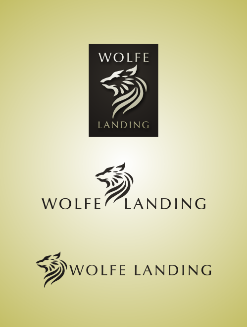
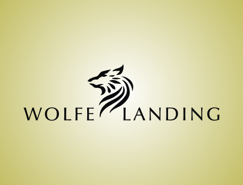
Usual logo depictions of a wolf more often than not exude fierceness, aggression and dominance. These themes are very appropriate for sports teams and tattoos. But sometimes, the wolf image is required in a logo without necessarily portraying these themes. For instance, a logo for a real estate company or a home community, which would focus on tranquility, carefree living and comfort. In a project I recently did, I was required to develop a logo for Wolfe Landing. The specifications were very simple: I only needed to have an image of a wolf, and the name "Wolfe" and that it should have a similar feel to earlier logos I made for them (Eden Park Homes and Fairfax Park). Pressed for time, they wanted me to come up with my own design and proceed immediately with vector work. Cool! The challenge I faced in creating this logo was how to portray the wolf in a manner that focuses on the positive aspects that is appropriate for such a company: privilege, freedom, dignity and respect. I knew that I can avoid the ferocity of the wolf by entirely using curves in the graphic (notice that most other wolf logos utilizes sharp lines). I had to select a dignified posture for the head of the wolf and work the curves from there. For the text, I chose Optima as the preferred font, simple yet elegant. I provided them with variations of the same logo. And luckily, they immediately accepted this design with no revision at all!

WolfeLandingv3

Saturday, May 28, 2011

Logo Design: Maluka Produce

Maluka Produce

Maluka Produce is a wholesale/retail business dedicated to delivering fresh local fruit and vegetables. They are located in Noosaville, QLD (Australia) and the owners wanted a logo that was clean and industrial, matching the industrial area in which their headquarters is located. As part of my creative pitch for them, I mentioned that the logo they will be needing would look best as an icon, either simple, minimalist or detailed but nature-based. Researching on the word "MALUKA", I discovered that it meant "Queen" and/or "Flower" in some cultures and "Work of God" in others. I thought of combining these key words and infusing these in the graphic, something that evokes cornucopia (bounty) and royalty. It turned out that the name Maluka is a combination of Matt and Luke, the names of the owners (but they did appreciate the research, and it turned out, these were the things they wanted in their logo as well!). As for the text, the themes would be minimalism – evoking cleanliness, freshness and health… thin, clean lines; or whimsy – evoking bountiful, freshness, wealth… thick, curvy, nature, wavy lines and modernism – evoking relevance, cleanliness, modern… thick, power, industrial lines. I provided them with these initial sketches:

MalukaEvolve1

Among these, they wanted to go with the minimalist stamp approach. I then proceeded with vector work, providing them with numerous options for the icon, among which they selected to develop the "leaf" concept.

MalukaEvolve2

As can be seen above, the developments included revisions in design elements (removing unnecessary embellishments and maintaining simplicity and minimalism in the icon) and color. Ultimately, the final design was reached and packaged to fit their needs. Maluka Produce is in www.malukaproduce.com and Facebook: Maluka Produce . All the fresh and healthy fruits in their store now has made me hungry…

Sunday, May 22, 2011

Murakamiesque 5

2011-05-21

Inspired from Haruki Murakami's "A Wild Sheep Chase", a story about a man's unusual adventure that leads him on a hunt for a mysterious sheep that seems to have powers to control the world. It is filled with quirky characters including a girl with magically seductive ears (that can increase the quality of sex a thousand-fold! woah!), a strange man that wears sheep clothing and many more.

Aristophanes and Eleven Minutes

2011-05-06

If you like Paulo Coelho and is quite familiar with most of his works, then it will be very easy for you to say that his novel Eleven Minutes comes as a unique story. First of all, Coelho apologizes in the preface saying that the theme of the book might be too "harsh, difficult and shocking". The book talks about sex, true love and passion but through the eyes of a young prostitute named Maria. We follow her journey in looking for true love even in the context of her unusual profession. The title actually is based on her observation that it only takes on average eleven minutes for the whole sex act to transpire.

There are many interesting moments in the book, but one of these that I loved is when Ralf, one of Maria's lovers, explains why one person always seems to seek the love of another, seeking a sense of fulfillment and oneness:

"According to him [Plato], at the beginning of creation, men and women were not as they are now; there was just one being, who was rather short, with a body and a neck, but his head had two faces, looking in different directions. It was as if two creatures had been glued back to back, with two sets of sex organs, four legs and four arms.

"The Greek gods, however, were jealous, because this creature with four arms work harder; with its two faces, it was always vigilant and could not be taken by surprise; and its four legs meant that it could stand or walk for long periods at a time without tiring. Even more dangerous was the fact that the creature had two different sets of sex organs and so needed no one else in order to continue reproducing.

"Zeus, the supreme lord of Olympus, said: 'I have a plan to make these mortals lose some of their strength.'

"And he cut the creature in two with a lightning bolt, thus creating man and woman. This greatly increased the population of the world, and, at the same time, disoriented and weakened its inhabitants, because now they had to search for their lost half and embrace it and, in that embrace, regain their former strength, their ability to avoid betrayal and the stamina to walk for long periods of time and to withstand hard work. That embrace in which the two bodies re-fuse to become one again is what we call sex."

- Ralf Hart (from Paulo Coelho's Eleven Minutes)

This is actually derived from Aristophanes' Speech in Plato's Symposium where various philosophers debate about the nature of Love and human interaction. Here is a video featuring the whole speech.

The art I made above features the mythical creature (the proto-man) rendered in a more human (rather than the egg shaped creature in the animation) approach. After I drew this (initially in my Monologue notebook), I realized how it serves as a reversal of an earlier Moleskine spread I made. Thus, I went along with the reversal, using colors similar to the earlier version.

2008-11-01

Sharpener

2011-04-24

Lead sharpeners, pencil sharpeners… sharpen your pencils all you want, but what you really need is to sharpen your mind.