
Kyary Pamyu Pamyu
This year will be the University of the Philippines Manila College of Allied Medical Profession’s (UPM-CAMP) 50th Anniversary. CAMP has undergone dramatic changes from the time of its establishment in 1962 to what it is today. After 50 years since its founding, its pursuit of academic excellence and its dedication to serve the Filipino people have been the guiding pillars of the School. These goals shaped the School as one of the premier institutions in the country that offers degree programs in the professions of Occupational Therapy (OT), Physical Therapy (PT), and Speech Pathology (SP) and post-graduate programs like MRS, MRS-SP, MClinAud and MPT. And just recently, the college has finally found a new home in its own building.
As a graduate and having been a faculty member for 10 years, CAMP has been a very important part of my life. I am so indebted for the all the wonderful memories, uplifting knowledge, skills and experiences. One cannot deny that the most amazing people of the country belong and were produced by this college. Sure it is something to be called a graduate of CAMP (considering how tough it is to graduate) but where else can find a college that respects each of its constituent for everything you are, molding you not only to become the best OT, PT or SP, but allowing you to grow with your other talents as well (singer, writer or artist, or whatever unconventional skill you might have). So it was with great pleasure for me to create the seal of CAMP, and this time, to design the commemorative logo of CAMP’s golden anniversary.
Dean Cabatan sent me all the necessary information I need to work with. The theme is: “CAMP @50: Aiming Higher -- toward greater relevance and stronger leadership”. The seal and the whole text should be included in the whole logo set. One of the informal guidelines I have when creating a commemorative logo is that it should look good enough for you to wear it. And of course, when you wear a logo, it should be flashy enough for people to notice you and easy enough to identify with the message.
I wanted “50” to be the main highlight of the whole design, incorporating the graphical elements within its outline. Celebration was what I have in mind, and though the drawing looks random, each swirl and swoosh represents an aspect of the chosen theme. I had to keep it simple as well to facilitate printing in all forms.
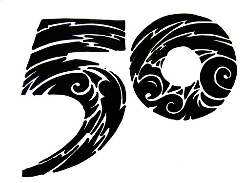
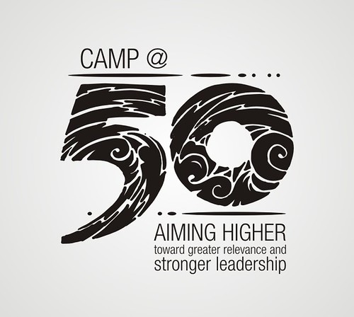
The CAMP seal will be conveniently placed inside the “0” and the text are placed around in simple but elegant NeueHelvetica font.
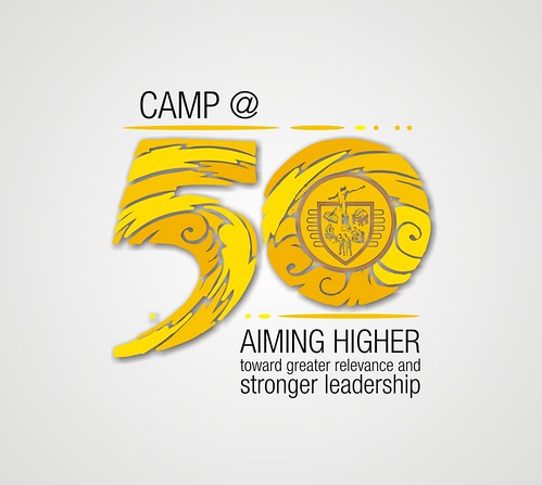
Of course, gold is the theme color, so I used different shades of yellow and orange in the logo. Good enough to wear?
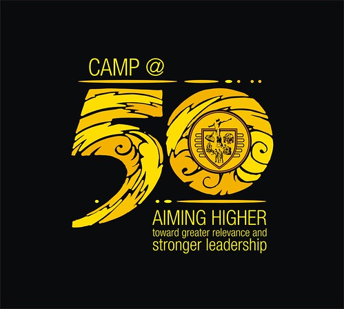
Here is how the logo might look like in shirt form (I soooo hope CAMP has the budget to make these shirts):

Happy 50 years CAMP!
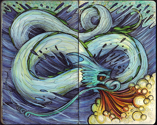
"Water has a calming effect on the Dragon's fearless temperament. Water allows the Dragon to re-direct its enthusiasm, and makes him more perceptive of others. These Dragons are better equipped to take a step back to re-evaluate a situation because they understand the art of patience and do not desire the spotlight like other Dragons. Therefore, they make smart decisions and are able to see eye-to-eye with other people. However, their actions can go wrong if they do not research or if they do not finish one project before starting another."
Gong Xi Fa Cai / Gong Hey Fat Choy!
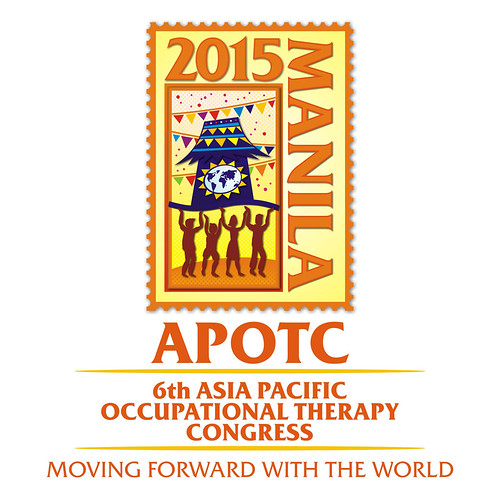
The Occupational Therapy Association of the Philippines, Inc. (OTAP, Inc.) will be celebrating its 50th anniversary in 2015 and to commemorate this milestone, the OTAP would like to have the honor of hosting the 2015 Asia Pacific Occupational Therapy Conference and the Asia Pacific Occupational Therapy Regional Group Meeting. In their words, “It would be a fitting way, not only for the OTAP to celebrate with the world, but more importantly, to share with the world the unique brand of Filipino occupational therapy." I was asked by the organization to create a logo to accompany their bid for the 6th APOTC Congress.
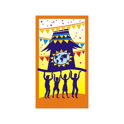
“Moving Forward with the World” is the slogan they chose and wanted to focus on the Bayanihan spirit that Filipinos are known for. They came up with an idea to use a stylized bahay kubo with four people at each corner carrying the bahay kubo. Bandaritas need to be used in the logo since we will be using this in our booth in Chiangmai. They sent me a sketch to explain further how they want the logo to look like.

Now, this was a rush job since they were pressed with time to come up with the necessary documents and media for the event, so any form of direction is truly appreciated. However, the theme is in a way difficult to execute, without making it look too traditional. And since the instructions were pretty focused, I am required to include specific graphical elements in the logo: bahay kubo, 4 people and bandaritas. The challenge is how to keep the logo look uncluttered even if it will be full of details.
I worked on developing their concept, but instead of approaching it in 3D (as their sketch suggested), I invested on fitting all the elements within a tile. This will be the main graphical tile where the other elements of the logo will be based on.
I used this tile within "15" (which was a mistake, since I thought then it was the 15th Congress. It was the 6th to be held on year 2015) and played around with some text.
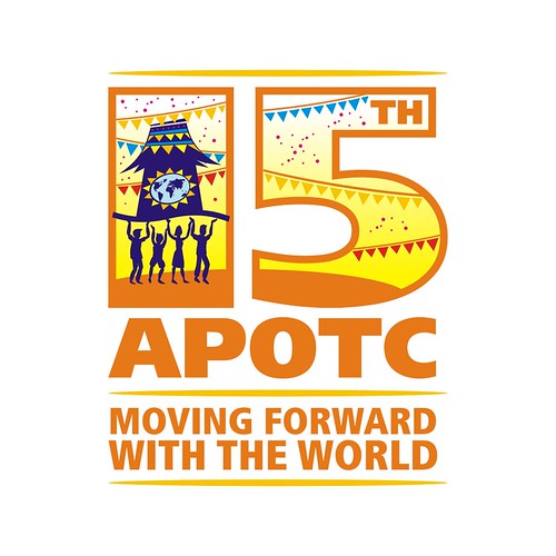
I still had enough time to enhance the logo, so I added highlights and effects (such as the basket weave background, drop shadows and gradients), and framed this within a stamp. I imagined it would be cool to have the logo packaged in a vintage looking stamp, where all merchandise bearing this stamp. Old Manila style.
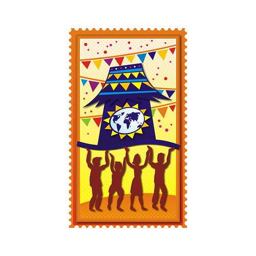
Here is the final logo.

Unfortunately, the organization’s bid didn’t make it. But I heard that the Philippine delegation put up quite a fight against the winning country. It’s just a matter of time when APOTC will realize this: “Occupational Therapy. It’s more fun in the Philippines!”
Radiate Inc. is an upcoming media company that will focus on film production and photography. Still in its beginning stages, the company needed a preliminary logo that they can work with. I was given much freedom with regards to its design, but basically they wanted it to be simple and relevant.
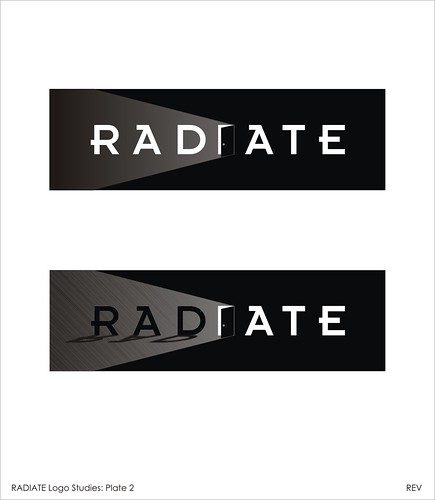
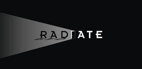
The first thing that comes to mind when one thinks of the word “RADIATE” is light. Sources of light, such as the sun, a light bulb, a candle, a firefly are all examples of what could be ideal graphical themes for the company’s logo. However, almost every company that has a name with references to light has a logo with different variations of these, tucked within a convenient frame or cleverly positioned over a letter. I wanted to offer something unique for this company. I came up with three initial concepts, after selecting a unique font which I think represents creativity and modern innovation. The first is a play on the negative spaces of the letters. Luckily, the central letter of the word RADIATE is the letter I, a very dynamic letter which can be modified to form a graphic. Since, I wanted to avoid using the cliché, I represented light in an indirect manner. Imagine, you’re inside a dark room and you came upon this door (Concept 2), and slowly you open it up, and bright light rushes in! (Concept 3).
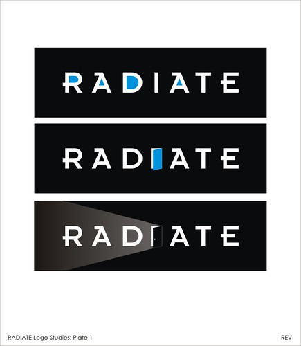
They instantly like the idea, so I developed the concept further, adding shadow effects. I even suggested that the logo could be animated (ala movie opening credits where they show the production company’s logos). So simple, it can work on its own in monochrome. Colors and other special effects can be added should they decide to expand and diversify.
The final design
LazyBob is a company that sells and installs swimming pools and automatic lawn movers. The name of the company is a bit unusual, and the owners chose it because it sounds fun, easy to remember and is also a bit "provocative". The word "lazy" have two meanings in the company name. According to the owners, the name stands for:
“The first and most obvious one is that we provide products and services to people who prefer to have a nice time at the pool rather than spending time working with their garden, i.e. they can be seen as a bit lazy. The second meaning of the word "lazy" is that we as a company will use the best possible products and methods when performing our services in order to do it as fast as possible - in order for us to work as little as possible, i.e. we can be seen as lazy. In the end this is of course a positive thing for the customer since the cost for the service will be low. The name Bob also has two meanings, it can either be the staff that performs the services (building pool, cleaning roof etc) or customer himself who enjoys a nice moment at the pool while the automatic lawn movers takes care of the grass and a worker (Bob) cleans his roof.”
There are numerous approaches to creating this logo. One of the things I thought of was creating a mascot which will also act as their main logo. However, research shows that in their business, most companies are already using characters to represent their company. Generally, character design is complicated and time-consuming, and may be beyond their budget. I settled for creating a simple crest or text-based design with minimal graphical elements. The crest works very well in different media. These were the studies for the logo:
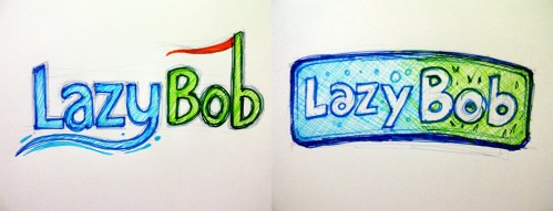
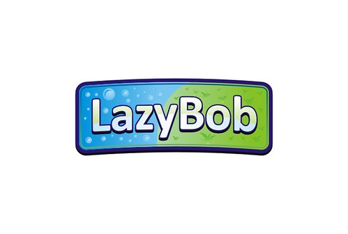
The owner opted for the rectangular emblem (to my relief) to be developed further. To highlight each word of the company’s name, and to add more character to the text, I used different fonts. The background features their two main services, pool and grass services.
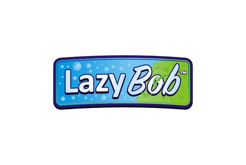
And the final design, in a dark background.

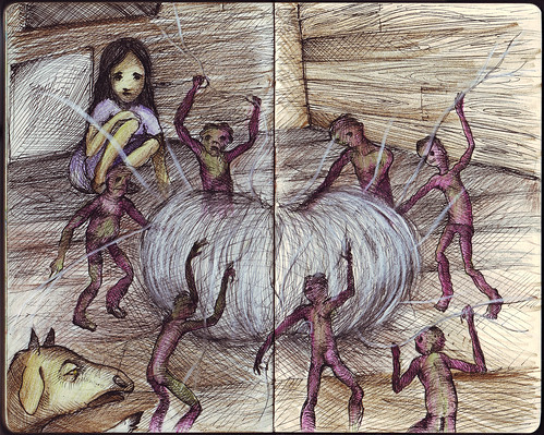
"Air Chrysalis"
A scene from Haruki Murakami's latest novel 1Q84. You have to read it to believe it.


