Radiate Inc. is an upcoming media company that will focus on film production and photography. Still in its beginning stages, the company needed a preliminary logo that they can work with. I was given much freedom with regards to its design, but basically they wanted it to be simple and relevant.
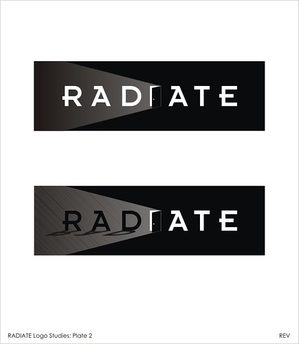
The first thing that comes to mind when one thinks of the word “RADIATE” is light. Sources of light, such as the sun, a light bulb, a candle, a firefly are all examples of what could be ideal graphical themes for the company’s logo. However, almost every company that has a name with references to light has a logo with different variations of these, tucked within a convenient frame or cleverly positioned over a letter. I wanted to offer something unique for this company. I came up with three initial concepts, after selecting a unique font which I think represents creativity and modern innovation. The first is a play on the negative spaces of the letters. Luckily, the central letter of the word RADIATE is the letter I, a very dynamic letter which can be modified to form a graphic. Since, I wanted to avoid using the cliché, I represented light in an indirect manner. Imagine, you’re inside a dark room and you came upon this door (Concept 2), and slowly you open it up, and bright light rushes in! (Concept 3).
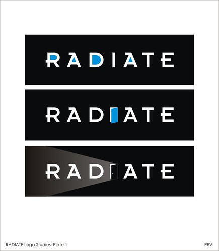
They instantly like the idea, so I developed the concept further, adding shadow effects. I even suggested that the logo could be animated (ala movie opening credits where they show the production company’s logos). So simple, it can work on its own in monochrome. Colors and other special effects can be added should they decide to expand and diversify.
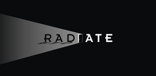
The final design


No comments:
Post a Comment