Sunday, September 23, 2007

Logo Design: Bed & Biscuit Pet Care

I've made some logo and branding concepts for veterinary clinics before and I must say that it was always an interesting and rewarding experience. The reason for this is that designing for veterinary clinics always involved some form of mascot creation, and having quite a fondness for cartoon characters, I would always accept projects involving any form of character design. Plus, I like animals, particularly dogs and cats. And depicting them in cute, funny and comical situations is always enjoyable. Recently, I discussed in a blog about the creative process for iRescueRover (of which I am currently making a series of designs for their shirt line), but here are designs for previous clients.

Bed & Biscuit Pet Care, based in San Antonio, TX, provides services for pet sitting (in their home), pet boarding (in the client's home) and to a lesser degree dog walking, mail pickup and plant care. They wanted a design that will be used for company branding and advertising. The logo should be fun, but professional. It should represent trust and love of animals. They suggested using symbols that are animal themed (i.e. paw, head, full body, silhouette, dog bone, etc.). The client wanted dogs used specifically, but can also include cats and images of house / home.

I submitted 3 concepts. Here are the 2 designs that are basically mascot based.

But among the 3 concepts I submitted, I definitely like the 3rd design which is more simple. It is text-based rather than graphics heavy. The idea was almost accidental, since I was trying to figure out a way of integrating animals, particularly dogs and cats into the text, in very much the same way I did for the Two by Two clinic. While examining the letters, I thought of modifying the shapes of some of the letters to represent animal forms. At first, I thought of using the initials (both “B”s) but thought it would be more creative to use the “D” of “Bed” and the “B” of Biscuit. The “D” already is shaped liked the body of a dog, while the “B”, that of a cat. And since both these letters are separated by a the “&”, not only does the name of the company say “Bed & Biscuit” but also “Dog & Cats”…

After some feedback from the client, I made the necessary revisions (though minor) to create this final version.

Monday, September 17, 2007

Logo Design: Bobath Philippines

Mylene Aguirre emailed me if I could develop her ideas for the logo of Bobath Philippines. She was tasked to make a logo for the Bobath advocacy group that Deanna Maranion is spearheading. It's actually a group of pediatric therapists practicing in the Philippines which is also open to PT and OT students and allied medical professionals involved in pediatric rehabilitation. They say they need the logo on print materials for upcoming seminars and would also like to it embroider it on shirts. She attached an image she was working on: focus on the B, shaped like a swaddled baby because after all, the group works with pediatric-age patients.

It was a very nice idea! And I'm glad that I don't have to come up with new ideas of my own, which in my experience in logo designing, takes a lot longer than the actual execution of the logo. Planning for a logo requires research and study… and immersion (you have to think like your client!). You have to understand Mai's drawing. It was done using a mouse in a raster program so you can't expect much (Hehe, sorry Mai, but at first glance, I thought it was a fetus or even an insect larva).

With the idea in place, I immediately proceeded in executing the design digitally. Since the logo was text-based, with the graphic integrated within the text, a huge deal of concern should be given to the font selection. I chose from a variety of popular fonts used in Web 2.0 designs and settled to choose on my favorite font. I worked on the B, oversized it a bit, and started adding the elements there. I wanted to retain Mai's curl (an eye) in her original drawing and interpreted it as the baby's "kiss me" in my design. Here is the initial design.

Although the baby takes up most of the visual attention to the design, the shape of the B is retained, thus still making it readable. I tested it among people… and it really catches the attention. It was a very "cute" design. Although I could have used a more abstract approach (less lines, just enough to give the impression of a baby), I think its "cuteness" will work for the organization, will draw more attention from its clients, both adult and children. The only comment that really bothered me was from my brother who noticed how his arms looked so much like boobs. That was really alarming, and to think that I didn't notice it before. (Haha, don't ask me why he of all people noticed it, or even why me as an artist, could have unconsciously integrated it in my work…). Here's the new design.

And finally, I completed the design with the other textual elements and added some Web 2.0 glass/reflection effects. Here's the final full-color design.

Naturally, a solid and b/w version was provided. Make sure you visit their Multiply site at Bobath Philippines Advocacy Group and inquire about their continuing education programs.

Sunday, September 16, 2007

On Being the Graphic Arts Expert at the Inaugural Ceremonies of Dean Cynthia V. Isaac…

I often wonder why the College of Allied Medical Professions (CAMP) of the University of the Philippines Manila is seemingly full of misplaced individuals who could have been better off pursuing other professions such as those they are truly passionate about. Individuals who study and train to be physical therapists, occupational therapists and speech pathologists and yet behind that professional façade is a uniquely talented person whose caliber in that special talent could rival those in that particular field. Singers, artists, fashion designers, dancers, painters and creative thinkers hiding beneath the white uniform or the scrubs clad with children's designs. Hmmm…

Recently, I have been charged to create the visual elements that could decorate the Inaugural Ceremonies of Dean Cynthia V. Isaac last September 6, 2007. This is by the way her second term as CAMP's dean. I didn't remember the first inauguration to be this extravagant (the need for elaborate art, VIP guests, band, etc!) but I think this is because of the pressure brought about by the inaugural ceremonies organized by the other colleges and of course, the love for grand events of the new chancellor of UP Manila despite cost-cutting measures of the university. So there it is, I have been summoned to channel my creative energies into this event. And I lost 2 days of valuable sleep for this and ended up sick a whole weekend.

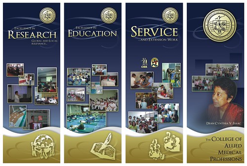
Weeks before the event, I drew up some sketches for the general feel and look of the ceremonies, taking cue from Dean Jake's favorite color which is blue. I like blue, and have often used it as a central color theme in CAMP events (1996 UP Manila Lantern Parade tie-dyed shirts, 2003 CAMP Shirt, etc…) so this is a familiar color to work with. I thought about using 4 banners each with a different theme for each. The banners should be designed so that it can also be reused for future events. Blue can work well with silver or gold, but for this theme, I wanted a stronger highlight, so I chose gold to go with the royal blue. The program/invitations will also utilize this color theme.

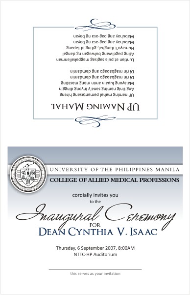
I proceeded with developing the invitation cards but it was not until the night before they should be released that the information written on them was finalized by the Central Administration of UP Manila. Because of this, a separate but larger program document will be distributed on the inaugural day itself to update the missing elements in the invitation. I will be using my own printer for this, and I wanted to be economical on the use of ink, so I employed the use of pastel and fade effects on the colored elements of the invitation cards. I used the fonts Optimus Princeps, a good free font that exudes authority and elegance and Calibri (my favorite sans serif these days!) for easy readability even at small font sizes (ergonomic fonts!).

Inauguration Invitation Front-Back

Inauguration Invitation Inside

After gathering the necessary pictures from my own and CAMP's stock, I proceeded with developing the banners (5 banners all in all! 4 for the stage, and 1 to include a congratulatory message to the Dean which will be posted outside the college). The banners will simply be a montage of pictures to support the themes each banner is carrying: Research, Education and Service… which are the 3 primary thrusts of UP Manila. The last banner will focus on the CAMP constituency. Looking at these mock-ups, you will notice that I could have used better pictures. Well, my stock is focused mainly on CBR activities, and CAMP's stock is very deficient and unorganized. But, I guess with the limitations, these look fairly well. As they were finished, they were then sent to the printing station.

Inauguration Tarp Out All

I almost forgot creating the congratulatory banner, because of the stresses brought about by the 4 earlier banners, and I had to create this in 15 minutes for emergency printing. It was relatively easy, because I only had to copy and paste elements from the invitation file.

Inauguration Congratulations Banner

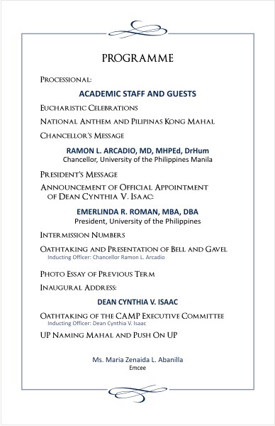
Lastly, I have to finalize the program for the inaugural day itself. Again, this was easy since the text was available, but due to format inconsistencies, I have to change the font of each word/phrase manually. Also, the text was only finalized the day before the event. I would have to print these with my own slow printer, so time was against me. This was another sleepless night.

Inauguration Program Front-Back

Inauguration Program Inside

And here are pictures from the inaugural ceremonies.

During the offertory in the Mass before the program, each department/program was tasked to bring a symbolic offering. Luckily, I was able to drop by a shop selling local handicrafts and I bought this net laden with shells. It was meant to represent CAMP and CBR's mission to bring out the best in the communities and people it is serving and training. Just as the shells in the net are of different colors and shapes, so does it recognize the unique individual strengths that each member of the community brings.

As I said, CAMPers are highly talented… "talentado" I would say. Each person is called to a certain mission, unique and special. Our talents and professions are just means to achieve our mission. My mission is to inspire faith, learning and creativity in other people… and as long as I know I'm fulfilling this mission, whether as a professor or an artist or whatever (Remember, your job or role is not your mission, and most importantly YOU are not your profession), I know I'll be happy.

Saturday, September 1, 2007

Logo Design: iRescueRover

Hot Diggity Dog Premium Pet Pampering, LLC is a high end customized pet care and dog walking service which will soon release a line of clothing merchandise for iRescueRover.org. They needed a logo that will be featured in their first shirt that will launch the line and brand the company. Subsequent t-shirt designs will have the logo embroidered on each shirt in a more discreet way (for example, on the sleeve). Here are the specifications of the client:

  1. One t-shirt design to highlight the logo itself. The client envisions a bronzed leafed sheriff type star as part of the logo, with the star placed central and large for the t-shirt. DO NOT Let this limit your vision however. The launching t-shirt might feature a huge star on the t-shirt front.
  2. An image of a dog integrated or central to your design. Suggestions: a mutt, the painted dog of Africa or a Greyhound image –may be abstract, artsy, beautiful, hip, cool or high end. Any domestic or endangered dog may be used.
  3. An image of a cat, domestic or endangered with the wording "iRescuekitty.org" (a sub category of iRescueRover.org).
  4. An image of a great white shark presented in a unique way, including the wording "iRescueShark.org" (a sub category of iRescueRover.org).
  5. An image of a bird, any endangered bird (i.e. a long crane vertically placed), and the wording "iRescueRobin.org" (a sub category of iRescueRover.org).

These were challenging requirements. Not only were they quite numerous, increasing the possibility of making the logo look cluttered. It seemed unavoidable, but I decided to include all these visual elements into one design. It felt like I was developing 5 separate ideas guised in one project. I turned to my sketchbook and went into my cartoon character mode, which I think is the appropriate approach to this. Besides, they wanted the design to appeal to all age ranges.

I really love the characters I created… I was actually drawing inspiration from stuffed toys here at home. I then traced by hand, inked with a brush pen, scanned and then digitized for vector editing.

I then added elements such as the sheriff star at the back and the name banner in front. At this point, it seemed a pretty solid T-shirt design.

I was worrying however about the design not being able to be translated well into small embroidered versions or even as a tag for their future shirts. I then developed simpler icons for the main organization and its subcategories.

And an option incorporating all these tags and just the characters.

I was glad the client selected this concept among numerous propositions by competing ideas. The design is still being finalized (deliberations regarding color and some design elements) for the shirt version but just in case you're wondering, here's Brad Pitt wearing the design, looking pretty serious in rescuing some helpless critters:

“Wear Proper Clothes To Respect The Sanctity of The House Of God”

Well, we really should. I remember when my brothers and I were kids, our parents would force us to wear polo shirts and pants (with the shirt tucked so deep, or rather the pants worn so high it made us look like we had unusually small torsos! Baduy!). There was a time when churchgoers were donned in their most formal attire. We were taught to dress that way. There was logic in this after all. Going to mass was a time when we would be communing with God and of course, each of us would want to look our best! There was a time when the sentiments and devotion of people flowed naturally outwards and expressed through their appearance and deeds, and not the other way around.

Eight years ago I had my own website which I called Goodness Bites which featured my artwork, literature and lecture materials. But the highlight of my old website was a comic strip series through which I expressed my funny experiences and thoughts on churchgoing. Some Catholic websites even featured these comic strips regularly. This is one of my most "syndicated" comic panel:

I wasn't able to maintain my website after Angelfire changed their policies about ad placements (My website was a mess with the ads). This was during the pre-CSS era. I didn't have the patience and ability to fix it up, so the website eventually died. And then just recently, I saw this commercial airing in TV:

You could imagine my surprise and delight upon watching this. I am not exactly sure if my comic strip inspired the director behind the commercial, but you couldn't deny that the "Christ, what a body!" concept is basically the same, not to mention the similarity between the elements of the video and the comic strip. My brother told me to invoke my intellectual property rights and demand compensation. I don't know. I couldn't. There was something not right if I did that. But it would be something if the person behind this commercial really did get inspiration from my comic strip which perhaps he saw 8 years ago. And then he got this opportunity to take this idea to video format so it could reach a broader audience. That really would be something.

Having this chance to see this, it makes me rethink about how I myself prepare for the mass. It's so sad that nowadays, I could go to mass wearing slippers and shorts without much thinking and so much for my own convenience. I know people say what's important is how sincere your thoughts and prayers are. But then perhaps when I have the ilk to say this, I'm just creating an alibi to justify my apparent lack of concern. We are after all physical beings with the need to "experience" things. God's glory is so great we don't even have the words to describe (or even the capacity to imagine). But He reveals Himself to us in ways that we can "experience" him: through the world we presently live in. It is I think right to express our love for Him in the only way we presently can: through the world we currently live in. The manner in which we lead all aspects of our lives, whether how small or large, is a natural reflection or outcome of our sincere beliefs and virtues. The world view has truly become so skewed that we now have the need to be constantly reminded in the face of our demand in expressing our human choices. Time to rethink.