Showing posts with label design. Show all posts

Wednesday, December 5, 2012

AngI.n.K. Corner: Tutubi... tutubi...

 photo AngInK-Tutubi500.jpg

I remember as a child, I used to chase and catch dragonflies with my brothers and cousins at the backyard of my grandparent's house. Now, with all the progress in the neighborhood, they're all gone. nowhere to be seen. How I wish to see them once more.

Main artwork done for AngInk corner, pubished in Manila Bulletin last December 1, 2012.

 photo Tutubi500.jpg


Thursday, July 28, 2011

MyMoleskine and “The Glassblower’s Apprentice” (Study)

2011-07-22

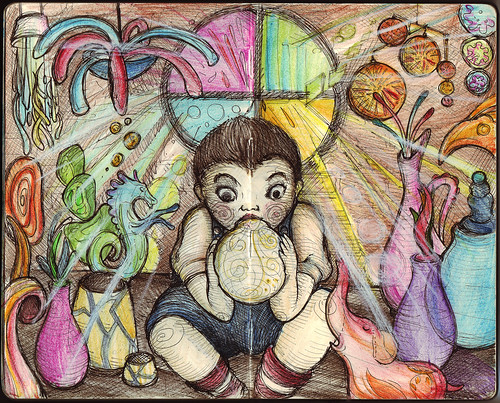
This is just a study for "The Glassblower's Apprentice,” a piece I hope to be chosen for an upcoming exhibit. I’ve always been fascinated by the magical nature of glass and the craftsmen at Murano, Italy seem to conjure magic in every piece of glassware they create. I’m still trying to figure out how to properly execute the effect of glass in a painting form. The final piece may look totally different as I try to explore various styles to execute this.

I uploaded the drawing as well to Moleskine’s MyMoleskine gallery, which they describe as “the best place where you can find and share the most beautiful creations made on a Moleskine notebook.” So if you own a Moleskine, and make art in it, that place may be a nice venue to showcase your talent.

Sunday, March 13, 2011

Logo Design: The Cheer-Up Squad

I love creating logos that just by looking at them, you can't help but smile. I recently made this logo for an organization, and this logo literally has a smile in it. The organization is called 'The Cheer up Squad' and they are a professional team of dedicated members that go around visiting the sick and elderly, cheering them up in all kinds of amazing ways. They wanted something colorful and playful with character but it should remain classy and very professional. Based on experience, the look of a logo like this can either look creative or silly, and there's a fine thin line between the two.

As I often do when I start creative projects like this, I presented the client with at least three initial concepts (colored versions using marker pens). The image below shows the sketches on the left, and the corresponding digital version on the right. It is quite evident in all versions that I have become fixated with the use of the smile, conveniently converting the letter "u" into a graphic of a smile.

The client was very happy with all versions but decided to go with the top orange version (which I personally liked as well). She suggested creating variations of the graphic by playing a bit with the smiling face, perhaps adding a hat or face element; or creating some flourishes with the text elements.

They all looked good, but compared to the original version, they all looked overly designed (and perhaps, as I said before, silly). The smile and the eyes seemed enough to convey the cheerful attitude they aim to portray, and the professionalism and respect they wanted as well.

Sunday, February 27, 2011

Logo Design: Activiteens

I made this logo for an exclusive upper class after school club for teenage girls. They organize activities ranging from drama, music, IT and many more. They wanted a new logo that was colorful but very professional. It must be very classical to reflect their clientele yet still have an element of excitement. The logo should have character to it, something different and attractive so they could use this as a powerful marketing tool. They specifically did not want any figures of girls in the logo but don't mind abstract vector faces.

These were my initial drafts, and for some of these drawings, I actually did not follow the specifications of the client (no figures of girls) but thought of presenting what it would look like if it did have these figures. Sometimes, if I feel strong about an idea even if the client was very specific, I would go ahead and present these as exploratory ideas.

It turned out they liked the versions with the figures. The design process involved combining elements from each draft concepts until we reached the final design.

For logo concepts and designs, illustration and other graphic design needs, you may contact me at revcruz@yahoo.com .

Wednesday, February 2, 2011

Logo Design: Zengu

Tengus are mythical creatures found in Japanese culture and are believed to be protective spirits or deities according to recent Buddhist lore. In one of my recent projects, the tengu served as reference for the logo of Zengu. The name of the company is actually a wordplay on tengu and Zen, and for my initial drafts, concepts started from literal representations of the tengu, which by the way are often depicted as a combination of bird and man, to abstract icons, leaning more on the minimalist zen aspect of their image.

The client was initially attracted to the icon versions, and revisions were made until the following image was reached.

Sometimes, the design process turns around in an entirely new direction, especially when dealing with clients which involves a committee deciding on the approval of the logo. My concept was entirely rejected and I ended up developing and refining a concept they developed on their own. Apparently, they chose a more classical direction for their logo. In the end, I basically enhanced their logo by sharpening their crane image and cleaning up the font to make it more legible.

It may be a little disappointing to have my proposals rejected, but thinking about it, the client knows what's best for their company and how they should be represented. But as an artist, I think was still able to infuse something of my own in the final work. In designing a logo, there is always balance between what you and the client wants. Some clients are more controlling of the process, while others would give free rein to the designer. It's part of the job to find that balance point, and simply flow wherever the design process takes you for optimum results.

For logo concepts and designs, illustration and other graphic design needs, you may contact me at revcruz@yahoo.com .

Wednesday, January 5, 2011

Paranormal Philippines v2: Prints are now available!

Photobucket

It's been a slow work in progress but I've finally completed re-drawing Paranormal Philippines! No drastic changes, I just made the lines clearer and sharper, the text parts more readable so it can still be clear even when blown up to a 30" x 45" inch print! I've been receiving numerous requests through my DeviantArt account to have the original Paranormal Philippines ready as a print. So I used this opportunity to update the artwork, so it will be pretty to look in full map size. A full-size map of the Philippines featuring our favorite Filipino mythological creatures! And I prepared it in two versions, black print on ancient parchment paper, and white on black. Just head on to http://revcruz.deviantart.com , select the map you prefer and click "Buy as Print". You'll notice it's available on different formats, from greeting cards to puzzles and mugs and lots more!

I understand that there's a bigger demand to have this on T-shirt. Frankly, I've seen this printed on shirts without my permission (apparently, they used the picture grabbed from the internet). I wonder who those motherf*$#ers are. They don't look pretty and the print is just to blurry for you to make out the details. Take note, that Paranormal Philippines is copyrighted and is protected by the law! *grins* Well, there already exists real Paranormal Philippines shirts, and I've been wearing the prototypes (dark grey print on grey shirt, as below; silver on black, white on black) for quite some time now. What prevents me from releasing it yet is that I am still not satisfied with the print. I'm still looking for a shirt printer who can execute the design perfectly. So for those who have been waiting, sorry, you will still have to wait for the official shirt. But I assure you, it will come out and when it does, it will be perfect!

Photobucket

Sunday, May 23, 2010

Logo Design: Baker’s Confetti

One of my recent logo creations involved one of my favorite things: baking! Well, not really. I'm not that much of an expert in baking, my skills limited to simple cookies and cupcakes, but I can say, I'm very good in eating what other people has baked! Anyway, the challenge of creating this logo is to capture the magic of baking, and with a very enticing company name, the logo should be as well.

Baker's Confetti carries the sweetest, best-tasting bottled sprinkles around. Their products are formulated with the finest ingredients, and were created with even the most discriminating consumer in mind. They wanted a logo with business professional style, but must be trendy and memorable as well. Their target audience is the typical home baker/candy maker, small bake shop/ice cream shop owner and the run-of-the-mill sprinkle aficionado (anyone with a sweet tooth!) The logo should represent quality, be memorable and visually attractive.

Sometimes, before I set myself into creating a logo, I select keywords to guide me through the process. And for this one, I specifically chose "magic" as the name of the company pretty sets it up… "baker" and "confetti". The confetti part is easy. I can create a logo with sprinkles about it, but that would be too common. So I had to illustrate the baker and confetti in a sort of magical way… After a few swings using simple geometric shapes in my vector program (I didn't go through pencil sketches for this one), and choosing a "delicious" font (which I edited slightly to balance it out) to go with it, I came up with this.

BakersConfettiB

And on light background.

BakersConfettiA

It was an instant favorite, and a personal one for me as well. Definitely one of my most memorable creations. Baker's Confetti is yet to launch their website and release their products, but they have a blog which features some recipes, and a facebook account as well.

Sunday, April 11, 2010

Logo Design: Riley Seaplane Company

It's wonderful when clients seek you out because a previous work impressed them and somehow fit the particular style they needed for their logo. Cam McCulloch saw the Art Deco style I did for Savoy Special, a rock and roll band based in Houston, Texas. Cam wanted to have a similar illustration and text for their seaplane company called "Flying Fish Aircraft Company". She shared ideas on how it could look like would like, one of which would have a flying fish with propellers on its back "like an airplane " coming out of the water. Cam provided me with reference pictures.

Another thought would be to use two F's in flying fish back to back some how to make wings. I did some research again about art deco design particularly how it represented aircrafts and fishes, and similar themes. I promised her 3 initial drafts for the logos and I came up with the following conceptual sketches.

The first one utilizes the two F's, forming the outline of the seaplane. It is a very simple design and can be framed in a numerous ways as shown in the variations. The second one invests on the idea of a flying fish-plane hybrid, and basing much from the reference pictures provided, the illustration was executed in art deco style, combining the dynamism of the fish and the sophistication of the plane. Again it can be framed in many ways, and various options for embellishments such as waves or splashes may be added. The final concept is again a flying fish-plane hybrid, but this time, executed in a simpler manner, flat from the lateral perspective.

Promptly after submission, Cam commented that the "Flying Fish" name of the company seems not to be working as a text in the initial drafts, and requested to use "Riley Seaplane Company" instead, executed in a more art deco inspired font. She liked the hybrid concepts and decided to steer the design development process towards that direction. The name "Flying Fish" would then be redundant, if an illustration using a flying fish would be use. Cam reminded me about the rejected design concepts I did for Savoy Special, particularly the wing concept and asked if it can somehow be incorporated in the design. It was of course possible, and presented an interesting opportunity. Before doing vector work, I made another sketch for final approval:

Cam really liked the design, and provided me with more reference pictures to incorporate in the design, specifically making the fish more detailed and framing options. After a suggestion of adding waves in the frame, the design so far was this:

And after much deliberation, we decided to tone down on the waves and settle with this final design:

This design was truly a collaborative work, and as a designer, I was very glad to have been able to realize the design the client wanted. Designers sometimes are frustrated with clients who seems too controlling of the creative process, while at the same time failing to communicate what they truly want, and sometimes, changing their mind incessantly. Not with Cam, whom I enjoyed working with. It is very rewarding to conclude projects with very satisfied clients.

Saturday, February 13, 2010

Harana

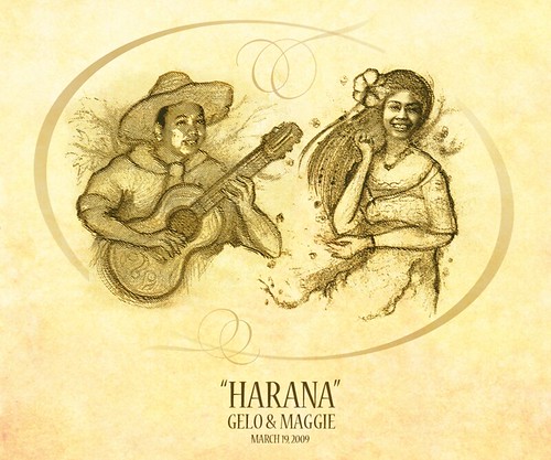
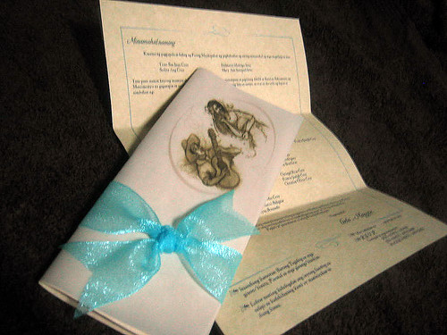
My brother Gelo's getting married. And like a good elder brother, I volunteered to prepare the invites… from design to finished product. The theme: Filipiniana. Of course, I wanted something special and unique for my brother and his fiancĂ© and what better way but to make an illustration… of them… in a manner that reflects their personalities and how friends see them and their relationship, within the Filipiniana theme… And this is what I came up with:

Haranav4

Solid theme but subtly humorous. If you knew any of the couple, I hope the drawing brought out a chuckle or at least a smile.

The drawing served as the main graphic element of the invitation, which upon instructions, should be kept to elegant simplicity:

Invites 4

So happy for my brother and his soon to be bride and I hope their love endures. Happy Valentines to all!

Tuesday, March 10, 2009

Logo Design: Swig

I recently made a logo for Swig, a new bar/restaurant from Stella's Restaurant in Ohio. Demographically, Swig is looking for the 25-50 year old. Swig can be described as an inexpensive, fun and intimate neighborhood joint. It will feature 19 draft beers, comfort foods primarily focused on sausage sandwiches, etc. and will be able to seat about 60 people inside, another 75 on outside patio during warm weather (with stainless steel tables and bar with black walnut trim). They're looking for a logo that "puts a smile on people's faces" and makes them curious enough to come in. Swig will be a casual place, where people can feel comfortable "come as they are," but it will be well-kept and have a bit of hipness, too. The logo should include the name of the bar and their tagline ("Charcuterie and Suds for the Curious"). The logo will be used for front facade of building, as well as promotional materials and other purposes.

I worked on developing a text-based logo, using friendly legible script fonts. Of course, using text as a logo is very boring so I aimed for subtle modifications to incorporate specific requests of the client. Emphasizing on the need for a logo that "puts a smile," I searched for a way to integrate this on the basic text… and voila… what if I reshaped the tail loop of the "g" into a subtle "smile"? I edited the dot of the "i" into a spiral to evoke the "suds" nature of the bar/restaurant. I avoided using any direct visual references (such as using graphics of beer or mugs) because the name of the bar/restaurant already refers to the act of drinking beer. How the text is displayed will be important to show subtly the "hipness" but at the same time "classiness" of the bar/restaurant. Here's the basic logo in black and white:

I provided some color versions, and I thought of framing it into this:

At first this didn't appeal to them, as one person in their group suggested that it looked like the logo for instant potatoes or Duncan Hines (bake products). A friend of mine I showed this to commented it looked like a chocolate factory's logo. I thought, "This is good!" It meant that the logo seemed to evoke taste… which is very important for a restaurant logo. I framed it actually to make it look like an old beer label, and I was glad other people who saw this version thought so. But I provided them with another version without the framing and the red band:

It took a while before they grew into the logo, after having other competing proposals. But finally, they liked it a lot, thinking its versatility to be used for signage, menus and letterhead. They would be using all iterations of the logo. I provided them with the horizontal treatments of the logo, and here are the final horizontal versions:

Now, I've wanted to have a swig of cold beer after this project. Come to think of it, I've never been drunk before and I've always wondered how I'd be overpowered by alcohol. Would I turn into a laughing clown or a violent brute, a sleepy slob or a raging sex maniac? I have this fear of losing control of myself, but there's also this curiosity that has to be quelled. If only it would be that easy to get drunk.

Wednesday, February 25, 2009

Logo Design: Spira Sales Corporation

SPIRA Sales Corporation was created as partners of TOTO Philippines at the onset of year 2007 to address the growing demand for high-performing bathroom and sanitary wares, fittings and accessories in the Philippines. SPIRA distributes TOTO products through a vast network of retailers that are strong industry players, like Wilcon Builders Depot, Inc. The distributorship network is strategically located mainly in Metro Manila and the rest of Luzon area. Apart from high quality products, SPIRA also boasts of a talented team which is equipped and trained to excel in customer service. Products and manpower are the two main strengths and investments of the company that ensure customer satisfaction. In time for the grand opening of the new TOTO Philippines Showroom at the 1st and 2nd floor of Ridgewood Square, C5 Road, Taguig, Metro Manila, SPIRA is all set to rebrand itself in this new endeavor.

The original logo of SPIRA is an example of a direct representation of what the sales company is all about. I interviewed current employees and asked them if they knew what the graphic in the logo really was, and all of them were unanimous in identifying the image as a toilet piece ("inidoro" to be exact). I thought that the old image would have to be changed, even if its shape was quite indecipherable. This is a case, that the product may not necessarily provide a wholesome image of the company. I was asked by the management to look at their website at www.totophilippines.com to look at their products, find inspiration and get a feel of the image they wanted to convey as a company.

TOTO Ltd. is the world's largest toilet manufacturer and produces the most innovative and highly technological sanitary wares around. I didn't realize until I reviewed their catalogue how much creativity, research and technology can go in producing their products. Their mission is to enhance humanity's relationship with water and with this; they strive in producing products and designs that provide seamless user experience. The image of TOTO is simply elegant (and works similarly to SONY's logo) and classic. I wanted SPIRA's logo to look harmoniously side by side with this TOTO image, and although I wanted to go for a similar typographical approach, the management was insistent with the integration of a graphical component.

I provided their management with 3 initial proposals based on key elements I drew from SPIRA's and TOTO's portfolio:

  1. PEARL within a SHELL / WATER DROPLET concept – The first thing I saw in SPIRA's website was this beautiful picture of a water droplet bouncing off from a rippled surface. I thought I should create a graphic based on this, but infusing it with the pearl-like qualities of TOTO's products, hence making it also look like an open shell.
  2. SPIRAL / WHIRLPOOL concept – The word "Spira" actually forms the root of spiral, thus a graphic based on the name might be good. Also, the "whirlpool" image evokes a dynamic personality of water.
  3. NAUTILUS SHELL concept – The products are heavily inspired from natural sources, so I looked for a natural symbol that infuses both the shell and the spiral elements.

Obviously, I was drawing references from nature, and used elements commonly associated with water and pearl/shells. Among the three, what do you think the management chose to develop?

SPIRA chose the spiral/whirlpool concept and they immediately liked the image being dynamic even without me providing an explanation of the graphic (I wanted to see whether they can relate to the logos). The comment they gave was how I treated the 2 swirls in the graphic… it seemed "deconstructed" or "dissolved". They were right. Although, I thought the effect was cool, it wasn't what they wanted to be. If there was a way I can make the swirls look more solid, while avoiding making it look like other swirl based logos.

I experimented using various treatments, from making the lines thicker, using stripes, etc. but I settled with the use of digital brush in creating the swirls. They look more solid than the previous, but more importantly, they looked organic and alive. Here it is, and the description I provided them.

"The logo of SPIRA Sales Corporation consists of 2 swirls forming a subtle upward-facing "S" in the negative space between them. The symbol represents the dynamism and harmony between the two main strengths and investments of the company: high-quality products and competent manpower. Also, the swirls represent the twin ideals of leadership and excellence, merging together with success as their goal. The color blue represents humanity's relationship with water (referencing TOTO's philosophy); while the color green represent's humanity's relationship with the earth and its brethren (a pledge to environmental and social responsibility)…"

It is wonderful how the SPIRA team feels proud to have this new logo. It is equally amazing how the new logo seems to bring out individual interpretations of the logo. Some members of the team described it as their "yin-yang", "whirlpool" or "spinning water." Cool imagery… signs that they are inspired and drawn to it – and I'm just very glad it is no longer their "inidoro." By the way, the showroom as well as this logo will be launched this early March.

Monday, February 23, 2009

Logo Design: Law of Attraction Experts

I recently designed a logo for a new company called "Law of Attraction Experts.com" whose mission is to provide a constant stream of inspirational, life-changing, timeless resources including courses, seminars, audios, books, events, free stuff, etc to assist people, kids and families on their journey toward enlightenment. I myself have seen the popular self-help film "The Secret" and I'm sure people would be familiar of the onslaught of books released about the "secret" which was supposed to have "travelled through centuries" to reach the viewer. I was very curious then what the "secret" was, and I soon learned that the secret is the Law of Attraction, a principle that "posits feelings and thoughts can attract events, from the workings of the cosmos to interactions among individuals in their physical, emotional, and professional affairs." It's basically positive thinking but more. I generally agree with the principle and how it seemed to work in my daily life and complement my faith… Don't you notice how when you generally feel depressed and negative about yourself, everything about you seemed to be negative towards you to? When you start the day happy and exude a positive vibe, everything seems to go oh so well!

The company needed a logo that speaks to both men and women, is easy to read, simple...spiritual and intelligent. They supposed that "Law of Attraction" should convey the spiritual side and the word "Experts" should convey the dynamic energy of the experts: the ability to help change people's lives and fast-track them to where they want to go. With this general description they provided, I somehow knew that I was going for something that would rely on typographic design. Since "Law of Attraction" would be spiritual, it needed to use a font that looked antique and wise. The word "Experts" should be bold and respectable. I presented 2 initial arrangements, one framed in a circle and the other one, where the word "Experts" is encased in a scroll or flag:

They immediately liked the second version but suggested in toning down the ornamentations around the capital letters of "Law of Attraction".

From here on, all that were needed were minor adjustments to the font and color treatments. Notice how I modified the tail part of the "n". In the first one, the tail curves inwards and makes the "n" looks illegible especially in smaller sizes. I curved it outwards.

But in the end, we settled with the straight down version. These were subtle modifications but were very important when it comes to readability.

With the general design of the logo finished, I provided them with possible colored versions, ranging from deep blue, violet and gold.

I'm really glad they liked the logo and how it fits their company's mission. I positively believe that it will serve their company well.

Matthew 7:7-8 "Ask, and it shall be given you; seek, and ye shall find; knock, and it shall be opened unto you: For every one that asketh receiveth; and he that seeketh findeth; and to him that knocketh it shall be opened."

Sunday, February 22, 2009

Logo Design: KALISS

I remember years ago when I was just fresh out of college and enjoying my hard-earned salary, when friends of my parents who were very active in our local parish invited me to donate money monthly to the seminary in support of priests in the making. They said it doesn't have to be that big, so I thought I can shell out P200 every month. I thought this was enough and since I myself intended of going to the seminary before, I was in full zealous support of these kinds of charitable activities. But there were months when I would fail to commit to the pledged donation, and I can't help but imagine the poor seminarist who depended on that meager support, shivering cold and hungry in a dark corner of his room.

Of course, it doesn't happen that way. Organizations who manage these donations are usually composed of individuals, groups, companies and businesses who want to share their means by pledging an amount in monthly/semi-annually/annually to raise funds in support for religious vocation. So I'm just a small fish in a sea of whales whose contributions are being gathered together to support the activities, facilities and training required in producing priests. Recently, I was asked by Fr. Boni Chavez, through Kuya Onjie to help out a similar organization in a manner I am quite happy to oblige. Their group is called KALISS which is actually an acronym for "Kabalikat At Lingap sa mga Seminarista ng Sto. Rosario-Montalban, Rizal" needed a new logo.

The logo must bear the rosary as icon of the Our Lady of the Most Holy Rosary, a bible, a chalice, a priest or nun icon, and an open arm or crossed hands as "balikatan" symbol. Now, these are standard religious symbols that one often sees in religious seals. I thought that the way to go with this logo is through heraldry.

As a kid, I have always been a fan of heraldry, and now I realize why I am so fascinated with logos and creating them: it's because I have been creating armorial designs since I was a kid. We had these "New Book of Knowledge" (not so new really, as they are now more than 30 years old!) and the pages of the "H" volume that was so worn out were the pages about heraldry. I scan them here, and you would see that I even had some pencil marks on it, and even ballpen tracing where I thought lines should be. I think I was around 5 years old then when I studied this, and you could imagine how fascinated I was to learn that these shield designs had some real meaning behind them and were actually meant to identify the people behind the armor. What's also fascinating is how the artist tried to depict it here, some quite morbidly… and as a kid, I enjoyed it.

I remember since then, I have been making shields and insignias for imaginary armies that my brothers and I used to play in our invented board games. You would find it weird, but I make it a point to study the coat of arms of parishes and dioceses. I even went to the point of casually interviewing a bishop abut the symbolisms in his coat of arms. When Pope Benedict XVI was ordained, one of the things I was excited about was his new coat of arms, as this will be the graphical representation of his past and upbringing, and most often would bear the theme of his reign as pope. It's really quite interesting!

Hmmm, back to the KALISS logo. The symbolisms were clearly requested and it was up to me how to arrange them. I thought of using the rosary as a framing element and all the remaining four symbols would conveniently go to each quarter of the shield. As I was sketching for possibilities, I discovered that the cross of the rosary can be the centerpiece, and be the instrument in dividing the shield into its four areas.

As I went on digitizing the design, I sought for a more special treatment of the rosary – something to give the whole logo a unique shape. Since the rosary included 5 segments (mysteries), I thought of creating a semi-circular curve for the 10 beads of each segment. When combined, it sort of suggests a subtle flower… or even a star (especially if you focus on the major beads). The icons were created in a manner following the "law of tincture" in heraldry.

With regards to color, I started with giving it a generally a Marian blue color.

However, it somehow looked dull. The KALISS group suggested using the liturgical colors, particularly gold, red, green and violet. I was quite excited that they suggested these 4 unique colors as this providentially supplied the colors for each quarter of the shield.

Finally, I added the text and provided them with the vertical and horizontal options. I wanted this logo to look respectful and dignified for it to represent a group with a good cause, as this will aid them raise the funds they need. Also, since this is a parochial movement, I wanted it the logo to be something that seems to belong among ecclesiastic heraldry. I hope this logo will serve them well. And perhaps then, I can redeem myself from letting my poor priest go hungry for months…