Showing posts with label t-shirt design. Show all posts

Wednesday, January 5, 2011

Paranormal Philippines v2: Prints are now available!

Photobucket

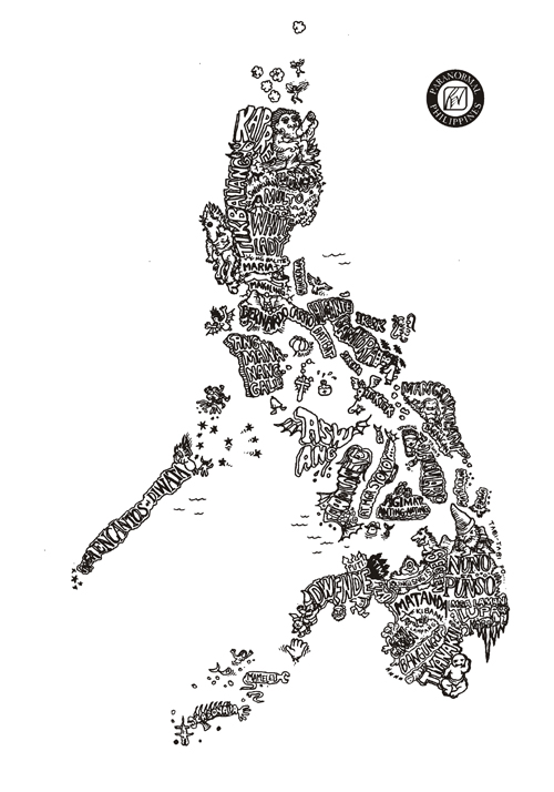
It's been a slow work in progress but I've finally completed re-drawing Paranormal Philippines! No drastic changes, I just made the lines clearer and sharper, the text parts more readable so it can still be clear even when blown up to a 30" x 45" inch print! I've been receiving numerous requests through my DeviantArt account to have the original Paranormal Philippines ready as a print. So I used this opportunity to update the artwork, so it will be pretty to look in full map size. A full-size map of the Philippines featuring our favorite Filipino mythological creatures! And I prepared it in two versions, black print on ancient parchment paper, and white on black. Just head on to http://revcruz.deviantart.com , select the map you prefer and click "Buy as Print". You'll notice it's available on different formats, from greeting cards to puzzles and mugs and lots more!

I understand that there's a bigger demand to have this on T-shirt. Frankly, I've seen this printed on shirts without my permission (apparently, they used the picture grabbed from the internet). I wonder who those motherf*$#ers are. They don't look pretty and the print is just to blurry for you to make out the details. Take note, that Paranormal Philippines is copyrighted and is protected by the law! *grins* Well, there already exists real Paranormal Philippines shirts, and I've been wearing the prototypes (dark grey print on grey shirt, as below; silver on black, white on black) for quite some time now. What prevents me from releasing it yet is that I am still not satisfied with the print. I'm still looking for a shirt printer who can execute the design perfectly. So for those who have been waiting, sorry, you will still have to wait for the official shirt. But I assure you, it will come out and when it does, it will be perfect!

Photobucket

Wednesday, March 3, 2010

Work in Progress: Paranormal Philippines v2

About 3 years ago, I created what could be one of my most popular creations: Paranormal Philippines. It's basically a Philippine map, where each geographic detail is drawn with the country's folklore and mythology.

Paranormal PhilippinesA4

Originally inspired from Aaron Hogg's Para-Normal US, I intended this design to be printed on a shirt. I would like to apologize to everyone who had been waiting all these years for the T-shirt, but due to numerous circumstances, it can't come out yet. I had no time to produce the T-shirts yet, and besides, the design is not prepared yet for printing. Though it looks nice as a whole, once you zoom into the parts of the work, you will notice how smudged it is. This is expected, as it was drawn on A4 paper with a 0.1 fine line marker.

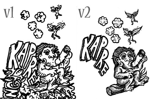
It is about time I update the artwork. This time, I plan to expand the map 500% of the original A4 and work with a variety of tools from ink brushes, brush and fine line markers. This is just a comparison of how the original compares with the new version. The other parts look more awesome.

Kapre2

This is something to look forward to. The Paranormal T-shirts will soon become a reality. Besides Paranormal Philippines v2, I'm currently researching for a new comic I'll be working on. Let's just say it's a combination of the historical and the supernatural. And if you have frequented my blogs, its plot won't come as a surprise to you. March will definitely a busy month, from numerous speaking engagements (aquatherapy and ergonomics), creative projects and an awarding ceremony plus I'll be officially training for BodyCombat! Hope I survive this busy month… Ciao!

Friday, December 7, 2007

Tee Graphic Design: “Poetic Synergy” (Threadless)

It's been a long while since I submitted a design for Threadless due to work and other creative projects. Well, I recently created a design and I need you guys to show some support. How? By visiting my design's page over at Threadless and give it a high score (of course, only $5 will count for me, haha). Don't forget to leave some nice comments there, because I would love my design to get serious approval! The only way my design's going to get printed at Threadless is if it scores so high and gets so popular that the people at Threadless have no other choice but to print it (that's crowdsourcing at its heart, you sell what the people want.).

My Threadless submission: "Poetic Synergy"

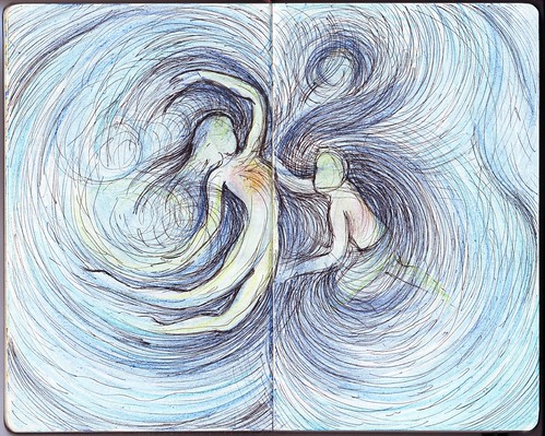
My design is entitled "Poetic Synergy" which is meant to represent harmony in nature… harmony even with the seemingly unceasing chaos… the infinite of the sea, the freedom of the sky and the heart of the land… You can draw your own interpretations. It's visual poetry. Some of you may recall my Moleskine entry "H2Om", well this is a variation of that, a more detailed nature-based version of the subtle Om. It may be too artsy for Threadless (whose catalog includes a lot of "visual puns" and comedic designs), but sometimes, they get these type of designs printed.

2007-11-24

The original moleskine entry: "H2Om"

The linework of "Poetic Synergy"...

So there, I am really determined to have one of my designs printed at Threadless (let's say it's one of my creative goals) an I hope this is the one… So click on these banners and show some LOVE!

My Threadless.com Submission

Saturday, September 1, 2007

Logo Design: iRescueRover

Hot Diggity Dog Premium Pet Pampering, LLC is a high end customized pet care and dog walking service which will soon release a line of clothing merchandise for iRescueRover.org. They needed a logo that will be featured in their first shirt that will launch the line and brand the company. Subsequent t-shirt designs will have the logo embroidered on each shirt in a more discreet way (for example, on the sleeve). Here are the specifications of the client:

  1. One t-shirt design to highlight the logo itself. The client envisions a bronzed leafed sheriff type star as part of the logo, with the star placed central and large for the t-shirt. DO NOT Let this limit your vision however. The launching t-shirt might feature a huge star on the t-shirt front.
  2. An image of a dog integrated or central to your design. Suggestions: a mutt, the painted dog of Africa or a Greyhound image –may be abstract, artsy, beautiful, hip, cool or high end. Any domestic or endangered dog may be used.
  3. An image of a cat, domestic or endangered with the wording "iRescuekitty.org" (a sub category of iRescueRover.org).
  4. An image of a great white shark presented in a unique way, including the wording "iRescueShark.org" (a sub category of iRescueRover.org).
  5. An image of a bird, any endangered bird (i.e. a long crane vertically placed), and the wording "iRescueRobin.org" (a sub category of iRescueRover.org).

These were challenging requirements. Not only were they quite numerous, increasing the possibility of making the logo look cluttered. It seemed unavoidable, but I decided to include all these visual elements into one design. It felt like I was developing 5 separate ideas guised in one project. I turned to my sketchbook and went into my cartoon character mode, which I think is the appropriate approach to this. Besides, they wanted the design to appeal to all age ranges.

I really love the characters I created… I was actually drawing inspiration from stuffed toys here at home. I then traced by hand, inked with a brush pen, scanned and then digitized for vector editing.

I then added elements such as the sheriff star at the back and the name banner in front. At this point, it seemed a pretty solid T-shirt design.

I was worrying however about the design not being able to be translated well into small embroidered versions or even as a tag for their future shirts. I then developed simpler icons for the main organization and its subcategories.

And an option incorporating all these tags and just the characters.

I was glad the client selected this concept among numerous propositions by competing ideas. The design is still being finalized (deliberations regarding color and some design elements) for the shirt version but just in case you're wondering, here's Brad Pitt wearing the design, looking pretty serious in rescuing some helpless critters:

Sunday, June 17, 2007

Tee Graphic Design: “Have A Cup Of Me” and “The Source of Knowledge” (Threadless)

Once in a while, I create t-shirt designs, and rather than have them saved in my hard disk, I prepare them as entries for Threadless' Competitions. As I mentioned in an earlier blog, all the designs in Threadless are created by the members themselves, go through a process of voting by the community. Once chosen to be printed, the designer wins $2,000 of prizes (cash and gifts). There are numerous Filipino designers there and some already had their designs printed and sold. I aspire to be one of them.

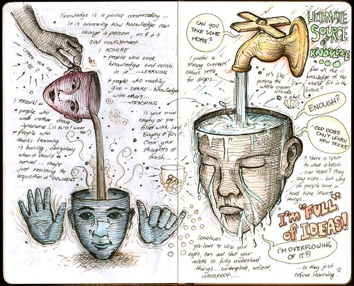
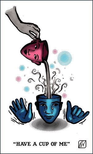
During the latter parts of summer vacation, I managed to finish two t-shirt designs based on sketches I made in my notebook:

2007-05-22

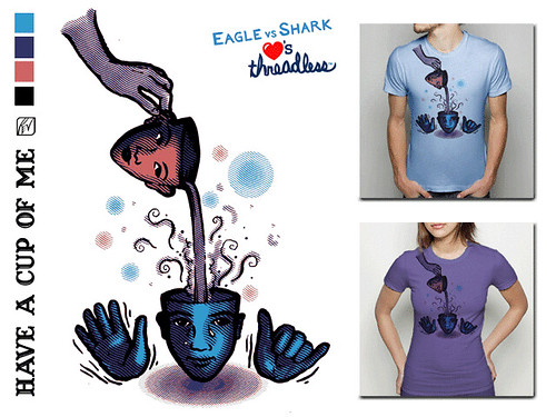
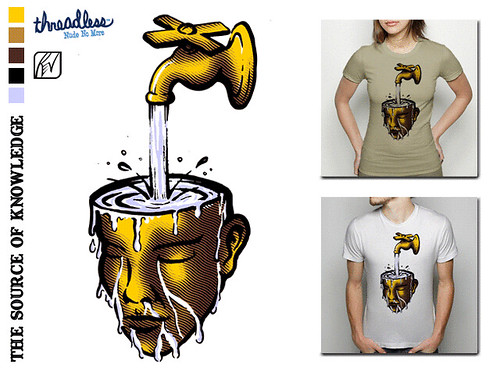
Here are the finished digitized versions:

CupofMe

SourceofKnowledge

I already submitted them at Threadless, and now, they're already up for voting:

CupofMe

SourceofKnowledge

I know my design is a little surreal and "weird" for the general public's taste. Not everyone would want to wear dismembered heads and hands on their shirts. It seems most designs at Threadless that get printed are the cheesy and cutesy designs catering more to their predominantly American teen population. But you'll never know. Help my designs get a good score by clicking on the images above or the links below and by voting only 5$... and if you have extra time, leave nice comments! Time's running up for voting…

Have A Cup of Me - Threadless, Best T-shirts Ever

Source of Knowledge - Threadless, Best T-shirts Ever

Tee Graphic Design: Flying Flaming Pinoy Peach!

"Hey Rev! Any chance you can design a cool, standout race outfit for Glen and myself when we walk/run/crawl the Peachtree Road Race on July 4?" Apparently, I didn't realize that posting pictures of your tee designs and Body Combat event costumes will almost surely invite requests such as this. Friends of Tessa know that they will be participating in the Peachtree 2007 Road Race this coming July. Of course, I'm not the type who will decline to such requests. My only limitation would be time, and being involved in a lot of busy-ness… it's one I always wish I have lots of (I even wish I don't have the need for sleep… Imagine what you can do with 6-8 hours!).

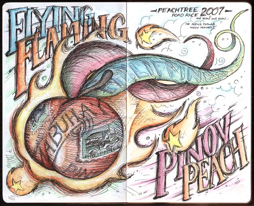
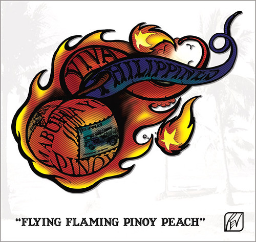
Tessa wanted the design to revolve around 30 (she'll be turning 30 soon…), Manila/Filipiniana, 4th of July, Atlanta, Pinoy/Pinay Peach (state fruit of Georgia) etc. This is so interesting and thought-provoking that my mind was already running with ideas as I was reading her message. I remember replying with this "I'm thinking of a shirt design, featuring a realistic Filipinized "peach" (I've been looking at previous winning shirt designs sa race niyo), so if both you and Glen are wearing it, the two of you will be wearing peaches on your shirts... looking good enough to eat. When I mean Filipinized, parang may tatak Pinoy (flag colors, sun and stars) on the peach itself. It will be photo-manipulated work. But it's still an idea... We might go for a more graphic iconic look." It's important for me to write it down, the idea at least. Soon, I found time of actually realizing the idea into a sketch in my notebook: Flying Flaming Pinoy Peach!

2007-05-16

Got feedback from her and I found this one quite amusing: "Can you separate the star ball at the bottom left from the big ball of peach/fire? Or is it supposed to be there talaga? It kinda looks like a big nipple when attached to the big ball, hehehe :)" Yeah, it does look like a nipple, haha. A month later, I found time to digitize the sketch, adding in photo-manipulated elements of stamps and digital painting with etching effects. I was going for a striking design, like when you see it, you'll say "peach flambé!" while still emoting Filipino pride.

PinoyPeach

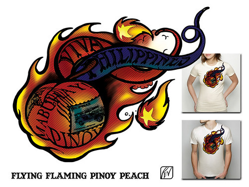
And the design, as I intended it to look on the shirts:

PinoyPeachdesign

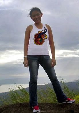
And Tessa as the model for the shirt:

Too bad, I won't have time to actually supervise the printing myself, since I'll be very busy. This will look best printed through digital silkscreen process with embossed rubberized inks for the black outlines. (Especially if it will be mass produced, 'di ba Tessa?) For the meantime, I asked Tessa to have it printed on their shirts through transfer process in time for their race.

Good luck to Tessa and Glen, the Flying Flaming Pinoy Peaches!

Thursday, April 5, 2007

Logo/Ambigram Design: FLIPNY Clothing Corporation (Prospective Work)

Recently, I was contacted by FLIPNY Clothing Corporation regarding developing ambigrams for them which will be used as their logo and integrated as shirt designs. They have been doing some research about ambigrams/inversions and came across my work and designs. They were quite impressed with my concepts/designs and were interested in acquiring some commissioned work. Naturally, I was interested in this potential project, as this combines my current creative passions: making logos, ambigrams and t-shirt designs.

This is prospective work, so I have to submit proposals first before they can commit to the project. Prospection helps the client decide whether the work initially fits the requirements for their project. For freelance graphic designers, prospection by clients can be very risky. You turn in your work first or previews of it, and hope it gets the "go" signal. I have been scammed before by potential clients, who used my "good as final" work without paying for them (even used it as an example for other artists to reference to!). But that's part of freelance designing.

FLIPNY is a clothing company that truly embodies the heart and soul of New York City and distributes it to the rest of the world. I found their company concept intriguing: "New York is not a City. New York isn’t even a State. New York is a lifestyle. A lifestyle that can’t be experienced by walking through Times Square or by visiting Rockefeller Center to check out the tree. It can’t be felt by shopping on 5th Ave or wining and dining in Tribeca. Only those that are most intimate with the city can truly see, hear and feel New York...The New York that they can feel as the FLIPNY logo burns on their chest and echoes through their head." I love New York. My 2 weeks stay before in that lovely city somehow gave me an experience of that lifestyle. In fact, if I ever get the chance to reside in the United States in the future, New York will be my place.

The image above shows their original logo. I was also supplied with previews of their current designs. So far, I have 2 distinct concepts, each one investing on the main company name "FLIPNY". These are just pencil sketches of the ambigram logos, but I think they are legible enough to get the message across.

Concept 1: Classic Gothic Style

I like this concept as this design offers a huge number of possibilities for shirt designs. The style uses classic Old-school lettering, similar to the "Angel & Demons" ambigrams. I added a little twist to the font, making it reminiscent of old New York pub or baseball team slogans. The design forms one word but effectively separates the name into its basic word components mainly "FLIP" and "NY". Here's the scanned image of Concept 1:

This will look cool as a tag or embroidered/printed at the nape or lower part of the shirt. Also, this looks like a logical evolution of their present logo, as the style is not so different. It adds a new dimension to the name, as the design can actually be "flipped" being an ambigram. I think it will work well and stand noticeable among logos of established T-shirt companies. I made small sketches of possible T-shirt designs using this as base design (sorry for the lack of details, but these are fast sketches). In this concept, the NY city skyline can be placed on top of swirl of the "F" (or below the "Y" in the inversion). The Statue of Liberty torch can be superimposed on the stem of the "F" (or "Y" in the inversion). These graphics are integrated effectively as part of the main ambigram, so they will also be inverted along with the main text.
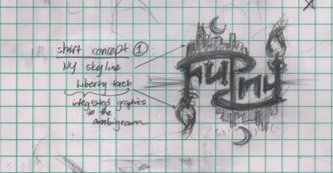

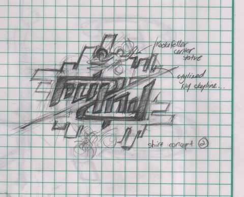
Of course, this is just a sample shirt design, as the graphic component of the design can be modified/replaced in unlimited ways. I am thinking of using other NY icons such as the Yellow Cab, Empire State, Rockefeller statue... images of daily NY life, such as hotdog stands, NY bystanders, speed bikers, office workers, skateboarders, etc. The potentials for design are endless, and can cater to almost any market.

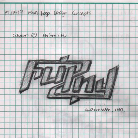
Concept 2: Modern/Hip(Hop)/Hi-Tek

Using a more modern font for the "solution", this like the first version also offers numerous possibilities for shirt designs. As this is more modern in approach, I think this will cater more effectively to the younger, sophisticated market. Here's the scan of Concept 2:
Here's a treatment of Concept 2 as a t-shirt design, this time, framing the logo with stylized illustrations of the NY skyline, and then highlighted with the Rockefeller Center statue. Of course, potential graphic components used will be endless, but I think for this version, geometric and linear graphic designs are more appropriate.
I think I made very interesting concepts that will surely make the company name stand out, even among established T-shirt giants. These two designs are definitely eye-catching and memorable. Hopefully, these proposals get the "go signal" an see the next stage in development.

Images copyright 2007 Rev Creations