Monday, December 29, 2008

Vienna: Please Come Home…

This is Vienna. She's a black/brown mini-dachschund who has been with the family for more than 7 years. We saw her grow up from a puppy to a cheerful dog. We allowed her to freely roam the house, hunting down the mice to her heart's content. She's intelligent in a unique way, and she would do almost the most outrageous things to get our attention. It seemed she envied the attention we gave the cats in the house to the point that she would even climb the chairs and table the way cats do, to our grave surprise when she would suddenly lick our lips during meals. She's the only dog I know who enjoys eating cat food. She's the only dog I know who doesn't bark at strangers but instead invites them to play with her. She likes being tickled on her belly, but be careful not to do it too much, because she tends to pee when she's at the point of ecstasy. She likes her face to be mashed up in your hands and doesn't mind a bit, as long as she can still breath. On one of her pregnancies, she suffered an hernia, where she needed to be operated on. The doctor said not to excite her so much so she wouldn't move too much to hasten her healing. But I guess with Vienna, that's impossible.

I guess we trained her to be too friendly and accommodating. One morning, she got out of our house without our knowledge (the garden and garage were being renovated) and when we discovered she was gone, she was nowhere to be found. Neighbors last saw her playing with a man. Our suspicion was that she has been taken away by this person. It could be anyone. Who could resist not owning such a friendly pet? Now, what I couldn't fathom is how people could simply grab a dog from a street without thinking that there could be a family looking for this dog. They could have asked around first, a little concern. This is basically kidnapping. We have lost a family member, and our family is grieving. We just pray that whoever took Vienna to please kindly return her to us… and if ever in your cold heart, you wouldn't do so, at least take care of her more than we cared for her.

Monday, December 8, 2008

Spinning: Coming Soon!

Poster4sm

That's the teaser poster for "Spinning" the children's book that Irene and I have been working on. We're glad that the Autism Society of the Philippines (ASP) will be helping out in disseminating information and buzz about this book.

I'm on the last stretch with my illustration for this project and it had been a wonderful adventure bringing the characters and colorful scenes of Irene's story to life… Anvil still has to do the final lay-out as soon as I complete the illustrations so we're targeting to release the book by February. Exciting!

Here's an alternate poster with our bios.

Poster5sm

Thursday, November 20, 2008

A Beautiful Day…

I woke up early today a little disoriented. You know that feeling when you don't realize you've fallen asleep while watching a show and you wake up with the television still on. You try to figure out whether the dream you had was really a dream because it was so vivid, so detailed you'd think you just watched a movie! I'm no stranger to dreams with fantastic settings and film-like plots, but this is the first time I had a dream starring Colin Firth and Maria Bello… why them? I don't know with my overactive brain. It's about this girl (Maria Bello) who finds an anonymous diary while cleaning up her basement. Now, as she reads the diary, which is actually a recounting of a man's love to a woman, events in the diary coincide with her memories of her own failed relationship with her ex-boyfriend who left her for another girl. Colin Firth is a shy neighbor who is struggling to lead a new life after his wife's tragic death. Colin and Maria seem to relate because of their own personal baggage but at the same time, it is a huge obstacle to their budding relationship. I won't go further into details, but in the end, Maria discovers that it was actually Colin who wrote the diary… and there's a funny twist when Colin realizes that Maria has been reading the diary all along. Weird no? I don't know how original the story is (it somehow reminds me of the Korean movie "The Classic"), but it's worth documenting into a storyboard. It might be a good story to base a project on… I hope I had more dreams like these…

It was coding day, so I have to drive to work early to beat the 7 o' clock curfew. But waking up early is not such a nuisance if you see this beautiful sky smile:

I had an aquatherapy session where I found myself teaching my client how to say "The Prayer of Jabez"… and somehow I realized, it had been quite a long while since I had been of service to God.

I left work early to attend a "Comic Writing for Artists" lecture at the UP College of Fine Arts (which complemented the "Comic Making for Writers" lecture by Jonas Diego last Tuesday at the UP College of Arts and Letters). I arrived early, but I had a chance to roam around the campus, and even though it was my first time, there was a certain familiarity with the ambience there. I thought, "What if I followed my heart's desire 14 years ago and became an artist?" Thanks to Gerry Alanguilan, Elbert Or, and Jamie Bautista for their wonderful insights regarding comic creation. Gosh! College students were all around at the lecture… I felt like I was sticking out like a sore thumb in the classroom… ako ata pinakamatanda! But I thought, you can never be too old for something you like to do. Got this from Sir Gerry:

on my own Moleskine! I'll build an Elmer themed spread around this dedication. Thanks Sir Gerry!

I had to kill time so I drove to the Bahay ng Alumni to have a snack at Chocolate Kiss. But instead of eating there, I ended up watching the dress rehearsals for "100 Years of World-Class Music" featuring the Philippine Madrigal Singers, UP Concert Chorus, Indayog, and many more. It was a rehearsal, but it was almost like the real thing (plus, I get to see the workings behind such a production… including foul mouthed director and confused stage managers!)… The song and dance numbers were so well-performed heartfelt I found myself moved to tears. Gosh, I miss seeing and hearing things of beauty for a long time… I missed singing in the choir… haaay… ang tanda ko na.

And then I met with a new friend at Starbucks… such a beautiful day! Glad I could smile and be genuinely cheerful again… and now, back to spinnninnnnng…

Wednesday, October 22, 2008

Creative Project: “Raisinhead: A Tale Of A Modern-Day Tiyanak”

There's a time when a story that you have been brewing inside your head ever since you were a small boy has to be told in one way or another. One such story that I have is that of Raisinhead. I don't know, what led me to create a story of a tiyanak and his quest for vengeance. Perhaps it were the nightmares (which mostly featured mangled aborted babies and other anatomy-related gore) that plagued my childhood slumbers or the late-night horror movies with deformed twins or the devil's spawn in unwilling mothers. But through the years, I was able to spin numerous versions of Raisinhead, and the most recent iteration has found its way on a medium I fondly love: graphic fiction or more commonly, the comics.

I've been working on Raisinhead for months now while interspersing my free time with logo design and ambigram work. But what really pushed me to develop this story into its graphic form is because I wanted to join this prestigious contest and what material to use best but one that has been close to my heart.

Here are previews of the art, and as you can see, I used the classic ink brush approach for the line work. I laid out the pages first with speedy sketches, and from there developed more complicated sketch work until I'm ready for final inking.

I scanned the panels and decided to place the text in via Photoshop since my handwriting is not legible enough to match the art (thanks to my De Quervain's!). Here's a preview of the 1st page.

I have basically finished Raisinhead already and in the process of having it reviewed, and so far it's been creating some stir in my family and among friends. Here's how the unveiling of the work went during a family dinner. You can basically see my brother (left) pissed off while debating with my mom (right) on its merits and demerits. It's weird how Archie (beside my mom) can give harsh critiques even though he hasn't read it yet, and my ninang (center), intrigued with all the talk, who doesn't read comic books at all, decided to read it and join in the debate…

Hahaha, it was an amusing night! But, I was glad. If Raisinhead could cause such a controversial debate in my family who know me very well and be very very critical… how much more if it is read by the general public! Some of my friends who have read it called it "heartbreaking…". I'm just glad that its 12 pages can have that effect! But hopefully, I'm not priming any of you before you read it. Hmmm, I can't have it available online. But upon request, I can provide you with the link to the .pdf file I have of Raisinhead (50 MB!). I just hope it fares well. But whether it gets a nod or not, I'm just glad it's out of my system in a format I love. Hmmm, you'll never know, I might decide to work on a graphic NOVEL version of it. Actually, I'm already working on the storyline of another graphic work I'll be creating (Hint: "Magkadugtong na bituka…")(while finishing Spinning, of course…). Here are close-ups:

Does the boy above look like me?

Work in Progress: Spinning (Paikot-ikot)

These past few weeks, I have been very busy working on two creative projects simultaneously, and with the available free time I have for creative work, you can say I'm progressing slowly but surely on these. I'll be writing about the other project in another blog entry, but for this one, I'll talk about "Spinning" first.

"Spinning" is a delightful short story written by Irene Carolina A. Sarmiento (Teacher Irene) about Kuya who has autism, his sister, Tin-Tin and their family.

"Like a giant top, he spins, and spins, and spins for fun. Tin-Tin wants to help Kuya so that they can play together and learn new things. In this story about love and understanding, Kuya also has plenty to share with Tin-Tin and with the whole world."

The book aims to highlight what children with autism are capable of being and sharing with others as whole human beings. It seeks to look beyond their handicaps and differences, and see how special these children truly are, with their own special gifts and abilities. As far as I know, this is the first story for children that Irene has ever written (or will be published – I'm sure she's written lots, for that matter). Having read most of her previous works, some of which have already garnered prestigious literary awards (Carlos Palanca Memorial Awards and Philippine Free Press Literary Contest), I'm more accustomed to her work on science-fiction and fantasy mostly using modern twists on Filipino folklore. But after reading "Spinning," I knew she has written a heartwarming tale that families and teachers can relate to, and when she asked me if I could illustrate her book, I was MORE than willing to agree!

First, I had to convince the publisher (Anvil Publications) that I'm qualified in illustrating a children's book. It would have been a lot advantageous if I was a member of INK (Ilustrador ng Kabataan), since most publishers get their illustrators from such organizations (mental note to join next time they call for members!). But thanks to my online gallery in deviantART, Flickr, and my (unfinished) website, and most importantly my personal experience in working with kids with autism, the publisher gave me the green light. Here are just some of the sketches I sent them.

And so after signing the contract, I'm now in the slow and grueling (but FUN!) process of setting into pictures the words that inhabit Irene's story. After receiving the specifications of the book, I laid out the needed illustrations based on these. I'll be creating approximately 15 to 20 individual paintings. Irene and the publishers imagined a dreamy (almost pastel-like look), but boldly colorful style for the art and somehow I was more inclined to use watercolors as base with pencil, pen or acrylic highlights for the paintings to achieve this look. Hmmm, I used the word slow, because the process I imposed on myself would require stages before the final actual artwork, and so far, I've only finalized three plates, and each required 3-4 stages, each an artwork by itself already! And with the limited time I have to work on these (I have a day job by the way!), it will indeed be a slow process. But I'm getting there!

The characters are the heart of the story and I have to get them right. For the character of Tin-tin, you will notice that I started out with the cliché girl with the pigtails look, but somehow I felt that I have to infuse the character with the author's personality and look (since she was coursing herself through this character, I think). I asked for Irene's child pictures which I could use as reference.

For Kuya, I had to use a variety of references, from my kids in Quality Life Discoveries to my very own kiddy pictures.

For the cover, which we also intend to use for the promotional, I decided to work on a special customized font for the book. I initially did sketches for the cover to feature Tin-tin in the foreground; however, finally, we decided to put Kuya in front. Also, during this stage, I still wasn't decided on how Tin-tin would look like, but finally settled on a straight hair look to maintain constancy.

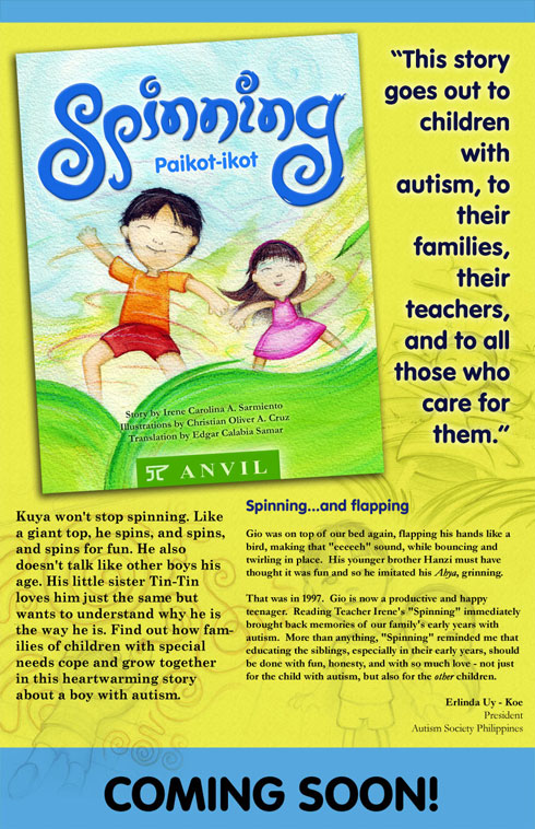
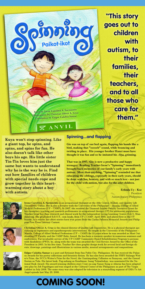
Using my initial sketches and mock-ups, I worked on a potential promotional poster which hopefully will be run soon pending approval from Anvil. But, you've seen it first here!

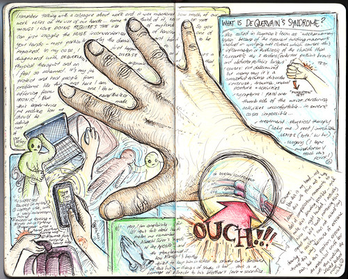
And here's a preview of how another spread is coming about...

And this ain't the final version yet!

Wish us luck, and hoping for the best for the book!

Friday, September 26, 2008

Logo Design: Philippine Physical Therapy Association 2008 Logo Contest

In celebration of the 10th National Physical Therapy Day last September 8, 2008, the Philippine Physical Therapy Association (PPTA) held a logo-making contest to promote awareness among PT students and professionals about the current and evolving practice of the Physical therapy profession in the Philippines. I really wasn't intending to join this contest because of numerous creative projects I'm currently involved in but as the deadline drew near I thought, "Oh well, I better create something as well, for old time's sake…" That's the reason why I told in my previous blog that somehow I wished I spent more time in creating this logo. But as other designers have shared, it's not the time spent on creating the logo that counts but the over-all impact it produces.

I said old-time's sake… and I really do mean old-time. I've been creating artwork for the PPTA ever since I became a member, ranging from conference logos, lay-out design, audio-visual presentations and even the first inception of the website. Below, you will see the original logo of the PPTA (not mine), and 2 conference logos I made (I have 2 others, but for some reason, I could no longer find them in my files) and an updated version of the original logo (I wonder why they stuck with the old logo).

PPTA Logo


Here it is, the winning logo of the PPTA 2008 Logo Contest:


"This logo retains the hand symbolisms of the original logo, representing the essential service-oriented theme of the Physical Therapy profession. In this rendition, the hands are arranged, open representing evolution of the practice; and emanating influence around the world (represented through the globe, another symbol retained from the original), which is the role Filipino therapists will take in the world scene. Within each hand and shape are embedded subtle symbolisms of the various fields and niches of the Philippine PT practice – pediatric, geriatric, sports (light green area - people), orthopedic/musculoskeletal (dark green area – spine symbol), neurologic, musuloskeletal (red hand – EMG, ECG signals), academics, clinical teaching, paramedical, pulmonary, etc… (blue hand – caduceus, with human figure, book)… The logo is arranged into a modern and eye-catching mark which can be presented in various formats and color schemes, ideal for many applications of this mark."

I wasn't really expecting this to win, but I enjoy good news, especially unexpected ones. I'm not sure if the PPTA will choose to replace the old logo with this new one, but somehow I feel I needed to work on this more (I still feel, this is not as distinct and compact as the original logo). But all in all, I'm glad this work was chosen (still creatively in service to the PT profession!).


Logo Design: Akande Music and Publishing

Akande Inc. is a 12-year old company that has been immersed in artist development, songwriting & song production. Akande Inc. has most recently decided to include publishing to its list of services. With a publishing campaign slated to begin Summer 2008, Akande Inc. is developing a diverse catalog of songs targeted towards the following industries: Movies, Advertising/Marketing, Television and Gaming. Aside from continually looking for unique individuals to help maintain an interesting and diverse sound within their catalog and extending their genre (Hip Hop, R&B, Pop, Rock and Folk Pop) to also include Metal, Dance and Children's Music. In line with their ongoing expansion, they would also like to spruce up the logo they currently have... something that would ultimately sit well on a website, t-shirt and business card.

Here is their original logo, which is actually a guitar tablature with the A chord. The red dots match the color of the A in the text.

The logo is a very distinct one, and although they were open to significant modifications of the logo, I thought that drastically deviating from their branded image will be detrimental to their planned expansion. Here are versions showing a more dynamic representation of the tablature and text.


Thinking that the slanted 3d-fied version of the tablature looks slightly unbalanced (doesn't work well as an icon), so here are versions where the tablature forms the negative space in a distinct iconic shape.


And in versions in horizontal arrangement and "just the dots" configuration in a font similar to the original one.


Ultimately choosing my original icon proposal, but fine-tuning the size of the dots.


Looks good as black and white versions and a mock-up proposal of their website (how the logo will be used in the website).

Tuesday, September 23, 2008

Tristeza…

Imagine being interviewed by GMA7 Emergency and you can't keep your head focused because you just realized something heartbreaking. Normally, I would be excited to watch my own TV debut but somehow I consciously tried to avoid watching it. And my friends who were able to watch the episode tell me that the network got my name wrong.

Then I review my notes for Watsu for an upcoming convention lecture and I wish to myself: "I wish someone would Watsu me…" suddenly realizing that I've given countless selfless hours of soul-enriching Watsu to others. I am a giver by nature, and somehow I find purpose in sharing and being needed. It's quite puzzling why I feel uncomfortable in receiving… perhaps somehow I feel unworthy.

I drove last Sunday to the PPTA convention for my lecture and I had the Eraserheads on my mp3 player plugged in. And when the song "Overdrive" played, I felt a profound emptiness… suddenly the song has lost its meaning… now that I know how to drive… and I suddenly remember the reason why I decided to learn how to drive. And the song "With A Smile" plays and it too has somehow lost its flavor. Suddenly the engine of the car sounded weird and after pulling over to check, I see that the muffler had collapsed and had been dragging along the road. Good thing I was already near the convention place, and dragged the muffler for at least 4 more kilometers. I then hired some boys to fix it up. Lecture went well but somehow I felt I needed more time (missed some points to discuss) but I ended up with some of the attendees feeling like they were Watsued already themselves. I guess my HeartMath practice worked. So nice to see familiar faces… friends, CAMPers, students (previous, now colleagues!)…

Left as soon as I finished the lecture, drove to Greenbelt to buy some heavy watercolor papers for an upcoming project ("Spinning!") and ink for my Raisinhead comics, and a fine brush that I need for an oil painting ("Puno ng Pangarap") I have yet to finish. I get text messages telling me my logo design for PPTA was chosen and how they liked it, and I'm glad but somehow I wished I spent a lot more time creating it. I don't know, out of the blue, while walking around the Ayala malls, I thought of this: "I'm not perfect. I can do a lot of things pretty well but I can be a bit of a stupid jerk in most other stuff… I'm weird and quite socially inept…" Oh well, I drove home as fast as I could (almost forgetting about the muffler. But the boys seemed to have done a good job… the muffler stayed… I stayed…)

Spinning Preliminary Sketch

Raisinhead - Tale of A Modern Day Tiyanak Panels

Puno ng Pangarap Work In Progress

By the way, thank you Diwi for saying "I love you Teacher Rev!" (I love you too), thank you Jared for treating me as the Mr. Bean of your life, thank you Ben for smiling at me whenever you see me, thank you Leslie for the wonderful time, thank you Irene for the Spinning opportunity (hoping for the best)… Good vibes to all…

Wednesday, September 17, 2008

Ambigram Project: Angel - Belle

I was sent a sketch by Candice who wanted help with an ambigram that reads "Angel" and "Belle" in different configurations.

I really appreciate this attempt, and looking at her solution, I would say that she has found the solution for this ambigram: The "a" of Angel automatically forms the "e" of Belle; the "n" of Angel conveniently translates into the double "l" of Belle; the "el" into the "B"; the challenge here obviously is the "g" and "e" combination.

In creating ambigrams, the ultimate goal is to make the words as legible as possible. In this case, I decided to change the usual configuration of the "e" by flipping it making it readable as a "g" the other way around. With testing, I think it worked.

Upon request, I made the "a" and "e" more curved and feminine.

I just hope that this ambigram will be a worthy tribute to Candice's friend.

Click on the image to rotate...

Wednesday, September 3, 2008

Logo Design: Physical Medicine & Rehabilitation Department of Makati Medical Center

In time for the National Disability Prevention and Rehabilitation Week Celebrations last July, The Physical Medicine & Rehabilitation Department of the Makati Medical Center (MMC) commissioned me to create a logo for them. Candice, a staff physiotherapist sent me their initial concepts, which she described as something that looks so much like "The Incredibles":

They wanted a logo that would be used in pamphlets, official documents, lectures, embroideries – all official functions of the department. The logo then had to be simple, iconic and easily represented in all types of media, including clothing. Thinking about a representative symbol for a rehabilitation clinic is not easy especially if you want to be unique. Cliché symbols includes stylized humans in various dynamic poses, wheelchairs and other adaptive equipment and many else (and I've used so much of these in many previous projects!). I started with a particular symbol, that of a hand (which is a cliché symbol in itself). But then I added an ellipse above to make it somehow look like a person.

I then arranged three of these symbols into a composition, something I hope will be able to represent 3's in the rehabilitation profession: the rehab team of the physician, therapist and client, the allied professions composed of the physical therapist, occupational therapist and the speech pathologist, and their vision, mission and objectives.

The idea behind the logo drew an instant appeal from their staff and department head, Dra. Melissa Zamuco-Mercado, and was immediately integrated as part of their celebrations and department branding. As of this moment, the logo is already in use, and pending final approval by the administration of MMC.

And the simplified 3 color versions with the circular seal variation.

Monday, August 25, 2008

De Quervain...

2008-08-21

I remember talking with a colleague about the things required in our line of work and we ended up claiming that our hands are our most valuable tool. Come to think of it, almost EVERYTHING I love doing requires the use of hands. So, just imagine the inconvenience of having an impaired hand, rendering it almost useless because of pain! Yes, I've been nursing a severe case of De Quervain's Syndrome for more than 2 months now, and there was a week where the pain was so intense I couldn't do anything at all! It's so ironic that as a physiotherapist and ergonomist by profession that I would have one. It is my job to protect and heal people from such problems, and here I am afflicted with one. Well, a lot contributed to this... work (handling patients in and out of the water with unusual hand positions), trauma (I carry a heavy bag to work) and abusive thumb movements during cellphone, mouse and laptop use. In fact, I drew this page entry with pain in my hand... my left hand modeled as my affected right arm drew). Funny, how we can be our worse patients. But I'm greatly relieved it's healing now.

Brought a lot of reflections... such as the story of Abrecht Durer's "Hands of the Apostle" and how it came to be...

Back in the fifteenth century, in a tiny village near Nuremberg, lived a family with eighteen children. Eighteen!

In order merely to keep food on the table for this big family, the father and head of the household, a goldsmith by profession, worked almost eighteen hours a day at his trade and any other paying chore he could find in the neighbourhood.

Despite their seemingly hopeless condition, two of Albrecht Durer the Elder's children had a dream. They both wanted to pursue their talent for art, but they knew full well that their father would never be financially able to send either of them to Nuremberg to study at the Academy.

After many long discussions at night in their crowded bed, the two boys finally worked out a pact. They would toss a coin. The loser would go down into the nearby mines and, with his earnings, support his brother while he attended the academy. Then, when that brother who won the toss completed his studies, in four years, he would support the other brother at the academy, either with sales of his artwork or, if necessary, also by labouring in the mines.

They tossed a coin on a Sunday morning after church. Albrecht Durer won the toss and went off to Nuremberg.

Albert went down into the dangerous mines and, for the next four years, financed his brother, whose work at the academy was almost an immediate sensation. Albrecht's etchings, his woodcuts, and his oils were far better than those of most of his professors, and by the time he graduated, he was beginning to earn considerable fees for his commissioned works.

When the young artist returned to his village, the Durer family held a festive dinner on their lawn to celebrate Albrecht's triumphant homecoming. After a long and memorable meal, punctuated with music and laughter, Albrecht rose from his honoured position at the head of the table to drink a toast to his beloved brother for the years of sacrifice that had enabled Albrecht to fulfil his ambition. His closing words were, "And now, Albert, blessed brother of mine, now it is your turn. Now you can go to Nuremberg to pursue your dream, and I will take care of you."

All heads turned in eager expectation to the far end of the table where Albert sat, tears streaming down his pale face, shaking his lowered head from side to side while he sobbed and repeated, over and over, "No ...no ...no ...no."

Finally, Albert rose and wiped the tears from his cheeks. He glanced down the long table at the faces he loved, and then, holding his hands close to his right cheek, he said softly, "No, brother. I cannot go to Nuremberg. It is too late for me. Look ... look what four years in the mines have done to my hands! The bones in every finger have been smashed at least once, and lately I have been suffering from arthritis so badly in my right hand that I cannot even hold a glass to return your toast, much less make delicate lines on parchment or canvas with a pen or a brush. No, brother ... for me it is too late."

More than 450 years have passed. By now, Albrecht Durer's hundreds of masterful portraits, pen and silver point sketches, water-colours, charcoals, woodcuts, and copper engravings hang in every great museum in the world, but the odds are great that you, like most people, are familiar with only one of Albrecht Durer's works. More than merely being familiar with it, you very well may have a reproduction hanging in your home or office.

One day, to pay homage to Albert for all that he had sacrificed, Albrecht Durer painstakingly drew his brother's abused hands with palms together and thin fingers stretched skyward. He called his powerful drawing simply "Hands," but the entire world almost immediately opened their hearts to his great masterpiece and renamed his tribute of love "The Praying Hands."

...a story of love and sacrifice... Come to think of it, what if we truly lost the use of our hands?

Monday, August 18, 2008

Logo Design: Flex-3 Fitness Product

I recently designed the logo that will be considered for a new fitness product, the "Flex-3" which stretches and tones the muscles and joints of the shoulder girdle, chest and upper back to improve flexibility and strength, decrease pain and improve posture. The device helps golfers improve their drive and overall game and practically "unleashes their A-Game." In a therapeutic setting, it helps patients with slumped posture, pain and stressed-out muscles in the upper back and shoulders, as well as pain and tingling down the arms and hands. A session takes only 3 minutes and greatly improves shoulder girdle flexibility and tone, hence giving it the name "Flex-3". John F. Carlucci, D.C., chiropractor and owner of a physical rehabilitation facility in New Jersey developed and patented the Flex-3 device. He wanted a logo to represent the product.

The product goes with the tagline "Super Flexibility in Just 3 Minutes." Specifications stated that fonts, graphics and style must be dynamic yet professional since it will be directed at financially and educationally upscale golfers and medical professionals. Some sort of stylized or abstract human figure can be incorporated into the Flex-3 logo text that communicates upper body flexibility, dynamism, vibrancy and life. John wanted the logo to be so visually striking and instantly compelling that when people see it on a T-shirt, golf hat or ad they think "that REALLY looks cool, what's that about?"

Initial ideas consisted of integrating a human figure within the text, and the most obvious way to do that is to replace the "X" with a human figure. I suppose this approach has been done in innumerable designs in various configurations, so this version should somehow be unique. Since the product emphasizes on flexibility, I decided to separate the human figure in two components, with each one using different colors. The two components met at each other's point, forming the apex or the joint of the figure. I think this suggested movement even though it is essentially a static figure.

Adding in the text, using a modified Microgamma typeface (connected capital "F" and "L", with a small "e", of the same height) and a dynamic "3" (using Scope-3, a typeface I developed), I completed the initial proposed logo. Since the "X" was the main focus, I made sure it was exactly in the center of the whole logo, adjusting the rest of the text to make it balanced. I made an enclosure that "bent" inwards, further placing focus on the human figure.

John commented that I tone down the "3", the same font as the rest. In a way, the "3" seemed too loud, taking away the attention from the "X".

The frame used before seemed to penetrate into the logo (the logo has to float on top of this frame), thus decreasing its legibility. I devised another frame that provided an ample enclosure, and with its design, also suggested "flexion".

After providing multiple color options, the final design was eventually accomplished and released.

The logo can now be seen in use at their website at Flex-3, Inc., and a video of the actual product can be seen below.