Showing posts with label physical therapy. Show all posts

Thursday, April 15, 2010

Guesting at DZMM Teleradyo: Todo Todo, Walang Preno

Quality Life Discoveries was supposed to be featured at Umagang Kay Ganda, the daily morning show of ABS-CBN, on Wednesday, focusing on the various services that the clinic offers. Of course, being the Aquatics specialist of the center, I was more than prepared to demonstrate and talk about Aquatherapy and WATSU® once more, the last time being in Unang Hirit (GMA's morning show). This meant waking up as early as 3 am, to be at the clinic at 4 and sink in the pool for more than 3 hours straight. Gruelling work, while trying to look pretty for the camera! But highly enjoyable!

However, due to some reasons, Umagang Kay Ganda had to back-out and instead I was invited to be a guest at a radio talk show in DZMM… Fine, I did radio interviews before, but of course I couldn't hide my disappointment. The first question I asked myself: Do I still have to wear my swimming trunks?

I was told to be at the DZMM station around 10:30 AM per instructions just in time for the 11:00 talk show. I was greeted by Lyn, the station assistant who led me to the make-up room. I saw the television screens around broadcasting the live radio shows and only then did it dawn to me that this was a televised radio show: Todo Todo, Walang Preno. Darn, I should have worn my trunks! Kidding aside, I was wearing the clinic's uniform of course. Make-up make-up while chatting with Lyn who shared how she could relate very much with the topic to be talked about because she had a nephew who was a "special child." Not long I was led to the booth, where hosts Winnie Cordero and Ariel Ureta were already airing. Off air, Winnie would talk to me, orienting me when we would go on-air, and asking a few questions about me, my work as a clinical consultant in QLD and the programs. I looked around from my seat, and pretty interesting, I could see the producer and technicians in their own booths, and pointed at me was a robotic camera. Ooops don't stare! Winnie and Ariel had their own cameras too. Good thing I was wearing the aqua colored shirt… looks good onscreen. I don't really listen to radio shows, but seeing how Winnie and Ariel work… uhhm, actually work is not the right word, have fun on-air, I was amazed… they're funny, witty and entertaining. After their signature "word of the day" segment, they were already informing the listeners about the next topic: "One Stop Shop to Wellness." This is it… just be my natural self, and forget the camera, forget that you're on air. It's just a conversation.

On air! Winnie asked me about my work, starting first with how I got to be called Teacher Rev… then my work as a physical therapist, how long it takes to be one and so on. We then talked about the programs starting with the TheraSuit Intensive Method, then Aquatherapy, which we spent considerable time with, with me talking about how great the water environment is in bringing out the best in children with disabilities, and at the same time, enjoying it. Ariel, would occasionally summarize or generalize these thoughts, highlighting the importance of early intervention and how physical therapists are "heroes", even "magicians" for helping patients regain their strength and skills when most think are unrecoverable. We had a short break, while new reports and some features were covered. Then in a few minutes, I was back on air, to continue talking about the other programs. I admire Winnie and Ariel for creating a light-hearted atmosphere that I almost forgot we were broadcasting. I wondered before the show, how such a potentially serious topic could fit their show, but they managed to bring out some laughs, while maintaining an educational tone all throughout. I asked Winnie if I could leave some parting message (remembering the small chat with the make-up artist who were all sad and pitiful about people with disabilities) and I did… (translated already) that we shouldn't focus on what our friends with disabilities can NOT do… because if we did, we are depriving them with opportunities to uplift themselves, and furthermore as a therapist, we wouldn't last long with our work… instead, we should focus on what they CAN DO… the small improvements that we see in our patients sometimes are enough reward to push us though…

The show finished around noon, and I asked for a photo with them. I thanked Winnie and Ariel for wonderfully championing the physical therapy profession, and told him that all PT's who were listening would be very glad. I went back to the clinic, very very happy.

Friday, September 26, 2008

Logo Design: Philippine Physical Therapy Association 2008 Logo Contest

In celebration of the 10th National Physical Therapy Day last September 8, 2008, the Philippine Physical Therapy Association (PPTA) held a logo-making contest to promote awareness among PT students and professionals about the current and evolving practice of the Physical therapy profession in the Philippines. I really wasn't intending to join this contest because of numerous creative projects I'm currently involved in but as the deadline drew near I thought, "Oh well, I better create something as well, for old time's sake…" That's the reason why I told in my previous blog that somehow I wished I spent more time in creating this logo. But as other designers have shared, it's not the time spent on creating the logo that counts but the over-all impact it produces.

I said old-time's sake… and I really do mean old-time. I've been creating artwork for the PPTA ever since I became a member, ranging from conference logos, lay-out design, audio-visual presentations and even the first inception of the website. Below, you will see the original logo of the PPTA (not mine), and 2 conference logos I made (I have 2 others, but for some reason, I could no longer find them in my files) and an updated version of the original logo (I wonder why they stuck with the old logo).

PPTA Logo


Here it is, the winning logo of the PPTA 2008 Logo Contest:


"This logo retains the hand symbolisms of the original logo, representing the essential service-oriented theme of the Physical Therapy profession. In this rendition, the hands are arranged, open representing evolution of the practice; and emanating influence around the world (represented through the globe, another symbol retained from the original), which is the role Filipino therapists will take in the world scene. Within each hand and shape are embedded subtle symbolisms of the various fields and niches of the Philippine PT practice – pediatric, geriatric, sports (light green area - people), orthopedic/musculoskeletal (dark green area – spine symbol), neurologic, musuloskeletal (red hand – EMG, ECG signals), academics, clinical teaching, paramedical, pulmonary, etc… (blue hand – caduceus, with human figure, book)… The logo is arranged into a modern and eye-catching mark which can be presented in various formats and color schemes, ideal for many applications of this mark."

I wasn't really expecting this to win, but I enjoy good news, especially unexpected ones. I'm not sure if the PPTA will choose to replace the old logo with this new one, but somehow I feel I needed to work on this more (I still feel, this is not as distinct and compact as the original logo). But all in all, I'm glad this work was chosen (still creatively in service to the PT profession!).


Wednesday, September 3, 2008

Logo Design: Physical Medicine & Rehabilitation Department of Makati Medical Center

In time for the National Disability Prevention and Rehabilitation Week Celebrations last July, The Physical Medicine & Rehabilitation Department of the Makati Medical Center (MMC) commissioned me to create a logo for them. Candice, a staff physiotherapist sent me their initial concepts, which she described as something that looks so much like "The Incredibles":

They wanted a logo that would be used in pamphlets, official documents, lectures, embroideries – all official functions of the department. The logo then had to be simple, iconic and easily represented in all types of media, including clothing. Thinking about a representative symbol for a rehabilitation clinic is not easy especially if you want to be unique. Cliché symbols includes stylized humans in various dynamic poses, wheelchairs and other adaptive equipment and many else (and I've used so much of these in many previous projects!). I started with a particular symbol, that of a hand (which is a cliché symbol in itself). But then I added an ellipse above to make it somehow look like a person.

I then arranged three of these symbols into a composition, something I hope will be able to represent 3's in the rehabilitation profession: the rehab team of the physician, therapist and client, the allied professions composed of the physical therapist, occupational therapist and the speech pathologist, and their vision, mission and objectives.

The idea behind the logo drew an instant appeal from their staff and department head, Dra. Melissa Zamuco-Mercado, and was immediately integrated as part of their celebrations and department branding. As of this moment, the logo is already in use, and pending final approval by the administration of MMC.

And the simplified 3 color versions with the circular seal variation.

Saturday, June 14, 2008

Quality Life Discoveries

One thing leads to another. I've always professed that one's job doesn't dictate your mission. You're always bound to fulfill your life's mission in the jobs that you choose or get offered to. I guess it was time for a change, for me to move on, after a wonderful decade of teaching in the University of the Philippines, to start anew… to something that will jumpstart my interest and creativity.

The past few months, I've been very busy organizing and setting up Quality Life Discoveries (QLD). It seemed providential that during the times I've been studying Watsu® 1 and 2, I'll be joining them not only as an aquatherapy specialist and PT consultant but also as its clinical director as well. With a handful of therapists and consultants already trained in some of the flagship programs of QLD and a remarkable investment by good-willed owners (who themselves have a son with cerebral palsy), one of my initial goals was to mold QLD into a fully operational rehabilitation and wellness center. Macro-ergonomic theory and concepts, organizational skills and knowledge, passion for anything technological and cutting-edge; and taste for branding and visual aesthetics all contributed to this task.

What Quality Life Discoveries is all about…

Quality Life Discoveries actually forms the latest chapter in a family's tale of love. Edwin and Mary Ann Cua have been seeking the best medical and therapy services abroad for their son, Jared, since he was diagnosed with cerebral palsy due to prematurity. With all of their dedication and perseverance in seeking services for their son, Jared improved dramatically, developing functional skills defying doctors' discouraging prognoses. All their travels proved to take heavy toll for Jared, who grew more and more exhausted, experiencing a seizure attack which may have been due to the stresses of traveling. The couple thought that instead of risking their child's life going all around the world incessantly, why not bring all of these easily accessible right at their fingertips. The puzzle begins to be pieced together: therapists gathered, trained in new programs and soon, a center to be built not only for their son but for other families to share in the quest of discovering quality in their lives.

The Logo

People would expect that I had a hand in the design of the center's logo. It looks like one of my creations, but it is not. It was created long before I joined QLD. But I actually like this logo, enough to call it mine because of the concepts it represents. The yellow tile features a child's drawing of a family, representing the center's vision of being family-oriented. The center is not just a center for the recipient of the services but a venue where the whole family can spend time together. The green tile features hands representing the center's pledge on the service of enabling our clients and their families discover their potentials. The red tile shows a mother and child image, symbolizing the center's focus on authentic care. And finally the blue tile includes books representing the center's vision to be a venue for learning and research.


Programs and Services

  • Physical Therapy
  • Occupational Therapy
    • with Multisensory Environments
    • with Sensory Integration Intervention Programs
  • Aquatherapy
    • Aquatic programs for Kids and Adults
    • Aqua-fitness programs for Adults
    • Watsu® for relaxation and flexibility
    • Adapted Watsu® for kids (autism, cerebral palsy, movement disorders and others)
  • Hyperbaric Oxygen Therapy
  • TheraSuitTM Intensive Method
  • GigerMDTM Rehabilitation
  • Oral-Motor Therapy
  • Special Education Tutorials
  • And many more to include in the future…

I'll be featuring some of these programs in my blogs in the future in detail. I've already mentioned Watsu® in my previous blogs. For a more detailed discussion on each, please visit our website at http://www.qualitylifediscoveries.com . We still have to update it unfortunately. Our e-brochure may be viewed below.

Read this document on Scribd: Quality Life Discoveries E-Brochure

Branding

And now to the aesthetic aspect which I know contributes a lot to how people will view and accept QLD and its services. I wanted to brand Quality Life Discoveries in a way that will not be limiting (in terms of target market, eg.: not just the pediatric population but also adults) but will also stand on its own among health service providers. It is quite challenging to build around an established logo, and since the logo itself already features several colors, I knew that I have to invest heavily in the use of colors for branding. I also relied on colors for organizational and administrative purposes.

The following images show the art I created for QLD. The earlier promotional materials depict my heavy reliance on color, using violet framed by aqua as the primary colors. The established multi-colored logo (I have to build around it) can effectively stand above it. I assigned a color for each of the programs, which then became used as reference in our administrative operations (color coding of schedules, folders and forms according to the programs) and geographic references (each floor in the center is color-coded too, blue for the first floor, red for the second and green for the third).

Icons were created for each room, hopefully effectively representing the programs the rooms will be used for. It blends seamlessly with the architecture of the center. Those who have visited the center will be amused to see which icon I used for my office.

Here are the latest materials I created for the center:


Flyers, Handouts, Brochures, Tarpaulin and Promotional Materials.


Icon designs.


Door and Elevator Design.

Looking forward…

There are a lot more to accomplish in the center, and a lot more has happened behind the scenes which are far too detailed and busy to write about. Although we are already operational, we aren't officially open yet. Our blessing will be on July 19, 2008, just in time for the National Disability Awareness and Rehabilitation Week Celebrations. We are also still looking for physical therapists, occupational therapists and speech pathologists. So if you're interested or know someone who's interested, don't hesitate to forward resumes to revcruz@qualitylifediscoveries.com .

It's been a while since I wrote for my blog and it's quite understandable why. But I'll try to update this not only with updates from QLD, but also features of my latest artistic creations.

Wednesday, February 27, 2008

Freeing the Body in Water: Watsu 2 Course

Two week after Watsu® 1, we continued with our training in this special aquatic bodywork in the Watsu® 2 course held last December 10 to 15, 2007 at Quality Life Discoveries. The Watsu® 1 focused on the Basic Transition Flow and with the 2 weeks given before Watsu® 2, there was enough time to master the technicalities demanded of Watsu® 1. Watsu® 2 focused on the Expanded Flow, introducing more complex movements and maneuvers interspersed between the sequences of the Transition Flow. It is highly suggested that any student interested in taking Watsu® 2 remember by heart the sequences and has practiced with different types of body types as well. All 6 students who took the first course were once again together with Karen and Tom Neff, certified instructors for the second course.

In addition to the concepts learned in the first course (which included topics such as resonance/coherence, undisturbed states, etc.), we were able to discuss more about special considerations and adaptations of certain movements required in both Transition and Expanded flow, and the extensive experience and knowledge of Karen and Tom definitely provided a fulfilling learning opportunity. Since we were able to learn the sequences of Watsu® 2 quite well, we were given a special demonstration of Waterdance®, another aquatic bodywork very similar to Watsu with the difference of being submerged.

The Watsu® 2 course included a special session with children, both well and with disabilities. I had the opportunity of working with a child with cerebral palsy. My other classmates worked with kids with conditions such as autism and ADHD. One could just imagine a pool filled with kids, and it was a fun yet memorable experience. I realized the immense potential of Watsu® for kids with cerebral palsy, because of the possibilities for a variety of positions and maneuvers that could help in relaxation and stretching. There was an observed calming effect for the children with autism even if it was their first time in the pool. It was of course too soon to conclude with just this session but just imagine how a regular program with Watsu® could bring about additional benefits to the quality of life of these children. Therapists in other countries have integrated Watsu® in their aquatic programs, and even parents have advocated its use as an adjunct to existing therapies.

During this course, we were given our own special Watsu® sessions by our instructors. Karen gave me Watsu® and it was indeed a special one. I wasn't able to sleep as the other participants, but besides being fully relaxed by the warm and flowing water, I was able to focus on some of my thoughts with clarity I have never felt before. It was as if the silence of the water, while being held by another person's arms brought me home with a renewed confidence in myself. The session with me proved that size is not a major issue.

Evaluation required being observed by our instructors while giving Watsu® to someone who hasn't receive Watsu® before. Anyone can definitely feel the tension in the air when we were being evaluated, and it had been a long time since I was given an exam and a practical exam at that! And for a Watsu® session to be successful, the giver should be relaxed, otherwise the tension would be felt by the receiver, thus it would be counterproductive to the session. I invited my dad to be my receiver for that session. At first, I was hesitant to have him as my receiver for personal reasons, but eventually I mustered enough will to give him Watsu®. It was after all a gift to be given one and I wanted my dad to personally experience this. The session with my dad was very special, for I wasn't able to follow the sequence. I had to adapt to what the body of my dad was telling me, for at first he was very tight and tense. Soon, my dad felt lighter in my arms and he was not relaxed in the water. It's a subtle but satisfying feeling of joy, when as a giver, you know that the receiver in your arms have already surrendered to the water. My dad said with arms spread apart after our session: "I felt like I was in outer space!" He patted me on my back. Somehow, I knew he wanted to hug me for such a wonderful experience, but the pat was enough. Besides I was hugging him like a child all throughout our session.

Before we parted ways, Karen and Tom showed us an audio-visual presentation – a visual memento. It was a very emotional experience as each one of us reviewed the time we spent together learning. We are now part of the worldwide Water Family.

In behalf of the participants, we also gave Karen and Tom a signed print of the special blue rendition of "Poetic Synergy". It was truly dedicated to them, since the artwork wouldn't have been created if it wasn't inspired by Watsu®.

Monday, November 26, 2007

Freeing the Body in Water: Watsu 1 Course

I just recently completed an intensive week of Watsu 1 and I must say it was a rich learning experience. Not only was it all about knowledge and skills but focused also on connection with the "receiver" of a Watsu® session. And since I intend to apply this newly refined skill as part of my own personal and professional development, my clients, be they abled or differently-abled will truly benefit from Watsu®. Here's Harold Dull, the founder of Watsu® presenting an introduction to this unique form of aquatic bodywork.

The course ran from November 19 to 24, 2007 at Quality Life Discoveries (Special People's Hub) and was supervised by Karen Neff, certified Watsu® practitioner, instructor and owner of Mandala Spas and Villas of Boracay. She was assisted by her husband, Tom Neff, also a certified Watsu® practitioner. There were only 6 of us as students and close guidance and supervision was provided. It included mostly hands-on sessions in the warm pools, a few didactics and land exercises. But generally, it was an intensive and exhaustive week, but at the same time a liberating and relaxing experience.

I have always been passionate about Watsu® ever since I received a basic introduction to it when I took a certification course in Sports for Physically Disabled Individuals in Tokyo, Japan (JICA sponsored). Ever since my professor lent me a training video, I've been integrating it if possible in my aquatherapy sessions, and demonstrating it in Aquatherapy classes. After receiving a Watsu® session, I'm convinced that this is something I could (actually, should) share to others. I saw it's potentials as a therapeutic modality among patients especially those suffering from pain, spasticity and other conditions. And since then, I've been looking for opportunities to further my knowledge and skills in Watsu®, but was only limited by my lack of resources (The courses offered in Harbin Springs, California are quite expensive not to mention, I have to travel there first. The nearest I've found was in India last September, but I couldn't leave my work in CAMP). It was providential that Quality Life Discoveries, per my recommendation, brought in the experts instead.

We learned primarily the Watsu® Transition Flow, perfecting it not only in the domain of technicality (remembering the biomechanics and sequence of movements) but most importantly on being able to connect in "resonance" with the receiver. Now, this is very important, as an academician myself, I've noticed that most students have only focused on the technicality of modalities, but are very weak in the more caring dimension of things. It gives a greater meaning on the term patient care – greater emphasis on "care"… it's not just handling but it's "caring". As in any modality, when the "caring" aspect is missing, one will not be able to achieve the full benefits. Unique to this course, We also applied Watsu® on children, both able and differenty-abled, where we have to consider modifications to the standard flow. Watsu® unlike other aquatic body work is very intimate. It is very interesting that we were discussing the following concepts aside from the techniques:

  • Resonance/coherence – All objects will in time sync in frequency. In Watsu®, it is the synchronization of breathing and heart beats. Water provides a deeper opportunity for synchronization.
  • Heart of service
  • The undisturbed state – Many receivers have likened their experience of Watsu® as a re-wombing experience.
  • And many more interesting ideas… which when you think about it works seamlessly with the technical stuff of things

Karen and Tom Neff have been very wonderful mentors. Their feedbacks which they say could be very harsh at times have been very constructive in our learning process. We as students felt their genuine love and concern in developing our own skills in Watsu®. We had wonderful classmates, who have been very cooperative and helpful in each other's learning experience also. Now I have to log 20 practice hours of Watsu 1 and then we will resume our course on December 10-15, 2007 for Watsu 2. Do you want a Watsu® session? I'd happily give you one!

Here are my latest Moleskine entries inspired by Watsu®…

2007-11-24

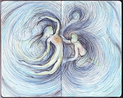
H2Om (water - Om)... I recently completed my Watsu 1 course and I must say it was a truly fulfilling experience. Not only have I been wanting to learn this for personal and professional (as a physical therapist) development, but I have always been passionate about the esoteric nature of Watsu, how it is possible to reach levels of consciousness and sensitivity through water not only as a receiver but as a giver. This is a follow-up on my previous "Poetry in Water" entry.

2007-11-25

Can you remember how it felt to be inside your mother's womb? There have been numerous testimonials from receivers of Watsu that describe the experience as a return to the mother's womb. It is afterall, a gravity-free environment where we are completely protected, stress-free and worry-free. I have a few interesting ideas on how this could be applied among differently-abled children. Another follow-up on my "Poetry in Water" entry series.

Monday, September 17, 2007

Logo Design: Bobath Philippines

Mylene Aguirre emailed me if I could develop her ideas for the logo of Bobath Philippines. She was tasked to make a logo for the Bobath advocacy group that Deanna Maranion is spearheading. It's actually a group of pediatric therapists practicing in the Philippines which is also open to PT and OT students and allied medical professionals involved in pediatric rehabilitation. They say they need the logo on print materials for upcoming seminars and would also like to it embroider it on shirts. She attached an image she was working on: focus on the B, shaped like a swaddled baby because after all, the group works with pediatric-age patients.

It was a very nice idea! And I'm glad that I don't have to come up with new ideas of my own, which in my experience in logo designing, takes a lot longer than the actual execution of the logo. Planning for a logo requires research and study… and immersion (you have to think like your client!). You have to understand Mai's drawing. It was done using a mouse in a raster program so you can't expect much (Hehe, sorry Mai, but at first glance, I thought it was a fetus or even an insect larva).

With the idea in place, I immediately proceeded in executing the design digitally. Since the logo was text-based, with the graphic integrated within the text, a huge deal of concern should be given to the font selection. I chose from a variety of popular fonts used in Web 2.0 designs and settled to choose on my favorite font. I worked on the B, oversized it a bit, and started adding the elements there. I wanted to retain Mai's curl (an eye) in her original drawing and interpreted it as the baby's "kiss me" in my design. Here is the initial design.

Although the baby takes up most of the visual attention to the design, the shape of the B is retained, thus still making it readable. I tested it among people… and it really catches the attention. It was a very "cute" design. Although I could have used a more abstract approach (less lines, just enough to give the impression of a baby), I think its "cuteness" will work for the organization, will draw more attention from its clients, both adult and children. The only comment that really bothered me was from my brother who noticed how his arms looked so much like boobs. That was really alarming, and to think that I didn't notice it before. (Haha, don't ask me why he of all people noticed it, or even why me as an artist, could have unconsciously integrated it in my work…). Here's the new design.

And finally, I completed the design with the other textual elements and added some Web 2.0 glass/reflection effects. Here's the final full-color design.

Naturally, a solid and b/w version was provided. Make sure you visit their Multiply site at Bobath Philippines Advocacy Group and inquire about their continuing education programs.

Monday, April 23, 2007

For the new graduates...

Another batch of students graduate, another schoolyear of hardwork accomplished. As most of the faculty returns from our annual college planning (this time organized at a beautiful private beach in Cabangan, Zambales), I am busy thinking of what the PTdepartment's graduation token for this year's graduates will be. The previous year's tokens were drawings of the faculty members presented in caricature styles. Of course, this year's drawing would still feature the faculty members, but I was imagining which style to use... I started work as soon as I found the time (I had to take a day off to finish the line work) and since the design involves entirely digitized work, my tablet was easily on flames in no time. Anyone familiar with Linklater's Waking Dreams, and the recent Scanner Darkly will notice that I adapted the same style of digital rotoscoping, enhancing the basic lines of the face, still making them recognizable. Here's what the PT graduates of this year will be receiving this year from the department (I hope you'll be able to recognize us!):


At the back are the personal messages of each PT faculty member, which I scanned and rearranged for layout purposes.


The design was then printed, cut (3" x 4.25" card format) and then laminated. Thanks to Sigrid for helping me out, the work finished faster. Our mini assembly line managed to produce 56 tokens in all! I hope the graduates appreciate these...


To the new graduates... congratulations! I hope you remember and imbibed everything that we have taught you, by thought and by example... and that you share to others, not only your knowledge and skills, but also the core values that a true UP graduate possesses. God bless to you all!