Saturday, March 14, 2009

Conjure!

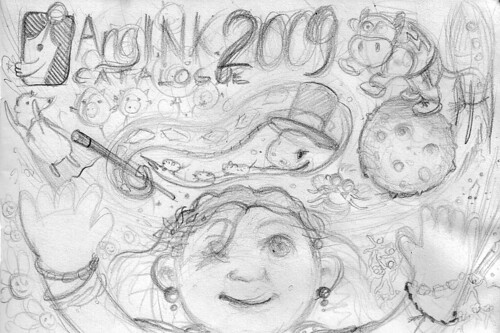
Good news! to those who doesn't know yet, I got accepted as a member of Ang Ilustrador ng Kabataan (Ang I.n.K.) which is an association of artists committed to the creation and promotion of illustrations for children in the Philippines. It is a great stride for my artistic side, as it will further expand my creative horizons… and of course chances of illustrating more children's books. By the way, we're already finalizing the layout of "Spinning" and although the publication is delayed (due to my suggestions and comments), it will be coming out soon. I chose this as my "About the Illustrator" picture…

Silly... Anyway, to my drawing! At first, I thought of drawing "Hampas Palayok" first, like a group of kids catching the blessings of an exploded pot while the blindfolded kid standing in the middle with his stick unaware of the frenzy happening around him – all this from the pot's perspective… then I moved on to using a piƱata instead, since these were more colorful. I ended up sketching a girl conjuring the most unexpected characters she has imagined…

Conjure-sketch

I did it using my signature ink, then water-colored and highlighted with colored pencils on illustration board. Try to see what I did to my brushes! Those rubber thingies really help me work even if my right hand is already screaming in pain (De Quervain's).

Conjure Work In Progress 3

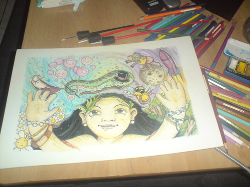
I really didn't have a story for this one, the characters just came out randomly and if you'd like, make a story out of it… the final scanned piece...

CatalogueCover-Conjure80

Here's the girl… a diwata? a babaylan in training? The girl looks a lot like my sister Sigrid, hehe.

A snake wearing a top hat and a magician's wand, studded with card suit designs on the length of its body… with three little mice frantically running on his long tongue. And the pig balloons…

A bee who is actually wearing these huge shades to hide his Chinese eyes… and it's a hustler, not your typical jolly bee…

And the carabao jumped over the moon… rather jumped from the moon… and a rocket to witness it…

A flying tailless bubwit and again pig balloons…

And the cutesy putesy flowers… "Conjure!"

What do you think are the characters all about? What story does this picture tell?

Anyway, have to get back to my drawing board and abuse my right hand more, lots of logos and designs to work on. Have to make full use of my free time!

Tuesday, March 10, 2009

Logo Design: Swig

I recently made a logo for Swig, a new bar/restaurant from Stella's Restaurant in Ohio. Demographically, Swig is looking for the 25-50 year old. Swig can be described as an inexpensive, fun and intimate neighborhood joint. It will feature 19 draft beers, comfort foods primarily focused on sausage sandwiches, etc. and will be able to seat about 60 people inside, another 75 on outside patio during warm weather (with stainless steel tables and bar with black walnut trim). They're looking for a logo that "puts a smile on people's faces" and makes them curious enough to come in. Swig will be a casual place, where people can feel comfortable "come as they are," but it will be well-kept and have a bit of hipness, too. The logo should include the name of the bar and their tagline ("Charcuterie and Suds for the Curious"). The logo will be used for front facade of building, as well as promotional materials and other purposes.

I worked on developing a text-based logo, using friendly legible script fonts. Of course, using text as a logo is very boring so I aimed for subtle modifications to incorporate specific requests of the client. Emphasizing on the need for a logo that "puts a smile," I searched for a way to integrate this on the basic text… and voila… what if I reshaped the tail loop of the "g" into a subtle "smile"? I edited the dot of the "i" into a spiral to evoke the "suds" nature of the bar/restaurant. I avoided using any direct visual references (such as using graphics of beer or mugs) because the name of the bar/restaurant already refers to the act of drinking beer. How the text is displayed will be important to show subtly the "hipness" but at the same time "classiness" of the bar/restaurant. Here's the basic logo in black and white:

I provided some color versions, and I thought of framing it into this:

At first this didn't appeal to them, as one person in their group suggested that it looked like the logo for instant potatoes or Duncan Hines (bake products). A friend of mine I showed this to commented it looked like a chocolate factory's logo. I thought, "This is good!" It meant that the logo seemed to evoke taste… which is very important for a restaurant logo. I framed it actually to make it look like an old beer label, and I was glad other people who saw this version thought so. But I provided them with another version without the framing and the red band:

It took a while before they grew into the logo, after having other competing proposals. But finally, they liked it a lot, thinking its versatility to be used for signage, menus and letterhead. They would be using all iterations of the logo. I provided them with the horizontal treatments of the logo, and here are the final horizontal versions:

Now, I've wanted to have a swig of cold beer after this project. Come to think of it, I've never been drunk before and I've always wondered how I'd be overpowered by alcohol. Would I turn into a laughing clown or a violent brute, a sleepy slob or a raging sex maniac? I have this fear of losing control of myself, but there's also this curiosity that has to be quelled. If only it would be that easy to get drunk.