This year will be the University of the Philippines Manila College of Allied Medical Profession’s (UPM-CAMP) 50th Anniversary. CAMP has undergone dramatic changes from the time of its establishment in 1962 to what it is today. After 50 years since its founding, its pursuit of academic excellence and its dedication to serve the Filipino people have been the guiding pillars of the School. These goals shaped the School as one of the premier institutions in the country that offers degree programs in the professions of Occupational Therapy (OT), Physical Therapy (PT), and Speech Pathology (SP) and post-graduate programs like MRS, MRS-SP, MClinAud and MPT. And just recently, the college has finally found a new home in its own building.
As a graduate and having been a faculty member for 10 years, CAMP has been a very important part of my life. I am so indebted for the all the wonderful memories, uplifting knowledge, skills and experiences. One cannot deny that the most amazing people of the country belong and were produced by this college. Sure it is something to be called a graduate of CAMP (considering how tough it is to graduate) but where else can find a college that respects each of its constituent for everything you are, molding you not only to become the best OT, PT or SP, but allowing you to grow with your other talents as well (singer, writer or artist, or whatever unconventional skill you might have). So it was with great pleasure for me to create the seal of CAMP, and this time, to design the commemorative logo of CAMP’s golden anniversary.
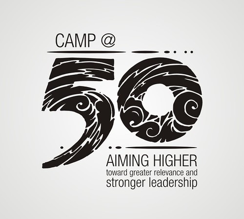
Dean Cabatan sent me all the necessary information I need to work with. The theme is: “CAMP @50: Aiming Higher -- toward greater relevance and stronger leadership”. The seal and the whole text should be included in the whole logo set. One of the informal guidelines I have when creating a commemorative logo is that it should look good enough for you to wear it. And of course, when you wear a logo, it should be flashy enough for people to notice you and easy enough to identify with the message.
I wanted “50” to be the main highlight of the whole design, incorporating the graphical elements within its outline. Celebration was what I have in mind, and though the drawing looks random, each swirl and swoosh represents an aspect of the chosen theme. I had to keep it simple as well to facilitate printing in all forms.
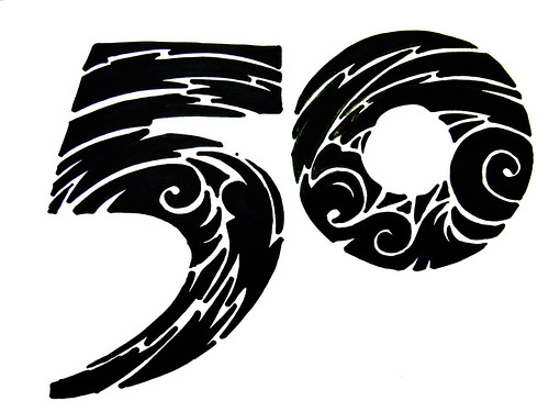
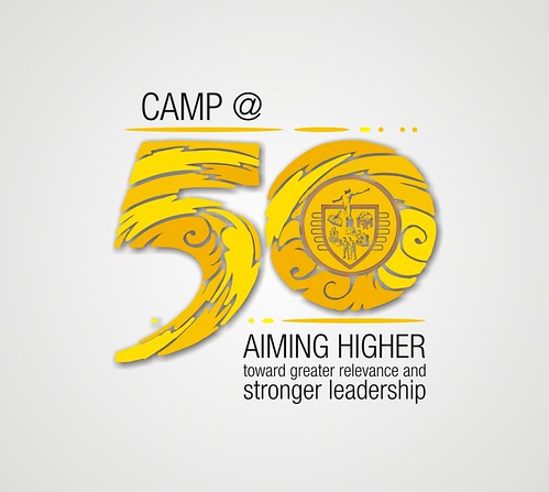
The CAMP seal will be conveniently placed inside the “0” and the text are placed around in simple but elegant NeueHelvetica font.
Of course, gold is the theme color, so I used different shades of yellow and orange in the logo. Good enough to wear?
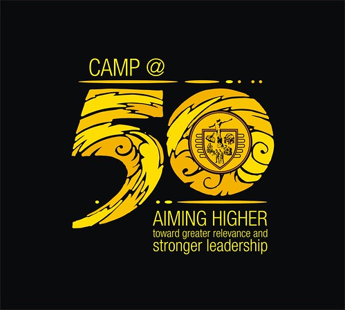
Here is how the logo might look like in shirt form (I soooo hope CAMP has the budget to make these shirts):

Happy 50 years CAMP!


1 comment:
I am impressed by the quality of information on this website. There are a lot of good resources here. I am sure I will visit this place again soon.
Post a Comment