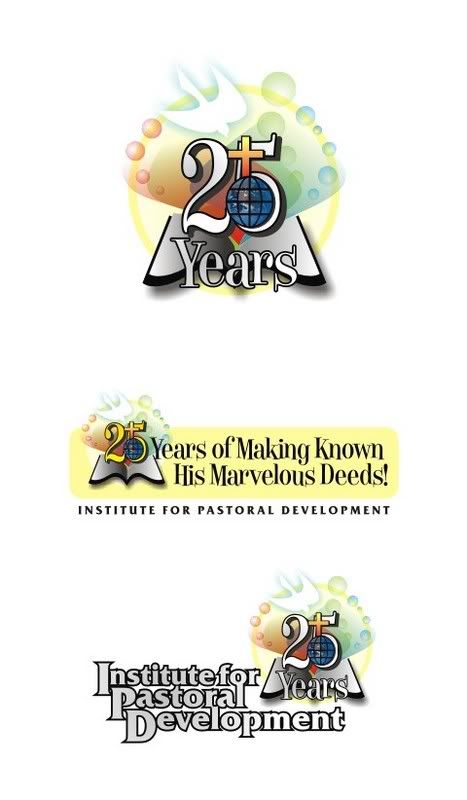
A month ago, I was commissioned by the Institute for Pastoral Development to develop concept logos for their 25th Year Anniversary this March, with the theme of "25 Years of Making Known God's Word!" The Institute for Pastoral Development (IPD) as described in their website, is a leadership development institute founded in 1982 by the Ang Ligaya ng Panginoon Community (Joy of the Lord) (of which I am presently a "dormant" member). IPD is committed to make "the Kingdom of God present in the world by equipping the people of God with skills, knowledge and spiritual deepening to empower them to become more effective servants in the missionary role of the Church." They have become instrumental in providing spiritual education to lay workers of numerous parishes and dioceses, sponsoring biblical summits and the like. Creating art for them would be a great honor!
I was provided with initial information, incuding suggestions from their panel. Since the theme was based on Psalms 105:1 " O give thanks unto the Lord, call upon His name; make known His deeds among the people!", they suggested that the graphics: 25 years of making known His (or God's) marvelous deeds". They envision a silver trumpet with these words spilling out of it. They hope the logo would look jubilant, quite playful but in a formal way. Hmmm, that was tough to achieve... After enough discussion with them, I proceeded to my drawing board, but it was worth looking at their existing official logo... perhaps I could build something from it:

The original logo features the typical components of a Christian institution: the world atop a bible, with the symbols of the cross and the dove. Quite traditional for my taste, but has been recognizable as the institute's logo for 25 years. Traditional, but functional. Building on the original logo, I developed a concept that is consistent with the theme, something that would convey growth... just as an adult would still retain features from when he was still a baby. I noticed that the original logo featured a closed bible, which was not consistent with the present theme... the book should be wide open, radiating with light, conveying a sense of "spreading the word to the world." I retained the original components, but rearranged around the "25" text:

The concept was then submitted and deliberated upon by their panel. They liked the concept but requested some changes: Yes the changes requested are as follows: one, that the 25 be placed outside the drawing of the dove, bible and cross (seems like there was too much overlapping of things) and that the name be written circumferentially, or around the graphics. No problem! At this point of development, the theme title has also undergone changes, and were incorporated in this version, laid out in a silver banner style:

I also developed another concept featuring their original suggestion of silver trumpets. The new IPD logo is incorporated in the banners of the trumpets:

Both concepts have been finally accepted and will be featured on their activities this March. Of course, grayscale and black/white versions were also provided.
This was a very interesting and deeply meaningful project to work on. The first email asking me to start this project included this: "My dear Ian, IPD can offer its prayers in exchange for your creativity. I hope this is okay with you too." Of course, I wasn't expecting anything in return for this job, as I consider this job as a service for God... I shouldn't have any qualms of not getting anything in return, as my talent is only on lease from Him. It is but expected of me to use it for His glory, and use it well... To the email, I jokingly replied "Haha, I need prayers!" and indeed I needed them very much...


No comments:
Post a Comment