Thursday, July 3, 2008

Logo Design: Abelardo’s Diner

It's been quite some time since I updated my blog with discussions about my recent creative outputs. A few months back, Archie David commissioned me on a project to create a logo for his center's newest endeavor, Abelardo's Diner. Not a lot of people know that the logo of Independent Living Learning Center (ILLC), a center that aims to promote the optimum potential of children with developmental disabilities and to facilitate their community integration through contemporary and functional approaches, was one of my early creative projects. The logo indeed underwent a lot of revisions until we finally hit the final one. An obsessive-compulsive client combined with an equally obsessive-compulsive artist is not exactly a speedy project. Here are the iterations of ILLC's existing logo.

Abelardo's Diner started off as a canteen for their students, faculty and guests. Now what makes this dining place special is that their students are assisting as dining and kitchen staff, part of training them for community integration through gainful employment. The logo should be able to represent the mission of ILLC through this service. Since they have upgraded the diner to a full-pledged restaurant, the logo should also be able to evoke a touch of class. With a clear brief which also included the color and design limitations I will be working with, I knew that the logo should be a text-based one, with very minimal graphic elements. I first provided some font options. Here is just a sample selection of the actual list I provided. I had my own preferences, but I wanted them to choose first themselves, based on their preferences.

Archie allowed his staff to vote on their top 3 font choices, which somehow coincided with his personal preferences. I then provided him with my preferred choice which features the P22 Arts and Crafts Hunter font, which also happened to be one of their top choices. The reason why I found this font so special is that it has the right amount of balance between class/formality and casualness. Just look at the way the "a" and the "s" are formed, and you can say that this is indeed a special font… as special as the people who run the diner. With the font chosen, the next step would be the enclosure. Again, I provided some options with another font choice.

We went for the oval treatment. I then applied some colors and matching leaves as ornamentation. Here's the final design.

By the way, ILLC and Abelardo's Diner was featured by the Probe Team. Here's the video.


Monday, June 30, 2008

Half-Naked for Half of the Day…

When confronted with the question, "How would you describe your job in Quality Life Discoveries?" I would usually answer: "Well, my work requires me to be half-naked for more than half of the day each day…" Seriously!

Well, that's just one aspect of my daily routine. Having a pool in the clinic you work in, means expecting to stare at your pruned fingers at the end of each session. When you work in the water for so long, you could almost honestly say that you could breath underwater (I think I already have scales and gills growing on my body). But kidding aside, I enjoy working with my clients, ranging from the very young and fragile (say 10 months old) to the very old and senile (record eldest 86 years old) in the pool. This and pushing paper, talking, supervising, designing and organizing. It gets overwhelming once in a while, but the challenge is exciting. The only sad thing is I always wish I have the body to flaunt whenever I'm in the pool.

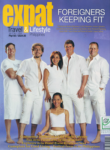
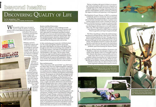
Just recently, the center was featured in Expat Travel & Lifestyle Vol. 2, No. 1 2008 (I think it was released around March – June) which featured healthy living. Months before, we were interviewed by Jacky Ong who was able to experience some of our services firsthand. The article is "Beyond Health: Discovering Quality of Life" and it includes a picture of me half-naked. Biggify these scans if you dare. But seriously, it is a well written piece introducing our center. Take a look.

Expatcoversm

ExpatSpread

Gusto kong matutong magdrive…

Something unique happens whenever I hear Eraserhead's Overdrive, especially when the song reaches its punchline chorus. My eyes begin to swell and tears start rolling as I prevent myself from uncontrollably banging my head while screaming "gusto kong matutong magdrive!" Yes, I don't know how to drive a car. Embarrassing I know that at my age, I would often cringe while confessing that I don't know how to operate the machine that congests the streets of Manila everywhere. With my overdeveloped thighs, one could easily see how I managed to rely on my feet as my main means of independent mobility. I only happened to learn how to ride the bike a few years back, but only because I was forced to cut up on my bus expenses while studying abroad. I don't know, perhaps I didn't learn how to drive the car probably because my dad didn't trust me enough (I was known as a "seraniko" as a kid… no toy could survive my dissecting hands… so he could just imagine what I would do to the family car!) or perhaps there was no need to. But really, it has been in my agenda to try out the driver's seat for many years, whatever means necessary. And guess what, the opportunity came.

Having more time and resources in my hands, with sound advices from my brothers and friends, I decided to enroll at A1 Driving School. I attended a 2 hour orientation course, which is a prerequisite before the actual driving. It was an informative orientation, and as they say it is designed to reduce the learning curve once we get our hands on the actual cars that we'll be driving. It was entertaining… too much I think. Thanks to a wacky instructor, who sprinkled his lecture with endless bits of corny ala-Bubble Gang jokes. There were also clueless students:

Instructor: Ma'm, saan nyo po balak magdrive? (Where do you intend to drive?)

Lady 1: Sa kotse?

Instuctor: Uhmmm… ma'm, di ko lang po matandaan pero alam nyo po, may tawag po sa inyo…

There was a point during a discussion which invited violent reactions:

Instructor: Bakit po manual ang inenrollan niyo?

Lady 3: Hmmm, sabi nila, pang-bading daw ang automatic…

What the?!?!!! I was enrolled in an automatic course! Now, I intend to convert some of my driving hour to manual driving.

I could never forget the first moment I stepped on the gas pedal and the car began moving. Woahh! I'm no longer an automobile virgin… and soon I was driving all throughout the streets of Quezon City. My instructor seemed approving of my driving technique because we spent most of the time talking about "boys stuff." There was a time when I was called by my instructor as a "kaskasero" because of my natural driving skills. I guess the Cruz driving gene is being unleashed after years of being dormant. By the way I was driving the latest Toyota Altis:

I felt like Orlando Bloom. Now, wanna see my car? Here's my car:

My dream car that is! Only in my dreams, haha! That's actually my boss' car (a Mazda MX-5 Roadster, just one of his cars) which I always see parked beside our center. Each day I go to work and see it, it seems to constantly tease me… "ain't I pretty? Too bad, you can't drive me…Bleh!" I can't drive you yet! But someday!

The only thing left for me to do is to fulfill the succeeding words to the lyrics… "Kahit na wala akong kotse…" Soon, I'll have my own car out of my own sweat and blood. But I guess by the time I have one, the gas prices might be so unaffordable, I wouldn't be able to drive it at all. Oh well… being a passenger still has its advantages.

Saturday, June 14, 2008

Quality Life Discoveries

One thing leads to another. I've always professed that one's job doesn't dictate your mission. You're always bound to fulfill your life's mission in the jobs that you choose or get offered to. I guess it was time for a change, for me to move on, after a wonderful decade of teaching in the University of the Philippines, to start anew… to something that will jumpstart my interest and creativity.

The past few months, I've been very busy organizing and setting up Quality Life Discoveries (QLD). It seemed providential that during the times I've been studying Watsu® 1 and 2, I'll be joining them not only as an aquatherapy specialist and PT consultant but also as its clinical director as well. With a handful of therapists and consultants already trained in some of the flagship programs of QLD and a remarkable investment by good-willed owners (who themselves have a son with cerebral palsy), one of my initial goals was to mold QLD into a fully operational rehabilitation and wellness center. Macro-ergonomic theory and concepts, organizational skills and knowledge, passion for anything technological and cutting-edge; and taste for branding and visual aesthetics all contributed to this task.

What Quality Life Discoveries is all about…

Quality Life Discoveries actually forms the latest chapter in a family's tale of love. Edwin and Mary Ann Cua have been seeking the best medical and therapy services abroad for their son, Jared, since he was diagnosed with cerebral palsy due to prematurity. With all of their dedication and perseverance in seeking services for their son, Jared improved dramatically, developing functional skills defying doctors' discouraging prognoses. All their travels proved to take heavy toll for Jared, who grew more and more exhausted, experiencing a seizure attack which may have been due to the stresses of traveling. The couple thought that instead of risking their child's life going all around the world incessantly, why not bring all of these easily accessible right at their fingertips. The puzzle begins to be pieced together: therapists gathered, trained in new programs and soon, a center to be built not only for their son but for other families to share in the quest of discovering quality in their lives.

The Logo

People would expect that I had a hand in the design of the center's logo. It looks like one of my creations, but it is not. It was created long before I joined QLD. But I actually like this logo, enough to call it mine because of the concepts it represents. The yellow tile features a child's drawing of a family, representing the center's vision of being family-oriented. The center is not just a center for the recipient of the services but a venue where the whole family can spend time together. The green tile features hands representing the center's pledge on the service of enabling our clients and their families discover their potentials. The red tile shows a mother and child image, symbolizing the center's focus on authentic care. And finally the blue tile includes books representing the center's vision to be a venue for learning and research.


Programs and Services

  • Physical Therapy
  • Occupational Therapy
    • with Multisensory Environments
    • with Sensory Integration Intervention Programs
  • Aquatherapy
    • Aquatic programs for Kids and Adults
    • Aqua-fitness programs for Adults
    • Watsu® for relaxation and flexibility
    • Adapted Watsu® for kids (autism, cerebral palsy, movement disorders and others)
  • Hyperbaric Oxygen Therapy
  • TheraSuitTM Intensive Method
  • GigerMDTM Rehabilitation
  • Oral-Motor Therapy
  • Special Education Tutorials
  • And many more to include in the future…

I'll be featuring some of these programs in my blogs in the future in detail. I've already mentioned Watsu® in my previous blogs. For a more detailed discussion on each, please visit our website at http://www.qualitylifediscoveries.com . We still have to update it unfortunately. Our e-brochure may be viewed below.

Read this document on Scribd: Quality Life Discoveries E-Brochure

Branding

And now to the aesthetic aspect which I know contributes a lot to how people will view and accept QLD and its services. I wanted to brand Quality Life Discoveries in a way that will not be limiting (in terms of target market, eg.: not just the pediatric population but also adults) but will also stand on its own among health service providers. It is quite challenging to build around an established logo, and since the logo itself already features several colors, I knew that I have to invest heavily in the use of colors for branding. I also relied on colors for organizational and administrative purposes.

The following images show the art I created for QLD. The earlier promotional materials depict my heavy reliance on color, using violet framed by aqua as the primary colors. The established multi-colored logo (I have to build around it) can effectively stand above it. I assigned a color for each of the programs, which then became used as reference in our administrative operations (color coding of schedules, folders and forms according to the programs) and geographic references (each floor in the center is color-coded too, blue for the first floor, red for the second and green for the third).

Icons were created for each room, hopefully effectively representing the programs the rooms will be used for. It blends seamlessly with the architecture of the center. Those who have visited the center will be amused to see which icon I used for my office.

Here are the latest materials I created for the center:


Flyers, Handouts, Brochures, Tarpaulin and Promotional Materials.


Icon designs.


Door and Elevator Design.

Looking forward…

There are a lot more to accomplish in the center, and a lot more has happened behind the scenes which are far too detailed and busy to write about. Although we are already operational, we aren't officially open yet. Our blessing will be on July 19, 2008, just in time for the National Disability Awareness and Rehabilitation Week Celebrations. We are also still looking for physical therapists, occupational therapists and speech pathologists. So if you're interested or know someone who's interested, don't hesitate to forward resumes to revcruz@qualitylifediscoveries.com .

It's been a while since I wrote for my blog and it's quite understandable why. But I'll try to update this not only with updates from QLD, but also features of my latest artistic creations.

Wednesday, February 27, 2008

Freeing the Body in Water: Watsu 2 Course

Two week after Watsu® 1, we continued with our training in this special aquatic bodywork in the Watsu® 2 course held last December 10 to 15, 2007 at Quality Life Discoveries. The Watsu® 1 focused on the Basic Transition Flow and with the 2 weeks given before Watsu® 2, there was enough time to master the technicalities demanded of Watsu® 1. Watsu® 2 focused on the Expanded Flow, introducing more complex movements and maneuvers interspersed between the sequences of the Transition Flow. It is highly suggested that any student interested in taking Watsu® 2 remember by heart the sequences and has practiced with different types of body types as well. All 6 students who took the first course were once again together with Karen and Tom Neff, certified instructors for the second course.

In addition to the concepts learned in the first course (which included topics such as resonance/coherence, undisturbed states, etc.), we were able to discuss more about special considerations and adaptations of certain movements required in both Transition and Expanded flow, and the extensive experience and knowledge of Karen and Tom definitely provided a fulfilling learning opportunity. Since we were able to learn the sequences of Watsu® 2 quite well, we were given a special demonstration of Waterdance®, another aquatic bodywork very similar to Watsu with the difference of being submerged.

The Watsu® 2 course included a special session with children, both well and with disabilities. I had the opportunity of working with a child with cerebral palsy. My other classmates worked with kids with conditions such as autism and ADHD. One could just imagine a pool filled with kids, and it was a fun yet memorable experience. I realized the immense potential of Watsu® for kids with cerebral palsy, because of the possibilities for a variety of positions and maneuvers that could help in relaxation and stretching. There was an observed calming effect for the children with autism even if it was their first time in the pool. It was of course too soon to conclude with just this session but just imagine how a regular program with Watsu® could bring about additional benefits to the quality of life of these children. Therapists in other countries have integrated Watsu® in their aquatic programs, and even parents have advocated its use as an adjunct to existing therapies.

During this course, we were given our own special Watsu® sessions by our instructors. Karen gave me Watsu® and it was indeed a special one. I wasn't able to sleep as the other participants, but besides being fully relaxed by the warm and flowing water, I was able to focus on some of my thoughts with clarity I have never felt before. It was as if the silence of the water, while being held by another person's arms brought me home with a renewed confidence in myself. The session with me proved that size is not a major issue.

Evaluation required being observed by our instructors while giving Watsu® to someone who hasn't receive Watsu® before. Anyone can definitely feel the tension in the air when we were being evaluated, and it had been a long time since I was given an exam and a practical exam at that! And for a Watsu® session to be successful, the giver should be relaxed, otherwise the tension would be felt by the receiver, thus it would be counterproductive to the session. I invited my dad to be my receiver for that session. At first, I was hesitant to have him as my receiver for personal reasons, but eventually I mustered enough will to give him Watsu®. It was after all a gift to be given one and I wanted my dad to personally experience this. The session with my dad was very special, for I wasn't able to follow the sequence. I had to adapt to what the body of my dad was telling me, for at first he was very tight and tense. Soon, my dad felt lighter in my arms and he was not relaxed in the water. It's a subtle but satisfying feeling of joy, when as a giver, you know that the receiver in your arms have already surrendered to the water. My dad said with arms spread apart after our session: "I felt like I was in outer space!" He patted me on my back. Somehow, I knew he wanted to hug me for such a wonderful experience, but the pat was enough. Besides I was hugging him like a child all throughout our session.

Before we parted ways, Karen and Tom showed us an audio-visual presentation – a visual memento. It was a very emotional experience as each one of us reviewed the time we spent together learning. We are now part of the worldwide Water Family.

In behalf of the participants, we also gave Karen and Tom a signed print of the special blue rendition of "Poetic Synergy". It was truly dedicated to them, since the artwork wouldn't have been created if it wasn't inspired by Watsu®.

Friday, December 7, 2007

Tee Graphic Design: “Poetic Synergy” (Threadless)

It's been a long while since I submitted a design for Threadless due to work and other creative projects. Well, I recently created a design and I need you guys to show some support. How? By visiting my design's page over at Threadless and give it a high score (of course, only $5 will count for me, haha). Don't forget to leave some nice comments there, because I would love my design to get serious approval! The only way my design's going to get printed at Threadless is if it scores so high and gets so popular that the people at Threadless have no other choice but to print it (that's crowdsourcing at its heart, you sell what the people want.).

My Threadless submission: "Poetic Synergy"

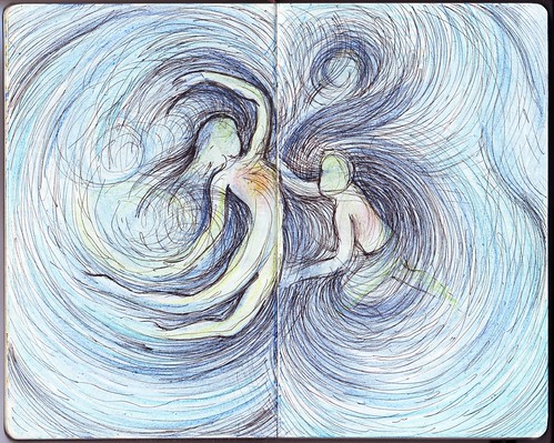
My design is entitled "Poetic Synergy" which is meant to represent harmony in nature… harmony even with the seemingly unceasing chaos… the infinite of the sea, the freedom of the sky and the heart of the land… You can draw your own interpretations. It's visual poetry. Some of you may recall my Moleskine entry "H2Om", well this is a variation of that, a more detailed nature-based version of the subtle Om. It may be too artsy for Threadless (whose catalog includes a lot of "visual puns" and comedic designs), but sometimes, they get these type of designs printed.

2007-11-24

The original moleskine entry: "H2Om"

The linework of "Poetic Synergy"...

So there, I am really determined to have one of my designs printed at Threadless (let's say it's one of my creative goals) an I hope this is the one… So click on these banners and show some LOVE!

My Threadless.com Submission

Wednesday, December 5, 2007

Limoncellos, Crocs, Fitness First in Mall of Asia and Beowulf in IMAX 3D…

Limoncellos. I recently uploaded pictures from our lovely dinner at Galileo Enoteca. If you love cold cuts (I do! I used to eat sausages directly from their packages when I was in Sweden, and my godmother will send me occasionally cold cuts from Germany) and cheese, this is the place for you. They also import high quality Italian wines and liquors. This prompted me to ask whether they sell one of my favorite liquors, limoncello. Limoncello, pronounced [limon'tʃɛlːo] (thanks for the correction Zen) is lemon liquor made from lemon rinds, alcohol, water, and sugar. It is usually bright yellow in color, sweet and lemony, but not sour since it contains no lemon juice. It is a digestivo, so it's best taken after a meal. If you haven't tasted it yet, you should! My brother Archie always brings home from his travels in Rome bottles of Villa Massa Tradizionale Limoncello di Sorrento and the last time he came home, he brought home a variant with cream (imagine irish cream, but with lemon). Unfortunately, Galileo Enoteca is currently out of stock of limoncellos. But I'll be constantly on the lookout. So if you know where I could get these, please do tell!

SM Mall of Asia. A few days ago, I went to SM Mall of Asia for the purpose of looking for a pair of Crocs sandals (this was the last shop I could ask, the other shops have ran out of available sizes!), and not to waste my time there just for the sandals, I also brought along my gym bag to experience the newly opened Fitness First there. Now, everyone should understand that SM Mall of Asia was designed for casual shoppers, who have the whole day to walk around. It is so huge it would be impossible to memorize the locations of all stores after a few visits. I had only one store to visit, and it was located (after inquiring at the concierge) at the entertainment block, far at the back of the mall which is a few minutes walk from the façade. It was already a good warm-up for the gym. I found the Crocs shop, but I was in for a disappointment. They have all the available sizes for the model (Brown Off Road size 10) I was looking for, except mine! I thought it's not yet time to buy myself one. As I left the store and headed to the gym (which was located outside the mall, in the newly constructed building), I passed by the IMAX 3D Theater and saw that Beowulf was showing. I haven't seen Beowulf yet, and I wanted to see it but just couldn't find the time to do so. So I inquired, and booked for the 5PM show. It was expensive, the ticket costing P400, but I thought, better experience IMAX with a film I wanted to see. I thought, it would be cool to watch a computer generated film in 3D. I went to the gym for a 2 hour workout session before the film starts. I thought, after the film (which would finish around 7pm), I would still be able to catch the Body Combat class at the gym.

Fitness First Mall of Asia. The new Fitness First gym is located in the building just outside the IMAX theatre, so it was a short walk. I went to the reception and showed my member's ID. I was surprised that they replaced my ID (which doubles as a card key for the locker rooms) with a similar plastic card but without the hole, the reason for which I will realize later. The first thing you'll see is the cardiovascular area (3 rows of treadmills, steppers, cycling machines and elliptical) with the standard TV screens. The member's lounge is very small compared to other clubs, and I actually have to squeeze through some of the chairs to reach the drinking stations (standard soda dispenser, coffee and water). I peeked inside the Mind & Body Studio and it was huge! The cable machines area was filled with new TechnoGym machines, with some of them fitted with digital monitors that would tell you how many reps you have already made and also the range of your movements as well. The strength and free weight area is located on the second floor. What amazed me is the new automatic locker system they have installed. The plastic card they gave me was actually the key card – all I had to do was to place the key card near the locker, and it would open and close – like magic! Amazing! After playing around with the locker door for a while (the other club goers who saw me do this are already giving the weird look), I proceeded to cardiovascular area to look for the ergs (rowers) to add to my Concept2 Holiday Challenge mileage. I couldn't find them, and I was beginning to worry that they decided to remove the rowers since after all they were not popular machines in the gym. But a personal trainer ushered me to the indoor rowing area, which is nestled in an elevated corner of the gym. While rowing, you get a nice view of the cardiovascular area. The ergs there are already connected to the TV systems so you can already plug in your earphones to listen to the shows (unlike in other clubs). The air conditioning was in top condition, so good that it was freezing in the cardiovascular area. I somehow wished they had the room temperature lower because it was quite difficult to sweat. On the other hand, I found exerting more to feel that I was giving an effort (I was running at a rate of 10.5-11 km/h at the treadmills, compared to my usual 9.5 km/h). The GX Studio looks spacious (in width, not length), but immediately I noticed how small the stage area was so it would be difficult to have more than 3 instructors at the same time. Another thing were the 2 huge structural pillars in the studio. Good thing they're located at the sides, but they could be quite a big distraction if you're moving from side to side. I have yet to experience a class in the Mind & Body and the Cycling Studio. But all in all, it was a satisfying experience (too bad it is quite far from home…).

Beowulf IMAX 3D. After 5 km of indoor rowing and another 5 km on the treadmills, I went to the theatre for my virgin IMAX experience. I had to feed myself but found that the snacks area in the IMAX are closed (Imagine no popcorn!!! Well, I'm not really a popcorn person when watching movies, but a movie watching experience is not complete without a whiff of buttered popcorn), I had to buy food outside (I had to settle with hotdog in a nearby stall). After devouring my snack, I proceeded to the theatre area (yes, I watched alone… loner ba?) where I was greeted with usherettes who distributed these special glasses you have to wear to create the 3D effect that IMAX is renowned for. The theatre area is huge! I picked a sear smack in the middle of the theatre, and looking straight ahead, the screen effectively covered even my peripheral vision. After a few minutes, the trailers rolled in, and they showed previews of upcoming IMAX shows. The 3D effect is really compelling! It's funny, I noticed some grandmothers beside me who were actually dodging at objects that really seem to fly towards you. After the trailers, the opening credits for Robert Zemeckis' Beowulf came in. It was amazing to watch the credits actually float on top of the background, and fly past your shoulders. Combine that with amazing sound effects. I knew I was in for an unusual experience, because I was stupidly grinning in sensual delight as I watched the film... The initial scenes were designed to make you get used to the 3D effects, and I specifically enjoyed the scene where the people were singing in the mead hall, and a flyby ensues… you literally find yourself flying away from the hall, from the kingdom, and into the forest (with the tree branches ) and into the cave of Grendel… and this was just the start...

The movie was great. I actually debated with my brother Oggie, who by the way writes amazing film critiques in his blogs, about this film. He claims that it was a waste of talent to bring Beowulf into life as a computer-generated film. Why not film the actors themselves as they are? I told him, it could have been a waste of talent, but the way I see it, this is a landmark film that celebrates how advanced the technology in film-making has reached. The technology this film has used to capture the performances of great actors such as Anthony Hopkins is so convincing that oftentimes, you actually feel you are watching the very actors themselves! The male characters looked very photorealistic; however, the female characters still looked like moving mannequins. This technology has great potential, and the way I see it, if motion-capture becomes so advanced and precise that it could even capture the smallest nuances of an actor's performance, this will open up a new concept in role-playing, rendering make-up and costumes obsolete. How else could Ray Winstone transform into the perfect-bodied Beowulf! Of course, Angelina Jolie is Angelina Jolie... (nosebleeding...)

Ray Winstone as Beowulf (which according to him looked like him when he was 18 years old)

Angelina Jolie as Grendel's Mother. Even though it was animation, she never expected she could feel so "exposed"

Although the story deviates from the original plot of the Beowulf epic, the screenplay by Neil Gaiman and Roger Avary was an exceptional reimagination focusing on how humans themselves could turn out to be the very monsters they have sought to fear and destroy and how the seduction of evil could overthrow even the noblest of men. Some who are faithful to the original epic might feel the changes weakened the power of the Beowulf story, but I feel the more human treatment of the main character, showing his flaws and weaknesses provides more opportunities for reflection and introspection than just entertainment.

The film I feel is best experienced in IMAX 3D (although I haven't watched it in ordinary theaters yet), so if you're planning to watch it, watch it in IMAX 3D format. It's worth the price.