Monday, November 29, 2010

Where Ideas Come From

2010-10-11

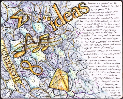
One of my latest moleskine entries which is partly related to the previous "Muse" spread:

Sometimes I ponder on the question, "Where do ideas com from?" In a contemporary world we live in, where ideas has become a valuable commodity even before they are materialized, it seems it could spring forth from almost anywhere... people are social and minds process incessantly everything that is fed into it voluntarily or not, and it produces a notion whether we could ever or has ever produced an original idea. Or rather, ideas are never original but a filtered or processed result of an internal mindstorm... even stimulated by external influences... Science proposes that an idea is born with a resulting new connection within the already complicated network of our mind.... a formation of a new connectome slightly different from a thought earlier. Imagine, we incessantly think, thus, we are constantly shifting!

I have to say that while I was working on this, I saw the following TED talks in YouTube, which directly inspired the drawing and the texts. The first one is a very interesting lecture by Steven Johnson about how ideas, rather than born from instant "Eureka" moments are actually brewed inside our heads quite differently.

The second talk is by Sebastian Seung as he discusses his work which involves mapping the connections in our brain, and how our "connectome" as he calls it, could open up a new way of understanding how our brains work.

Now let's all say... "I am more than my genes! I am my connectome!" Interesting!

Thursday, November 25, 2010

Muse

2010-10-10

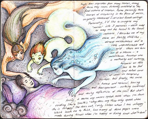
People draw inspiration from many sources, many of these seem distantly unrelated to the final instance of creation. Some personify these sources of creativity in the form of muses, originally mentioned in ancient Greek writings. Personally, I'd like to imagine my "muses" into 3 personas - which may or may not be linked to the Greek versions. I describe one of my muse as feisty, child-like... almost mischievous and a little unpredictable and wild... ideas are born out of storm - a mindstorm. Another one is motherly and nurturing because an idea has to be fed and taken care of until its complete fruition. And finally, the muse is honest and natural, baring and transparent... nothing contrived and truly reflective of the soul. But what's funny, it seems my muses speak more when I'm down recalling Stevie Smith's "Why does my Muse only speak when whe is unhappy? She does not, I only listen when I am unhappy." Which leads mo to think, how many of these pages were made during times when I'm happy or during times when I'm down?

It took a long time before I made another page in my Moleskine again. And what better topic than to talk about my muse/muses. It take a certain level of motivation to work on art, but once I get inspired the process is easy. And in one way or another, I lost my muse, thus the hiatus.

Monday, November 22, 2010

Ang INK Corner: Dreaming of Heaven

Last November 20, 2010, one of my artworks was published at Manila Bulletin's Ang INK Corner. As I have mentioned before, Manila Bulletin features in their Student & Campus/Youth Section artworks from Ang Ilustrador ng Kabataan, or Ang INK as we are fondly called. This is my second time to be published there, my first one being published almost a year ago, featuring my art coupled with my sister's poem about recess. Unfortunately, due to my extreme "busy-ness" juggling time between work and my numerous passions, I haven't been able to attend Ang INK's regular meetings. I definitely regretted not being able to participate in the annual exhibit since I was not able to finish the painting I was already working on. Anyway, when Blooey asked me if I could work on that weekend's feature, I just had to say yes. It was an added bonus that there was no theme for that week, I could choose any artwork I have, as long as it's for general patronage. In my mind, I thought I don't have to create from scratch since I have tons of materials from my Moleskine collection. I already had a particular drawing that I thought would be a great feature:

2007-08-09

It's one of the favorite drawings from my sketchbook, and it's not surprising. It's cute and witty, unlike most of the other drawings in that collection. I was already preparing the layout for the newspaper, when I realized, while looking at it, that I wouldn't allow it published. First of all, it's from a notebook and it had this ugly line in the middle. The lines are not that refined. And the overall layout would not look natural. I finally said to myself, I have to rework the whole drawing from scratch!

DreamingofHeaven

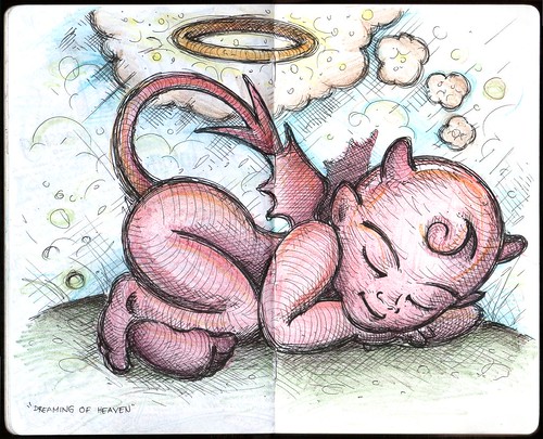
It took me a whole night to work on this. If you notice, it was indeed a huge improvement from the original drawing. The lines and cross-hatching are finer, the features of the characters are more defined, plus the layout is more natural, as if it was drawn particularly with the final layout in mind. Just exactly how we children's book illustrators should do it!

I just love the description about me: "Rev is usually a good guy, but sometimes he imagines himself to be uhmm naughtier?" I meant it as a joke, but I was surprised that one of my patients in the clinic remarked: "That's very you!" Uhmm, I wonder what she meant by that.

Thursday, November 18, 2010

Logo Design: MMA Headquarters (MMA HQ)

It's interesting when my clients ask me about my other interests, because it opens a whole lot of creative avenues. Most probably, after seeing my online photos about my passion for BodyCombat®, which is a Martial-arts inspired workout designed by Les Mills International, and being an instructor myself, a regular client of mine asked me if I was into "martial arts, karate, MMA (mixed martial arts) ?" I never received any formal training in any martial arts, but in BodyCombat® you get exposed to various disciplines despite being a non-contact activity, mixing everything into one dynamic cardio workout. I said "in a way, yes…" and this inadvertently plunged me into another creative project: I have to create a logo for an MMA website.

The brief was pretty straightforward. MMA Headquarters (or MMAHQ) is a website that obviously caters to MMA enthusiasts with a demographic of 15-35 years old individuals. They intend to sell MMA-related products and feature a blog discussing product deals and events. They were open to several ideas: "fighting related elements, icons, silhouettes, other metaphors." The logo needed to have an icon or a scalable element that can be used independently of the words but still maintain the brand Identity. In their words: "what the Nike Swoosh accomplishes on its own." (a request, almost every client I had always remarked ;-P) Having been involved in MMA inspired artwork, I somehow have an idea of what they wanted. A quick Google search of MMA-inspired logos will show you what I mean.

I focused on creating an icon, this time working on a clever graphical way of combining "H" and "Q" since it is these two letters that set MMAHQ apart from other competing websites. Drawing inspiration from a logo I made for my old BodyCombat® team, I made the following sketches:

The client provided a very informative feedback:

Maybe like a clean grunge, if that's not a total contradiction. Like discipline amidst the grunge, if that makes sense. Like more jagged edges than sloppy, messy ones. I'd almost want to say there's a bit of military influence; I've seen so many board shorts and t-shirts that have camo or camo-like patterns. There's also a bit of a hip hop element; not too much but a bit of graf influence I think… but if you look at the fonts they use they are always super durable... Like you put all the fonts together and let them fight it out and the really strong one emerged victorious. Tempered by steel/tested by fire. It's still sort of Gladiator-esque in a way, but still trying to gain legitimacy as a new sport, so that's why I'd say it's not quite as grungey...grunge being sorta not caring about anything, MMA being more hyperfocused on a goal and defying human odds to get there

The client was very excited with these previews and almost immediately, we decided to develop the ideas to their vectorized format:

With almost little editing, the logos were finalized as what you will see in their website. On a side note, not entirely unrelated to this post, and with the fact that my birthday is nearing, I would just like to say that if anyone gift me with this or this, I would love you forever…

Sunday, May 23, 2010

Logo Design: Baker’s Confetti

One of my recent logo creations involved one of my favorite things: baking! Well, not really. I'm not that much of an expert in baking, my skills limited to simple cookies and cupcakes, but I can say, I'm very good in eating what other people has baked! Anyway, the challenge of creating this logo is to capture the magic of baking, and with a very enticing company name, the logo should be as well.

Baker's Confetti carries the sweetest, best-tasting bottled sprinkles around. Their products are formulated with the finest ingredients, and were created with even the most discriminating consumer in mind. They wanted a logo with business professional style, but must be trendy and memorable as well. Their target audience is the typical home baker/candy maker, small bake shop/ice cream shop owner and the run-of-the-mill sprinkle aficionado (anyone with a sweet tooth!) The logo should represent quality, be memorable and visually attractive.

Sometimes, before I set myself into creating a logo, I select keywords to guide me through the process. And for this one, I specifically chose "magic" as the name of the company pretty sets it up… "baker" and "confetti". The confetti part is easy. I can create a logo with sprinkles about it, but that would be too common. So I had to illustrate the baker and confetti in a sort of magical way… After a few swings using simple geometric shapes in my vector program (I didn't go through pencil sketches for this one), and choosing a "delicious" font (which I edited slightly to balance it out) to go with it, I came up with this.

BakersConfettiB

And on light background.

BakersConfettiA

It was an instant favorite, and a personal one for me as well. Definitely one of my most memorable creations. Baker's Confetti is yet to launch their website and release their products, but they have a blog which features some recipes, and a facebook account as well.

Friday, May 7, 2010

"What Makes You Happy?"

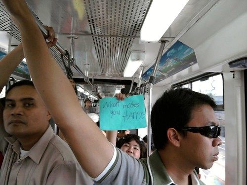
What Makes You Happy?

I was on the MRT the other day heading to one of my gym classes, when out of the usual bustle, there were people in the train carrying sign cards… this small lady seemingly so excited to catch my attention showed me hers… Her card says… “What makes you happy?”… I thought to myself, “Secret, hehe…” and smiled.

Thursday, April 15, 2010

Guesting at DZMM Teleradyo: Todo Todo, Walang Preno

Quality Life Discoveries was supposed to be featured at Umagang Kay Ganda, the daily morning show of ABS-CBN, on Wednesday, focusing on the various services that the clinic offers. Of course, being the Aquatics specialist of the center, I was more than prepared to demonstrate and talk about Aquatherapy and WATSU® once more, the last time being in Unang Hirit (GMA's morning show). This meant waking up as early as 3 am, to be at the clinic at 4 and sink in the pool for more than 3 hours straight. Gruelling work, while trying to look pretty for the camera! But highly enjoyable!

However, due to some reasons, Umagang Kay Ganda had to back-out and instead I was invited to be a guest at a radio talk show in DZMM… Fine, I did radio interviews before, but of course I couldn't hide my disappointment. The first question I asked myself: Do I still have to wear my swimming trunks?

I was told to be at the DZMM station around 10:30 AM per instructions just in time for the 11:00 talk show. I was greeted by Lyn, the station assistant who led me to the make-up room. I saw the television screens around broadcasting the live radio shows and only then did it dawn to me that this was a televised radio show: Todo Todo, Walang Preno. Darn, I should have worn my trunks! Kidding aside, I was wearing the clinic's uniform of course. Make-up make-up while chatting with Lyn who shared how she could relate very much with the topic to be talked about because she had a nephew who was a "special child." Not long I was led to the booth, where hosts Winnie Cordero and Ariel Ureta were already airing. Off air, Winnie would talk to me, orienting me when we would go on-air, and asking a few questions about me, my work as a clinical consultant in QLD and the programs. I looked around from my seat, and pretty interesting, I could see the producer and technicians in their own booths, and pointed at me was a robotic camera. Ooops don't stare! Winnie and Ariel had their own cameras too. Good thing I was wearing the aqua colored shirt… looks good onscreen. I don't really listen to radio shows, but seeing how Winnie and Ariel work… uhhm, actually work is not the right word, have fun on-air, I was amazed… they're funny, witty and entertaining. After their signature "word of the day" segment, they were already informing the listeners about the next topic: "One Stop Shop to Wellness." This is it… just be my natural self, and forget the camera, forget that you're on air. It's just a conversation.

On air! Winnie asked me about my work, starting first with how I got to be called Teacher Rev… then my work as a physical therapist, how long it takes to be one and so on. We then talked about the programs starting with the TheraSuit Intensive Method, then Aquatherapy, which we spent considerable time with, with me talking about how great the water environment is in bringing out the best in children with disabilities, and at the same time, enjoying it. Ariel, would occasionally summarize or generalize these thoughts, highlighting the importance of early intervention and how physical therapists are "heroes", even "magicians" for helping patients regain their strength and skills when most think are unrecoverable. We had a short break, while new reports and some features were covered. Then in a few minutes, I was back on air, to continue talking about the other programs. I admire Winnie and Ariel for creating a light-hearted atmosphere that I almost forgot we were broadcasting. I wondered before the show, how such a potentially serious topic could fit their show, but they managed to bring out some laughs, while maintaining an educational tone all throughout. I asked Winnie if I could leave some parting message (remembering the small chat with the make-up artist who were all sad and pitiful about people with disabilities) and I did… (translated already) that we shouldn't focus on what our friends with disabilities can NOT do… because if we did, we are depriving them with opportunities to uplift themselves, and furthermore as a therapist, we wouldn't last long with our work… instead, we should focus on what they CAN DO… the small improvements that we see in our patients sometimes are enough reward to push us though…

The show finished around noon, and I asked for a photo with them. I thanked Winnie and Ariel for wonderfully championing the physical therapy profession, and told him that all PT's who were listening would be very glad. I went back to the clinic, very very happy.