Being busy with serious stuff, I don't have time to even bother hearing or reading news. So, it will come as a surprise that being a graphic art creator and appreciator, I wouldn't know about the unveiling of the official London 2012 Olympics logo. It seems the logo has created such an uproar in the UK, I had to hear about the news from my friends there.
London was awarded as the official site of the 2012 Olympics, and the original candidate logo shows a flowing ribbon in the Olympic colors representing the legacy of the River Thames to the city, giving life to it:

It's a wonderful design and the concept of using the ribbon as a design element is simply fantastic. Recently, the Olympic organizing committee chaired by Sebastion Coe unveiled the new London 2012 emblem claiming it to be the "the vision at the very heart of our brand" The emblem, as the organizers say aims to be "dynamic, modern and flexible reflecting a brand savvy world… a reminder of our promise to use the Olympic spirit to inspire everyone and reach out to young people around the world."

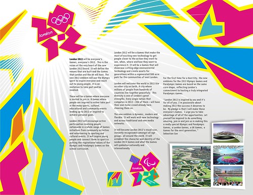
It is indeed a massive leap of change in design from the original concept. The emblem comes in 4 vibrant colors and for the first time, the Paralympic Games (shown lower right) will share the same shape as that of the Olympic Games.

Sadly, the rest of the world does not share in this vision, calling it various derogatory names and invoking images that I won't dare mention here. There is even an ongoing petition to have the logo removed and replaced. What do you think?
At initial glance, I was shocked (as the rest of the world was). I had a hard time trying to understand the logo, and it seems that whatever it was trying to represent, it failed to do so. It was indeed eye-catching and bold, but puzzling as to what it tries to convey (I realized only later after reading a brief about its design that the shapes are based on the numbers 2012). The colors are bold and unconventional, reminiscent of the punk 80's or Nickelodeon shorts. It looked like a mess having those cryptic jagged shapes in those flashy colors.
But as soon as I was able to understand the design (and I tell you, it took some time!), reflecting on what the designers at Wolff Olins (who also designed the Athens 2004 Olympics emblem) could have been thinking when they came up with this design, it becomes a realization that the logo possesses huge potential as a brand (take note, there's a huge difference between a brand and a logo… a logo is simply a graphic representation while a brand represents the "moving idea", and the logo is just a part of it). As a brand, it can be a focal point for the visual design of the whole Olympics Games, rather than being just a static logo. It is unique, not boring (definitely!) and highly flexible (design-wise, and the video, though being accused of causing epileptic fits, was able to successfully show how dynamic the emblem could be). The mere fact that ordinary people can conjure up various images, (ranging from the imaginative to humorous and even obscene!) proves it can be a dynamic graphical theme. It's simple (yet dynamic) and universal, energetic and promising. Olympic signages and icons will be based on these shapes or colors. London will be one colorful city come 2012. But all this will depend on how the logo will be executed… and unfortunately, it may not live up until 2012 to see it come to life due to the overwhelming public loathing.
I must admit that it is not a pretty logo in the "classic" sense. But all I'm saying is that the London 2012 Olympic logo COULD work… and to test if it could indeed look creative and appealing, I quickly made a concept poster featuring the logo using the description brief from the official site and images of what the Olympic venues would look like.
Hmmm… I think it could work. Note how I "londonolympicized" my own logo into the poster.
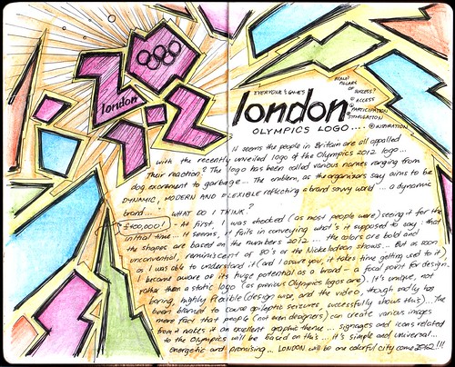
Here's the journal entry capturing my initial thoughts and drawings on the London 2012 Olympics emblem.
And finally, here's a funny bit about the logo:


No comments:
Post a Comment