Looking back on my previous works that has been successful as identifying marks of clients; I would consider the work I did for Savoy Special, a rock and roll band based in Houston, Texas as one of my most distinctive designs. Not only did I employ a unique style in rendering the logo, but the requirements of the client were quite challenging: the idea of using Art Deco, while maintaining a modern appearance. Of course, the logo should still be representative of a rock and roll band.
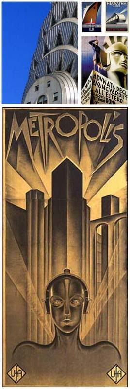
Art Deco was a popular movement evident in the decorative (architecture, interior and industrial design) and visual art (sculpture, paintings, film and fashion) of the 1920's to late 1930's. In architecture, the most representative of this style can be seen on the design of the Chrysler building's spire. Numerous posters from this time period reflect the elegant geometric (almost industrial) lines representative of this distinct style. A favorite landmark film of mine, which holds the distinction as the first science fiction film (and sometimes infamously as the film Adolf Hitler loved and rumored to have sown the seeds of Nazism in his mind), Metropolis, also bears the marks of Art Deco.
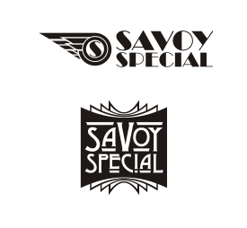
I made several sketches developing a mark for the band. Among the ideas were the use of a stylized geometric wing, combined with a flaming wheel, and a distinguishing nameplate. Although, I am quite satisfied with these two, they don't have that "X" factor that will make the band's image stand out. The wheel version looks quite dated, and may even be confused with a vintage automobile shop (which some rock and roll bands might appreciate, but doesn't quite cut the modern feel the client requires). The nameplate is just that… a nameplate that lacks personality.
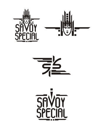
Reviewing my sources of inspiration for Art Deco pieces, I noticed a recurring graphic element in most designs… people were always drawn stylistically with regal and flowing lines. Art Deco is heavily integrated by how the head, limbs and body are positioned, how the hair is drawn… and oftentimes, a distinctive headpiece among other implements is worn by the human subject. I wanted to invest on a distinctive headpiece for the graphic element of the logo, and build a suitable font around it. What turned out was something reminiscent of the robot from Metropolis, an infusion of Art Deco with modern styles. It would pass for an old era design but still be successful as modern or even futuristic. The client loved it. I even made an SS monogram based on the design (and I guess this can be considered as one of my earliest attempts at ambigrams).
It had been more or less a year since I designed this logo and it seems Savoy Special has come a long way since and have worn crowns of success. The logo, which I actually titled "Music Crown" can be seen at their website, promo materials and CD's. Visit their website at www.savoyspecial.com to learn more about the band.


1 comment:
They are all eye-catching and attractive...
Custom logo
Post a Comment