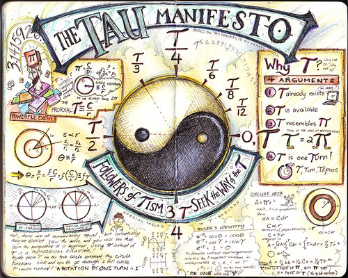
This is based on Michael Hartl's The Tau Manifesto which is dedicated to one of the most important numbers in mathematics, perhaps the most important: the circle constant relating the circumference of a circle to its linear dimension. For millennia, the circle has been considered the most perfect of shapes, and the circle constant captures the geometry of the circle in a single number. Of course, the traditional choice of circle constant is Pi but, as mathematician Bob Palais notes in his delightful article “Pi Is Wrong!”, Pi is wrong. It’s time to set things right." I can't remember how I came about this article, but the geek in me naturally drew me to read and understand this. And I must say, it is very convincing! Now, I realize why trigonometry seemed a little off and illogical, and I could only wish that my teachers then used tau instead of pi. Things could have been a lot easier to understand, and a lot of us could have loved math a lot more. I wished I was able to finish this Moleskine entry on June 28 which coincidentally is Tau Day!
Thursday, July 28, 2011
MyMoleskine and “The Glassblower’s Apprentice” (Study)
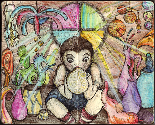
This is just a study for "The Glassblower's Apprentice,” a piece I hope to be chosen for an upcoming exhibit. I’ve always been fascinated by the magical nature of glass and the craftsmen at Murano, Italy seem to conjure magic in every piece of glassware they create. I’m still trying to figure out how to properly execute the effect of glass in a painting form. The final piece may look totally different as I try to explore various styles to execute this.
I uploaded the drawing as well to Moleskine’s MyMoleskine gallery, which they describe as “the best place where you can find and share the most beautiful creations made on a Moleskine notebook.” So if you own a Moleskine, and make art in it, that place may be a nice venue to showcase your talent.
Saturday, July 2, 2011
AngI.n.K. Corner: Unnatural Expeditions
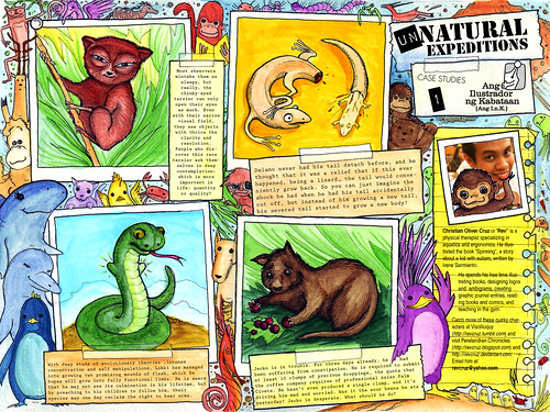
"Unnatural Expeditions" features some of the characters I created for my tumblr site: Visoliluquy where I post doodles from my little drawing notebook. I try to post as much as time allows. This is also a special tribute to my colleagues at Quality Life Discoveries, who are represented here in their alter-ego animal forms. Published today at the Manila Bulletin's AngI.n.K. corner (page E-2).
AngI.n.K. Corner: A Student's Life
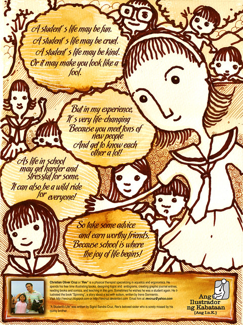
"A Student's Life" is another collaboration with my sister, Sigrid who wrote the poem for this piece. This was published in Manila Bulletin's AngI.n.K. Corner last April 16, 2011.
Sunday, May 29, 2011
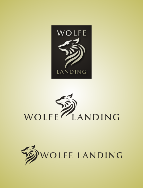
Logo Design: Wolfe Landing LLC
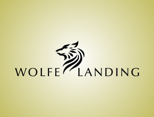
Usual logo depictions of a wolf more often than not exude fierceness, aggression and dominance. These themes are very appropriate for sports teams and tattoos. But sometimes, the wolf image is required in a logo without necessarily portraying these themes. For instance, a logo for a real estate company or a home community, which would focus on tranquility, carefree living and comfort. In a project I recently did, I was required to develop a logo for Wolfe Landing. The specifications were very simple: I only needed to have an image of a wolf, and the name "Wolfe" and that it should have a similar feel to earlier logos I made for them (Eden Park Homes and Fairfax Park). Pressed for time, they wanted me to come up with my own design and proceed immediately with vector work. Cool! The challenge I faced in creating this logo was how to portray the wolf in a manner that focuses on the positive aspects that is appropriate for such a company: privilege, freedom, dignity and respect. I knew that I can avoid the ferocity of the wolf by entirely using curves in the graphic (notice that most other wolf logos utilizes sharp lines). I had to select a dignified posture for the head of the wolf and work the curves from there. For the text, I chose Optima as the preferred font, simple yet elegant. I provided them with variations of the same logo. And luckily, they immediately accepted this design with no revision at all!
Saturday, May 28, 2011
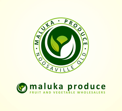
Logo Design: Maluka Produce
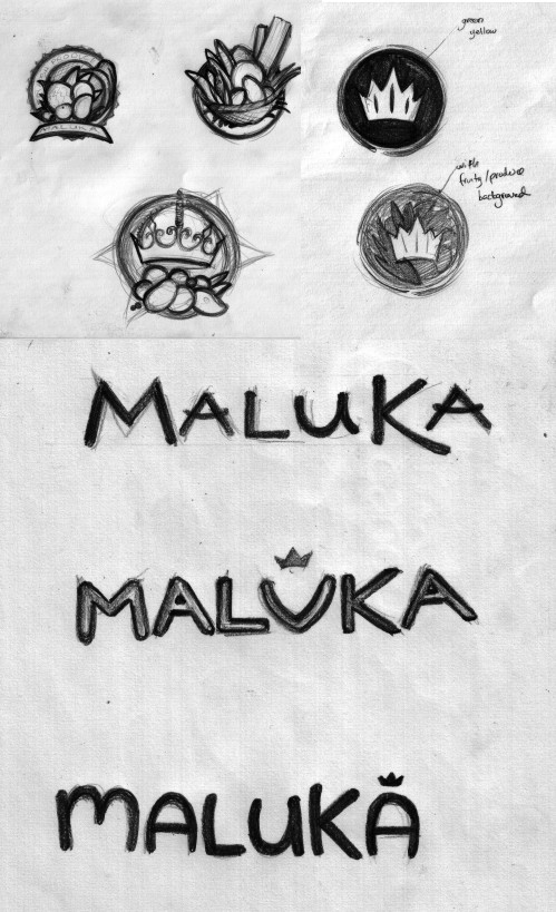
Maluka Produce is a wholesale/retail business dedicated to delivering fresh local fruit and vegetables. They are located in Noosaville, QLD (Australia) and the owners wanted a logo that was clean and industrial, matching the industrial area in which their headquarters is located. As part of my creative pitch for them, I mentioned that the logo they will be needing would look best as an icon, either simple, minimalist or detailed but nature-based. Researching on the word "MALUKA", I discovered that it meant "Queen" and/or "Flower" in some cultures and "Work of God" in others. I thought of combining these key words and infusing these in the graphic, something that evokes cornucopia (bounty) and royalty. It turned out that the name Maluka is a combination of Matt and Luke, the names of the owners (but they did appreciate the research, and it turned out, these were the things they wanted in their logo as well!). As for the text, the themes would be minimalism – evoking cleanliness, freshness and health… thin, clean lines; or whimsy – evoking bountiful, freshness, wealth… thick, curvy, nature, wavy lines and modernism – evoking relevance, cleanliness, modern… thick, power, industrial lines. I provided them with these initial sketches:
Among these, they wanted to go with the minimalist stamp approach. I then proceeded with vector work, providing them with numerous options for the icon, among which they selected to develop the "leaf" concept.
As can be seen above, the developments included revisions in design elements (removing unnecessary embellishments and maintaining simplicity and minimalism in the icon) and color. Ultimately, the final design was reached and packaged to fit their needs. Maluka Produce is in www.malukaproduce.com and Facebook: Maluka Produce . All the fresh and healthy fruits in their store now has made me hungry…
Sunday, May 22, 2011
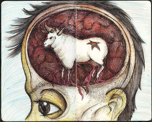
Murakamiesque 5
Inspired from Haruki Murakami's "A Wild Sheep Chase", a story about a man's unusual adventure that leads him on a hunt for a mysterious sheep that seems to have powers to control the world. It is filled with quirky characters including a girl with magically seductive ears (that can increase the quality of sex a thousand-fold! woah!), a strange man that wears sheep clothing and many more.