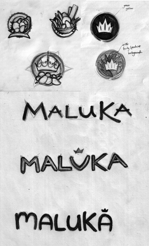
Maluka Produce is a wholesale/retail business dedicated to delivering fresh local fruit and vegetables. They are located in Noosaville, QLD (Australia) and the owners wanted a logo that was clean and industrial, matching the industrial area in which their headquarters is located. As part of my creative pitch for them, I mentioned that the logo they will be needing would look best as an icon, either simple, minimalist or detailed but nature-based. Researching on the word "MALUKA", I discovered that it meant "Queen" and/or "Flower" in some cultures and "Work of God" in others. I thought of combining these key words and infusing these in the graphic, something that evokes cornucopia (bounty) and royalty. It turned out that the name Maluka is a combination of Matt and Luke, the names of the owners (but they did appreciate the research, and it turned out, these were the things they wanted in their logo as well!). As for the text, the themes would be minimalism – evoking cleanliness, freshness and health… thin, clean lines; or whimsy – evoking bountiful, freshness, wealth… thick, curvy, nature, wavy lines and modernism – evoking relevance, cleanliness, modern… thick, power, industrial lines. I provided them with these initial sketches:
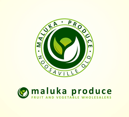
Among these, they wanted to go with the minimalist stamp approach. I then proceeded with vector work, providing them with numerous options for the icon, among which they selected to develop the "leaf" concept.

As can be seen above, the developments included revisions in design elements (removing unnecessary embellishments and maintaining simplicity and minimalism in the icon) and color. Ultimately, the final design was reached and packaged to fit their needs. Maluka Produce is in www.malukaproduce.com and Facebook: Maluka Produce . All the fresh and healthy fruits in their store now has made me hungry…


No comments:
Post a Comment