The Occupational Therapy Association of the Philippines, Inc. (OTAP, Inc.) will be celebrating its 50th anniversary in 2015 and to commemorate this milestone, the OTAP would like to have the honor of hosting the 2015 Asia Pacific Occupational Therapy Conference and the Asia Pacific Occupational Therapy Regional Group Meeting. In their words, “It would be a fitting way, not only for the OTAP to celebrate with the world, but more importantly, to share with the world the unique brand of Filipino occupational therapy." I was asked by the organization to create a logo to accompany their bid for the 6th APOTC Congress.
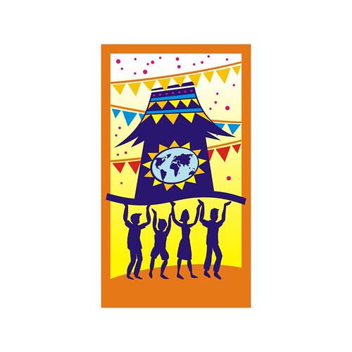
“Moving Forward with the World” is the slogan they chose and wanted to focus on the Bayanihan spirit that Filipinos are known for. They came up with an idea to use a stylized bahay kubo with four people at each corner carrying the bahay kubo. Bandaritas need to be used in the logo since we will be using this in our booth in Chiangmai. They sent me a sketch to explain further how they want the logo to look like.

Now, this was a rush job since they were pressed with time to come up with the necessary documents and media for the event, so any form of direction is truly appreciated. However, the theme is in a way difficult to execute, without making it look too traditional. And since the instructions were pretty focused, I am required to include specific graphical elements in the logo: bahay kubo, 4 people and bandaritas. The challenge is how to keep the logo look uncluttered even if it will be full of details.
I worked on developing their concept, but instead of approaching it in 3D (as their sketch suggested), I invested on fitting all the elements within a tile. This will be the main graphical tile where the other elements of the logo will be based on.
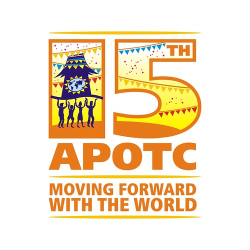
I used this tile within "15" (which was a mistake, since I thought then it was the 15th Congress. It was the 6th to be held on year 2015) and played around with some text.
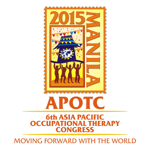
I still had enough time to enhance the logo, so I added highlights and effects (such as the basket weave background, drop shadows and gradients), and framed this within a stamp. I imagined it would be cool to have the logo packaged in a vintage looking stamp, where all merchandise bearing this stamp. Old Manila style.

Here is the final logo.

Unfortunately, the organization’s bid didn’t make it. But I heard that the Philippine delegation put up quite a fight against the winning country. It’s just a matter of time when APOTC will realize this: “Occupational Therapy. It’s more fun in the Philippines!”


1 comment:
I found this is an informative and interesting post so i think so it is very useful and knowledgeable.
Stationery Design
Post a Comment