Recently, I made logo designs for Westfalen Orthotic Services, Inc., a small company located in Markham, Ontario, Canada, that manufactures custom foot orthoses for clinics across Canada. They also offer in-house clinical services, including biomechanical assessment, gait analysis and fitting of custom foot orthoses. Now, it's very interesting to create logos that combine both my technical knowledge (as a physical therapist by profession and a trained ergonomist with appreciable background in biomechanics, orthotics is a familiar discipline) and creative skills.
The client wanted the logo to look modern and sopisticated. It should be able to represent feet, comfort, health and a company who delivers quality service. The logo should make potential/current customers think of a reputable and dependable company. A search on existing logos of companies providing foot orthosis resulted in a variety of designs. The most widely used symbol is the foot, and I think this is unavoidable, since it is what primarily what these companies represent. For this project, I wanted the logo to stand noticeable among current "foot" logos, while maintaining a modern feel characteritic of current logo trends.
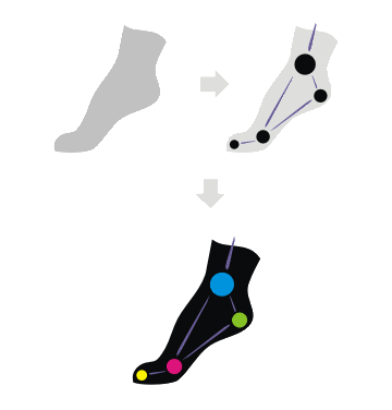
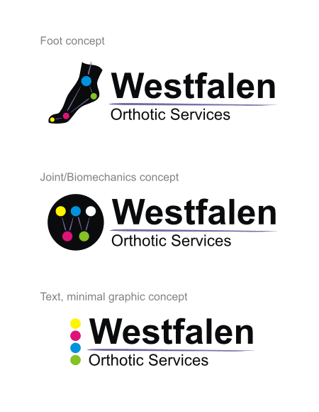
I developed 2 concepts for this project. The first concept invests on the standard foot, but for this I used a silhouette of a foot in "push-off" position, to denote movement and function. Next, points were placed on the functional joints of the foot, and a representational diagram was created, signifying the specialty of the client. This was then colorized, with each dot, using a different color, colors the company may wish to modify to suit their objectives.
Simple but beautiful Arial font was used for the text accompanying the graphic. The "foot" concept may further be reconfigured but still be able maintain the same feel as the original.
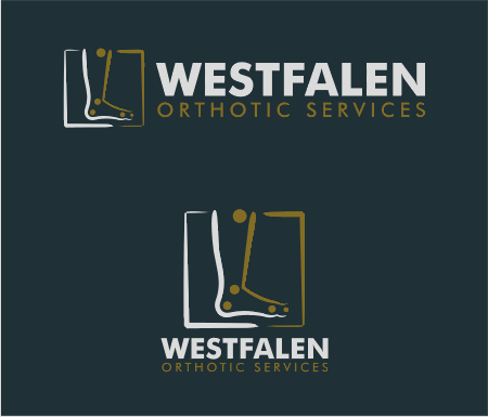
The second concept still invests on the the standard foot symbol, but this time utilizes the outline in fine brush strokes. This was further framed in similar brush strokes and the biomechanical points are also added. Unlike the first concept, the points in this version are not connected through lines. An attempt was made to connect the dots, however, since the graphic already utilizes a number of lines (the brush strokes), these lines would look redundant and would overcrowd the logo. It was also commented that these dots, while originally placed to represent the functional joints, could also represent the usual pain areas of the foot, an area which orthotics addresses too.
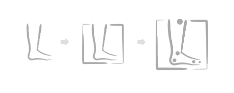
The graphic was then colored (limit to 2 colors to maintain simplicity). The Futura font was used for the text.
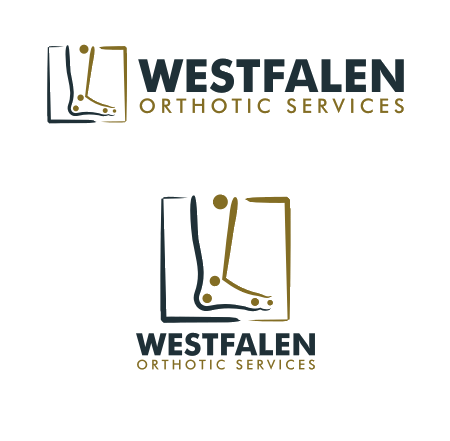
A version on dark background was also made.
Although both concepts were highly regarded, the client ultimately chose the second concept.


1 comment:
This is great info to know.
Post a Comment