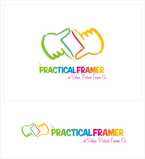
Although the concept I submitted for the logo of The Practical Framer, a company that manufactures and sells picture frames, was not accepted as their primary logo, the premise behind my design is quite clever.
The client wanted a logo whose style is modern, whimsical, of alternative craft... a little retro, but not too stuffy. Since The Practical Framer was established as a separate identity for an online store of the Saline Picture Frame Company, they wanted the logo to represent an accessible "practical" feel, competent, affordable, easy and sophisticated. Also, the company requested that no mitered picture frames be used in the logo... the company seems avoiding the old fashioned, obvious "what-we-do is represented in our logo" type of design.
Keeping in mind the client's set limits, I wanted to represent their business in a creative, indirect manner. How would you represent a picture frame without using a picture frame? Use something to suggest the idea of a picture frame! I sought to look for a relevant symbol drawing on my fondness of taking pictures, reading a lot of manuals and guides on photography and observing amateur and professional photographers. Whenever we see a beautiful view, or see a beautiful face, but have no camera around, we instead try to imagine what it would look like as a photo. What do we do? We do this, don't we?
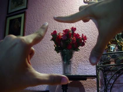
We create a virtual frame using our hands, adjusting the subject within the set limits of the perpendicularity of our index fingers and thumbs and sigh "If only I could take a picture of this (or paint this), how beautiful it could be!"
Developing this experience into a concept, and infusing the concept into an actual logo graphic was an interesting process. I came up with a colorful design and as shown here, can be used as a standalone graphic without the accompanying text. The graphic is fun, but not silly... memorable and distinctive... and most importantly, clever.
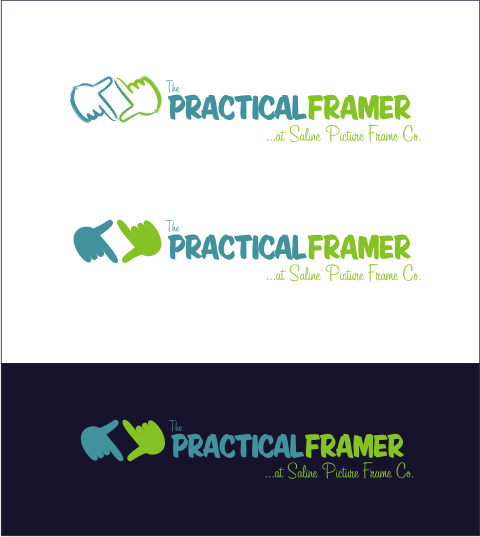
The logo also works in simple colors, and can work on light and dark backgrounds.
The logo concept features a graphical symbol that is not a direct representation of their nature of work, but works on a different level, increasing the semantic power of of the client's name ("practical" - "hands", "framer" - "the frame formed by the hands").
My other logos can be seen at my deviantART site.


1 comment:
It probably didn't get picked for a number of reasons.
1. 80 bazillion colours, try reproducing that on anything besides a computer screen.
2. too many swoopy/small details, especially on the hands. again try reproducing (embroidered garmet? forget about it! reduce to .75" without losing info? No way!) these are common problems that schooled designers are trained to notice/correct.
3. in the solid hands option, it looks more like odd birds, not hands.
4. the hand cropping logo isn't really all that unique. not one iota actually...
5. your choice of font for "framer" always reads to me like "farmer" every time. and that cursive you have at the bottom is near impossible to read. (again did you try to reduce the size?)
Anyway, I'm sure there are more reasons, these are what came off the top of my head in about 2 seconds.
It's pretty, but it is no where even close to a good (let alone award-winning) logo.
Post a Comment